


The book is published in Japan and is based on the 6-volume work of kimono designer and teacher Sanzo Wada in the 1930s, a time when Japan was between wars, and was absorbing Western influences.
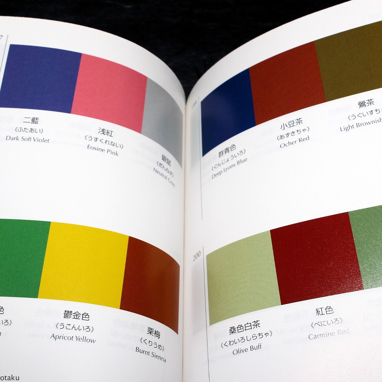
Japan has over 1000 traditional colors, based initially on the Chinese color system. Each named with reference to the seasons, and to plants, and animals, and the colors are often associated with social ranking.

The book starts with two-color combinations, and then proceeds to three- and four-color combinations. The back of the book is more like a Pantone book
The only English language in the book are the color names; there is no other context, nor suggestions on how to use it.
I enjoy looking through the book purely in abstract terms, with the intention of trying some of the combinations in actual designs. I like the fact that it doesn't direct the user how to react to the color pairings.
----
Resources
----
Resources
Book at Amazon: A Dictionary Of Color Combinations
Previously: Translating "Color and Light" into Japanese
Wikipedia: Japan's Traditional Colors and Japan's 12 Cap and Rank System
Thanks, Steve.
Previously: Translating "Color and Light" into Japanese
Wikipedia: Japan's Traditional Colors and Japan's 12 Cap and Rank System
Thanks, Steve.
9 comments:
What a coincidence; I just bought that book a month ago. I stumbled upon it by chance, and I was just fascinated by the gentle arbitrariness of it all. The downside if you don't read Japanese is that you can't enjoy the beautifully imaginative Japanese colour words. As examples, the so-called 'pale lemon yellow' in the scanned image you put in the post actually reads as 'pale egg colour'; 'Light brown drab' is 'apricot blossom mouse', which actually means 'grayish apricot blossom', 'mouse' being a common word used for a darker shade of grey (a lighter grey would be 'ash'); 'Etruscan red' is 'sparrow tea', 'tea' being the usual word for brown; 'Hay's russet' is 'kite colour' ('kite' as in the bird, of course). Another interesting example is the colour referred as 'burnt Sienna' in the first photograph. In Japanese, it's called 'chestnut tea', or 'chestnut brown'. I think most of the English names used in the book are rather ad hoc, while the Japanese terms would actually be recognised in certain specialised occupations, like kimono dyeing, Japanese style painting (or 'nihonga'), lacquerware making, 'ukiyo-e' woodblock printing, etc...
If any particular colour strikes your fancy and you want to know more, please feel free to ask!
Thank you, Matthew! I had a feeling I was missing a lot of the subtle meaning of the book, and I really appreciate the detailed interpretation you shared. I'm so impressed with how Japanese culture has such a refined appreciation of color.
i wonder if these combinations are related to kasane no irome, the art of colour-layering garments from japan’s heian era. (see link: http://www.sengokudaimyo.com/garb/garb.ch14.html for examples)
gekitsu, yes I think so. The artist who put these combos together designed costumes for movies and knew his historical garb. Here's another link: http://www.immortalgeisha.com/wiki/index.php?title=Kasane_no_Irome
I wonder if this is based on the power of big data: n people associate this color plan with ... peace, spring, chocolate? Somewhere I have a book of this kind, published in Japan ... can't find it ... I'll look again. gj
Found it: here it is.
Kobayashi, Color Image Scale. 1992 but still in print, evidently. gj
https://www.amazon.com/Color-Image-Scale-Shigenobu-Kobayashi/dp/477001564X/ref=pd_sim_14_38?_encoding=UTF8&pd_rd_i=477001564X&pd_rd_r=NPKEKB5J58X0N1PZASXV&pd_rd_w=nX93C&pd_rd_wg=ij278&psc=1&refRID=NPKEKB5J58X0N1PZASXV
GJ's recommendation is the one I use, also. It has color images - and English text. I've had mine for decades. Wonderful stuff.
Matthieu, thank you for those details. What evocative names for color, beautiful and poetic. Much nicer than referring to colors as PY42 and such.
This explains why the Akashiya Sai watercolor brush markers I have (dye, not pigments, so not actually watercolors nor permanent, but still very bright and pretty) have very evocative names in Japanese (like mouse grey and peony) that get unceremoniously squashed in the English language catalog (silver and magenta just don't do it for me).
Truly wonderful.
(I really need to republish my review of those markers some day, along with my translations of the color names....)
Post a Comment