


The Roman alphabets are the oldest and most universal The Italian Renaissance capitals, which in turn derive from those carved into Trajan’s Column in Rome, deserve careful study, as they are the basis for many subsequent variations.

Note the circular outside shapes of the C, G, O, and Q; the narrowness of the S; the nearly midline crossbars on the E, F, and H; and the serifs, the small spurs or feet at the top and bottom of ascenders. Achieving the nuances of classic Roman capitals is difficult with single stroke construction using a lettering brush or a broad pen, but some of the examples an attractive alphabet that can be constructed rapidly with a broad pen or flat tipped brush.
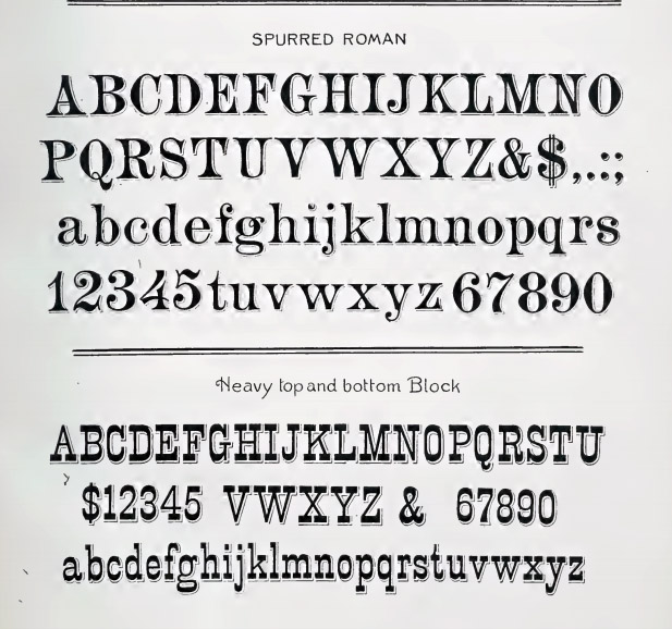 Most traditional alphabets have a consistent distribution of thick and thin lines. Typically, letterforms are drawn with greater thickness on the vertical ascender, compared to the horizontal crossbar, a byproduct of pen technique. Novel effects can be achieved by using a constant thickness throughout the letter or by reversing the normal relationship of thick and thin lines, .
Being “modern” or “artistic” or “up to date” became an obsession in Bergling’s day. He revels in eccentric departures from the staid rhythms of traditional alphabets. He includes Art Nouveau features, such as curving ascenders, curlicue serifs, or crossbars placed high or low.
Thanks to his experience weaving letterforms into monograms, Bergling was especially adept at interlocking ascenders and descenders. Some of these ideas were revived by underground comic artists in the 1960s, such as R. Crumb, who took a strong interest in both the music and the phonograph sleeve design of Bergling’s era.

 Printing technology was rapidly changing at the threshold of the twentieth century. Photoengraving and photolithography allowed lettering to be printed directly from the original penwork. This opened up a range of possible effects, and liberated graphic design from the relatively labored and mechanical look of set type and hand engraving. The photomechanical processes also made reproduction possible at a size smaller than the original.
-----
Series on J.M. Bergling and the Golden Age of Penmanship
Part 1
Part 2
Part 3
Part 4
Part 5
You can get a signed copy of Bergling's "Art Alphabets and Lettering" from my website store.
----
Here's where you can get the Dover book on Amazon. You can also still find a vintage copy on Amazon.
___________________
3 comments:
Good morning, James:
I would like to propose that you do one of your periodic competitions, for the best ampersand. It's such a lovely and versatile device.
gj
Thanks for this series, James. Having dabbled in calligraphy as a teenager, I enjoyed it quite a bit. In the mid-1980's, I took a graphic design course in college in which the professor had us doing calligraphy for the first month. His point was that the best way to understand typography was to draw the letterforms. I think you'd be hard-pressed to find anyone doing calligraphy in graphic design courses today, but then again, it was probably unusual even in the 80's.
It was that Architects were about the last holdout of proper letterwriting as we call it. Years ago when I started my own architecture office I bought several good "architects fonts" for my CADD work so they still have a hand-drawn and lettered feel...and I occasionally still get compliments for the clarity and readability of my construction drawings.
At my college in the late 70s we were shipped off to the civil engineering department for two semesters of traditional technical drafting. PC-based CAD didn't become affordable until the late 80s nor common until the 1990s in most offices. Now the schools don't bother teaching draughting anymore...and it shows.
I'm still always on the lookout for good fonts, and YT videos on handlettering.
Post a Comment