Stream scene in watercolor by Solomon J. Solomon
Showing posts sorted by date for query solomon. Sort by relevance Show all posts
Wednesday, March 15, 2023
Saturday, August 14, 2021
Solomon J. Solomon Paints a Young Violinist
Solomon J. Solomon, Mischa Elman Playing the Violin, 1911
Solomon Solomon painted the Mischa Elman (1891-1967) when the young violinist was just 20 years old.
His hands are a blur, but his face painted with a solid understanding of the old masters.
Elman was a child prodigy, but not everyone wants to perform with young prodigies:
"Elman was still only a boy when [musician Leopold] Auer arranged for him to play with the famous Colonne Orchestra during their visit to Pavlovsk. Knowing Édouard Colonne's hatred of child prodigies, Auer did not tell him Elman's age when making the arrangements, and not until the famous conductor saw young Mischa waiting to go on the platform did he realize that he had engaged a child. He was furious, and flatly refused to continue with the programme. Frantic attempts were made to assure him that Elman had the recommendation of Auer himself and was well capable of doing justice to the music, but Colonne was adamant, "I have never yet played with a child, and I refuse to start now," he retorted. So Elman had to play with piano accompaniment while conductor and orchestra sat listening." According to Elman ."I was eleven at the time. When Colonne saw me, violin in hand, ready to step on the stage, he drew himself up and said with emphasis: 'I play with a prodigy! Never!' Nothing could move him, and I had to play to a piano accompaniment. After he had heard me play, though, he came over to me and said: 'The best apology I can make for what I said is to ask you to do me the honor of playing with the Orchestre Colonne in Paris.' He was as good as his word. Four months later I went to Paris and played the Mendelssohn concerto for him with great success."
--
The Practice of Oil Painting and Drawing (Dover Art Instruction)
Tuesday, July 24, 2018
Evolution of a Picture, Part 1: Compositional Studies
Although many artists studied in the 19th century ateliers, few of them published practical information about the actual methods used by masters of academic realism.
In their books, authors like Harold Speed, Solomon Solomon, and Charles Bargue focus mostly on drawing and painting accurately when working from observation. It's much harder to find information about how academic artists developed their imaginative ideas.
One exception is the following article from 1901 called Evolution of a Picture: A Chapter on Studies by Cabanel-trained Edgar Spier Cameron. This stuff is gold. Because it's so useful, I present it to you in full in four installments.
In their books, authors like Harold Speed, Solomon Solomon, and Charles Bargue focus mostly on drawing and painting accurately when working from observation. It's much harder to find information about how academic artists developed their imaginative ideas.
One exception is the following article from 1901 called Evolution of a Picture: A Chapter on Studies by Cabanel-trained Edgar Spier Cameron. This stuff is gold. Because it's so useful, I present it to you in full in four installments.
"A sketch may be made in this way for the mere pleasure of doing it, or in order that the data which are thus secured may be preserved for future use, but the process of making a picture is longer and much more elaborate.
![]() |
| STUDY FOR DECORATIVE FIGURE By Jules-Elie Delaunay |
"The picture which expresses something, which has a raison d'être, is generally evolved with as much thought and care as a writer bestows on a serious article or a story and by somewhat similar processes. In a picture, whatever its subject may be, the "unities" are imposed by the means of expression.
"A picture cannot well represent more than one idea, one place, or one instant of time. All that the artist has to say must be concentrated into one single effect, and consequently all of his study must be in the direction of elimination from the multiplicity of suggestions which nature makes to him, the material for a picture.
![]() |
| STUDY FOR DECORATIVE FIGURE By Jules-Elie Delaunay |
![]() |
| Compositional study by Jean Leon Gérôme |
"For any important pictures requiring arrangement or composition, as is the case of nearly all figure subjects, most artists make numerous studies. The title "Study" applied to paintings shown in exhibitions is nearly always a misnomer. Such works are chiefly the work of students or painters who have more technique than ideas to paint, and were not painted as a study for something more important.
![]() |
| Sheet of studies by Wilhelm von Kaulbach |
Tomorrow: Part 2: Studies and Études
-----
Sources and More Info
Evolution of a Picture: A Chapter on Studies by Edgar Cameron in Brush and Pencil Magazine
Vol. 8, No. 3 (Jun., 1901), pp. 121-133
The author is muralist and critic Edgar Spier Cameron (1862-1944) from Chicago. He studied at the Art Students League in New York and the Académie des Beaux-Arts in Paris. His teachers were Dewing, Inness, Cabanel, Lefebvre, Boulanger, Laurens, and Benjamin-Constant.
You can find more about these methods in my book Imaginative Realism.
Vol. 8, No. 3 (Jun., 1901), pp. 121-133
The author is muralist and critic Edgar Spier Cameron (1862-1944) from Chicago. He studied at the Art Students League in New York and the Académie des Beaux-Arts in Paris. His teachers were Dewing, Inness, Cabanel, Lefebvre, Boulanger, Laurens, and Benjamin-Constant.
You can find more about these methods in my book Imaginative Realism.
Tuesday, November 22, 2016
Your Casein Questions
When I try out a new kind of paint, I like to use a super-limited palette, as I did on this painting of a historic wooden boatbuilding shop. (Watch on YouTube)
Yesterday I invited you to ask questions about casein, and they were great ones. Here are some answers.
Paint
Elo Wobing: Can I ask why you choose this medium over other water soluble painting mediums? Specifically, why not use acrylic paint which is also water soluble with opaque and transparent qualities?
Elo, Yes, you're right, acrylic is very similar. The stronger emulsion strength of acrylic paint makes is preferable to casein if you want durable impastos. The kind of acrylic I do use from time to time is Holbein Acrya Gouache (which is really acrylic). The thing I like about casein is the weaker emulsion, which keeps the paint from being sticky or gummy as it's drying. Casein flows more readily off the brush than does acrylic.
J. Oates: I am curious too as to why you choose casein over gouache. It is not as readily available as gouache in the UK, and so not easy to try.
Good question. Casein and gouache are very similar, so the lessons in this video apply to both media. I reach for casein when I want a fuller bodied paint, and it's less expensive per cc so I can use it more freely. It also has a more closed surface when it dries, meaning the paint won't be reactivated by a later wet stroke. Gouache is better than casein for fine detail, and gouache offers more color choices, and generally heavier pigment concentration.
Matt Dicke: Do you have a preference of Gouache or Casein as an alternative to oil? There are many times when dealing with solvents is not possible and having a water based medium that has a similar feel and handling to oil is needed?
I would say that casein has more body than gouache, and in that sense, it feels more like oil. Maybe it's also that the paint tubes are the same size as oil, and I use plenty of paint when I'm using casein. Casein doesn't really have the impasto quality of oil, though, and neither does gouache. Also, neither gouache or casein has the transparent deep darks of oil. They both dry light in the darks, and that takes some getting used to.
Gary: Is it advisable to order an additional, larger tube of Titanium white with the casein sets? In some media (acrylic gouache) it is difficult to paint opaquely without it.
Yes, I think it's a good idea to have one of the larger tubes of white. I go through two or three times more white than any other color.
Keita Hopkinson: From your experience, how fast does casein dry... (whether a wash, or opaque passages)? Thanks much!
Since it's an aqueous medium, drying time depends on the heat and humidity, as with watercolor and gouache. It will dry to the touch anywhere from a few seconds to a minute or so. Casein is unusual in that the proteins in the milk emulsion continue to strengthen after the paint has dried to the touch, so after a few days or weeks, it will be tougher than paint that has just dried.
Matthieu Kiriyama: I wish I could put my hands on some casein paint, but it doesn't seem like they're available here in Japan (A set of 6 colors from Richeson sells for a hefty 100 to 180 dollars on Amazon). Is Richeson the only manufacturer you know of that I could look into? I understand that milk paint is a popular medium for painting furniture, but not every brand is suitable for fine arts? (I have the same problem of not being able to buy your new video with Paypal the way I did on Sellfy before.)
Since it's an aqueous medium, drying time depends on the heat and humidity, as with watercolor and gouache. It will dry to the touch anywhere from a few seconds to a minute or so. Casein is unusual in that the proteins in the milk emulsion continue to strengthen after the paint has dried to the touch, so after a few days or weeks, it will be tougher than paint that has just dried.
Matthieu Kiriyama: I wish I could put my hands on some casein paint, but it doesn't seem like they're available here in Japan (A set of 6 colors from Richeson sells for a hefty 100 to 180 dollars on Amazon). Is Richeson the only manufacturer you know of that I could look into? I understand that milk paint is a popular medium for painting furniture, but not every brand is suitable for fine arts? (I have the same problem of not being able to buy your new video with Paypal the way I did on Sellfy before.)
Richeson is the only manufacturer of tubed artist grade casein that I'm aware of. They bought the Shivá company, and make the same paint under the two different brands. If casein is not available in your area, no worries. I would substitute gouache or Acryla gouache. Here's a previous post about gouache materials. And sorry about the Paypal issue. I've been having difficulties uploading the files to Sellfy and Cubebrush, but I'll keep trying.
Color Palette
Koushik: 1) How do you pick a limited palette a priori? For instance, in the painting at Lowell's, you picked a very low chroma yellow palette (with black literally being the cool color). Do you decide up front which gamut you're going to use, pick suitable primaries, then interpret things within that range? As in, you could just as well do your fall Wyoming painting (Torrey creek) using say, a strong blue, a cool red and a muted yellow (like ochre)? I'm just asking because I'm trying to understand how you fix your color gamut without any pre-mixing by limiting your pigment choices.
Good question. I don't follow any set rule. I'm usually pretty intuitive about palette choice. But as I think about it, there are three common circumstances that determine my decision of a given limited palette.
1. One is simply what I have in my paint kit. I often bring a random choice of white plus a red, a yellow, and a blue, trying to choose a version of those colors I haven't tried in a while. That's how I recently fell in love with Perylene Maroon, and Prussian Blue in gouache.
2. Another circumstance is when I have a preconceived color (or lighting) idea and I don't care what the actual colors are in the scene in front of me. That was the case with the painting of the solar flare effect, which I wanted to look like my memory of a photographic lens flare.
3. The third circumstance is when I look at a given scene and I try to identify the main color notes that reappear in the scene or that are essential to it. I try to boil those down to about six or fewer colors and set those out as tubes on the palette. If I need a "spiker" color or "guest" color (as I call them sometimes) I can bring them in as an extra spice.
Varnish and Mediums
Koushik: 2) You mention varnish in the section on birch panels. You appear to be using some sort of brush-on varnish (made by Richeson I presume) for your finished pieces. In one of your earlier posts on GJ you've mentioned trying the Richeson varnish on paper and having it soak into the surface repeatedly. How would you varnish something that is painted on say, illustration board? Does the clear coat spray work better instead? Additionally, how long do you wait before varnishing (with either brush-on or spray)? I know the emulsion strengthens with time - even though the surface is dry to touch, Richeson says it might take several weeks before the paint film completely sets!
Margaret Berthold: I'm having trouble varnishing casein paintings on 140 pound Arches watercolor paper. When I spray on a gloss varnish, some areas remain matte and some are glossy. It's very patchy and it seems no matter how many coats I apply it won't acquire an even gloss. Would sealing the paper help? With what? Or is a different surface a better idea?
Yes, as mentioned above, if you want the glossy look of a finish, try to prep the surface at the beginning to make it less absorbent. Two things to add: don't use anything with oil on any layers below the casein, and consider leaving the casein unvarnished. The matte surface can be very attractive.
![]() |
| Garin Baker painting with me (in oil) at Lowell's Boat Shop |
Yes, I was using the Richeson varnish, applied with a brush. But I have also tried Krylon Crystal Clear. Both tend to get soaked up into paintings done on absorbent paper or board, so for those substrates, it can take over four coats before you start seeing much gloss or darkening of the darks. Even if the varnish soaks in, it's important not too use too much with each application.
A surface sealed at the beginning with gesso or acrylic medium or a thick layer of casein that fills the paper's pores would allow the varnish to float on the surface more. It's probably a good idea to wait at least a week or two before varnishing.
Margaret Berthold: I'm having trouble varnishing casein paintings on 140 pound Arches watercolor paper. When I spray on a gloss varnish, some areas remain matte and some are glossy. It's very patchy and it seems no matter how many coats I apply it won't acquire an even gloss. Would sealing the paper help? With what? Or is a different surface a better idea?
Yes, as mentioned above, if you want the glossy look of a finish, try to prep the surface at the beginning to make it less absorbent. Two things to add: don't use anything with oil on any layers below the casein, and consider leaving the casein unvarnished. The matte surface can be very attractive.
Technique
Jeff Allen: When painting the water, would the same layering technique apply as casein, paint the light 1st, then the dark?
I'm not completely sure I understand your question. Since it's an opaque medium, you could proceed in various ways—light first, then dark; or dark first, then light. Or area by area. My general approach is to wash in some light tones, work the big masses of tone and save the lightest, darkest, and finest accents for last.
Hypnopoodles: Do you know of any great works of art done in casein? And on another note, do artists ever work large with gouache and casein? I'm not sure I've ever seen a gouache painting spanning several feet
John Berkey comes to mind (above). Casein has been used a lot in theatrical set painting and Medieval portable altarpieces, and in some murals, so certainly it can be used large. Below is a casein painting by Samuel Colman.
Links and resources
I'm not completely sure I understand your question. Since it's an opaque medium, you could proceed in various ways—light first, then dark; or dark first, then light. Or area by area. My general approach is to wash in some light tones, work the big masses of tone and save the lightest, darkest, and finest accents for last.
![]() |
| John Berkey |
Hypnopoodles: Do you know of any great works of art done in casein? And on another note, do artists ever work large with gouache and casein? I'm not sure I've ever seen a gouache painting spanning several feet
John Berkey comes to mind (above). Casein has been used a lot in theatrical set painting and Medieval portable altarpieces, and in some murals, so certainly it can be used large. Below is a casein painting by Samuel Colman.
![]() |
| "Solomon's Temple, Colorado" 20.5" x 26" casein on canvas Samuel Colman Jr. - 1888 |
Links and resources
"Casein Painting in the Wild"
HD Digital download on Gumroad (Credit cards)
HD Digital download on Sellfy (Paypal) Buy now
DVD at Kunaki (ships worldwide) or Amazon
Casein Explorers Pack (12)
(A good introductory palette that gives you pretty wide gamut.)
Casein 6 Pack
(The colors I used for this painting. On its own, it's a rather muted palette. It makes a good supplement to the 12 pack.)
Casein 6-pack with travel brush set
(Same set as above with the short-handled set).
HD Digital download on Gumroad (Credit cards)
HD Digital download on Sellfy (Paypal) Buy now
DVD at Kunaki (ships worldwide) or Amazon
Casein Explorers Pack (12)
Casein 6 Pack
Casein 6-pack with travel brush set
Labels:
Casein Painting
Tuesday, August 9, 2016
Petition to Set the Record Straight About Norman Rockwell
Yesterday they started a petition to encourage the Norman Rockwell Museum to rescind its endorsement of the book.
Read Abigail's articles in the Huffington Post:
Deborah Solomon’s Disaster (and How She Duped So Many)Wednesday, June 15, 2016
Your Comments, Questions, and Shares from the LiveStream
On Monday's live stream, we had people from Wales, Canada, U.K., Germany, Brazil, Chile, Colombia, Slovakia, India, Phillipines, France, Singapore, Malaysia, South Korea, Puerto Rico, California, Arizona, Texas, Baltimore, Ohio, and NYC (to name a few). Thanks to everyone who joined in.
And congratulations to Faisal Tariq for winning the Best Question prize (Signed, First Day Cover of Australian Dino Stamp), Sherry Pound West for winning the best comment (You get a Dinotopia Collector Card Pack), and Deborah Secor for winning Best Share (You get a Department of Art Patch).
Questions

Kent Gardner
Gouache -- Prior to watching your videos I never thought of it as a fine art medium. Is it true that historically it has used mostly by commercial artists for illustration that was to be reproduced?
Deus Ex Machina ·
Hello from Germany, i really enjoy the painting in the wild series! i was wondering if you have a certain technique for preparing and or exploring with color (e.g. watercolor) swatches in a sketchbook? Not necessarily for a certain motive, but abstract studies. Actually, I would love to see a in depth tutorial about making colored thumbnails :)
Sam Gauss When you're learning a new paint medium, is this the sort of exercise you'd recommend? Grayscale?
Khoa Tran hi james,is the department of art a real thing? Like a club or something (I'm from vietnam btw)
WINNER: Faisal Tariq
Does painting in Gouache help you with painting in oil? (Or more generally painting in one medium help with painting in another medium?)
The answer is YES. Painting in an opaque medium like casein or gouache is in many ways more like oil than it is like transparent watercolor. You can approach the sequence of steps in the same way (such as 1. toning board, 2. background, 3. shadows, 4. halftones, 5. lights, 6. highlights and accents.) The main difference is that with water media every decision is greatly accelerated. Gouache encourages you to be direct and economical with your brushwork. That is, it makes you think about a stroke, mix it, and lay it down with one touch, rather than fussing back and forth with it.
Does painting in Gouache help you with painting in oil? (Or more generally painting in one medium help with painting in another medium?)
The answer is YES. Painting in an opaque medium like casein or gouache is in many ways more like oil than it is like transparent watercolor. You can approach the sequence of steps in the same way (such as 1. toning board, 2. background, 3. shadows, 4. halftones, 5. lights, 6. highlights and accents.) The main difference is that with water media every decision is greatly accelerated. Gouache encourages you to be direct and economical with your brushwork. That is, it makes you think about a stroke, mix it, and lay it down with one touch, rather than fussing back and forth with it.
When you return to oil, that economy of means and directness pays off too. You'll be a faster painter. Oil's properties don't encourage directness and economy as much.
Transparent watercolor is almost a different animal from all the others. It requires kind of an inside-out thinking because you have to paint around the lightest areas, and that takes a certain amount of planning and deliberation. But at the same time it wants you to be intuitive, decisive, and spontaneous. All good qualities to bring to any kind of painting.
Other excellent questions (sorry I couldn't get to them all):
Charles Valsechi
Do you intentionally reduce the value of the light side to create more form? (The white head sculpture appears lighter than your painting.)
Yes, usually I restrict the value range of the light side and lighten it a bit, and I try to unify or group the values of the shadows. Then the painting becomes simpler, more poster-like, and more attention goes to the all-important light-to-shadow transition, which was the obsession of Sargent and others.
BTW, I spray painted this plaster head to a light gray so that its brightest light would come close to the white of the paper. If the maquette was white, there would be no way to match the apparent values on a 3D form using a white-to-black range of paint on a 2D surface.

Kent Gardner
Gouache -- Prior to watching your videos I never thought of it as a fine art medium. Is it true that historically it has used mostly by commercial artists for illustration that was to be reproduced?
Yes, besides all its uses in the design field, gouache has a rich history as a gallery art medium, particularly among French academics like Vibert and Leloir.
Wael Mizo ·
My Question: is there any way to darken specific colors in value for the shade sides of an object in shadow with its complement without losing its saturation, for example green or red - do objects in real world losing its saturation in their shadow sides along with value?
Wael Mizo ·
My Question: is there any way to darken specific colors in value for the shade sides of an object in shadow with its complement without losing its saturation, for example green or red - do objects in real world losing its saturation in their shadow sides along with value?
If you use the complement to darken a color, it will lose saturation. But that's OK because objects typically will lose saturation in shadows. Not always, however. If the shadow side is receiving strongly colored light that matches the local color, it may be higher in chroma (or saturation) than the light side.
Christopher Seubert · Thank you for the demo and all the information and instruction you have passed on. Truly enjoy your posts, videos, blogs and books. Question: who was your most influential instructor/teacher?
Ted Youngkin, my perspective teacher at Art Center, and also my high school teachers Bill Burnes and Bill Goggin. Beyond them, I didn't have too many living teachers. The ones I learned from most were from books, namely by Rockwell, Loomis, Speed, Solomon, Carlson, and Bridgman.
Max Chew Zishen I noticed you were flipping through your sketchbook and every painting is knocking it out of the park! Have you not had any clunkers or bad starts, or did you cut them out of the book?
Thanks, Max. I've had plenty of clunkers and bad starts. I'd say that about 20% are experiments that didn't work the way I had hoped. If I can't fix them, I don't cut them out. Instead I paint over them in casein and have another go on another day.
Joseph Matthew Sebastian Garcia
"I am just wondering how you might light this piece if you were to display it? The values seem cool, but I find, working with a monochrome palette in gouache, that the greys tend to look blueish. Also, does warm lighting even affect the overall look of this piece?"
I added raw sienna and ultramarine blue to the palette alongside the black and white in case I wanted to offset the cooling effect of white on grays. The piece should look OK in any light, warm or cool, as long as the relative color temperatures are good in the painting. But I wasn't too worried about the color temperature for this exercise since I was mainly focused on value.
Deus Ex Machina ·
Hello from Germany, i really enjoy the painting in the wild series! i was wondering if you have a certain technique for preparing and or exploring with color (e.g. watercolor) swatches in a sketchbook? Not necessarily for a certain motive, but abstract studies. Actually, I would love to see a in depth tutorial about making colored thumbnails :)
Yes, I have developed a swatch chart that I love to use for limited palettes. I don't usually paint pure abstracts, but instead look for abstract possibilities in real scenes.
Matthew Enns Do people look at you funny when you paint out in public?
Yes, and here's a post that discusses what I do when that happens.
Waltteri Reunamo ·
Do you prefer synthetic brushes?
Waltteri Reunamo ·
Do you prefer synthetic brushes?
I do like them for gouache and casein because they have good snap and edge definition, especially in the flats. Casein should be used with synthetics because the ammonia content can be hard on natural fibers.
Sam Gauss When you're learning a new paint medium, is this the sort of exercise you'd recommend? Grayscale?
Yes, for people new to gouache or new to physical painting, I recommend painting in black and white. It helps to reduce the variables, so you don't have to worry about hue or chroma.
Khoa Tran hi james,is the department of art a real thing? Like a club or something (I'm from vietnam btw)
The Department of Art is the name for me, my wife, and a few painting buddies of ours. One of our blog compatriots, Steve, generously contributed a supply of embroidered patches. Sometimes we use the patches for special prizes. We made matching uniforms with our names and patches so that we look official when we're street painting. We also have traffic cones marked that way.
Best Comment
Sherry Pound West Watching you while on my way to eye surgeon. May get interrupted by the surgeon!
Best Share
Deborah Secor
I really enjoyed your demo. I have a group of about 200 people and enjoyed sharing the live link, plus posting a screen shot I took as you said hi to us! The personal touch is very nice. Thanks so much. You two were remarkably able to handle all the challenges that came your way, including the technical ones. Great teamwork. :D
Deborah Secor
I really enjoyed your demo. I have a group of about 200 people and enjoyed sharing the live link, plus posting a screen shot I took as you said hi to us! The personal touch is very nice. Thanks so much. You two were remarkably able to handle all the challenges that came your way, including the technical ones. Great teamwork. :D
-----
Friday, January 1, 2016
Harold Speed Chapter 6, Tone Exercises
Happy New Year, everybody, and thanks for visiting the blog. Today we'll take a look at Chapter 6: "Elementary Tone Exercises" from Harold Speed's 1924 art instruction book Oil Painting Techniques and Materials
.
I'll present Speed's main points in boldface type either verbatim or paraphrased, followed by comments of my own. If you want to add a comment, please use the numbered points to refer to the relevant section of the chapter.
1. "There is nothing better than simple, direct, solid painting."
By "solid" he means opaque. The opaque paint allows you to get smooth, flat, tones, but it requires you to be accurate in mixing those tones.
2. "Nothing is as good as a clean cast placed in a strong light and shade."
He's recommends doing studies from a plaster cast, probably of a classic figural sculpture, something without too much detail. Casts are available from companies like Masters International
. If you'd like to recommend sources for casts in the comments, I'll add them here.
3. To paint accurately you have to see the world as if it were flat.
Speed says this isn't easy because we're not accustomed to ignoring the third dimension, due to our stereoscopic vision.
4. "It is a help to look at what you are going to paint through a rectangular hole cut in a card, across which straight lines have been drawn with cotton threaded through at equal distances, both ways, drawn tightly."
I've tried making a string-net viewfinder like he describes, and it doesn't work nearly as well as an acrylic sheet with a forehead spacer, as I demonstrate on my new video.
Speed says: "these mechanical helps should not be relied upon too much, and should be dispensed with as soon as possible, as they interfere with freedom of expression." He has a point. If any technique undermines your confidence or restricts your freedom to make aesthetic choices, it may not be helpful.
But it depends on what you want to accomplish with a given painting or study. If what you want to do is capture exactly what you see, why not start with an efficient method for doing so? It's not really any more mechanical than the "segment and slope" method. Sometimes dead-on accuracy is what I want to achieve. But other times I want to subtly change and alter what I see for expressive purposes.
While I respect artists who apply an absolute moral code to their studio practices, I am a pragmatist in such matters. I believe the results will always justify the method. My observation is that artists with fixed or absolute ideas about "right" or "wrong" methods or ideas about "cheating" will end up trapped within the walls that they have constructed. I do agree with Speed when he says: "Nothing is done on a canvas that has not first been conceived in the mind."
5. (Process)
a) "The first lay in should be as simple a map of these tone masses as you can reduce your subject to."
b) First lay down the tones of the light and the shadow each with a thin average tone, and then subdivide the large mass into smaller forms. In Creative Illustration
, Andrew Loomis calls this the "Big Tone Approach."
c) Half-closing the eyes makes it easier to see the average tone. The eye is attracted to little accents at first, so this can be difficult.
d) Paint background first, just thick enough to cover solidly, but not too thick. Save your thick painting for later.
e) Keep the tones simple and flat, but spend time and attention on the halftones and transitions from light to shade. This is something Sargent and Carolus-Duran emphasized, too.
f) Scrape it out if it doesn't work. Also something Sargent did.
g) Don't keep patting it with your brush. Think first then add a stroke.
h) Speed talks about working in front of a window, but if you want absolutely controlled conditions, you can work under an artificial light. I have always preferred the changeability of window light.
i) After you've practiced with casts you can proceed to other still life objects of varying colors and textures, and then to the figure and to real life.
6. (Tools and Materials)
a) Use a flat brush with rounded corners. Here's a website that discusses oil brush shapes. Silver brushes
are good, but there are many brands available.
b) Use the largest brush you can stand.
c) Hold the brush as far up the handle as possible.
d) Speed recommends using raw umber as a good color for the first pass especially because it dries fast and is fairly neutral.
7. Lines down the form emphasize toughness and across the form softness, and in every direction mystery and atmosphere.
Andrew Loomis (above) talks about this too, in his excellent instructional book Creative Illustration
, and I wonder if he got it from Mr. Speed.
I'll present Speed's main points in boldface type either verbatim or paraphrased, followed by comments of my own. If you want to add a comment, please use the numbered points to refer to the relevant section of the chapter.
![]() |
| The Selene Horse from the Parthenon (Image source) |
By "solid" he means opaque. The opaque paint allows you to get smooth, flat, tones, but it requires you to be accurate in mixing those tones.
2. "Nothing is as good as a clean cast placed in a strong light and shade."
He's recommends doing studies from a plaster cast, probably of a classic figural sculpture, something without too much detail. Casts are available from companies like Masters International
3. To paint accurately you have to see the world as if it were flat.
Speed says this isn't easy because we're not accustomed to ignoring the third dimension, due to our stereoscopic vision.
4. "It is a help to look at what you are going to paint through a rectangular hole cut in a card, across which straight lines have been drawn with cotton threaded through at equal distances, both ways, drawn tightly."
I've tried making a string-net viewfinder like he describes, and it doesn't work nearly as well as an acrylic sheet with a forehead spacer, as I demonstrate on my new video.
Speed says: "these mechanical helps should not be relied upon too much, and should be dispensed with as soon as possible, as they interfere with freedom of expression." He has a point. If any technique undermines your confidence or restricts your freedom to make aesthetic choices, it may not be helpful.
But it depends on what you want to accomplish with a given painting or study. If what you want to do is capture exactly what you see, why not start with an efficient method for doing so? It's not really any more mechanical than the "segment and slope" method. Sometimes dead-on accuracy is what I want to achieve. But other times I want to subtly change and alter what I see for expressive purposes.
While I respect artists who apply an absolute moral code to their studio practices, I am a pragmatist in such matters. I believe the results will always justify the method. My observation is that artists with fixed or absolute ideas about "right" or "wrong" methods or ideas about "cheating" will end up trapped within the walls that they have constructed. I do agree with Speed when he says: "Nothing is done on a canvas that has not first been conceived in the mind."
![]() |
| Albert Edelfelt academic study |
a) "The first lay in should be as simple a map of these tone masses as you can reduce your subject to."
b) First lay down the tones of the light and the shadow each with a thin average tone, and then subdivide the large mass into smaller forms. In Creative Illustration
c) Half-closing the eyes makes it easier to see the average tone. The eye is attracted to little accents at first, so this can be difficult.
d) Paint background first, just thick enough to cover solidly, but not too thick. Save your thick painting for later.
e) Keep the tones simple and flat, but spend time and attention on the halftones and transitions from light to shade. This is something Sargent and Carolus-Duran emphasized, too.
f) Scrape it out if it doesn't work. Also something Sargent did.
g) Don't keep patting it with your brush. Think first then add a stroke.
h) Speed talks about working in front of a window, but if you want absolutely controlled conditions, you can work under an artificial light. I have always preferred the changeability of window light.
i) After you've practiced with casts you can proceed to other still life objects of varying colors and textures, and then to the figure and to real life.
a) Use a flat brush with rounded corners. Here's a website that discusses oil brush shapes. Silver brushes
b) Use the largest brush you can stand.
c) Hold the brush as far up the handle as possible.
d) Speed recommends using raw umber as a good color for the first pass especially because it dries fast and is fairly neutral.
7. Lines down the form emphasize toughness and across the form softness, and in every direction mystery and atmosphere.
Andrew Loomis (above) talks about this too, in his excellent instructional book Creative Illustration
8. The Mosaic Method
This is closer to the method taught by Carolus-Duran. I discussed this in a previous post on Carolus Duran's Method. He concludes by talking about yet another method of doing studies, where you let an underpainting dry and then glaze and scumble some semi-transparent color over it. This kind of method is discussed at some detail in Solomon J. Solomon's book, The Practice of Oil Painting and Drawing
.
This is closer to the method taught by Carolus-Duran. I discussed this in a previous post on Carolus Duran's Method. He concludes by talking about yet another method of doing studies, where you let an underpainting dry and then glaze and scumble some semi-transparent color over it. This kind of method is discussed at some detail in Solomon J. Solomon's book, The Practice of Oil Painting and Drawing
Next week—Chapter 7: Colour.
-----
In its original edition, the book is called "The Science and Practice of Oil Painting
." Unfortunately it's not available in a free edition, but there's an inexpensive print edition that Dover publishes under a different title "Oil Painting Techniques and Materials

," and there's also a Kindle edition.
Saturday, August 1, 2015
GJ Book Club: Chapter 17: Portrait Drawing
On the GJ Book Club, we're looking at Chapter 17: "Portrait Drawing" in Harold Speed's 1917 classic The Practice and Science of Drawing.Now we arrive at a solid chapter that is full of Speed's best thoughts about how to approach a portrait. He's not only talking about drawing, but about painting, too. I'll paraphrase Speed's points in bold, followed by further comments and links to previous GJ posts that discuss the topic further.
1. An individual's personality affects the outward appearance of their face, both the overall form and the features.
This leads to a question I've often pondered when I'm riding the subway or looking at criminal's mugshots. Can you read a person's biography from their face alone? How much are our innermost lives written on our faces?
2. The real object of the portrait painter is to seize on these unique characteristics of the sitter, even if they are shy and self-conscious about those qualities.
Speed says, "Some close study of individual characteristics must be the aim of the artist." Recent studies of face recognition have shown that the way we remember faces is by cataloguing the ways they deviate from the norm. We keep a mental catalog of their unusual qualities.

Caricaturists know this (above by David Boudreau) and they're experts at emphasizing those deviations.
![]() |
| King George V by Joseph Solomon |
In Speed's words: "Catching the likeness, as it is called, is simply seizing on the essential things that belong only to a particular individual and differentiate that individual from others, and expressing them in a forceful manner."
4. No two people look alike; even if the differences are slight, we can recognize someone after a long time or from far off.
We've all noticed this when we see someone we know in a crowd way off. We're also attuned to recognizing very slight differences in body posture and walk cycles, too, which is why a walk cycle is a central job of designing an animation character.
5. We record the memory of a face not as a collection of individual details, but as a gestalt, or an overall impression.
He says it's important not to dwell too much on any one feature, but to develop the whole subject as a general impression and get that right before honing into the details. You can see this in quick portrait sketches (above) or unfinished paintings by master portraitists.
6. Your eye has to be "fresh" to recognize these differences. If you've been looking at your picture for too long, you lose sight of the uniqueness of the subject.
The best illustration of this is this video, which will blow your mind if you haven't seen it before. Look at the cross in the middle of the frame, as unaltered photos of celebrity faces flash by. They will appear to be distorted caricatures, but they're not. Your "fresh eye" is seeing them as distinct and unique variations.
7. Look for great qualities in the old masters, and then seek those qualities as you observe living examples in nature.
Another point Speed makes is to get to know the person's biography first, at least the main qualities of his temperament that are likely to have influenced his or her face. Another way I think of this is, what is their central metaphor? What is the basic story they keep telling about themselves? Do they present themselves as a victim, a clever trickster, a lover, a thinker, or a rogue? Speed says, "The habitual cast of thought in any individual affects the shape and moulds the form of the features. So I would say, chat it up with the person, and if possible keep them talking throughout the sitting. If they're sitting there like a wooden statue, there's no way you'll capture their true likeness.
8. Get the exact proportions correct first. The metrics have to be right.
We saw this in an earlier post when I interviewed one of the artists for Madame Tussaud's.
![]() |
| Portrait by Boldini |
9. Speed's criticism of the "striking" portrait.
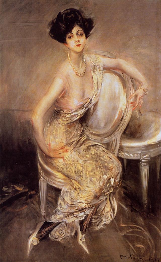
Speed says, "Probably the most popular point of view in portraiture at present is the one that can be described as a "striking presentment of the live person. This is the portrait that arrests the crowd in an exhibition. You cannot ignore it, vitality bursts from it, and everything seems sacrificed to this quality of striking lifelikeness. And some very wonderful modern portraits have been painted from this point of view."
He then goes on to question this fashion. I'm not sure exactly who he had in mind, but it might be Boldini, who did many such striking portraits, and they're related to the bravura of Hals. I doubt that Speed is criticizing Sargent, but he might be.

9. Speed outlines two methods for developing the portrait:
a) Mass in the impression, then finish the eyes first and then finish the rest of the face, moving outward from the eyes. Some contemporary painters advise actually constructing the face outward from the eyes, a more radical version of what Speed is proposing—but this method, I believe, is prone to errors in construction.
b) Block in the overall impression and develop areas throughout the face all together, finishing up the eyes later in the process.

10. Speed's classifications of portrait styles:
a) The quiet and sober portraits of Holbein (above).
b) "Seeking in the face a symbol of the person within." He gives the example of G.F. Watts (below).
![]() |
| Watts portrait of Wm. Morris |
11. Speed cautions against capturing momentary expressions (or contemporary fashions).
He traces this to the ability of the camera to capture a smile. Speed says you wouldn't want to live with a person who is smiling all the time (creepy), so you wouldn't want to live with a portrait like that, either. What would Speed think of modern portraits, where the fashion nowadays is to show the subject grinning? A "fixed smile is terrible," Speed says.
No one can hold a smile very long. That's why someone needs to count down "3, 2, 1, Cheese!" when we take a smiling photo. (See my previous post on Smiling Presidents)
Feel free to offer your comments on any of the points mentioned above, or other points I may have missed.
-----
The Practice and Science of Drawing is available in various formats:
1. Inexpensive softcover edition from Dover, (by far the majority of you are reading it in this format)
3. Free online Archive.org edition.
Articles on Harold Speed in the Studio Magazine The Studio, Volume 15, "The Work of Harold Speed" by A. L. Baldry. (XV. No. 69. — December, 1898.) page 151.
and The Windsor Magazine, Volume 25, "The Art of Mr. Harold Speed" by Austin Chester, page 335. (thanks, अर्जुन)
GJ Book Club on Pinterest (Thanks, Carolyn Kasper)
GJ Facebook page
Overview of the blog series
Announcing the GJ Book Club
Chapter 1: Preface and Introduction
Chapter 2: Drawing
Chapter 3: Vision
Chapter 4: Line Drawing
Chapter 5: Mass Drawing
Chapter 6: Academic and Conventional
Chapter 7: The Study of Drawing
Chapter 8: Line Drawing, Practical
Chapter 9: Mass Drawing
Chapter 10: Rhythm
Chapter 11: Variety of Lines
Chapter 12: Curved Lines
Chapter 13: Variety of Mass
Chapter 14: Unity of Mass
Chapter 15: Balance
Chapter 16: Proportion
Chapter 17: Portrait Drawing
Chapter 18: Visual Memory
Chapter 19: Procedure
Chapter 20: Materials
Overview of the blog series
Announcing the GJ Book Club
Chapter 1: Preface and Introduction
Chapter 2: Drawing
Chapter 3: Vision
Chapter 4: Line Drawing
Chapter 5: Mass Drawing
Chapter 6: Academic and Conventional
Chapter 7: The Study of Drawing
Chapter 8: Line Drawing, Practical
Chapter 9: Mass Drawing
Chapter 10: Rhythm
Chapter 11: Variety of Lines
Chapter 12: Curved Lines
Chapter 13: Variety of Mass
Chapter 14: Unity of Mass
Chapter 15: Balance
Chapter 16: Proportion
Chapter 17: Portrait Drawing
Chapter 18: Visual Memory
Chapter 19: Procedure
Chapter 20: Materials
Labels:
Portraits
Friday, March 27, 2015
Announcing the Friday Book Club
Most of what I know about painting and art history I learned from old books, and every once in a while I like to reread them, because learning is a lifelong process.
That led to an idea. What if we created a free forum on the blog where we could all compare notes about a favorite book?
What book to start with? It could be a biography, an art history book, or an art instruction book.
And it should be broken up into chapters. We're all busy, so we can read and discuss just one chapter a week. I'd like to suggest we begin with Harold Speed's "The Practice and Science of Drawing."

Harold Speed (1872-1957) was Royal-Academy trained portrait painter. His teaching method focuses on solid principles that have stood the test of time. Check out some of his drawings and paintings at the National Gallery website. Edit: And there's a slideshow of his work at BBC (thanks, Glenn)

Like Solomon J. Solomon
![]() |
| Harold Speed, Edward Grey, 1st Viscount Grey of Fallodon |
![]() |
| Harold Speed "Drawing" (Dover Edition) |
This isn't going to be a workshop. I'm not the teacher, nor will I be comprehensively summarizing the points of the chapters. I'll just share my basic take-away from each reading, and I may show an example of how those thoughts affect — or have affected—my own practice. I'm expecting to learn from you and from the discussion. I will try to answer a few questions, but I'm hoping that members of the forum can help shoulder some of the Q and A.
We'll discuss a new chapter every Friday. The discussion will take place in the blog comments. Let's get started a week from today with the Preface and the Introduction. That's your assignment, and mine, too. Those who have time can do practice exercises related to each chapter as we move through the book.
If someone wants to set up a Facebook or Pinterest group for posting artwork, that would be great, and I'll link to it. (Edit: Here's Pinterest link, thanks Carolyn Kasper. Keita Hopkinson also created a GJ Book Club Facebook page here.) I may stop by for a quick visit, but I'll probably focus most of my attention and comments on the blog so that the forum and discussion will be archived and searchable.
Let me know in the comments what you all think of the idea.
Subscribe to:
Posts (Atom)