Friday, April 11, 2008

Hair: The Ribbon Secret

Earlier this week we looked at how to solve the “string mop” problem by using big brushes, keeping the masses simple, and softening edges.

It also helps to visualize masses of hair as ribbons. In a real ribbon, the highlight goes across, not along, the curving shapes.

Leyendecker often captured this ribbonlike quality when he painted hair. Note the lock of hair at the righthand edge of this woman’s bun. The cool highlight crosses the lock, with the warm-toned highlight beside it.

When hair is short or pinned close to the head, the highlight extends across a large region of the entire head, with the full mass of hair getting darker as it turns away from the highlight region. Kroyer paints the lighter brown tones where the hair catches the frontal light, and lets the whole back of the head go to an uninterrupted dark.

The same is true with Leyendecker. Even though he weaves those strokes like a basket, he never loses sight of the big arrangement of light tones, linking individual locks into a single light mass across the whole head.

Drew reminded me about pen and ink techniques, so here are some coiffures by Charles Dana Gibson that show all the same principles we’ve been talking about, but in a totally different medium.


Even if you want to suggest a lot of detail, as Boldini does here: use a big brush, merge locks into larger waves, paint the highlights across those wavy forms, and aim for the ribbon instead of the mop.

Part 1 "Hair: The String Mop" link.
Thanks, Steve and Augie for the Leyendeckers.
To see the full Leyendecker photo set on Flickr, link.

Thursday, April 10, 2008

Allure of the East

We stopped in earlier this evening for the preview opening of the New-York Historical Society's new exhibit "The Allure of The East: Orientalism in New York, 1850-1930."

Compared to the dazzling and extensive Central Asian textile exhibit in the room next door, the Orientalism show is compact, but it has a few representative paintings by Jean-Leon Gerome (lower left), Madrazo Y Garreta (lower right) and Edwin Lord Weeks (not shown). Both shows will be officially open from April 11-August 17. link.

Tomorrow: Hair, Part 2

Dino Art Workshop, 2

This is the second Thursday post giving you a teaser preview of the material in the brand-new April issue of ImagineFX Magazine, which covers dino art and Dinotopia. Grab a copy at your newsstand for the full story!

It is sometimes said that artists are the eyes of paleontology, because our work gives visual form to the theories that scientists have about dinosaurs and other extinct creatures. Paintings helps shape the way the public imagines dinosaurs. Could they run fast? How did they look when they were attacking—or defending themselves? Were they dull grey or striped or spotted?

There’s bound to be a certain amount of guesswork in paleoart. All we have to start with, really, is a box of bone fragments, a footprint or two, and a lot of opinions. Because these creatures were real, we have an obligation to the facts. On the other hand, since they’re long gone, we have a degree of artistic latitude.
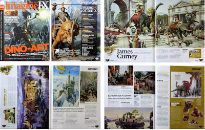
To paint a dinosaur restoration you don’t have to start with a blank canvas and dream the whole thing up from nothing. There are a lot of tricks to fortify your imagination and to give your work those little touches of naturalism that trick the viewer into thinking he or she is seeing a slice of real life rather than an artistic fabrication.


Watch out for the spiky look
A lot of feathered dinosaurs are shown with a spiky, ruffled look. Real bird feathers, including flightless birds, more often show a variety of textures and silhouettes, sometimes with a smooth contour, or blending into a mass. Also, keep in mind that feathers are grouped into into larger tracts. To study real bird feathers, sketch them in ornithology collections, and learn from the work of the great bird illustrators, who have developed the skills of painting feathers over a lifetime.

Change your behavior
I’ve painted more than my share of running, snarling T.rexes, and so has everybody. It’s such a cliche that we almost don’t react to these pictures any more. Why not show a dinosaur drinking water, scratching an itch, bathing, sleeping, or courting a mate? If a dinosaur has feathers, there’s a whole repertoire of preening behaviors that you can infer from birds.

Keep your head down
Look at the posture of real animals. They spend most of their time with their heads down, especially if they’re plant eaters. There’s a tendency for us to paint dinosaurs rearing up in human-like poses. But recent thinking about sauropods and hadrosaurs suggests that they spent most of their lives in more head-down, tail-up postures, unless they are alarmed.


Close your mouth
Dinosaurs, especially meat-eating dinosaurs, are nearly always depicted with their mouths open, but how often do you see films of real animals or birds with their mouths agape? Unless they’re in the act of biting or vocalizing, most creatures shut their traps. On most predatory dinosaurs, the closed mouth has a distinctive overbite, and most articulated skeletons are found that way, too.

Mess things up
Don’t paint the dinosaur in “showroom” condition. They had a hard life, and fossils are often found with injuries and bite marks. If it makes sense for the scene, show them wet, dusty, muddy, or covered with debris. Some of their teeth might be broken off, or their horns scratched and worn.

More
Last week's dino art tips, link.
Cornell Lab of Ornithology: Good source for understanding bird feathers and plumage, link.
Hawk photo courtesy Wikipedia
Elephant Photo courtesy 4x4 Global Challenge.

Tomorrow: Hair, Part 2: The Ribbon Secret

Wednesday, April 9, 2008

Art By Committee: "Looming Up"

Wednesday is the day for pure science fiction wacky goodness. And it’s your chance to pitch in a sketch if you feel like it.


For those new to the “Art By Committee” game, we start with an excerpt snipped from an actual science fiction manuscript. You illustrate the text either digitally or traditionally. Below is an example by James Warhola.


Read this week’s challenge below. It’s a real corker. I’ll bet all the solutions will be wildly different!


No rules or prizes, just a couple suggestions: please scale your JPEG or PNG files to no larger than 700 pixels across and title the file with your name. Let me know if you want me to link back to you when I post on Wednesday the 16th. Email all answers by Tuesday, April 15 at noon eastern time USA.

Tomorrow: Five More Dino Art Tips

Tuesday, April 8, 2008

Hair: The String Mop

Like water and foliage, hair has always presented a unique challenge to both the traditional painter and the digital artist.


If you define individual locks too much, there’s a tendency for it to come out looking like a string mop. And if the edges are too hard, it tends to sit on the head like a leather helmet.


To solve the “string mop” problem, group the strands of hair into large masses and look for soft edges. This detail of a painting by Harry Anderson has the hair flowing in broad, wavy shapes. He has also softened the edges at the temple, just to the left of her eye, and where the hair meets the neck.


Tom Lovell has kept a soft edge on the temple, all the way from the ear to the bangs. The hair grows back from this point, and it’s almost never a sharply defined edge. Note, too, that the curls along her neck are stated in large masses, without inserting many lines in the direction of the hair growth to define individual hairs or locks.


Anders Zorn uses a big bristle brush to sweep up individual locks into simple patches of highlight.

On Friday, don't miss Part 2: "Hair: The Ribbon Secret"

And if you're in New York City, tomorrow, Wednesday, please come to my digital slide show "Dinotopia: Behind the Scenes" at the Society of Illustrators, 128 E. 63rd St., 6:30-9:00. Admission to benefit the Society $10/$6 (Students).

Tomorrow: Art By Committee

Monday, April 7, 2008

Leighton’s Lemon Tree

When you’re drawing something as complex as a tree, with all of its myriad twigs and leaves, how much accuracy is humanly possible? Suppose you had all the time you wanted. How much patience and care could you devote to making a faithful portrait of the entire tree in every detail?

Frederick Lord Leighton (1830-1896) undertook such an experiment during a vacation to Capri in 1859. He worked from dawn to dusk on this 21x15 inch drawing for over a week. He once said that drawing a flower or tree was as difficult as drawing a head if you approached it with the same conscientiousness.


When he finished the drawing, he presented it to the influential critic John Ruskin to hang in the Oxford Museum, in the hopes that it would “impede, if possible, the increasing wrong-headedness in study—the careless conceit, the irreverent dash, the incompetent confidence of many modern students.”


Leighton’s Lemon Tree is a monument of careful draftsmanship that rivals Durer or DaVinci. Ruskin marveled at what the pencil is capable of: “The structural quality is finely wrought out, everything is followed out to its termination, every leaf is suggested and yet kept in perspective.”

The drawing was on exhibit last fall in Bristol’s City Museum & Art Gallery.

More
Leighton’s letter to Ruskin, link.
Ruskins response, link.
Leighton at ARC, link.
Bristol Museum show, link.

Tomorrow: Hair: Ribbons and String Mops

Sunday, April 6, 2008

Color Obtains in the Light

Some time ago, I promised that I’d share some of the tips I learned from the illustrator Tom Lovell. One of his maxims was: “Color obtains in the light.”

“Obtains” in its old-fashioned sense means “to prevail, or to gather in strength.” Another way to put it is: “Color increases in saturation in the light relative to the shadow.”


In the Vermeer painting of the milkmaid, the colors of the yellow bodice, blue apron, and orange pitcher are all relatively more saturated in the light than in the shadow. This happens because the color receptors of our eyes respond better in relatively higher light levels.


I was chanting the mantra “COLOR OBTAINS IN THE LIGHT” (much to the befuddlement of passersby) while I was working on this plein air sketch of a sign. Where the light struck the top, I observed that the red was truly much more vibrant.

Like all hard-and-fast rules, this one has a couple of exceptions. When a form of a given color is in shadow, sometimes the shadow is filled with reflected light of a similar hue.

For example, the shadow side of this ochre-colored building in Toledo, Spain is drenched in light reflected from an orange-colored building across the street, making it more saturated than the same color in the full sunlight.

Another exception is that the glare of the sunlight can be so bright that it actually overloads the color receptors of the eyes, draining the chroma from the lights, at least temporarily until the eyes adjust. This often happens in contre-jour light situations.

Addendum: April 7
I contacted Dr. Jack Werner of the Werner Lab of Vision Science, Department of Ophthamology & Vision Science, University of California, Davis, and asked him to clarify these points from a modern scientific perspective. He kindly responded:

The change in response of the photoreceptors increases with intensity and then simply levels off. I think the saturation changes that you observe in illuminated spots vs. in shadow are rather complex. It is possible that the lightness in one patch induces darkness in the other patch and vice versa. As a result, your observation depends upon both the direct effects of light and the indirect effects due to lateral interactions in the visual pathways.
In other words, if I dare paraphrase into my own words, we can't evaluate the colors in isolation if they're appearing in a complex scene, because we perceive colors in relation to each other, and the perception of adjacent colors in the light and shade have complex series of effects on each other.

Thank you, Dr. Werner.


Saturday, April 5, 2008

Artists as Models

When you’re at a figure sketch group and the model gives you a boring pose, don’t despair. Turn to the side and paint one of your artist colleagues.


That’s what I did on this 20-minute oil study on prepared brown chipboard. I had much more fun with this subject than with the model, who was twisted up in a pretzel. I loved the way the mullions of the windows were casting a shadow on the sheer curtains.

I usually try to check first with the folks around me to see if it’s OK, and usually they don’t care.

At the San Diego Comic Con the organizers asked me to go up on a stage and paint something out of my imagination. This is a tradition for artist-guests at comic conventions, they explained. So I set up my little easel. A group of onlookers gathered round.


“What are you going to paint?” someone asked. My mind instantly went blank. I tried to dream up dragons or giant ant-men or six-armed lizards, but my muse had flown. So I turned to the fellow next to me; I think his name was Donald Yee. Aha! Problem solved. There was my subject!
-------

Related GJ post: The Ninety Degree Rule: link.

Tomorrow: Color Obtains

Friday, April 4, 2008

Second Graders

Today I visited an elementary school to talk to the second graders about Dinotopia and to do a demo drawing of a dinosaur.

I enjoy talking to second graders because I was that age when I fell in love with drawing, thanks to Mrs. Bailey at Almond School in Los Altos, California.

Kids that age are also refreshingly honest. A girl stopped me afterward to say, "I saw your book at the bookstore and my mom almost bought it, but I found one I liked better, so I got that instead."
----------
More candid comments from kids, link.

The Windmill Principle

For many years I had a print of this painting by Rembrandt on my wall. I looked at it often. Something about the tonal arrangement gave me a strange feeling of satisfaction that I couldn’t quite identify.

It’s a simple design with a majestic feeling of of fading light. But what was it about that windmill that kept grabbing my attention?

All at once it dawned on me. The vanes of the windmill have been painted with great attention to tonal relationships. The upraised vane is light against dark (L/D). The one opposite that is dark against light (D/L).. The other two are subordinated. One is dark against dark (D/D)., and the other is light against light (L/L).. Each vane of the windmill represents one of the four possible tonal arrangements.

It’s like a Bach fugue that puts the subject through every possible inversion. The resulting effect marries the subject to the background in a way that both separates it and embeds it. In tonal terms, it invites and delights.


I started to look for “the windmill principle” in other painters. In this Anders Zorn portrait, the figure is rendered with all four conditions of tone in relation to her surroundings. At (1) she is light against light, at (2) light against dark; at (3) dark against dark; and at (4) dark against light. Note too that the subordinate edges at (1) and (3) are blurred a little more.

The windmill principle appears again here in this painting by Sir Alfred Munnings. Is this intentional? Were these artists aware of what they were doing? While we can’t ask them, I believe they were very aware of this principle, whatever they called it.

In my own experience, tonal designs like this take conscious planning, like writing a sonata. It doesn’t just happen. Look for yourself and see where you find the windmill principle.

More
Read about the Windmill Principle in my book, Imaginative Realism: How to Paint What Doesn't Exist
Previous GJ post on “invite, delight,” link.
More on Zorn and Munnings at ARC.
Thanks for the pics, Armand!