Friday, November 6, 2015

Painting Mermaids at MICA

Patrick O'Brien, a professor of Illustration at Maryland Institute College of Art (MICA), has redesigned his “Oil Painting for Illustrators” class to appeal to the new generation of illustration students, calling it “Creature Creation Workshop.”
 

They started by painting from dinosaur maquettes to get used to visualizing a creature in a setting with believable light. 


Then they moved on to mermaids. The students looked at how mermaids have been portrayed in art history, and then did lots of sketches from their imagination.


They brought in a female model to hold a mermaid-like pose (for the upper half at least).


Patrick O'Brien bought some fish at the market so the students could do empirical research on the mermaid's lower half.


They put it all together, with lots of drawings and studies to fit the mermaid into the environment they imagined.


They did their final paintings in oil. Not many students get a such a rare chance to paint fantasy creatures based on real-life inspiration. 
-----

Thursday, November 5, 2015

Why Limit Your Palette?

The new issue of International Artist magazine (#106, December/January) has a four-page feature that I wrote on extreme limited palettes—palettes that have four or fewer colors plus white.

One rhetorical question I pose is: Why limit your palette?
1. Paintings from limited palettes are automatically harmonious, but they’re very often eye-catching and memorable too. 
2. Old masters used limited palettes by default because they just couldn’t get the range of pigments we have now. Using older, quieter colors can give a much wanted mellowness. 
3. A limited palette forces you out of color-mixing habits. If you don’t have that standard “grass green” color, you’ll have to mix it from scratch, and you’re more likely to get the right green that way. 
4. Limited palettes are compact, portable, and sufficient for almost any subject. In fact you can paint almost anything in nature with just four or five colors.

In case you missed it, here's a recent video showing a painting made with just two colors plus white (Link to YouTube video):


International Artist magazine has been successfully using the cross-media strategy of printing QR codes next to paintings for which there is an accompanying YouTube video.
------
Previously on GJ: Limited Palettes 
-------
"Gouache in the Wild"
• HD MP4 Download at Gumroad $14.95
• or HD MP4 Download at Sellfy (for Paypal customers) $14.95
• DVD at Purchase at Kunaki.com (Region 1 encoded NTSC video) $24.50

Wednesday, November 4, 2015

Tuesday, November 3, 2015

Yoda Toyota


I found a picture of Yoda on a cereal box yesterday (upper right). I wondered: is he different from the way he first appeared in Star Wars: Empire Strikes Back? Have other things changed, too?
What do you think?

Edit: Nenko Genov added this comparison. Thanks, Nenko
------
Related posts:
Stormtrooper Doughboy
Automotive Zeitgeist
Car Names

Monday, November 2, 2015

Illustrated Capital

Illustrated initial capital, brush and ink.
I drew this illustrated capital to begin one of the chapters of The Hand of Dinotopia by Alan Dean Foster.

Trusting the universe I created to someone else's imagination takes a leap of faith, but this was a leap I made with a lot of confidence, knowing that Alan was accustomed to writing within established intellectual properties. Among many other projects, he ghost-wrote the original novelization of Star Wars.

James Gurney and Alan Dean Foster in Tunisia, 2008
He is also a friend of mine, and we traveled together to Malta, Tunisia, and Morocco in 2008.

Sunday, November 1, 2015

Teaching Imaginative Realism in High School

Mr. Seifert from Information Technology
at Athens Area High School helps out as a model.
Dr. Andrew Wales, art teacher at the Athens Area High School in Pennsylvania, says:
"In Art 3 and Art 4, we are learning how artists portray the costumed figure. As a guide, we're using a selection from Imaginative Realism: How to Paint What Doesn't Exist by James Gurney. In this way, we're learning what real artists do when they want to portray a fictional scene."
Imagine a train track here
He continues: "We're using models and makeshift costumes to set up imaginary scenarios. Students will use these as sources for drawings. They'll use other sources for background imagery."
------
Teachers: If you want to use Imaginative Realism as a text, why not order a classroom copy from me (USA only, please) that I can sign to you or your school? If you remind me that you're a teacher, I'll send a free signed poster, too.

Saturday, October 31, 2015

Graveyard Painting Results


We received an overwhelming response to the challenge to paint a graveyard on location in a limited palette. There were dozens of entries on the Facebook event page from all over the world, including Taiwan, New Zealand, South Africa, Europe, Mexico, and all over the USA and Canada.  

Some of you painted outside for the first time, or with gouache for the first time, or it was first time out with a limited palette. Some went out with other painters or with members of your family. Some of you painted the graves of your relatives. Some overcame real fears and found a peaceful mood.

Congratulations and thanks to everyone who took part! Following is the Grand Prize winner and the six Finalists. It was really hard to decide because there were so many excellent entries. 


Grand Prize Winner: Garrett Eaton
Location: Mountain View Cemetery in Oakland, CA, which was designed by Fredrick Olmsted (the guy who designed Central Park). 
Palette: Gouache -- Cadmium Yellow Lemon, Ultramarine Light, Burnt Sienna, and Permanent White. 


Artist's comment: Because of its age, many stones are broken and haphazardly lie about; this is what I chose to paint. The light changed significantly over the course of the painting and as a result, my sketch is an amalgam of multiple lighting conditions. Didn't quite get the shadow depth completely.

My comment: Wow, when I was a student I lived just a few miles from this graveyard and never knew about it. Really nice job of color, composition, and lighting.


Location: "Stadtgottesacker", Halle/Saale, Germany
Palette: Gouache -- black, Paris blue, raw sienna and white.


Artist's comment: I always liked a certain sculpture on a cemetery in the middle of the city called "Stadtgottesacker". The whole place is beautiful, but it had to be this sculpture. Today I went there to paint this challenging motif. It took me around four hours. The text says: Aliis inserviendo consumor - In serving others, I consume myself.

My comment: Beautiful design and color, well drawn, and fascinating text.


Artist: Karen Winslow
Location: Mountainview Cemetery in Cambridge, Vermont. 
Palette: Oil, cadmium yellow light, Perylene red, and Delft blue, plus white. 


My comment: I liked the mixture of soft edges and crisp details, and the beautiful grays you got in the background, and the shadowed foreground. Also I was so impressed by the other painting you did by moonlight, Karen! 


Artist: Ian Bosworth
Location: Mabe church in Cornwall, UK.
Palette: Gouache--Ivory black, Raw sienna and a touch of Indian red.


Artist's comment: Never painted a cemetery before but I quite enjoyed it!

My comment: Super job. It was a good choice to go with the black to get that maximum contrast. I don't miss seeing the blue colors at all. Wonderful depth between the cropped foreground and the far fields.


Location: Non-Catholic Cemetery of Rome, Italy.
Palette: Watercolor -- Burnt sienna, French Ultramarine blue and Yellow ochre.


My comment: Sargent palette! I like the way you blended the colors wet-into-wet in the shadows.You added so much life and energy to what was there.

Artist: Michael Mrak
Location: Basking Ridge, New Jersey
Palette: Gouache-- Gamboge, Vermilion, and Ultramarine Blue. Plus white.


Artist's comment: I had never been to this graveyard before but I was looking for one that was 'historic'. The big maple hadn't started turning yet, but the light was great. Next time I'll need to remember to dress warmer.

My comment: Your painting really gives the feeling of standing there. I like the way the stones seem to be congregated around the tree. The tree looks as ancient as the graves.


Artist: Ed Mostly
Location: Decommissioned crematorium oven on display at Arnos Vale, a large cemetery in Bristol, UK.
Palette: Noodlers Lexington grey ink, Permanent Rose and Quinacridone Gold.

Artist's comment: It was installed in the 1930s, and is a grimly fascinating object to study, an industrial 'memento mori'! It provoked a range of reactions from the other visitors, including an awed 'Wow' from a Goth couple. My wife's family is from the area and there's a possibility her granddad might have passed through its portal.

My comment: Yikes, it has a face! I love the subtle grayness of your color and value choices.
-----
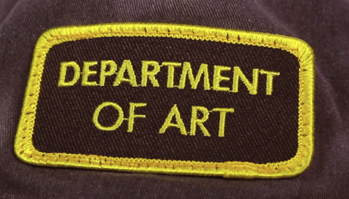
To the winner and finalists, please email me your mailing address so that I can send you a "Department of Art" embroidered patch. You can find my contact info on the bottom left column of the blog.

To all who participated, and who added likes and comments to the pages, thank you! It really had the feeling of camaraderie that comes from a group paint-out, without the distraction of entry fees and auctions.

Check out all the entries on the Graveyard Painting Facebook page, and leave a comment.

Friday, October 30, 2015

Refillable Fountain Pens

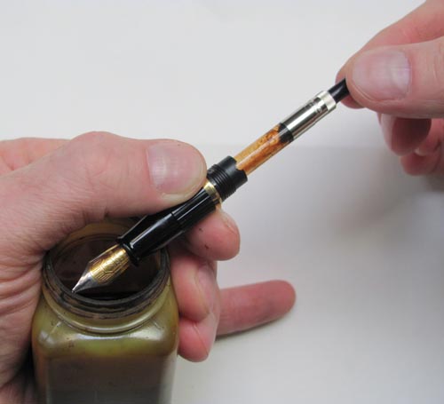
Greg Shea asks: "Do you have experience drawing/sketching with a refillable old style fountain pen? (The kind where you draw ink into the pen to refill it, not the kind that uses cartridges). I'd like to fill a pen with walnut ink, so I can use it to to do drawings with addad watercolor. I usually use dip pens with crow quill nibs, but they can be a pain to use and to carry around."

I've tried a bunch of different systems for through-the-nib refills, including a twist-knob-piston type, the squeeze-bulb, and the lever-action on the outside of the handle. I remember using one called a Pelikan 120 that was popular as a drawing pen about 30 years ago, but I haven't seen them around recently. Many of the Chinese brands, such as Jinhao and Baoer are both inexpensive and refillable.

My favorite is the piston cartridge that comes as an accessory with Waterman pens, such as the low-end Phileas brand. You can get the converter as a separate item if you already have a Waterman pen. You can also refill the cartridges with a hypodermic syringe, which is cleaner than through the nib refills.

Previously: How to Refill a Fountain Pen

Philadelphia Visit

Thanks to everyone who came to my presentation yesterday in Philadelphia, including the students from the University of the Arts and the Pennsylvania Academy of Fine Arts. 

Sorry we ran out of Dinotopia books, but you can get them signed at our web store if you live in the USA.

Gallery director and illustration professor Ralph Giguere hosted us, and Senior Lecturer Dominick Saponaro joined us for supper.


The exhibition of original art from Dinotopia will be up at the UARTS gallery at Anderson Hall, 333 South Broad Street, 7th Floor in Philadelphia, Pennsylvania until November 16.

Meanwhile on YouTube

Street Painting in Indiana is my first YouTube video to pass 100K views. If you missed it, it's embedded and linked below.


(YouTube link) Thanks everyone for checking out my videos. 

Tools: