Tuesday, April 5, 2011

See-Through Square


Here’s a fun experiment. Cut out a square of bright colored paper about two or three inches across.

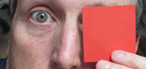
Hold the square about four inches from your eyes. Let some light shine on the side of the square you’re looking at, so that the color appears vibrant. Now, keeping both eyes open, look off to a scene in the distance.


You may notice that the square appears transparent in the middle but opaque at the edges. Here’s the effect simulated in Photoshop.

The reason, according to vision scientist Dr. Margaret Livingstone of Harvard, is that our color receptors respond to color borders, but they tend to disregard flat, homogenous areas of color.

Our color system codes a color area by establishing its color contrast at the edges of the area, and then fills in perceptually. Even though a tomato is colored red equally at its edges and at its center, we only get information about its color from the edges. We don’t  get any direct information from the red in the center at all.

The color spills into the center of a form from the edges, an effect called "color assimilation."


The phenomenon is also illustrated by the “watercolor illusion” by Lothar Spillmann, where colors along the border of a shape seem to leak into the shape, and we perceive a tint of color throughout the shape, even if it’s not really there.

In our experiment with the colored squares, the information from the far-seeing eye takes over where the near-seeing eye is getting no data, giving preference to the scene. At the edges of the square, the color border information from the near-seeing eye takes precedence, making the square seem opaque.
-----------
“Watercolor illusion” Lothar Spillman on Journal of Vision
Vision and Art: The Biology of Seeing by Margaret Livingstone

Monday, April 4, 2011

Robotic Flying Machines

Autonomous flying machines are getting more and more ingenious.


Here’s a very birdlike ornithopter.

According to Alex Knapp of the Forbes Blog:
This bionic technology-bearer, which is inspired by the herring gull, can start, fly and land autonomously – with no additional drive mechanism. Its wings not only beat up and down, but also twist at specific angles. This is made possible by an active articulated torsional drive unit, which in combination with a complex control system attains an unprecedented level of efficiency in flight operation. Festo has thus succeeded for the first time in creating an energy-efficient technical adaptation of this model from nature.


These hovering platforms act as ping-pong paddles to juggle balls in mid-air.

----------
Previously on GJ:
Human powered ornithopter
Insect Vehicles
Utopiales Poster, Part 1

Character Design Interview

I'm really excited to have been interviewed by the Character Design blog. If you scroll down to end of the chat, there is a portfolio of 35 drawings that I did of people, animals, and cars, mostly from observation.


The blog has a very deep archive of interviews with artists who work for the most part in the field of concept art, character design and animation, such as Nate Wragg, Jason Deamer, and Kei Acedera

Character Design interview with James G.
List of all interviews on Character Design

Sunday, April 3, 2011

Van Dyck’s Little Masterpiece

Anthony Van Dyck (1599-1641) was so proud of his portrait of Cornelius Van der Geest that he carried it around with him throughout his career as an example of his abilities. He did the painting before he was 20 years old.


The tonal organization is very simple, aided by the soft frontal lighting. The plane of the forehead and the front plane of the nose have the highest tonal value. The cheeks and the rest of the face are slightly darker.

Allowing the forehead to shine as the highest value in a portrait suggests a person with spirituality or intellect. It gives the face a generous, luminous quality.

According to Royal Academy instructor Solomon J. Solomon (writing about a century ago), the painting was made with the following steps*:
1. A brown grisaille, keeping the shadows warm.
2. Loading of stiff white impasto in the forehead and the ruff.
3. When the impasto was completely dry, glazing the skin tones and lips. The glaze sank into the pits around the impastos, making them come forward even more. Translucency like this is almost impossible to achieve with an opaque alla prima handling. 


Note the softness in the eyes:
1. The edges of both the iris and the pupil are soft.
2. The eyelashes and eyebrows are understated. You don’t see individual hairs.
3. The highlights are very carefully placed. On the bottom eyelid, there’s a highlight on the edge of the lid and the moist area where the lid meets the eye.
4. Finish is not a matter of greater detail, but rather of more complete consideration.

Softness takes conscious, deliberate effort, and it’s often the mark of greatness. 

According to British academic master Solomon J. Solomon, “there is more to be learnt in the painting of flesh from this picture than from almost any other I know, so luminous is this masterpiece.”

The painting is 14.75 x 12.75 inches. It is at the National Gallery, London. Their website lets you zoom into it.
---------
* ADDENDUM. Note: a friend of the blog, who knows a lot more than I do about historical painting methods, sent me the following clarification, based on his research:

"I've one disagreement though. Your step by step list says that he did a brown grisaille, upon which he impastoed with plain white. Then, on top of the dry impasto he glazed down.

Generally, the evidence does not seem to support that as his usual procedure. Both the NG (London) Technical Bulletin #20 and the catalog from the 1990 exhibition in Washington (NG) show flesh cross sections which contain other pigments in addition to lead white, within the lead white layer.

Contemporary writings, written by those who purport to have known van Dyck also do not mention a brown grisaille followed by a white system as you have described. All list a dead color layer followed by a carnation color layer."  
Thanks for the insight!
Previously on GJ: Eye Highlights
Wikipedia on Anthony Van Dyck
National Gallery website
“Muddy Colors” blog post on eyes.

Saturday, April 2, 2011

Baby Tattooville 2011

If you’re interested in pop surrealism, you won’t want to miss Baby Tattooville this year. It’s the five year anniversary of the event. Impresario Bob Self is inviting back some of the artists who have participated over the years, plus some exciting surprises.

The event, which occurs from October 7-9, will happen at the unique Mission Inn in Riverside California, where the Riverside Art Museum will be doing an exhibition of lowbrow artwork.

I attended Baby Tattooville a couple of years ago, and I had fun meeting some GJ blogreaders—I ended up doing sketches of everyone. If you’re interested, you’d better hurry; there are only 14 spaces left!  I’ll be returning to Baby Tattooville as part of my Fall 2011 southern California tour.

Here’s how Bob Self puts the pitch:

“Baby Tattooville provides a unique opportunity for a few enthusiastic collectors (like yourself) to spend a weekend with an all-star lineup of celebrated artists. Without the time constraints of a typical personal appearance, or the crowd control issues of a standing-room-only event, artists and collectors will have a weekend-long opportunity to discuss and explore their mutual interests. Original work will be created and celebrated around-the-clock; no one will leave empty handed. If you would like to receive information and updates about Baby Tattooville 2011, please join our mailing list below.”
----
Previously on GJ:
Official Baby Tattooville website
Leading up to the Last Baby Tattooville 
Seeing What's Not There
Baby Tattooville Wrapup

Friday, April 1, 2011

Bold New Art in the White House

The New York Times and the Huffington Post reported recently that the Obamas have redecorated sections of the White House with prime examples of animation art from the Walt  Disney Company, based on a comprehensive licensing agreement that will also bring Disney art to Capitol Hill and the Pentagon.

Reporter Carl Vogel reports:
 The Obamas’ taste in art includes works from "Snow White," "Pinocchio," "Lady and the Tramp," and four other Disney classics. Works from those films were among some 45 pieces that the first couple borrowed from the Disney archives to decorate their private White House residence and the West and East Wings, the White House press office announced on Tuesday.
It is a big, wide selection of mostly background painting with custom animation cels created to fit within the historic frames that are part of the White House's decor.
In the weeks before the inauguration Michael Smith, the Obamas’ decorator, paid a visit to Disney headquarters to talk about what art he could borrow.
“We have one rule: We want to lighten the nation's mood right now. We think animation art is a good way to do it, and it's a vital American art form."
Mr. Smith, working with Michelle Obama and the White House curator, William Allman, made choices for the first family’s living quarters and office areas after perusing the Web sites of several motion picture studios.

“Michael Smith came to us with a long list of artists and asked me what was available,” Kerry Borvin, chief curator at the Disney archives, said in a telephone interview. “There are some very interesting figures. It’s more interesting and shows a greater diversity of art than I’ve seen.”
-------
New York Times article: "A Bold and Modern White House" 
Huffington Post article: "Obama's Modern Art"
Related Post from GurneyJourney (April 1, 2010) "Dinotopia Themed Caskets"

Thursday, March 31, 2011

Saint Louis Courthouse

Here’s a pencil drawing I did of the old courthouse in Saint Louis, from my hotel window.  It was a cold day, and across the street there were billows of steam pumping out of some ducts.


I was excited by the atmospherics, because the steam added life and mystery to what otherwise would have been a fairly ordinary architectural study. But I had to make sure to draw the whole structure and measure everything out before I covered it up. Some parts of the drawing are erased with a kneaded eraser.

Wednesday, March 30, 2011

Salt Art

Spill some salt, paint a portrait.
----
Via Best of YouTube

Who U Gonna Call?


Ghostbusters meets evangelism in this van parked along a road in Milford, Pennsylvania. I wonder what he keeps in there.

Tuesday, March 29, 2011

Value Planning

An art student recently asked me the following question:
 Dear James,
Some discussions I've been involved with lately have got me thinking about the relationship between color and value. Do you approach them as two different steps of a painting? For example some people see a well worked out monochromatic grisaille painting as perhaps the most important step in a painting, with the scumbled on color as an accentuating element. On the other hand some people have a more Alla Prima approach where they jump right into color, and create the illusion of "turning" surfaces and value directly through color mixing. How long do you spend on the monochromatic stage of a painting?
                    ---Pro Cedure.
   
Dear Pro Cedure,

You ask a very great question color and value. Yes, I do think about the value structure as a separate step in developing a studio composition. I tend to do that thinking as a preliminary step in the charcoal or pencil stage. As I'm sure you know, Norman Rockwell was the king of planning the value design first in charcoal before jumping into oil (above: "The Ferry Story" courtesy of Heritage auctions).

Whether you plan the tonal structure as a separate study (as Rockwell, Cornwell, Lovell and many academics did) or whether you establish it on the final canvas as a preliminary stage of painting, either way it really is the foundation of a good picture. Color adds a lot, but it can’t save a bad value design.

And even with a thorough planning, you can still turn forms with color temperature as you suggested in your question. Rockwell is a good artist to study for that, and I believe many of his instincts for impressionistic color effects came from his study with Charles Hawthorne.

In my case with a fantasy or historical painting, once I have figured out the tonal design in two or three values as a separate step, I begin the layin or block-in. I don’t use a monochromatic grisaille but rather a limited palette of color, such as yellow ochre, burnt sienna, and ultramarine blue. The whole step should only take an hour or two.

My goal in the preliminary block-in is to establish not only the tonal statement, but also the big warm and cool relationships and the overall color mood at the very outset of the painting process. I stay well short of darkest darks, saving those for the finishing steps of the painting.

When working on location, or when painting the figure in under two hours, I am under shorter time requirements. So I often dive right in with color, but sometimes I do a quick pencil thumbnail sketch to plan the value design.

All the best, JG
----------
Related post on GJ: The "two-streams" hypothesis of visual perception
Recommended books: "Hawthorne on Painting"
"Rockwell on Rockwell"
I also cover this material in "Imaginative Realism"