Showing posts sorted by relevance for query eye highlights. Sort by date Show all posts

Friday, March 4, 2011

Eye Highlights

Here’s a fun experiment you can try with a friend. In a dark room, hold a candle about a foot away from your friend’s eye. Position the candle a few inches off to the side of the direction of the gaze, and have your friend look a little to one side, too.


Look at the variety of highlights. And remember: a highlight is a reflection of the light source on a wet or shiny surface.

Several highlights are visible. The brightest one (2) is a reflection of the candle on the outer surface of the cornea. The image is oriented right side up, a miniature image of the candle itself. Just under the main highlight at (2), you can see a little red area. That’s a reflection of the glowing red wax just below the candle flame.

The next brightest highlights, (1) and (4), are reflections off the eye fluid that pools up along the edges of the eyelid. Those highlights are directly across the pupil from each other.

Another faint highlight, (3), is visible to the right of (2). This highlight is a reflection off the back surface of the eye’s lens. If your subject changes the focus from near to far, that highlight will shift very slightly to the left and right as the shape of the lens changes. When the lens accommodates to different focal lengths, it’s mainly the back surface of the lens that changes shape.

There are two very faint intermediate highlights between (2) and (3), but they’re too dim to show up in this photo. One is a highlight off the back of the cornea, and the next would be off the front of the lens. You might see them if you try this yourself.
-------
Photo by Jeanette (in candlelight @ 800 ASA)
More at Seeing the Light: Optics in Nature, Photography, Color Vision, and Holography, by David S. Falk, p. 149. (Thanks, Roberto)

Wednesday, December 28, 2011

Softness in Eyes

I want to make a very simple point with this post: Keep the eyes simple. Downplay detail in them. Soften edges if you can.


I'll start with one of the greatest portrait painters of all time: Anthony Van Dyck. The eye of this old man looks complete, but note that the pupil doesn't have a hard edge, there are no individual eyelashes. The eyebrows aren't drawn as a bunch of separate hairs either.

The only part that's really crisp are the highlights, and they're more prominent in the lower lid and the lacrimal caruncula (the little watery pit on the inside corner of the eye).


In this woman's eye by Andrew Loomis, the pupil is sharper, but the iris is softened on the left side, and the eyelashes and eyebrows are softened and unified. He chooses to downplay the caruncula and the fold over the eye.


In this detail of a portrait by John Singer Sargent (click to enlarge) both eyes are greatly softened. There are some crisp edges, but look where he places them. They mainly occur in the structural forms surrounding the eye, not details within the eye itself, such as the iris, pupil or little hairs. 


Sargent spent as much time preparing the structure around the eye as he did painting the eye itself. He compared the process of painting an eye in its socket to dropping a poached egg on a plate. The subtle movement of muscles around the eye is what conveys the character of expression, perhaps even more the particular details within the eye.

Caruncula on Wikipedia

Friday, February 12, 2016

Harold Speed, "On Painting a Head"

Today we'll continue Chapter 9: "Painting from the Life" from Harold Speed's 1924 art instruction book Oil Painting Techniques and Materials.
I'll present Speed's main points in boldface type either verbatim or paraphrased, followed by comments of my own. If you want to add a comment, please use the numbered points to refer to the relevant section of the chapter.

Today we'll cover pages 144-157, "On Painting a Head."

Harold Speed, Old Tom, courtesy BBC

1. "Before commencing, select the colors you will need and choose the fewest that will serve your purpose."
This is good advice that will reduce confusion, eliminate habits of color mixing, and yield harmony in the final result.

2. Don't take the colors as they come from the tube; Mix your own colors.
Also a good idea. You can create your gamut primaries, instead of using the colors as they happen to come from the tube. So here you're not mixing the particular notes of your scene, but rather you're mixing the ingredients of your color scheme. Instead of using yellow ochre and cad yellow as separate palette colors you can mix the two, and then use that mixture as your gamut anchor. For example he recommends mixing Indian red and burnt sienna. This is what the manufacturers do, mixing pigments to get convenience colors.

3. "The paint as supplied in tubes is a little stiffer than is always comfortable to paint with, and it is as well to thin the white by mixing up some of your medium with it."
I find the opposite is often a problem with modern paint. Paint often comes out of the tube too runny. In that case you can stiffen tube colors by first placing them on blotter paper (or other absorbent paper or cardboard) a few hours before you need to use them. As Speed suggests, it's good to have some "stiff white" about the consistency of butter always available on your palette for impasto-rich highlights.

4. Sequence: background, hair, forehead (middle tone), planes of lower face, eye socket, nose, highest light in forehead, etc.
It might seem difficult to follow this procedure in the form of text, given that we're used to seeing videos that show the process much more clearly. But try to visualize it. This is close as we're going to get to a time machine back to the Royal Academy.

5. "In the case of a short portrait sitting...do not attempt any more complications in your tones. Keep them flat and simple at first."
Put your work into refining the edges instead of refining the tones. I would say to think of the head as a roughly carved block at this stage, and rejoice that there aren't too many details to worry about.

6. "Always paint with the least amount of paint that will get the effect you want. Reserve thick paint for those occasions when you want to make a crisp touch quite separate from what it is painted into."
For beginning painters there's a lot to think about when you mix a color: value, color temperature, hue, chroma, and now you've got to think about paint thickness, not to mention what brush to use, etc. As you read Speed talking about his thought process, note what considerations are foremost at each stage. Value judgments are most important at first, then edges become vitally important, then he's thinking about warm versus cool differences. 

7. Carefully define the eye sockets before detailing the eye.
Speed probably learned this method from watching Sargent, who was said to paint an eye in this way, like making a frying pan (eye socket) and dropping an eye into it (the egg). Later Speed says: "Remember the eye is a cavity, through which is pushed the globe of the eye, on which the eyelids are placed. The eyelids therefore partake of the spherical form, as do also the 'whites' of the eye."

8. "You should always talk to your sitters if you want to keep them alive."
Many first hand sources attest to the fact that portrait painters of the past talked to their models while they painted them. This is one of the most important points that is generally missed by modern practitioners. It makes all the difference in the disposition of the face and the expression of the model.  Sleepy, dull models yield sleepy, dull portraits. Talking models yield portraits that are alive. There's no getting around it. Here's a previous blog post "Talking Models" on the topic and another post "Speaking Likeness" on the same subject.

Detail of a portrait by Velazquez
9. The under eyelid: "I know of no part of a head that so easily shows the hand of a master as the painting of the under eyelid."
To find some examples of plane breakdowns as suggested in the detailed discussion on pages 153-155, such as the "three cherries" of the lips, etc. I recommend the anatomy books by Vanderpoel, Loomis, Peck, and others.

10. "Having laid in your work with the muted middle tones, you will be able to use much purer colour in the later stages, as they will be quieted by mixing with the middle tones already there."

Portrait by Harold Speed
11. "Finish is not necessarily the addition of details, but of refinements."
Try to accomplish what Speed calls oneness of impression, and look for that quality in the great portraits of Sargent, Velazquez, and Rembrandt. Accents are last, and you can think of the whole head painting as a setup for those last highlights and accents.


Next week—we'll continue with the chapter with the section beginning on 157.
-----
In its original edition, the book is called "The Science and Practice of Oil Painting." Unfortunately it's not available in a free edition, but there's an inexpensive print edition that Dover publishes under a different title "Oil Painting Techniques and Materials (with a Sargent cover)," and there's also a Kindle edition.
----
GurneyJourney YouTube channel
My Public Facebook page
GurneyJourney on Pinterest
JamesGurney Art on Instagram
@GurneyJourney on Twitter

Thursday, April 19, 2012

Seybold's Old Woman


Super-detailed realism is not just a recent idea--it has been around for a while. This oil painting of an old woman is by Christian Seybold (1695-1768). He was a German artist active in Vienna in the Baroque period.


Even when you zoom way into the eye, the detail keeps on going. He has carefully rendered the delicate  overlapping wrinkles around the eye, and he has captured the redness inside the folds.


Compare to this detail of an eye from a Sargent self portrait.
------
High-rez file of this image on Wikipedia Commons
The painting is in Dresden at the Gemäldegalerie Alte Meister 
Thanks, Keita
Previously on GurneyJourney:


Sunday, April 3, 2011

Van Dyck’s Little Masterpiece

Anthony Van Dyck (1599-1641) was so proud of his portrait of Cornelius Van der Geest that he carried it around with him throughout his career as an example of his abilities. He did the painting before he was 20 years old.


The tonal organization is very simple, aided by the soft frontal lighting. The plane of the forehead and the front plane of the nose have the highest tonal value. The cheeks and the rest of the face are slightly darker.

Allowing the forehead to shine as the highest value in a portrait suggests a person with spirituality or intellect. It gives the face a generous, luminous quality.

According to Royal Academy instructor Solomon J. Solomon (writing about a century ago), the painting was made with the following steps*:
1. A brown grisaille, keeping the shadows warm.
2. Loading of stiff white impasto in the forehead and the ruff.
3. When the impasto was completely dry, glazing the skin tones and lips. The glaze sank into the pits around the impastos, making them come forward even more. Translucency like this is almost impossible to achieve with an opaque alla prima handling. 


Note the softness in the eyes:
1. The edges of both the iris and the pupil are soft.
2. The eyelashes and eyebrows are understated. You don’t see individual hairs.
3. The highlights are very carefully placed. On the bottom eyelid, there’s a highlight on the edge of the lid and the moist area where the lid meets the eye.
4. Finish is not a matter of greater detail, but rather of more complete consideration.

Softness takes conscious, deliberate effort, and it’s often the mark of greatness. 

According to British academic master Solomon J. Solomon, “there is more to be learnt in the painting of flesh from this picture than from almost any other I know, so luminous is this masterpiece.”

The painting is 14.75 x 12.75 inches. It is at the National Gallery, London. Their website lets you zoom into it.
---------
* ADDENDUM. Note: a friend of the blog, who knows a lot more than I do about historical painting methods, sent me the following clarification, based on his research:

"I've one disagreement though. Your step by step list says that he did a brown grisaille, upon which he impastoed with plain white. Then, on top of the dry impasto he glazed down.

Generally, the evidence does not seem to support that as his usual procedure. Both the NG (London) Technical Bulletin #20 and the catalog from the 1990 exhibition in Washington (NG) show flesh cross sections which contain other pigments in addition to lead white, within the lead white layer.

Contemporary writings, written by those who purport to have known van Dyck also do not mention a brown grisaille followed by a white system as you have described. All list a dead color layer followed by a carnation color layer."  
Thanks for the insight!
Previously on GJ: Eye Highlights
Wikipedia on Anthony Van Dyck
National Gallery website
Muddy Colors” blog post on eyes.

Saturday, March 16, 2013

Highlights and Specularity, Part 1

This photograph shows three spheres with varying surfaces. The one on the left is matte, the one in the middle is glossy, and the one on the right is highly reflective. 


On the matte sphere there is no highlight. On the glossy sphere in the middle, the highlight is clearly apparent. The mirror-like sphere on the right also has a highlight, which is really a reflection of the light source. The light source is the sun shining through a window.

The right sphere also reflects the scene around the ball, including the white paper background and the dark room behind the camera. In the right ball, you can even see a reflection of the middle ball, with a highlight in the middle of that reflection.

That same pattern of reflections of the paper, room, and neighboring ball is subtly visible in the middle ball as well.

In the middle ball, there is a second, smaller highlight just to the right of the primary highlight. This secondary highlight is the sunlight is reflected three times. The light bounces off the middle ball, bounces back off the right ball, and bounces again off that little highlight on middle ball back to your eye.

So we've arrived at a definition: A highlight is a specular reflection (Latin "speculum"=mirror) of the light source on a shiny surface. The shinier and smoother the surface, the brighter and clearer the highlight.

These three diagrams show what's happening at the surface level. On the matte surface, light arrives from the top left and hits the rough surface. Some light gets absorbed and the rest scatters away in all directions. This is what happens when light hits a matte surface like a sand dune or a sweater.

The glossy surface of the middle ball bounces a a portion of the light at the same relative angle as the incoming light, but some of the light rays hit uneven spots and bounce in random directions. This is like bouncing a golf ball on a country road. It will probably bounce the way you want it to unless the golf ball hits a crack or a pebble.

The mirror-like surface is so smooth that all the light bounces off the surface predictably at the same relative angle, like bouncing a ball off a basketball court. (Edit: a true mirror-like reflection requires a metallic surface, and cannot be achieved by smoothness alone. Thanks, David!)


Since highlights belong to the world of specular reflection, they should be thought of as somewhat separate and distinct from the normal modeling factors (light, halftone, and shadow) of diffuse reflection. Artists in the world of 3D computer graphics can control the form-modeling and the specularity as separate components.

I wrote an article on this subject of "highlights and specularity" for the current issue of International Artist magazine, which should be on the newsstands now. This blog post is just a little piece of it.


The six-page article contains a lot more examples and explanation, and it includes artwork that has never been reproduced in print before. I'll talk more on the blog about highlights in real-world examples tomorrow.
----
International Artist magazine, Issue 90
This subject is also covered in my book Color and Light: A Guide for the Realist Painter (Amazon), also available signed from my website store.

Friday, May 22, 2015

GJ Book Club, Chapter 8—Line Drawing: Practical


On the GJ Book Club, we're studying Chapter 8, "Line Drawing: Practical," from Harold Speed's 1917 classic The Practice and Science of Drawing.

The following numbered paragraphs cite key points in italics, followed by a brief remark of my own. If you would like to respond to a specific point, please precede your comment by the corresponding number.

This is one of the core chapters of the book, with many good illustrations. Rather than try to comprehensively summarize the content, I'll just call out a few key points to provide a memory jogger and a discussion starter.

1. Appearances must be reduced to terms of a flat surface.
In many modern academic ateliers, one proceeds from a 2D shape analysis in an early stage, to a 3D construction stage later. Seeing the forms in front of you as flat shapes can be a challenge, and Speed offers various methods for doing so, including......


2. Method for creating a drawing grid: cardboard with cutout hole, and black thread held in with sealing wax.
Over the years I have experimented with various forms of this grid, including one with black threads woven across. By the way, sealing wax is a sticky wax people would melt and then stamp with a tool for sealing letters. You could use hot glue for the same purpose. 

I've found a more useful grid is a set of lines drawn with an indelible marker on a piece of acrylic or plexiglass sheet. In order to get accurate measurements, the observer must maintain a constant distance and position relative to the grid. Holding it at arm's length is one way, but there are others. Maybe in a future post or video I'll show some other methods.

3. The drawing grid or frame should be held between the eye and the object to be drawn in a perfectly vertical position.
This needs a bit of clarification. Rather than being held in a "perfectly vertical position," the grid or viewfinder should be held perpendicular to the line of sight, which is a different thing in the case of an upshot or downshot. Holding the grid vertically in such an up or down angled view would negate the normal convergent effect of vertical lines. In fact, in photography, "tilt-shift" lenses are sometimes used to artificially hold the lens vertically to negate the normal perspective of verticals.

4. It is never advisable to compare other than vertical and horizontal measurements.
A corollary to this is the importance of being able to judge a true vertical, often aided by a plumb line.


5. Three principles of construction.
A. Block out shape by analyzing into straight lines (Figure X, above)
B. Breaking down the shapes of curves.  (Figure Y).
C. Vertical and side measurements. (Figure Z).
These three basic geometric methods, used in conjunction with each other, are used in the demo of the figure block-in below.


6. Method for blocking in a figure, with the prime vertical drawn through the armpit.
He also says, "Train yourself to draw between limits decided upon at the start." This is so important for placing figures accurately in multi-figure work. Some other methods, such as building outward from the center, will not serve as well for producing figures that must fit within strict limits.

7. In the case of foreshortenings, the eye, unaided by this blocking out, is always apt to be led astray.
This is so true, and in the case of foreshortenened lengths that I try to always remember to make measurements.

8. In blocking-in, observe the shape of the background as much as the object.
In many modern books, this advice is put in terms of judging "negative shapes."

9. Lines bounding one side of a form must be observed in relation to the lines bounding the other.
He continues, "The drawing of the two sides should be carried on simultaneously so that one may constantly compare them." 

10. In line drawing, shading should only be used to aid the expression of form.
Even though this drawing has some tone, Speed uses it to show the way parallel lines can express form and textures like hair.
11. Diagram of a cone (seen from above) next to a window at left.
Speed proceeds to go into some detail about the theory of what we would regard highlights, terminators, core shadows, and cast shadows. But he's not primarily concerned with accurately producing a tonal analysis of form. That will come later in "mass drawing." He is still thinking in terms of a drawing conceived primarily in linear terms. That's why he suggests using the soft frontal lighting of an open window at the observer's back.


12. You seldom see any shadows in Holbein's drawings; he seems to have put his sitters near a wide window, close against which he worked.


13. Lines of shading drawn across the forms suggest softness, lines drawn in curves fullness of form, lines drawn down the forms hardness, and lines crossing in all directions so that only a mystery of tone results, atmosphere. 
In his book Creative Illustration, Andrew Loomis recapitulates these same points, not only for drawing, but also painting techniques.


14. In the method of line drawing we are trying to explain (the method employed for most of the drawings by the author in this book) the lines of shading are made parallel in a direction that comes easy to the hand, unless some quality in the form suggests their following other directions. 

15. Don't burden a line drawing with heavy half tones and shadows; keep them light. 
He says, "The beauty that is the particular province of line drawing is the beauty of contours, and this is marred by heavy light and shade." 


16. Analysis of forms of the eye, the eyebrow, and the eyelashes.
There are many good pieces of advice in the text.
---
The Practice and Science of Drawing is available in various formats:
1. Inexpensive softcover edition from Dover, (by far the majority of you are reading it in this format)
3. Free online Archive.org edition.
and The Windsor Magazine, Volume 25, "The Art of Mr. Harold Speed" by Austin Chester, page 335. (thanks, अर्जुन)
------
GJ Book Club Facebook page  (Thanks, Keita Hopkinson)
Pinterest (Thanks, Carolyn Kasper)

Friday, July 10, 2015

GJ Book Club, Speed, Chapter 14: Unity of Mass

On the GJ Book Club, we're looking at Chapter 14: "Unity of Mass" in Harold Speed's 1917 classic The Practice and Science of Drawing. The following numbered paragraphs cite key points in boldface. If you would like to respond to a specific image or point, please precede your comment by the corresponding number.

This is another core chapter of Speed's book, with invaluable advice on tonal organization.

1. The modifications in the relative tone values of objects seen under different aspects of light and atmosphere are infinite and ever varying.
In other words, the color you mix on your palette for a given object can be greatly altered by the light and atmosphere of a given situation. 


2. The painting of flesh higher in tone than the sky was201 almost universal at many periods of art, and in portraits is still often seen.
This is an artistic convention, which makes some sense compositionally, but it doesn't look naturalistic. That's a Tiepolo.

3. A black glass, by reducing the light, enables you to observe these relationships more accurately.
He's referring to a Lorrain mirror.

4. There should never be pure white or pure black masses in a 
203picture.
This is one of the best reasons to mix your "blacks": you get color character in the darks that way. You can't go as low in value, but you don't want to. How often do pianists hit the lowest note on their keyboard? This power in reserve is also true of chroma. "Keep a shot in your locker," as Pyle and Dunn used to say. 

5. Speed continues: "Also, the highest lights in nature are never without colour, and this will lower the tone; neither are the deepest darks colourless, and this will raise their tone."
Keep in mind that highlights partake of both the color of the light source and the local color of the object. Solar highlights with a little cadmium yellow look brighter than pure white.

6. Painting light to dark vs. dark to light
Interesting discussion here about painting sequence and value keying. What do you all think of his view of this?

7. These tone values are only to be perceived in their true relationship by the eye contemplating a wide field of vision. 
When he says "wide field of vision," I believe he doesn't mean viewing angle, but rather scope or range of awareness.

8. Light and shade and half tone are the great enemies of colour, sullying, as they do, its purity; and to some extent to design also, destroying, as they do, the flatness of the picture.
Sometimes the strongest color effects can happen when the chiaroscuro of form lighting are minimized, and the objects are shown more or less as flat shapes. He says, "Large flat tones give a power and simplicity to a design, and a largeness and breadth of expression that are very valuable, besides showing up every little variety in the values used for your modelling; and thus enabling you to model with the least expenditure of tones."

9. The nearer these tones are in the scale of values, the more reserved and quiet the impression created, and the further apart or greater the contrast, the more dramatic and intense the effect

Strong light and shade divides forms into light and shadow shapes, as he points out, but it also introduces cast shadows. All these things can complicate a picture unless you go out of your way to group values by shape welding.

10 Straight lines = flat tones. Curved lines = gradated tones.
I love the equivalency he draws here, which makes perfect sense, especially if you paint a still life of a polygonal vs. a rounded form. The lines and the tones are related.


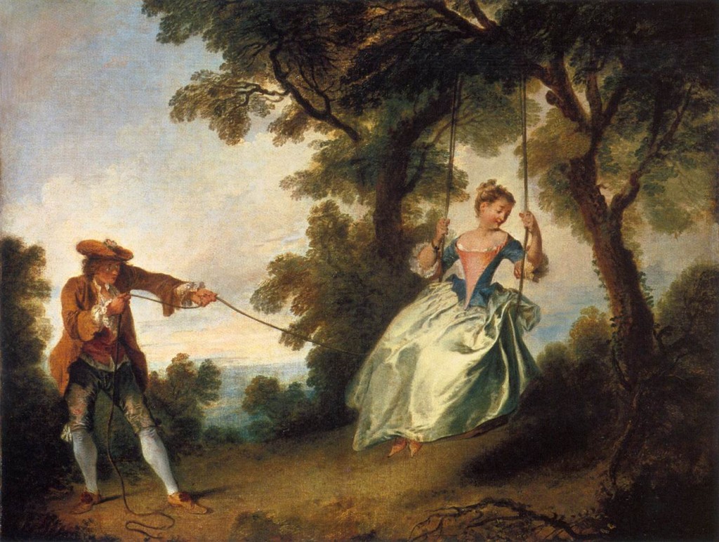
11. Watteau created a dream country of his own.
Example above. So did Maxfield Parrish and Dulac and Moebius and Syd Mead.


12. Gradation
Pencil diagrams like the ones Speed demonstrates are a valuable way to study old masters. He mentions the magic of Turner and Watteau for their use of large gradations, and I would add the Hudson River School painters, especially Church and Bierstadt.

He also echoes Ruskin when he points out that these gradations should be looked for not only in large areas, but also in the rocks and leaves.

13. The desire of so many artists in these days to cut loose from tradition and start all over again puts a very severe strain upon their intuitive faculties
An interesting point. He also says that the lack of a traditional system "keeps them occupied correcting things that more knowledge of some of the fundamental principles that don't really alter and that are the same in all schools would have saved them. Knowledge in art is like a railway built behind the pioneers who have gone before; it offers a point of departure for those who come after, further on into the unknown country of nature's secrets—a help not lightly to be discarded."

14. But all artifice in art must be concealed, a picture obviously composed is badly composed. 
This is traditionally know by the Latin line: Ars est celare artem: True art is the concealment of artifice.
-----
Harold Speed (Dover ed.)
The Practice and Science of Drawing is available in various formats:
1. Inexpensive softcover edition from Dover, (by far the majority of you are reading it in this format)
2. Fully illustrated and formatted for Kindle.
3. Free online Archive.org edition.
4. Project Gutenberg version
Articles on Harold Speed in the Studio Magazine The Studio, Volume 15, "The Work of Harold Speed" by A. L. Baldry. (XV. No. 69. — December, 1898.) page 151.
and The Windsor Magazine, Volume 25, "The Art of Mr. Harold Speed" by Austin Chester, page 335. (thanks, अर्जुन)
GJ Book Club on Pinterest (Thanks, Carolyn Kasper)
GJ Facebook page

Overview of the blog series

Announcing the GJ Book Club
Chapter 1: Preface and Introduction
Chapter 2: Drawing
Chapter 3: Vision
Chapter 4: Line Drawing
Chapter 5: Mass Drawing
Chapter 6: Academic and Conventional
Chapter 7: The Study of Drawing
Chapter 8: Line Drawing, Practical
Chapter 9: Mass Drawing
Chapter 10: Rhythm
Chapter 11: Variety of Lines
Chapter 12: Curved Lines
Chapter 13: Variety of Mass
Chapter 14: Unity of Mass
Chapter 15: Balance
Chapter 16: Proportion
Chapter 17: Portrait Drawing
Chapter 18: Visual Memory
Chapter 19: Procedure
Chapter 20: Materials

Sunday, April 13, 2008

Colored Light and Form

When two lights of different colors illuminate a form, the lit areas interact with each other in unexpected ways.


In this oil sketch of a white head maquette, an amber-tinted light shines from below left, while a blue-tinted light comes from almost the opposite angle.

There’s almost no overlap between the regions lit by each of the lights. One light or the other covers almost every surface of the head. There are just a couple of small places untouched by either light: the dark area where the nose meets the eye socket, and the hollows above and below the ear.


This maquette is lit by two colored lights. One is yellow-green, and one magenta. The lights are placed closer together, so the illuminated areas overlap on the top of the head, the brow, and the cheekbone plane. In these shared areas, the colors mix to a pale yellowish white, brighter in tone than the lightest tones in each of two regions lit by one light only.

Here's another casting of the plaster head covered with silver aluminum powder. The surface now has a high level of “specularity” or reflectivity.


What happens with colored light on a reflective surface? Even with three different light sources (green, red-violet, and blue), the lights don’t really mix very much on the planes of the head. Instead, each light source accounts for a separate array of specular highlights.

Remarkably, our brains are able to construct an understanding of form based on these fragmentary bits of information.

But if we remove the color clues (and flop the image for a fresh look), the form is much harder to visualize. The highlights seem like random light spots on a dark head. This illustrates a key recent finding of visual perception researchers, namely that color plays a central role in the brain's active construction of form and depth, and is not—as is often supposed—a kind of extra frosting on perception.
------
Related GJ posts on
Character Maquettes, link
Studio Lighting Equipment, link.

Friday, October 24, 2008

Tone Paper Studies

This scene shows captured prisoners from the Moche culture of ancient Peru, painted for National Geographic.

It was developed entirely from studies from the model, not from photography. (Photography is a useful tool, too, but I'll cover that in other posts.) If you’re doing a reference study of yourself or a model taking the pose, you can capture all the reference information you’ll need by working on tone paper.

In most art schools, the tradition of drawing posed figures on tone paper tends to be regarded as an end in itself, or else purely as a timed practice exercise for training the eye and hand for observational drawing.

But for most of the last five centuries, tone paper drawings were merely a means to an end, and the drawings themselves were not highly valued.

A light gray or tan paper works best for figure studies. The tone of the paper should be approximately equal to the darker halftone—the point where the form turns away from the light just before it enters the shadow.

You can begin either with vine charcoal or with a soft charcoal pencil and draw the pose lightly in line, noting the dividing line of the shadow and the boundary of the cast shadow. Once you’ve got the pose where you want it, reserve the charcoal for the shadows and accents.

The light side of the form can be defined with just a few careful touches of white chalk or white charcoal pencil. Where the form turns more to the light in the brightly illuminated halftones, you can scumble a light tone overall, saving your strongest touches of pure white for the highlights and accents.

As you work on your studies from life, don’t just draw what you see. As Howard Pyle said, “Don’t copy the model, but make a picture.” Accentuate the muscles and tendons that are important in telling the story. Describe to your your model the character you want them to act out. Better yet, act out the part yourself, and ham it up a little. Your model will feel less inhibited if you make a fool of yourself.

Let your imagination guide your eye. This mindset leads to better drawings than ones where you are just copying what you see. The drawings you produce as preliminary studies for a finished work will have more urgency and confidence than the standard 20 minute studies that are done without feeling or imagination.

Thursday, June 29, 2017

'What Is The Blast Rule?'

Detail, Sargent watercolor
Jonathan asks, "What is the BLAST Rule?"

That's a shorthand I try to remember when I'm painting. Those letters stand for five principles of paint technique:

Big brushes.
Large to small.
Accents last.
Soften edges.
Take your time.

Big brushes
Regardless of the medium, I get out the biggest brushes first. As I proceed, I may choose smaller brushes later if I need to, but I always try to use a brush that's a little bigger than I need for a given passage. Flat brushes are especially good for giving you a variety of strokes, from large areas to sharp lines.

Large to small
Typically, some overall light and dark value statement should be made right away, even if it's in a lighter key. It helps to work out the big shapes first. Rough them in, get them right, then subdivide. In watercolor, I often like to put down a big ghost wash early on, covering 90% of the surface, leaving only the brightest highlights.

Accents last
Accents are the eye-catching darkest darks and highest highlights, or the brightest dashes of chroma. They should stand apart from the rest of the system of values. Usually with oil or gouache or casein, they should be added last, saving the final punch for the end. With transparent watercolor, the whites have to be considered from the start.

Soften edges
Edges shouldn't be all soft or all hard. They should have variety. But softness is often a measure of quality and professionalism, and soft edges are harder to achieve in water media. To avoid the “coloring book look” it takes a conscious effort to capture a feeling of melting, merging, blurring, and blending. Softness must be accomplished early in the process. Forms get sharper and more detailed in the later stages.

Take your time
Patience and concentration are a rare commodity in our attention economy. You can be be both a lumberjack and a watchmaker. Paint fast and furious, but allow yourself also to slow way down and really observe. The limits I run up against are my ability and willingness to focus deeply and for long periods. To do that I have to ignore distractions such as wind, changing light, intrusive passersby, and the computer.


The BLAST Rule is one of many painting tips in my book Imaginative Realism: How to Paint What Doesn't Exist, which you can get signed with free shipping at my website store.

Friday, December 14, 2007

Albino Frogs & Occlusion Shadows

Here’s a study from life of a giant albino bullfrog from an aquarium. The creature was the size of a plucked chicken, and about the same color. He held still for twenty minutes while I did this study.

I drew him in pencil on gray mat board, and then laid a milky wash of opaque watercolor over his whole body, saving the brightest whites for the accents and highlights. When the overall light wash was dry, I added the dark accents in pencil. These include the pupil of the eye and the places where forms push together in the folds and wrinkles.

Lighting specialists in the 3-D CG animation field call these dark places “occlusion shadows.”

Wherever two forms touch each other, or a form touches a floor, a dark line or accent results. You can see the effect by pressing your fingers together and looking at the little dark line where they touch. Not much light makes it to that point of contact. You’ll also notice it gets darker in the inside corner of a room where the walls meet.

Computer lighting programs don’t create this dark accent automatically. Until recently it had to be added by hand. But software pioneers have recently made lighting tools that can anticipate when the light will be occluded and such an accent will appear.

As a traditional oil painter, I'm fascinated by such new terminology and visual analysis developed my brother artists in the CG arena. I wonder if one of you who is familiar with 3-D CG lighting might be willing to comment on the challenges presented by occlusion shadows.