Showing posts sorted by relevance for query james perry wilson. Sort by date Show all posts

Wednesday, January 30, 2013

Wilson’s Natural History Dioramas


Michael Anderson has posted the eighth chapter of his online biography of James Perry Wilson, the master of diorama background painting.


Anderson's new chapter concentrates on JPW's work in the North American Mammal Hall of the American Museum of Natural History in New York, considered by connoisseurs of diorama painting as the finest ever accomplished.

Wilson traveled to specific locations, to gather stereo photographs, soil samples, and plein air studies.


Essentially self taught and science-minded, Wilson developed independent theories of color and light which allowed him to paint more naturalistically than most other artists. This 12 x 16 oil study of the Teton range was painted on location.

Anderson writes:
Of the twenty-nine dioramas in the North American Mammal Hall, Wilson would paint nineteen during the years spanning 1938 to 1954. His personal stamp is visible throughout the hall. These are levelheaded, realistic backgrounds, controlled by Wilson to have the greatest effect. There are no flights of fancy, there isn’t a thing painted that wasn’t in his references or empirically available to the eyes of someone at the site. While the realism Wilson brought to the dioramas is on another plane, his colors glow with such luminosity that many visitors have asked whether they are backlit. Wilson imparted a level of three-dimensionality to his backgrounds that had never before been as perfectly realized as this. The remarkable thing is that Wilson also grasped the spirit of a place that seemed to come naturally from the rightness of the finished work. 
James Perry Wilson, Chapter 8, the North American Mammal Hall
Book: Windows on Nature: The Great Habitat Dioramas of the American Museum of Natural History
Previously on GJ:
James Perry Wilson's Plein Air Oils
Wilson's Dioramas, Part 1
Wilson's Dioramas, Part 2
Wilson's Sky Blending Method

Wednesday, December 29, 2010

Stylelessness

One of the requirements of a backdrop for a museum diorama is that it creates an illusion of real space. If it makes you think of paint on a wall, it’s not working.


To really succeed, you have to paint a scene without any individual style. Some people call it “painting actuality.” It’s carefully composed, but composed to be artless, that is, it doesn’t make you conscious of the means it took to produce it. (Above, bighorn sheep diorama in New York, with background by James Perry Wilson correction: Belmore Brown.)

Carl Akeley, who helped develop the art of the diorama to its highest level at the American Museum of Natural History in New York, put it this way:

"The landscape painter who has cultivated a style or manner is not any good…the painted background must display a complete unity with the mounted animals.  The painter must make the beholder forget that he is looking at paint, and feel that he is looking at nature itself.  The artist must forget himself in his work.  We must set the standard to which others will have to rise."


William R. Leigh, one of the backdrop painters for the AMNH said painting backdrops "calls for the utmost measure of truth; there is in it no place for individuality."


Leigh did brilliant studies in Africa (above) as preparation for his diorama paintings. But great as he was as a painter, some of his backdrops were criticized for their distracting style. Trained in Germany in the Dusseldorf tradition, he had a hard time getting rid of the very theatrical lighting, brushwork, and unnatural colors that served him well as an easel painter. The backdrop below is by W.R. Leigh.


The person who fit into the role perfectly was James Perry Wilson, who I’ve mentioned a few times before in other contexts. Wilson came from a background in architectural illustration, and was largely self-taught. He first worked at the museum assisting Leigh, who was 20 years older. Wilson learned the craft, and then applied his own intellect to the unique challenges of the art form.

Wilson (above) was a slow painter and a bit aloof in his personality. The detailed story of what he went through to navigate the museum politics is told in the latest chapter of Wilson’s life by online biography.

This chapter is no ordinary blog post. Wilson’s story is being written by the Peabody Museum’s own Michael Anderson, who originally planned it for a book, but is publishing it online instead, chapter by chapter.
---------
Wilson Biography, Chapter 5: Joining the American Museum of Natural History (scroll halfway down for the discussion of stylelessness).
Quote is from W. R. Leigh, Frontiers of Enchantment. 1939, p.49.
The big book on the AMNH diorama is Windows on Nature by Stephen Quinn
Previously on GJ: "James Perry Wilson's Dioramas"

Tuesday, December 10, 2013

Plein-air painting in the nude


OK, by popular request, here's the story of James Perry Wilson painting in the nude:
"Wilson was irrepressible. There are several accounts of his penchant for nudity. This was not a lewd or sexual activity for Wilson, he grew up in the 'Fresh Air' generation where getting outdoors and sunbathing was associated with health. He may have been encouraged by his mother to get outdoors and soak up sunshine given the amount of life-threatening and mortal sickness experienced directly in his family. His interpretation of how to soak up sunshine may not have been the same as his mother's, but the pairing of plein air painting and healthful sunbathing was probably shared and encouraged."

James Perry Wilson painting in Yellowstone, courtesy AMNH and Michael Anderson
"Fred Scherer recounts that they were painting together in a secluded area when he looked over and found Wilson to be totally naked. At some point later that day, Fred noticed two women on horseback coming up over the hill. He whistled to alert Wilson, who reached down, whipped his pants up, and continued painting as if nothing had happened."
James Perry Wilson "The Restless Sea," 1933, 24X30, o/c

The quote comes from Michael Anderson's extraordinary online biography of Wilson, called "Painting Actuality: Chapter 2. See also Chapter 4 with more examples of Wilson's plein-air work."

Friday, August 6, 2010

J. P. Wilson's Plein Air Oils

Michael Anderson of Yale's Peabody Museum is publishing a book online about the work of James Perry Wilson, who I believe to be one of the most resourceful landscape colorists of the 20th century.

Mr. Anderson writes:
"James Perry Wilson loved to paint. He loved to paint dioramas, architectural subjects, and more than anything else, he loved painting outdoors en plein air.

"In sharp contrast to his diorama painting or architectural work however, Wilson painted other works in a single day on transportable 8"X10" mahogany panels or 12"X16" canvasboards.

"These small works, done apparently for the sheer love and challenge of painting, reflect the same skill and intelligence seen in his diorama work with the addition of a working spontaneity. They guide us directly to the heart of James Perry Wilson and where his passion lay.

"There is a palpable quality of joy in Wilson’s paintings. He expresses his awe of nature through paint. This is a meticulously observed landscape that emanates his love of color in nature and his depiction of light and atmosphere."


For the full chapter, follow this link to JPW's Plein-Air Painting. I highly recommend this link, and be sure to scroll down a little past halfway to read JPW's notes on atmospheric colors. This is like a whole textbook on plein air practice by a painter who thought more probingly about light and color than almost anyone.
-------
Previous GJ posts about J.P. Wilson, Part 1 and Part 2

Sunday, January 11, 2009

James Perry Wilson’s Dioramas, Part 1

When you stand in front of a diorama at the American Museum of Natural History in New York, it feels like you’re looking into miles of real space.


But just beyond the taxidermied animals and the fake twigs and leaves, you’re really gazing at a painting on a vertical wall just a few feet away from you. The slightest wrong color note or eyecatching brushstroke would jump out and shatter the effect.

The artist who painted these illusions was James Perry Wilson (1889-1976), who established the highest standard ever reached in diorama backdrop painting.


His first training was in architecture. He was mainly self-taught as a landscape painter. He traveled to study the environments that he sought to portray, making stereo photographs and plein air paintings on location, often using a “widescreen” format with two or more adjacent canvases.

According to contemporary accounts, he occasionally removed his clothes in remote locations and painted in the nude.

He captured both the artistic and scientific truth of a particular locale, with painstaking accuracy of botanical, atmospheric, and geological detail.

In addition to his work in New York, he painted some of the dioramas for the Peabody Museum in New Haven, Connecticut, The Museum of Science in Boston, and the Canadian Museum of Nature in Ottawa.


Every diorama has a “tie-in” area where the 3-D foreground comes up against the painted back wall. Nay-sayers had claimed that it’s impossible to represent water along the tie-in line. Rising to the challenge, Wilson designed the Connecticut shoreline diorama to feature a couple of areas with tie-ins crossing water areas, including the section above, where the painted illusion begins just beyond the turtle.

The full backdrop was often 35 feet wide or more, with a dome-shaped ceiling. This required large amounts of paint and careful mixtures. To make the perspective accurate across such a oddly curving surface, Wilson worked out a unique grid system that he called “the unsquare square” to compensate the foreshortening of the side sections.


Every backdrop was carefully planned using maquettes, color sketches, and full-size charcoals drawn on the backdrop before the final paint was applied. The tie-in area was the last section to be completed, and had to be painted with four-foot brushes after the foreground elements were in place.

Tomorrow I’ll share some rare notes and technical tips from JPW.
--------
More on Wilson
Wilson’s dioramas have been lovingly preserved thanks to the efforts of Michael Anderson of the Yale Peabody Museum, link,
Stephen Quinn of the American MNH, link,
and Ruth Morrill, JPW’s former assistant and the widow of dioramist Ralph Morrill.

Stephen Quinn’s book Windows on Nature chronicles the story of the dioramas at the American Museum of Natural History.

Continuation of this post: James Perry Wilson's Diorama's, Part 2.

Tuesday, December 1, 2015

Foliage is Lightest at Its Outer Edges


In indirect light, foliage tends to be lightest at its outer and upper edges, and darkest at its base or its core.
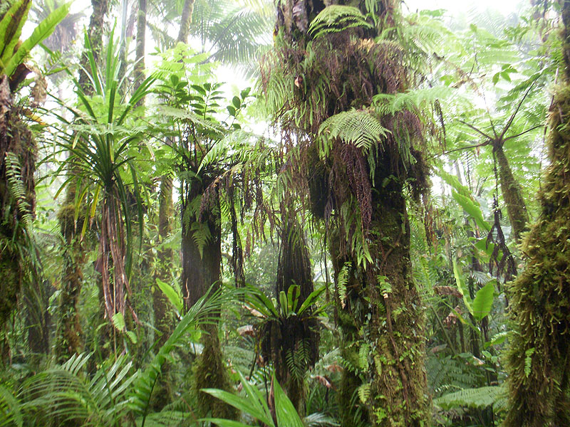
Micronesia foliage from U.C. Berkeley
This is true at the level of individual leaves or fronds, such as these leaves in a rain forest. Note the gradations within each leaf, with the lightest values at the tips of the leaves and the darkest values at their bases where they attach.

With transmitted light, this darkening at the proximal end is a consequence of both the greater material thickness at the base, and the lesser amount of light arriving at the top surface due to occlusion from nearby forms.


In this painting from Dinotopia: First Flight, I was conscious of varying the color and value of the leaves and making them lighter at the tips, especially when we see them illuminated by the yellow-green transmitted light. 

The principle is also true on a larger scale, not just at the level of a leaf, but also at the level of entire trees when you look at them in indirect light. 

James Perry Wilson, Summery Showers
In this 12x16 inch oil study by James Perry Wilson (1889-1976), note how each tree silhouette gradates from darkest at the base of each tree or bush to lightest at the outer and upper edges.
----
Previously:
Blog posts about James Perry Wilson

Saturday, December 7, 2013

Archival footage of diorama painting


The American Museum of Natural History shared this short video featuring archival footage of James Perry Wilson's working method. Wilson painted many of the finest diorama backdrop paintings for the American Museum of Natural History in New York.

The video refers to a unique grid system that Wilson used for projecting a scene onto a curving backdrop, so that the forms don't get stretched out. Wilson called the grid "the unsquare square." Based on his background as an architectural illustrator, he was meticulous about planning, and did a complete full-size charcoal drawing on the back wall before painting in oil. You can see him covering up the drawing as he applies the paint. (Direct link to video)

Wilson was also unusual for plein-air painting completely in the nude, but that's another story.
------
More about the diorama art in Stephen Quinn's book: Windows on Nature: The Great Habitat Dioramas of the American Museum of Natural History
Thanks, Jason Peck

Thursday, May 12, 2011

Wilson’s sky blending method

Michael Anderson of Yale’s Peabody Museum has published a new online chapter about the diorama background painting methods of James Perry Wilson.


According to Mr. Anderson:
“Wilson developed a rigorous method for painting skies in his large scale dioramas that had its roots in his plein air paintings.  While painting outdoors, he would carefully blend progressive tints of his three main colors, the horizon, mid-sky, and upper sky, into a graduated, light-filled sky color. 

“In a typical diorama, Wilson carefully planned the sky colors and usually painted with thirteen bands of color.  These colors were pre-mixed to the determined quantity so there would be no color matching midway through the painting of the sky.”
In Wilson’s own words:


 “A typical fair-weather sky, especially at high altitudes, graduates smoothly and evenly from a deep blue (cobalt or ultramarine) overhead, to a clear and much lighter blue, usually a turquoise hue, at perhaps one quarter of the distance from the horizon to the zenith.  Below this level the tone usually lightens still more, but the blue color is modified by ground haze. 

"The hue may be somewhat greenish, in very clear weather, or purplish, on hazy days, especially at low altitude.  These three tones—upper part of the sky, clear turquoise band and horizon color—may be considered as the key colors for the entire sky.  If they are carefully prepared, all the intermediate tones may be obtained automatically by mixing these.  This will insure a smooth, even gradation.  The process of repeated subdivision naturally results in 13 bands, as the following diagram will indicate."
Libyan desert diorama (top) is in the American Museum of Natural History in New York.

Read the new chapter of Michael Anderson's biography of James Perry Wilson

Monday, January 12, 2009

James Perry Wilson’s Dioramas, Part 2

In the midst of World Wart II, a young soldier wrote a series of letters to James Perry Wilson, painter of the illusionistic diorama backdrops for the American Museum of Natural History in New York (see yesterday's post). Mr. Wilson replied with valuable insights about his approach to color and atmosphere:


“It is one of the fundamental principles of aerial perspective that the dark tones of a landscape are the first ones affected by the interposed veil of atmosphere.

“A green tree in the foreground, for instance, will appear dark green in the shadows; but you don’t have to get very far away from it before that green disappears entirely, especially if you are looking toward the sun. In the middle distance the shadow areas in the foliage will take on a violet tone, while the sunlit parts are only a little cooler green than they are close up.

“At a distance of several miles this violet will become more and more blue. By this time air will have begun to affect the sunlit parts also, and the green will begin to disappear. A forest-covered mountain fifteen or twenty miles away, in clear air, will probably appear of a violet hue; but if it is fifty or sixty miles, it will be a clear pale blue.

“Another thing to remember is the effect of air on values. Here again it is the darkest tones that are affected first. The deep shadows and the halftones melt together, while the detail is still distinct in the highlights. As the distance increases, both dark and light objects approach the sky in value; but the light objects will hold out the longest.


Objects lighter than the sky grow darker as they recede, instead of lighter, and they grow warmer instead of cooler. You can observe this on a clear day when there are cumulus clouds in the sky. As the clouds recede they become yellowish, and those away off in the distance will be pinkish. (Note: the above image is the painted background from a Peabody Museum diorama.)

“The reason for this diverse behavior of light and dark objects is to be found in the fact that the air absorbs and scatters light of the shorter wavelengths toward the blue and violet end of the spectrum, while transmitting the reds and yellows whose wavelength is longer. Toward sunset, when the slanting rays of sunlight have to traverse a thicker layer of air, still longer wavelengths are filtered out and the sun appears red.


“Do you remember the band of pinkish light across the top of the mountain in the Jaguar group? What happens here is that all the blues are filtered out high up in the sky, and by the time the sunlight reaches the lower air and falls in front of the mountain, it is decidedly reddish. So you are looking at the mountain through a reddish veil instead of a bluish one.

“The most important thing to remember in painting a sunset effect is to keep all your tones harmonious and consistent. And if you have bright clouds, yellow or rose-colored in the blue sky, don’t paint your sky too blue. Keep the blue very quiet. That way your clouds will appear much more brilliant and luminous.”


Color Palettes
According to his assistant, Ruth Morrill, Wilson used the following nine colors, along with Permalba white.

Ultramarine blue
Cobalt blue
Windsor blue
Cadmium yellow pale
Cadmium yellow deep
Yellow Ochre
Indian red
Cadmium scarlet
Alizarin crimson

“He could make anything he wanted from those colors,” Ruth Morrill said. He did not use black and only rarely used browns. He regularly premixed graduated tints of each of the primaries on his palette before commencing to paint.


According to one of Wilson’s letters, the entire distance of the Connecticut shoreline diorama (above) was painted with ultramarine, light red and yellow ochre. “It is astonishing what variety you can get with these three,” he wrote, “especially since both the red and the yellow are rather subdued colors. I recommend your experimenting to see what you can do with just these three. They are bound to impart a mellow quality to the greens, which is a good thing.”
----------
More information
As blog reader Armand Cabrera pointed out, there’s a good article on JPW in American Art Review, December 2000. There’s another detailed article in the Peabody Museum publication Curator, October 2000. Both articles are written by Michael Anderson, who has compiled 20 years of research about Wilson. I am grateful to him and Ruth Morrill for sharing their unpublished interview material.

Jaguar image courtesy Supreme Fiction, which has an interview with Stephen Quinn about the art of the diorama, link.

Wednesday, September 22, 2010

Clouds: Growth and Dispersion

Clouds have a life cycle. They grow and they decay. We don’t really perceive the process because it happens so slowly.

If you speed up the action, you can see the growth side of the equation as the clouds emerge in tight, convex cells.


Watch the top of the frame, and you can also see the dispersion. Clouds break into fragments, called “fractus” clouds, and then melt into the sky. Because the water vapor is less dense, fractus clouds are never as bright white as the growth cells.

Artist James Perry Wilson included both phases of a cloud’s life in this detail of a painted diorama backdrop at the Museum of Natural History in New York.
---------------
Fractus clouds on Wikipedia
Earlier GJ Posts: “Capturing a Cumulus”
"James Perry Wilson's Dioramas"

Wednesday, May 6, 2009

Edges in Moonlight

When you go out on a moonlit night, away from streetlights, can you see the cracks in the sidewalk? How about the blades of grass, the clapboards on a house or the small twigs and branches?

Unless you’re a cat or an owl, these smaller details melt into the larger shapes. Everything has blurry edges. The reason visual acuity drops off at night is because the central point of vision where we see small detail is filled with photoreceptors that only work best in bright light.

James Perry Wilson, the artist famous for his diorama backdrops, conveyed this subjective experience in this architectural rendering. He softened the edges and suppressed the detail everywhere except in the brightly-lit windows where the light levels are higher.

Assuming that he wanted to simulate this perceived effect, this rendering by Edward McDonald is not quite as effective because he kept all of his edges too sharp.

If you use night photography as reference, remember that the camera doesn’t see as the eye does, and you have to make this adjustment if you want to suggest human vision.
---------
Related GJ posts:
James Perry Wilson, Part 1 and Part 2
Why moonlight is blue.
Day for night shooting.

Images from "Color in Sketching and Rendering" by Arthur Guptill. It's a book on watercolor rendering, mainly of architectural subjects, with lots of color plates, one of Guptill's best books.

Sunday, June 30, 2013

New chapter about diorama wizard James P. Wilson

Michael Anderson of Yale's Peabody Museum of Natural History has published the latest chapter in his online book about the life and work of diorama backdrop artist James Perry Wilson.

The new chapter covers Wilson's work for the North American mammal corridor groups in the American Museum of Natural History in New York, 1945-1954. 

Above is a detail of one of those dioramas. The coyote is a taxidermy specimen. The painted backdrop starts just above the bottommost fringe of tan pebbles just behind the animal. The line where reality becomes painting is called the "tie-in" and JPW was a master at disguising it.


Sunday, February 22, 2015

Window-shading


This small oil study by James Perry Wilson was left unfinished, allowing us to see how he did it. After a careful line drawing, he painted from background to foreground, completing each area before moving on to the next.


This photo shows J. P. Wilson at work on an outdoor study, with two panels side by side in a special frame so that he could paint a panorama. This one also seems to be completed area by area. 

The method is sometimes called "window-shading," because it resembles unrolling the final canvas like pulling down a window shade. It was a common practice for painting museum dioramas, for which Wilson is best known.
Francis Lee Jaques painting the Peabody Museum's Alaskan Brown Bear diorama,
Courtesy Peabody Museum of Natural History and Michael Anderson
According to Michael Anderson of Yale's Peabody Museum, Wilson would have seen the practice used by his colleagues, such as Francis Lee Jaques: "From the horizon, Jaques would typically paint down and from left to right, though not always. Sometimes he would skip around painting an area to completion and then going to another area, painting it to completion and so on. Jaques typically painted the birds first and painted the background around them later."

Both artists would have done a tight color comprehensive of the overall scene first, and used that as a guide.


Frederic Church painted this study of the view from his home Olana in winter. I would bet that he painted it area-by-area from background to foreground. 

Window-shading is a fast way to work, and it can yield almost photographic results. It's a good way to paint fast under challenging conditions, such as winter landscapes or sunsets. 


Ilya Repin used a similar method in this study from costumed models. Over a preliminary line drawing, he applied the paint to achieve a finished effect area by area, like a coloring book or paint-by-number. There's no overall block-in or imprimatura or ebauche, as you might do if you followed the "BLAST Rule."

There are several advantages to this method. In oil, especially with an oil-primed board, you can make use of the white of the board for small highlights that show through thin textures of paint.  
------
Previously on GurneyJourney: Area-by-Area Painting

Thursday, August 8, 2013

Breaking the foreground line

When composing a picture, it's sometimes effective put an element in the direct foreground, cropped by the bottom edge.


Here's an example by Henryk Siemiradzky (1843-1902), which doesn't break the foreground line. The bottom of the composition along the frame edge is empty. Nothing wrong with that, but it can make the picture feel a bit more formal, more like a stage play. Keeping the foreground line open like this is what artists have usually done. 

Let's consider some other possibilities. 


This is the "Proclamation of the code of Emperor DuĊĦan, by Paja Javanovic. That one figure partially cropped in the center left foreground opens up the picture.

Harry Anderson portrays Coronado's men discovering the Grand Canyon (thanks, Jim). The foreground figure is cropped just above the knees, and his gesture involves us and implies that the rest of the group is behind us. "Breaking the fourth wall" like this is more suited to an illustration than a mural, perhaps.

Here's a landscape by James Perry Wilson. Not many painters would think of putting the bushes right smack in the extreme foreground, but that decision gives him a lot of depth. We can step around the bushes on the left and enter the world he has created. 

Wilson spent most of his career painting diorama backdrops, so he was extremely conscious of foreground/background issues.
-----

Saturday, October 23, 2010

Schlierkamp Interview


Two days ago, a German reporter named Christian Schlierkamp interviewed me.

Christian SCHLIERKAMP: During your career you have been working in such different fields as book cover illustration, on animated films like Frank Frazetta/Ralph Bakshi’s “Fire and Ice,” you celebrated the outstanding success of  your Dinotopia books, which also have been turned into a TV series, and you give lectures for creative professionals (e.g. at DreamWorks Animation SKG and Lucasfilm, Ltd).

What in your perspective has changed within the field of visual art in general and for the artists and the requirements on them compared to 20/25 years ago?

JAMES GURNEY: The most obvious change in the last two decades is the emergence of digital tools, both in illustration and in filmmaking. Although I work in traditional oil paints, I find this new technology very interesting, particularly the breakthroughs in 3D modeling, lighting, and animation, because it has brought about a renaissance of new understanding of the visual world. It has brought artists together with physicists and mathematicians to better understand such things as subsurface scattering, caustics, occlusion shadows, and particle behavior. All of these new insights have influenced me, even though I work entirely in traditional media.

But I think your question touches on another, and perhaps less obvious change. Emerging forms of digital distribution offer artists new ways to market and promote their work.

These tools have given artists a lot of choices for how to use their talents. If they enjoy working collaboratively on a large enterprise like a film or a video game, there are huge opportunities. The term “concept artist“ didn’t exist when I was in art school. But artists can also work alone to write, illustrate, and design their own illustrated stories, graphic novels, or even animated films, and connect with the readers before the works are published.

CS: Considering platforms like “Deviant Art“ or “Conceptart.org,” in which artists seem to produce outstanding artwork en masse every day, one provokingly may ask: is there still a demand for illustration/imaginative artwork and what does this mean for the individual artist of today?

JG: I can’t say too much about those forums simply because I don’t have enough time online to be able to explore them, but I realize they’re a rich resource for both emerging artists and professionals.

People are hungrier than ever for images from the imagination. Imaginative artwork is healthier than ever today. The most successful exhibit in recent years at the American Society of Illustrators was the Spectrum exhibition. Most young people have grown up loving comics, games, science fiction, and fantasy, so it’s not going away soon.

CS: In your first instructional book on illustration, “Imaginative Realism – How to Paint What Doesn’t Exist” you give an extensive overview, drawing from the treasure trove of the Golden Age of illustrators as well as providing a generous insight into your personal methods and experiences, on how to create imaginative artwork in an encompassing way that I didn’t find in such form yet – will there be further publications after “Color and Light?” What was your initial starting point/motivation to go for a “how to”-book?

Yes, there will be more books after Color and Light, including another art-instruction book, sketchbooks, and new illustrated fantasies along the lines of Dinotopia. I’m also keenly interested in video, e-book, and app formats, so I will find at least a little bit of time on the side to develop those ideas.

To answer your second question, like a lot of artists in my generation, I found that art school didn’t answer all the questions that were burning in my mind. I was hungry for certain chunks of information, and I could never find it, so I wrote the books to answer all those questions.

To research those books, I drew not only from my own direct experience, but also on that of the older mentors I encountered, such as the classic illustrator Tom Lovell. I also researched out-of-print art instruction books from 50 and 100 years ago, which was like a window into the distant past.
Imaginative Realism reached within the last six months the #1 position on Amazon.com in the categories of both art instruction and painting, Color and Light, not released yet, is already on #3, only through pre-orders! How do you explain this success and was it surprising for you?

Completely unexpected, both for me and the publisher! There are so many good books on art instruction out there, especially about drawing the figure, or painting a landscape, or rendering a still life. I didn’t want to repeat what has already been said. But as I looked at the available books, I realized there were gaps, and those pieces of missing information were what I wanted to offer. Surprisingly few books systematically explored the question of making a realistic picture of a subject from fantasy or history. That was the subject of my first book.

Concerning “Color and Light” – one might say the two most fundamental themes of art. I was skimming through the archive of your blog “Gurney Journey“ and found as well a lot of theoretical knowledge as practical examples – what can we expect of this book? Can you give us a brief overview? What are it’s essentials/what was most important for you ?

As I assembled the first volume, Imaginative Realism, I realized that the information on color and light was so extensive that I decided it required a second volume.

I was interested in reaching four groups of readers:
 
1. Artists of all media interested in a traditional realist approach.
2. Fantasy and science fiction artists, illustrators, and concept artists.
2. Non-artists who are curious about the workings of the visual world.
3. Collectors and and fans of my artwork, making sure to introduce all new artwork compared to what we saw in the last book.

Here’s what the book contains: The book begins with a survey of historic masters who used color and light in interesting ways. It then examines the various sources of light, and we look at how light creates the illusion of three-dimensional form. The middle chapters cover the basic properties of color as well as an introduction to paint and pigments.

Then I present the method I use for color planning called gamut mapping. The later chapters of the book deal with specific challenges that we face when we wish to portray surfaces like hair and foliage, together with detailed information about the infinitely varied phenomena of atmospheric effects. The book ends with a glossary, a pigment index, and a bibliography.

The book does not contain recipes for mixing colors or step-by-step painting procedures. It is not overly technical, but it deals authoritatively with the topic. I also spared the reader some of the extremely technical discussions that are hard to follow unless you’re a physicist. Instead I wanted to keep the text brief enough so the artwork could be reproduced large. And I wanted to offer practical observations that painters can really use. I have already heard from art teachers that it will used as a textbook in art schools and I hope it will be a standard studio reference for many kinds of artists.

Of what I got from your blog, stronger than in “Imaginative Realism,” you seem to focus in your new book on plein-air studies; in “Imaginative Realism“ you promote as well a classic approach to using plein-air studies, charcoal studies from life models as well as from nature whilst the modern digital painter oftentimes is used to working mainly with photo references he loads into his painting software. Why are studies from life so important? What is the difference to working with photo references and is this approach achievable within today’s fast-moving industry (be it book publishing/editorial artwork or conceptual design for the film- and game industry)?

The best way to answer that question is to show you a page from the book which shows the comparison of photographed and observed reality.
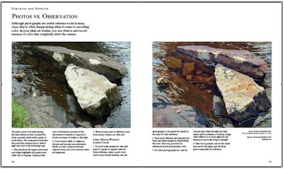

Working from imagination and from observation are indispensible to each other. I couldn’t paint from my imagination for very long without needing to go outdoors, and I couldn’t paint from observation exclusively. And yes, it’s achievable to work from life in this fast-moving world. A charcoal study from the model only takes fifteen minutes. But I also love spending three hours or more doing a careful oil study from observation.

Contrary to many modern art schools you do not promote to go for an individual/“personal“ style. Can you explain why?

You’re right. I think it’s a mistake to dwell on developing a personal style, especially for a student, because sometimes the style gets in the way of really seeing. Also, any style eventually becomes tired and stale, but truth to nature is timeless. In my view, students especially, but also working professionals, should keep studying the world around them with close observation. It’s natural and good for young artists to model their pictures after those of other artists as a path to mastery. But I prefer my heroes to be dead, and I’ve always tried to study many different ones, not just one.

In the afterword of IR you quote American painter Harvey Dunn, who said: “The only thing that’s true about anything is the spirit of it,” concluding the book by saying: “Art that lives in the memory and stands the test of time mixes earthiness with mystery, containing both a fistful of clay and a feather from an angel’s wing.” What in your point of view is essential for good art in general and is there something you can share to young up-striving artists?

I can’t speak for what is “good art“ because I love many different kinds of art which are based on different starting premises. But I have always been interested in a painting where the surface seems to disappear and I feel I can live inside the scene I’m painting. There’s a Latin quote that I have wood-burned onto my mahl stick. It says: “Ars est celare artem.” I picked it up from an artist named James Perry Wilson, who painted the illusionistic diorama backdrops in the American Museum of Natural History. It translates: “True art is the concealment of artifice.” It’s easy to make a painting look like paint, but it’s much harder to make a painting that pulls in viewers so completely that they feel the heat of sun on their neck and the sand in their shoes.

Art is more than illusionism, of course. What really matters to me in the end is to what extent a given work connects the visible world with the world of dreams and emotions. Many different modes of art can achieve that goal, but what excites me is art that does so by being sensitive both to the visual world around us, and the sea of mystery inside us. The inner eye and the outer eye inspire each other.

Interview by Christian Schlierkamp
--------

Sunday, December 15, 2013

Diorama background painter on N.P.R.


National Public Radio did a feature about the passing of Fred Scherer, one of the diorama background painters for the American Museum of Natural History, and an associate of James Perry Wilson.

NPR: In the Background: Art You May Never Notice (with lots of pictures of the dioramas)
Direct link to audio player