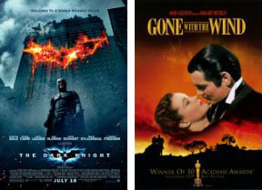
By sampling pixels from movie posters since 1914, Vijay Pandurangan has compiled a bar chart showing how the distribution of basic hues has shifted over the years. He ignored black and white, and also cancelled variations in value and saturation, showing the colors in their purest form.
Can we draw any conclusions about changes in the zeitgeist? Here's one suggestion: there seems to be a slight increase in cool colors after the end of major U.S. wars. Notice how the blue spikes for a year or two following 1918, 1945, and 1975.
------
Vijay's Blog
via BoingBoing


8 comments:
I think that some of the 'cool' spikes in the late 70s, mid 80s and late 90s have to do with the increase in sci-fi movies at the time. Star Wars,Close Encounters, Alien, ET, MiB, The Matrix. A lot of those posters had blue, purple or green as major colors.
I actually believe that the use of cool colors seems to start slowing after WWII which I think could be a link to the popularity of Noire/Chiaroscuro lighting which is almost in every movie today.
Beware, it is the curse of teal-and-orange.
http://theabyssgazes.blogspot.be/2010/03/teal-and-orange-hollywood-please-stop.html
good
good
good
nice
I had noticed the trend, particularly the rise of blue. But I didn't realize the impact until I was browsing the Redbox earlier, thinking "Is the John Carter movie out yet?" *skim skim skim* "No. Guess not." I only noticed it out of the corner of my eye as I was leaving, and was surprised that the cover was blue while the poster they had during its run at theaters was red. That and its a movie about Mars!
So I was looking for red and not finding any. You'd think given the film's lackluster box office reception that they'd keep the red cover so that it would stand out and at least be a hit as a rental.
Post a Comment