


Thanks to everyone who entered the "Sunny Still Life Challenge" on our Facebook group "Color in Practice." Entries were posted from all around the world, with both experienced painters and some people who haven't painted a still life or used a limited palette before.
You tried some bold experiments and achieved some excellent results. You've all inspired me to try some of the triadic combinations and subjects. It was hard to choose one Grand Prize and Five Finalists. Here they are:
Grand Prize Winner

Zoungy Kligge says: "The gourd on the left is Trái bầu in my mother's native Vietnamese, also known as a bottle gourd. It seems like only yesterday we were displaying last year's harvest. I guess the pandemic sped up time."

"Between those memories, the sentiment of my family who grew and arranged these things, and the quickly setting sun, my mind, as I painted, was focused very much on the fleeting nature of life."
James here: Those feelings and memories seem woven into your artistic choices, and they're somehow embedded in the final painting. I like your choice of color triad [Holbein permanent yellow (PY1), alizaron crimson (PR83), and ultramarine deep (PB29), plus DaVinci titanium white (PW6)]. It brings out an attractive array of autumn colors, with vivid oranges and those cool reds and the blues in the cast shadow of the long-necked gourd.
------
Finalists


Catherine Cervas Heaton "Bocce Set in Sun," 5" x 8." By the time I figured out what I was going to paint, after two other subjects failed, I had one sunny day--and finished today indoors because the shadows were getting long outdoors. Lemon Yellow, Hooker's Green, Permanent Rose, Titanium White."
James here: I'm impressed with the variety between the texture of that wire box.and the lines incised in the reflective balls. You've demonstrated how a painting can look complete without using a basic color like blue.

Catherine, I can tell from the reflected light on your painting that you were wearing a red shirt when you took the photo. You probably already know this, but a red shirt can wreak havoc on color choices for the outdoor painter on a sunny day. I try to remember to wear a dark, neutral shirt when I paint outside, especially when facing toward the sun.
-----

Hilary Killam—"I gathered up my gourds and set up a still life in the park on a recent sunny day before it started getting too chilly. This was painted in mid/late afternoon sun, so the shadows are a little long. My triad consisted of cadmium yellow, venetian red and phthalo blue, plus titanium white."

It's not every day you get to say "I gathered up my gourds!" I think it's so impressive that you gathered your subject and set them up in a park. Very brave of you.

She continues: "I knew I needed a vibrant orange for the pumpkins, so I chose cad yellow for its intensity, and I thought phthalo would be able to produce a good teal color for the box. I just love those little squiggly stems on the pumpkins! This one is 6x6 inches in gouache on watercolour paper."
I love those colors, which give you that beautiful teal tint and powerful orange colors. Who needs violet? The gamut is working for you. Good separation of light values from shadow values.
----

Eryn Pimentel "I used a triad of lemon yellow, carmine, and turquoise blue gouache. I used my son’s old bath toys before we get rid of them, and tried to keep this cool to fit the feel of the cool bath tile."
I like the way that most of the area in the picture is in the range of blue, green, and dull yellow, leaving other colors out. But there's that red smokestack on the little tugboat that provides a contrast. This reminds me of an important point about color schemes in general: You can have three or more colors in a picture, but those colors don't have to be equally distributed. You can reserve an accent for just one small area of the picture, and it can have lots of impact that way.
----

Jenny Hansell"Working on a sunny still life (from a photo of flowers on my windowsill) using the triad of cadmium yellow, permanent alizarin and Prussian blue. It’s really hard! I’ve never tried to paint flowers before - in fact it’s my first still life in about 35 years. Maybe I should have started with a banana and an apple!"
Jenny, you captured the darkness of shadows and the vibrancy of the transmitted light coming through those petals. The effect of light is quite striking, and there's often a dramatic lighting ratio when you're looking at a subject in a sunny window, because the fill light only comes from the much-darker ambient light in the room.
I wonder how your experience would have been different if you painted from direct observation, aided by a comparison with the photos. Now that you've climbed this mountain, you're ready for the next one.
----

Yoko Matsuoka
"There were so many hairy caterpillars out that day, and I'm allergic. It made it quite an adventure. Colors used are Cadmium Yellow, Ultramarine, Alizarin Crimson."
It's good to see an informal vignetted approach. One little tip: When you're working with a set of a dozen or so pan watercolors and you want to limit your palette, one thing you can do is to make a cardboard mask with cutouts for the set of colors you want to use. That way you won't forget and reach for another color.
-------
Sorry I couldn't include everyone, but you can see them all by going to the Facebook Group: Color in Practice and using the hashtag #sunnystilllife. Be sure to join the free group and share your own feedback and encouragement.
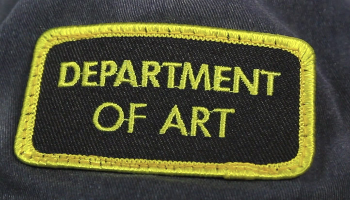
Each finalist receives a "Department of Art" patch and a free tutorial download. Please email me with your mailing address, and I'll get those to you.
-------Facebook Group: Color in Practice.
Gumroad tutorial: TRIADS: Painting with Three Colors
Check out some of our previous challenges:
7 comments:
Wow, I'm thrilled and honored - thank you! -- Jenny
Will done everyone!
Wow, what an honour to be mentioned here! Thank you so much for setting up this fun challenge. Congratulations to all the lovely artists here!
Thank you James. This was a lot of fun. Congratulations to everyone involved!
It’s Catherine, Wow I am thrilled and appreciate being selected a finalist in your challenge! I enjoyed this experience, and I really appreciate your generosity about art. And I saw later the dead giveaway what color I was wearing...! Gray from now on : )
Wonderful sense of light and shadow in all the paintings. Congratulations!
Wonderful work, everyone. It's a treat to see these sunny pieces, especially when the weather's turning wintry.
Post a Comment