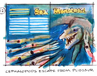
Here was the first sketch for it, drawn in water-soluble colored pencils. The big sea creature is chasing down a bunch of squid-like cephalopods, who are scattering in the foreground.

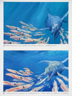
Before going to the finished painting, I did two small oil studies to give the art director some latitude for layout. But even though I got the green light to go to finish, I wasn’t feeling excited enough about the picture.
It wasn’t the design or the color that bothered me. The problem was that I didn’t care enough about the situation, because it’s hard to identify with invertebrates.

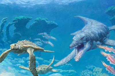
The solution was to show the big predator chasing a pair of sea turtles instead. We can feel for sea turtles, and we know from the fossil record that pliosaurs ate them. Framing the scene with big coral stands instead of open blue water also helped the drama.
The take-away point is that design alone isn’t enough (at least for me) to drive a picture. The story is just as important. If anything, the story should drive the design. And sometimes it takes sketch after sketch to nail down the story.
-------
Previous post on the Tylosaur, Part 1 and Part 2
Ranger Rick magazine


16 comments:
Clever last-minute switch.
Empathy is as vital a quality of an illustrator.
A much stronger picture. The decision making never stops, does it? You are exactly right in your thinking. I found my eyes going back and forth between pliosaur and turtles, creating two focal points and heightened drama. Well done, sir.
Your post really touched a nerve with me. I sometimes do not feel right about an illustration I'm working on and redraw and mess with until it feels right.
I always thought this a mark of a poor illustrator on my part, not to hit the mark the first time I drew it...or the third. I figured this was my fault and all the "other" illustrators got it right in a few renderings. I just followed my instincts until the picture merged with story. Now I realize I was probably over-rationalizing.
And getting right the first time may not feel right or be the best fit. Thanks so much for reminding me to trust myself.
I don't know.. Even though I agree that design is just one part of composition, I think in this case the earlier version worked better because of the flowing lines the squid made. I think the final piece has lost the sense of speed because the space that used to be these flowing lines is now largely empty or filled with less flowy turtle shapes. The coral is definitely a good change though.
I like both versions, but I think the switch to turtles was a smart move. Also, I had no idea Ranger Rick was still around, how fun!
I agree that the scene seems to have slowed down, but I feel that it is much more frightening. The previous drawings were open, with escape available in any direction. The new addition of the reef elements on the left, right and bottom, and the light flickering on the underside of the ocean's surface boxes the creatures and the viewer in severly limiting our escape options.
On the one hand, I want the turtles to make it to a protective nook or alcove in the reef because... well, they're turtles. Who doesn't love turtles? On the other hand, if the turtles make it, that leaves only the pliosaur and me. And I know I can't outmanuever that thing, even if it is moving slowly.
Suffice it to say I always find a major problem when I'm starting the finish. It seems to elude or mask itself up until I'm knee deep in laying my big blocks of color.
Now I take a break between all the prep work and starting the transfer.
=s=
Yeah, I do agree that's a better idea for a layout. Although the squids aren't bad either.
But the turtles with their more recognizable faces does create more empathy for the situation.
James, I have a general question about design and your paintings for for Ranger Rick, Natl. Geographic, etc.
Obviously this composition is very carefully composed, with the turtles' flippers and even the little extra cephalapods pointing ("spokewheeling" was the term in I.R.) in the direction of the mosasaur's gaping maw. My question is this: do you ever try to counter-act this painterly technique by deliberately introducing tangencies or haphazzard composition to achieve a more "photo-journalistic" appearance? Since these paintings are filling the purpose that photography would normally serve (for a magazine article about non-extinct animals), do you ever try to make your paintings look more like photographs by sacrificing some of the clever composition? (Clearly, this particular chase scene is a dramatization and would never have been a photograph anyway, even of living animals - but in other cases?)
Just curious!
I love this one, Jim. Some illustrations seem to come with a sound-bite, because I can hear the muffled, aquatic growl of that pliosaur.
I could identify with those invertebrates :-).
What made the circle round (literally) for me is the big coral stands: you get an oval vorm from the tip of the giant predator through the wingtips of the lower turtle to the top of the coral...
But of course, this is a matter of composition, not of empathy...
@ Everett Patterson: interesting question. I hope that once we may read an entire blog post dedicated to that question?
Thanks for the comments, everybody. Yes, Everett, that's a fascinating question. I do introduce "photographic" artifacts into my paintings sometimes — especially motion blur and depth of field and sometimes photographic color schemes and odd offhand poses— because I'm often trying to get a look that blends well with the look of a photo magazine like Ranger Rick or Nat. Geo.
But I usually can't bring myself to introduce clipping (burning out to white or dropping to black), or deliberate tangencies.
Really fantastic seeing those early sketches!!
Thanks for sharing!
Thanks for the great process share. I really like your color thumbs.
You can really see the fear/flight expressions on the turtles faces. What an emotional, action-packed image.
I really like when people are expressing their opinion and thought. So I like the way you are writing.
oil painting
Post a Comment