


In this 1924 poster for the London Underground, Walter E. Spradbery limited his palette to just four colors: white, cyan, red, and green.
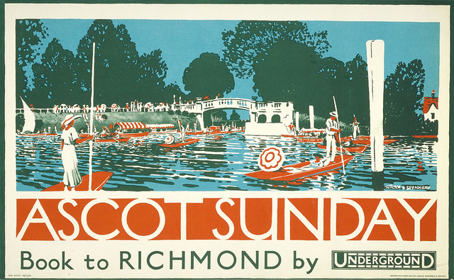
The resulting poster has a several advantages over an image with a full range of tones and colors. It's cheaper and easier to print, and the simplicity gives it more visual impact from a distance.

Here's a detail of the original painting in opaque water-based colors. Where possible he eliminates outlines around small shapes and lets them blend together.
It's a challenge to design a picture with just four colors. One naturally wants to subdivide, gradate, soften, and outline. But a painting gets its power from the grouping of tones, and this regime forces the artist to group, generalize, and simplify.
3 comments:
I also like the silhouette of the trees and how liquid the water looks and how perfect the lettering fits in.
A lovely poster in my eyes.
My art professors on more than one occasion referred to some of my early painting and illustrations as "garish" and "over-saturated," One of them suggested I experiment with a more limited palette, maybe even some monotone and duo-tone work. I can't say enough how helpful pulling back sometimes can be. Just because some of these companies offer 150+ colors of paints or pencils, doesn't mean you gotta use all of them on the same painting :)
'Less is more' as my old Design I teacher, Polifka, used to say.
I'm all for a limited palette although, those particular 4 colors together are rather disturbing to me, especially in the print, but maybe it works better when viewed from afar. I like the posterization. - mp
Post a Comment