If we're drawing so that shading lines describe the contour and volume of an object, how should it be done? Should the lines go in the direction of the light source? Or along a perspective line?
I've attached a little jpg to illustrate my question because I'm not sure if I've made any sense. Which way is best for the lines to go?
Answer:
It's a good question. Actually there are no rules. Both ways you've suggested can describe the form well.
The one marked A is often called "shading along the form" or "along the axis." B is sometimes called "bracelet shading" which I mentioned on another post. In that case, the lines (or brushstrokes, if you're painting) are going around the axis of the form.
On a larger compositional level, your choices often depend on the feeling you want to create.

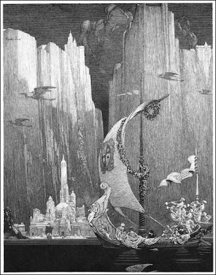
For example, in this fantastic world drawn by Franklin Booth, the lines on the far mountains are vertical, which reinforces the feeling of soaring majesty.

In this detail of a drawing by Polish artist Stanislaw Bohusz-Siestrzencewicz (1869-1927), the lines on the horse's neck wrap around the cross section of the form, but he's also connecting diagonal movements from the horse to the man to suggest action.

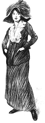
In this drawing by the same artist, the lines spiral diagonally around the form to suggest the relaxed, informal posture of the woman.
So I'd say: experiment with both kinds of shading: along and across the axis. Also, try shading diagonally if you want to suggest atmosphere or action. Once you're comfortable with the choices, it will become automatic, and you can mix them up in the same drawing.
----
Thanks, Paul Mendonca for the Siestrzencewicz files.
More samples of Stanislaw Bohusz-Siestrzencewicz
Andrew Loomis talks about a similar topic, stroke direction in painting, in his excellent book Creative Illustration


6 comments:
Fascinating thought James, which could be extended all over the place. If you think of comic book lines there are multitude of variations and one Neal Adams used to brilliant effect in his 60s DC work on muscular Batman; Gene Colan wispy lines in Tomb of Dracula and so on
It is a magical thing when an artist can use line in all sorts of unusual ways, yet still describe the form. I used to be amazed by the advertising illustrations done for (Los Angeles) The Antique Guild back in the 70s. The artist, I've forgotten his name, though it might have been Frank Ramirez, had lines going every which way, lots of fun movement, while perfectly describing the shapes, light and shadows on old pieces of furniture. His work was in the newspaper often and I wish I had saved some of it. I can't find a trace of it online, now.
James, your blog is wonderfully informative. I really love the line work in the Stanislaw Bohusz-Siestrzencewicz images, especially the horse scene. - mp
the line work of Paul Calle comes to mind in this discussion. His book "The Pencil" is still in print and well worth the look.
Greg, thanks for the tip on The Pencil. I just ordered it. I saw a new one listed for $9,999.00. Seemed 'out of line' with the other prices.
For those interested, Rendering in Pen and Ink by Arthur L. Guptill, originally published in 1930, also has some great examples of various line techniques. - mp
I teach drawing to freshman level art students, and the question of what to do with hatch lines is always a big question. Their natural tendency seems to be to "bracelet" the form with lines running at right angles to the long axis. The problem is, if you're working in pencil or charcoal, as we normally do in class, you end up with a lot of lines, but very few values! I encourage them to use a fallback mode that resembles a basket-weave, with lines parallel, at right angles and at both diagonals to the axis. Pretty much the method of Michelangelo, and also of Frank Frazetta. Of course, if you're using line both to shade and to create graphic effects, it can be a whole different ball of wax.
Oh, and speaking of my students, this blog is frequently required reading for them Thanks!
Try looking at the way line is used in etchings and engravings - this can be translated into making similar marks with a pencil or pen.
Post a Comment