


With a private commissioned portrait, there's yourself, the sitter, and sometimes the sitter's family, who typically pays for it.
(Video link) With a portrait of an important public figure such as Kate, Duchess of Cambridge, there's yourself, the sitter, the Royal Family, the public, the pundits, and your fellow painters. That's a lot of people to think about. And which face do you try to capture, the "natural self" or the "official self"?

Artist Paul Emsley says that "after initially feeling that it was going to be an unsmiling portrait, I think actually that it was the right choice in the end to have her smiling, because that's really who she is, I think." After two sessions, he worked from a photo that he and Kate both approved (below, thanks, Mark Heng)

In the portrait, Kate has a complex expression called a "stifled smile." The smile is restrained by the action of the orbicularis oris, mentalis, and triangularis muscles. Those muscles act together to oppose the normal smiling action of the zygomaticus major.
Try to match the expression yourself, and you can feel the conflicting tensions.
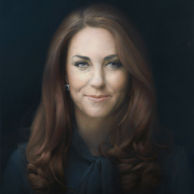
In his book about facial expressions
The stifled smile can appear either shy, endearing, smirking, impish, conflicted, scheming, self-conscious, or self-satisfied. Faigin says it's often used in advertising, but rarely in art.
Edit: Poll results from 78 votes "What emotion does Kate's portrait suggest?": Smirking 24 votes, Conflicted 15, Self conscious 14, Endearing 13, Self satisfied (tie) 13, Impish 9, Other 9 (tie), Shy 5, Scheming 4 votes.
What emotion does Kate's expression suggest to you? And does it matter what you or I think? Both the artist and the model are reportedly happy with the results. According to Marvin Mattelson, quoted in the video piece, that's all that really matters. If anyone else likes it, that's just a bonus.
------
Book: The Artist's Complete Guide to Facial Expression
Photo of artist is from MSN News
Huffington Post: "Kate Middleton Portrait Unveiled....And It's Awkward." (1400+ comments)
Making a Mark blog, with two additional videos
Paul Emsley's website
53 comments:
Well it could be a private affair if it was another client. The expenses of the royal family are paid by taxpayers, aren't they?
Agnes, right, good point. That, and presumably it will be publicly exhibited in the National Portrait Gallery.
A photograph can capture what we see but this is a painting not a photograph. The important parts are not what you see but the feelings, emotions, memories, and connections that stir within the viewer. It matters not at all who pays for this portrait, for Kate is admired by many within her own country. Kate's public role is the outward manifestation of the history, customs, and dreams of a people. The task of this portrait is to convey Kate to others without the restrictions of time. If you do not like this portrait then paint your own and admire that.
Artist made Kate look older than she is (especially through the eyes). Rather unflattering...
Does anyone else think it looks more successful in the photo with the artist? The colours seem richer and the angle actually seems to mediate the stilted feel.
Could our response be at least in part to poor photography?
I think this expression is an unusual one to want to capture for perpetuity. It seems rather Giocondorish...
Design-wise Emsley limits his choices by using face-on. Yes, the photography of the artwork doesn't do it any favours, terribly desaturated, but the proportions are off. Kate's face lends itself far better to a 3/4 pose, which his rendering is naturally pushing in that direction. Also the lighting aids the flattening effect further. I actually like the expression, quite ambiguous and intriguing.
Either way as long as both subject and artist have accepted its flaws and merits, who cares?
I'm not particularly fond of it but then there are many well-liked paintings that I also don't appreciate.
In my personal opinion it looks a bit plain with all the darkness and the angle of the subject is boring.
The taxpayer has nothing to do with this portrait. It's been gifted to the NPG by Sir Hugh Leggatt and the Art Fund (see http://www.artfund.org/about-us/art-fund-faqs#how-is-the-art-fund-funded-do-you-receive-government-support for how the Art Fund is funded. Its main purpose is to RAISE funds for art!)
The videos quoted in my blog post about this Paul Emsley and the Duchess of Cambridge - two videos and a drawing give a much better impression of the painting than I've seen to date in any of the portraits. The photos for some reason drain the colour.
The key point for me is that a woman of some maturity (she is after all 31 - not a fluffy 19 year old!) has decided to have an 'unvarnished' portrait of herself be the first formal portrait - before she gets endlessly painted in a more glamorous way for years and years to come. For her to have the courage to say "this is me" says far more about her than any glamorous smiling portrait ever could - a point missed by most of the male commentators to date!
Personally I think the smile has something of a private joke about it! Also Paul Emsley does not do teeth(!) and very rarely ever has even a hint of a smile.
@ Paul Moyse
Full on big head is what Paul Emsley does - and anybody choosing him as a portrait artist would know this.
This is not an artist who aims to flatter. I've seen his work a number of times and frankly photos don't do it justice
Sorry - my comment should have read
"The videos quoted in my blog post .... give a much better impression of the painting than I've seen to date in any of the PHOTOS."
Yes, I've seen his website and drawing only face-on is a weakness in his armour. When an artist chooses 3/4 they are choosing to interpret extra three-dimensional information. In terms of a portrait artist's drawing skills it's like diving into the deep end of a swimming pool for the first time, we don't know if we'll sink or swim until we try it. Being able to handle that extra information with either pencil, oil or any other medium is essential for structural and anatomical understanding.
Katherine, thank you for those additional insights and clarifications. I have added a link at the end to your post on the Making a Mark blog, which has those two additional videos you refer to.
Paul, I've also added the link to Mr. Emsley's website so that people can see his other work.
Louise, you're quite right that a royal portrait may attempt to evoke dreams, memories, and aspirations of the people, coupled with a sense of history. These factors add even greater burdens to the portrait painter's mission, and complicate our collective response to the work.
Please note that I never passed any personal judgment on the work; I'm trying to understand what's going on with the expression, especially around the mouth, and why it evokes so many different responses. Those who bring both praise and blame to the portrait seem to focus on that smile, which really is unusual for a portrait, royal or otherwise.
The videos have swayed me completely; seeing the poor images online I thought Emsley had made a bit of a hash of it, but in the vids it's looks a very good piece of portrait painting, top marks from me!
I think all the 'art spiel' given over to it (not by the artist himself mind you) is a bit much 'the use of the two eyes..'.. really? I'd never though of using that technique :). It's a very good painting, and a great royal portrait, but there's no shame in saying 'I took loads of shots, picked the ones we thought looked good, and painted that... bish, bash, bosh'.
The question it does raise for me is whether taking individual close-ups of a sitter and working from those images is wise, as it may be what's led to a sliiiiggghht disjointed and unfamiliar look to her features.
Better than my work, so I take my hat off to the bloke, well done!
I like the portrait. It reminds me of one of my favorite stifled smiles in art.
I suspect we will soon be seeing knockoff versions of the stifled smile flitting about the lips of celebrities and cosmetics models.
Matthew
Hopefully, this is only slightly off-topic:
Katherine's mention that "Emsley does not do teeth" brought to mind my thoughts - probably not original - about including teeth, especially with an open-mouth, in portrait painting. Photo reference seems to increase the possibility of using the open-mouth (with or without teeth included) pose for a painted portrait. Yet, somehow to me, teeth seem oddly out of place in a painted portrait. Is this due to the fact that historically painted portraits had only the sitter as reference, and hence - on some level - teeth/open mouth in a painted portrait seems out of place?
I think the NBC spot framed the discussion well when they showed the picture of the Rhino and Nelson Mandela that the artist did. Painting being a visual language, words never seem to suffice. But putting Kate's pictures up next to other portraits that the artist did along with portraits from other artists that have stood the test of time might be a useful exercise.
The portrait to me is shocking in the lack of regard for her wonderful spirit that shines through her eyes. Her eyes appear watery, perturbed, and tired. I'm puzzled why anyone thinks it is a good representation of the Duchess.
Tom, regarding showing teeth, have a look at the post I did called "Smiling Presidents," looking at how the toothy smile became accepted and now the norm, both in photographic and painted official portraits: http://gurneyjourney.blogspot.com/2010/06/smiling-presidents.html
As to doing portraits with teeth: Frans Hals used to do them;-)
There's the British "Stiff Upper Lip" - here we have the Stifled Smile:-) nice expression. Although I don't know if using that extent of photographic reference is permissible in a royal portrait; can't get rid of the impression that it somehow shows.
Drawing and likeness issues aside, it's too soft and overly blended for my tastes. Most modern realism pedagogy insists that hard edges are artificial and amateurish, but in my opinion overly blended edges are even more artificial and amateurish.
I may be projecting a bit of myself onto Kate in this instace but I make this face when I'm trying to be polite and suppress a chuckle that is usually the result of a funny thought that would be rude to share. I imagine someone in Kate's position often finds herself in similar situations. In fact I find this picture has an almost Mona Lisa quality to it because of the expression.
I quite like the expression. It seems like she is hiding a funny secret or more sadly trying to cover her natural joy with official decorum.
I don't care for the color, rather dark, flat, and desaturated. But that might go with the mood of decorum stifling joy.
I would have to agree with Phil Moss's comment and Maywyn's comment. Something seems slightly off about it, probably as a result of blending photo references. And she appears tired, or like she has a headache (or morning sickness?), which is never how I see her in photos. However, I do appreciate the artist's skill, as they do surpass mine by a long shot. Portraits are difficult.
maybe it's me James, but I felt the somewhat odd contraction of muscles (as described in a stifling smile), made Lady Katherine look older than she typically appears in photos and on TV. That more than the expression gave me cause to debate whether I liked it.
...had another look at that stifled smile:
Tongue In Cheek?
I like it, feels like a more personal look at a royalty. reminds me a abit of this portrait of the danish queen by Thomas Kluge,
Photo here
This picture is really a missed opportunity on various levels. As Marvin Mattelson says in the video, the purpose of a portrait is to make you feel that you are in the presence of a real person. The frozen smile and the giant size of this portrait make that impossible. I'd imagine myself feeling like I was, instead, in the presence of an advertizing poster. In the end, Kate Middleton simply chose the wrong artist. Just imagine what Nelson Shanks or Aaron Shikler would have done!
I disagree Greg. This painting will make waves. Just look at how many people have commented on this post of you doubt it. Thousands if not millions will not only see the peice, but thanks to the controversial choices of the expression and the quality of their depiction this peice will be talked about by many people for some time to come. Love it or hate it everyone will want to give their opinion, and for an artist that kind of exposure is golden. The painting isn't meant to be flattering as much as it is meant to capture an essence, and send a message I think. And I think it is intriguing.
When I see a huge portrait such as this, that also is front on and flattened, 'smoothed', a little unflattering, and painted from a photograph, I think that perhaps the purpose was not so much to create a feeling that you were in the presence a real person (surely then you'd make the painting normal human sized), but you are seeing a representation of that strange mix that is part real person (the smile), part royalty (we know), part media star... ie, exactly, Craig: an advertising poster/ print. Think what Warhol was saying about Monroe, mass production and media.
Whatever, I agree with Keith - I love that it's got us all talking and thinking!
What an interesting discussion!
Keith Parker mentioned Mona Lisa in his comment above. Her smile was my first thought about this portrait, although Leonardo softened Mona's stifled smile.
I'm guessing our modern high definition visual influences make this portrait fit the taste of many.
Well, no question this portrait will be talked about, and maybe more so because many people just don't like it. I was only yesterday looking at a selection of recent portraits of Elizabeth II. I was amazed how really fine some of them are, but none of them will ever be as famous as the "ugly" portrait by Lucian Freud.
Oh crud I got your name wrong; sorry Craig.
James - I have an explanation for the mouth. It may well seem odd to American eyes - particularly ones which are used to smiling Presidents - but there's a very simple reason.
In the entire collection of some 11,000 portraits in the National Portrait Gallery (which go back to Tudor times), there isn't a single smiling head.
Not one.
It's the practice to paint a portrait without a smile and certainly with no teeth.
Given the Duchess is particularly well known for her fabulous smile this would have created a huge challenge for any artist. On the other hand the challenge may well have slightly easier to tackle by an artist who equally does not do smiles or teeth! I think the comments about the compromise being arrived at via a closed mouth smile explains an awful lot!
I forgot to add....
I've spoken to a number of artists who have painted members of the Royal Family, most recently Daphne Todd, who is the ex President of the Royal Society of Portrait Painters.
The very real constraint that any portrait painter has to live with is that typically they only get two, maybe three short sittings for these commissions. The explanation for this being the Royals' very crowded engagement diaries and time needed for the travelling involved in attending various functions around the UK. Plus the fact that the Queen would have nothing to do all day but sit for royal portraits if painters could have all the sittings they could wish for!
I believe an exception was granted to Lucien Freud - probably on the basis of both status (Britain's greatest living artist - when he was still alive) and his advanced age. He painted the Queen in 2001 but even he had to compromise and paint on a small canvas so he could get it finished within the constraints of his own exacting approach to painting portraits
As you will note from this link controversy is nothing new to the unveiling of a new Royal Portrait! :)
Hmmm. Katherine, the portraits of the queen I was mentioning a few comments back were featured on Matthew Innes's "Underpaintings" blog. If it's true that all royal portraitists must deal with the strictures you describe, it seems to me that several of these painters navigated these potential roadblocks much better than Freud. I would be curious to now if you agree.
The common complaint that the portrait has aged her is spot on. It's also made her face too wide, it seems to me, and given her the air of carrying cares and resentments. I think he's gone too far trying to get hyper realism of surface detail at the expense of capturing the personality and vivacity of the person depicted, too. Also, I dislike over-lifesized portraits, they give me the creeps. Only dictators and pharaohs should be shown like this.
Craig - given it was Freud's habit to keep people turning up for sittings on a weekly (or more often) basis for a year or more, I think you'll understand that even with the relaxation of the normal protocol, he was under a severe constraint so far as his normal modus operandi was concerned!
I think people just need to accept that royal commissions just don't work quite like any other sort of portrait commission.
They also suit some painters (eg ones who work in fast and in a more painterly way) better than others.
My ex drawing tutor, who painted the Queen, told me that the Palace allowed him access to the room in which the portrait was set and access to the dress used for the portrait which was then suitably stuffed to enable him to do the painting. Most of the royal portrait painters seem to use the sittings to start and finish the head only - and make this relatively small within the entirety of the painting. This enables them to use the limited time they have to best effect.
For an artist to make virtually all the painting about the head is most unusual. It creates a much bigger challenge than usual - and this particular aspect appears to have gone unremarked by most of the commentators. Whether this was a wise move could be debated - but this is how this artist typically works and I guess is what he would be most comfortable doing.
I'd love to know who suggested that maybe the "no smile" rule might be relaxed so we got the dimples at either side of her mouth.
I'd also be grateful if people could explain in what particular way the painter has aged her.
Katherine- I asked mainly because you called Freud Great Britain's greatest living (now deceased) painter. Actually, the limitations imposed upon royal portraitists these days are not all that different from the challenges many portrait artists face these days. Just now I'm doing a portrait of three 19th Century German military musicians. Not only the likenesses, but all details of their uniforms and instruments must be accurate, yet if the finished painting looks like nothing more than a colored sepia-tone photo, it will not be a success. Luckily for me, I read "Gurney Journey," so I have some idea how to do this!
Really debatable post...damn good!! i think nothing matters as long as the artist and the model agree...Thanks for posting!!
trafimet plasma consumables
The original photo reference was posted on ConceptArt.org : http://conceptart.org/forums/attachment.php?attachmentid=1679638&d=1357940157
IMO the artist didn't bring much of himself to the painting, and only a snapshot's worth of the subject.
Thanks everybody for these thoughtful comments and fascinating links. I think everybody has articulated my own various reactions better than I could.
I don't think there's anything wrong in principle with a portrait done from photos. Rockwell's portraits of Eisenhower and Kennedy are immensely satisfying, both in the original and reproduction.
Of course in this case, I haven't seen the original painting or met the subject. But from what I've seen of the reproductions of this painting, the ambivalence of the expression says something not just about the artist and the model, but also about the expectations we all bring to oil-painted portraiture. Kate comes across in candid photos with a beautiful radiant smile, but no one is ready to see that full-on toothy smile enshrined in a painting. So Kate is caught somewhere between the big smile and the calm neutral expression of the rest of the portrait gallery's subjects. And for me, that "caught between" quality, which is in itself a momentary phenomenon, impossible to hold for more than a second, is both the success and the failure of the piece.
I feel, like some others have said, that the painting comes out better in the photographs of the artist; the light is better and perhaps the viewing angle (the side-to-side compression?).
Still, this is a beautiful painting, and the model too. I won't let my personal preference for lighter backgrounds, etc., interfere with my enjoyment of Mr. Emsley's great work.
I personally do not feel it captured her in the best manner possible. I think the painting makes her look much older than she is and though the chubbiness may be from baby weight, he cheeks do feel a bit bloated. I also think that the painting is very stiff and does not flow well or portray any "life". Might just be me though.
Personally I say more power to Emsley. He works with integrity. I think it's wonderful that the portrait is stimulating conversation (and not just on art blogs), and bringing painted portraiture into public consciousness in a way that hasn't happened in years. As to the portrait, personally I have issues with it - things I don't particularly care for. But I respect it and Emsley's process.
I think the aging effect comes from the edgework (its hard to get edge info from a photo). The artist has really softened the hair (almost looks like airbrush or digital). So the soft hair edges, relative to the harder nasolabial folds, chin, and prominent eye wrinkles makes the signs of age the second strongest statement after the smile.
But I'm viewing this small, and on a computer screen -- these oversized portraits are meant to be viewed in person.I'm sure its a very different experience.
I guess I am just an old painter when it comes to portraits. Even if the likeness is spot on and a certain personality is captured if the painting itself is lacking then it's lacking overall. I have not seen this on the wall but have seen enough work in reproduction to get an idea. Even if it does work as likeness and captures personality, which still seems suspect, it doesn't seem to have some of the basic tenets of a good painting. More flame for the fire I guess.
I happen to hate it, but moreover, I think it leaves her still needing to have a portrait done. Maybe next time she'll choose a photographer.
MJ
P.S. The color palette, at least in the JPEG reproductions (I haven't seen the painting), makes it look like a painting on black velvet. Plus, the image manipulation (soft focus face and hair, super-sharp eyes) is a standard hackneyed Photoshop gambit.
Sorry, guess you can tell I think it's horrid.
MJ
Having watched the videos Ms. Tyrrell has referenced I see now that my first impression is correct. It looks just like the photos and probably just like the Duchess when she sat for the artist. But is it possible to enter the "uncanny valley" in a painting? I feel like it is technically a superb painting but there is just something that is a bit off-putting that doesn't truly capture Kate's "Kate-ness" (for lack of a better word).
http://conceptart.org/forums/attachment.php?attachmentid=1679638&d=1357940157
Thanks for the link to the source photo, Lane.
My (totally personal and insignificant in the greater scheme of things) vote lands in the "horrid" camp.
1. I know he was going for a glowing effect, but instead, we get a portrait of the undead. Was this the intended effect?: http://www.clevvertv.com/wp-content/uploads/2013/01/The-Twilight-Saga-Breaking-Dawn-Part-2-2012-Movie-Poster1-e1358189196215-300x300.jpg
In fairness, sometimes photos of paintings can be deceiving in this area...
2. Some bizarre decisions regarding the depiction of the features. For instance, the shrunken width of the nostrils (Have nostrils become unfashionable?). When people smile, the nostrils flare, sometimes a lot. You can see it in the photo. Nostrils also have a big impact on how the distance between the eyes and the nose is perceived, and thus, the size of the nose. And the eyes- Getting the extra sharp sparkle treatment while the rest of the face is a little soft focus creates a weird disconnect. As noted before, a cheesy Photoshop trick that gets used a lot in high school yearbooks. The eyebrows are a missed opportunity- The glamour of the raised and angled right eyebrow lost. And the left eyebrow has been thinned down, adding to the effect of aging. The cheekbones, very glam in the photo, are played down.- Basically, everything seems to be genericized to detrimental effect.
3. The paintwork- smoothed out, unremarkable. To see large scale heads with expression and expressionistic paint, check out Colin Davidson from Belfast: http://colindavidson.com/
On a positive note, I did check out Paul Emsley's website, and some of the work is beautiful like this one of a tree: http://paulemsley.com/works/?nggpage=4&pid=177
Smiley Face!
Hi James,
Much as I take my hat off to any good portrait painter, I'm afraid that I find that the portrait of Kate Middleton resembles a very bad, air-brushed photograph that was lit by a flashbulb. Perhaps that was the artist's intention, but it makes for a boring painting.
Her smile doesn't resemble the Mona Lisa's at all (the Gioconda's smile is a pun on her name, by the way—Leonardo loved visual puns—giocondo, in Italian, means happy or playful).
Fond regards, John.
Michael John Angel
Director of Studies
Angel Academy of Art, Florence
P.S. The majority of the comments are great, by the way. Bravi, everybody!!
And I agree: the original photo looks better, but at least the painting is bringing more public awareness to portrait painting.
Michael John Angel
Director of Studies
Angel Academy of Art, Florence
Post a Comment