


As long as the animation style was abstract enough, the absurdity of that idea worked. But as Disney animation became more realistic, it became more and more untenable.
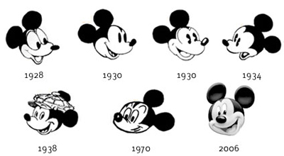
Over the years, Mickey underwent a design evolution, including a major redesign by Fred Moore for Sorcerer's Apprentice. The effort to make him and Minnie more dimensional and emotionally complex came with a price, however, because they became less believable. There was always the problem of those abstract circular ears, which did bizarre things on head turns.
Audiences eventually lost interest in the character, despite efforts to make him the official mascot for the Disney Studios.
Toy designer and Mickey collector Mel Birnkrant puts it this way:
"Mickey disappeared because of Disney's push towards reality, which wrecked a lot of things in my opinion. As [veteran animator] Ward Kimball explained to me—and this is the inside story—all of Disney was steering a course towards reality. And it got to a point where the story men, as well, could no longer swallow the existence of a three foot mouse. They could believe in Donald Duck as he was just large enough to exist in the human world (think Three Caballeros). But Mickey no longer made sense to them."

"The absurdity of the situation is no better illustrated than in the post-Pinocchio cartoon when the kitten Figaro was developed to a new level of realism. There is a scene in which Minnie is giving Figaro a bath that is utterly surreal."
("Bath Day," 1946) Link to YouTube
"Mickey and Minnie interacting with small kittens was a recurring theme in the early days, but there was no such thing as reality back then. All the characters were abstract."
Disney Studios has recently attempted to revive Mickey as a more abstract (and sarcastic) character in short films for the internet.
----
Previous Post: How Tall is Mickey? (With the weird live action clip of a monkey in a Mickey suit)
Deja View Blog: Fred Moore's Mickey Sketches
Mel Birnkrant's Cartoon Character Collection
All art ©Disney Studios
12 comments:
My all time favorite is still the 1930-1934 one. I feel like it had a lot more character, compared to the modern one.
I miss the old shorts so much! Those ones for the internet have really bad animation and style, in my opinion.
Story by Eric Gurney! Any relation?
As soon as Mickey became the studio mascot, he no longer had an entertaining personality. Unlike Bugs Bunny, he couldn't play crazy tricks on other characters, or be surprisingly hilarious. There will never be a feature length animated movie starring Mickey Mouse. He is forever relegated to having his picture taken with children and appearing as a logo on merchandise.
I love this conflict. A similar problem arose when medieval artists began incorporating the renaissance rules of perspective for the first time. The shift forced a level of "realism" that did not fit existing concepts of image-making. For example in medieval artwork, Jesus was often the largest figure in a composition, because He was viewed to be the most important. Importance determined size. But the new truths of perspective developed by Masaccio & Brunelleschi dictated that distance from the viewer determined size. Some artists embraced the new frontier while others maintained traditions. There are so many interesting ways to see!
Mickey's ears = halos in art. As perspective emerged in religious art there was a paallel problem with halos. Were they three dimensional floating objects? Symbolic circular labels regardless of the orientation of the subject? Or perhaps suggestive nebulous auras surrounding the head of the saint? There were many approaches to the dilemma at the time.
After all: It happens to be Mickey Mouse's Fate:
If by chance, the unforgettable Carl Barks would have drawn Mickey, instead of Scrooge Mc.Buck...errh... Scrooge Mc.Duck:
Suppose instead of drawing the Duck clan, Carl Barks would have been tasked to draw Mickey Mouse & Minnie and consorts?
Would there be another outcome?
Would Mickey's fate have been changed?
I see in the credits that Eric Gurney wrote the story for "Figaro". Any relation?
Ernest and P, I'm not sure if Eric Gurney was any relation or not. He probably was if you go back far enough, but I haven't traced him yet.
Rich, interesting idea. Seems Barks could make almost anything work, maybe because his stories were pretty good.
Jim and Robert, great point about the perspective and the halos. Never thought of that.
Terry, and Fabio, I agree. I like the '30s Disney shorts, but I like the Warner Bros shorts more in general because they do what animation does best, with strong characters and stories.
I could never get past that squeaky voice. The duck, yes. Goofy okay in moderation but not the mouse. OMG Minnie was even worse.
I'd hear the voice in my head even when I read the comics.
It was only in the cartoons that there was no emotional complexity to Mickey. In the comic strip, which is usually overlooked, he had tremendous adventures any almost every possible genre, with great danger and villains, in complex plots and emotions. I would argue that it was not the look, as in most cartoon artwork, but the writing.
There was a brief period--in the early or mid-1940s, I think--when they tried making Mickey's ears work in perspective, and that looked even weirder!
In general the Disney cartoon characters never clicked for me much as a kid, or in later years. I found the other aspects of Disney's production, especially the full-length movies, to be much more successful, by far. Yet for me, and apparently for millions of others, Mickey and/or the ears work well as a mascot and symbol for the Disney brand. I do note, though, that the characteristic, stylized Disney "signature" is being used more and more as the logo, if my impressions are correct.
Post a Comment