


 Today we'll take a look at Chapter 7: "Colour" from Harold Speed's 1924 art instruction book Oil Painting Techniques and Materials
I'll present Speed's main points in boldface type either verbatim or paraphrased, followed by comments of my own. If you want to add a comment, please use the numbered points to refer to the relevant section of the chapter.
Speed divides three approaches to color. They're listed in historical order, but without saying that one is necessarily better than another. Speed acknowledges the beauty of each way of looking at color, similar to the way that the smaller orchestras of earlier music produced sonorities as valid as the big orchestras of later composers.
.jpg)
1. Primitive colouring
"Consists in simply filling in the boundaries of objects and background with their local colour and expressing the internal forms by the introduction of a little shading." No cast shadows, no colored light. Examples: most Asian artwork, plus Giotto and Fra Angelico up to Botticelli in Europe.
Advantages: clarity of expression, but less impact of form and less realism.
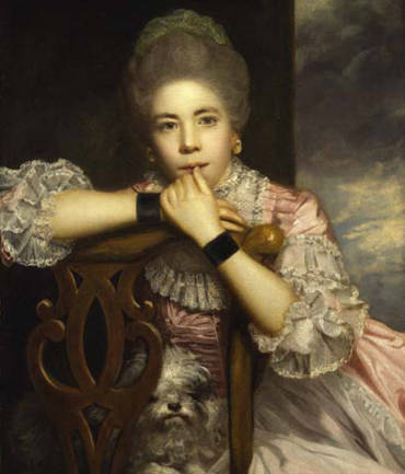
2. The Brown School
Introduction of light and shade, 3D form. The brown tone is a convention that unifies the otherwise jarring contrasts. Joshua Reynolds (above) states that shadows should be brown color. I've heard this referred to as "brown soup." Many of the impressionists reacted against this brownish tone when they went outside and saw a more silvery or variegated light.
But in the credit given to the French Impressionists, other pioneers are often overlooked. The insights and practices of the late 19th century outdoor painters were anticipated decades or even centuries earlier by other artists such as Velazquez and Vermeer, as Speed points out. In the case of Velazquez (below), the colors are fairly quiet and neutral, and it is the organization of value and the handling of edges that contribute to the sense of unified vision.

3. Impressionist School
This is an outgrowth of the optical science of the nineteenth century. One of the key ideas is the dissociation of apparent color from the local color of surfaces.
Another set of ideas had to do with the science of vision, and the recognition that color is a phenomenon of perception as much as it is something external. Goethe was a pioneer in this.
 |
| Johann Wilhelm Schirmer, 1836 (Dusseldorf School) |
In the realm of landscape, I would also add that early outdoor painters in Italy, Germany, Scandinavia, England, and America preceded many of the color innovations of the more famous French Impressionists.
 |
| Painting by Harold Speed |
Speed points out the problem of putting a figure that is lit with indoor studio light into an outdoor background setting. (I don't have a good example of this offhand....any suggestions?)
 |
| Childe Hassam |
This is a topic that I've discussed in a previous series:
Part 2: Mixing your own black
Part 3: Using black in a painting
Part 4: Is Black a color?
Speed's coverage of it is nuanced, warning of the dangers of the "fruit salad" coloring, but also reminding us of the power of darkness and shadow, which was sometimes lost in impressionist coloring.
 Next week—Chapter 8: Colour: Practical
-----
In its original edition, the book is called "The Science and Practice of Oil Painting ." Unfortunately it's not available in a free edition, but there's an inexpensive print edition that Dover publishes under a different title "Oil Painting Techniques and Materials
 (with a Sargent cover)," and there's also a Kindle edition.
Get my book "Color and Light" signed from my website or from Amazon .
.
----Get my book "Color and Light" signed from my website or from Amazon
GurneyJourney YouTube channel
My Public Facebook page
GurneyJourney on Pinterest
JamesGurney Art on Instagram
@GurneyJourney on Twitter
8 comments:
As for putting a model lit with indoor light into a scene of a landscape: Courbet and Corot did this, among the first to go outside and do the landscape from direct observation in some medium before returning to the studio. Degas probably also did this, even more convincingly. late in his life, Renoir tried to firm up his drawing of the nude but retained the Impressionist palette and brushwork for the landscape around and behind the figures (not as successfully as Degas). Puvis de Chanvannes is another, but his landscapes look recalled as if from antiquity. Cezanne never used live models, and it shows... though he was trained well and could draw them, he had an inordinate fear and distaste for the actual presence of another person (practically at all), especially a nude.
4. Titian’s Sacred and Profane Love, is a fascinating painting for all of its hidden secrets and symbolism. The lighting has a subtle change, which immediately came to mind when I read that. I also think you can actually see this in the Mona Lisa to a small degree. I am impress that these artist could pull off changing directions of light when needed to fulfill the expression of an idea.
Link- https://www.walksofitaly.com/blog/art-culture/sacred-profane-love-titian-mysteries
1.-2.-3. What approach do you think Speed is most advocating?
4. What immediately came to mind when I read Speed's comment about problems putting a studio generated figure into an outdoor scene was Manet's "Luncheon in the Park."
I think it was in Ross's book "Judgement of Paris" I read that the clothed figures in that painting were at least partially studied outdoors. Of course the nude was entirely in studio. To me she looks as if she's almost floating in the composition rather than sitting on the ground, I suppose in part because she's as light as a ghost!
Weren't Bouguereau's peasant girls painted with studio light but set in outdoor settings?
I like that Speed defends the earth colours ... and black ... a venerable group of pigments.
I just keep on looking at the painting by Harold Speed: Never saw it before.
Fascinating.
He really got the colors right between the shaded and the sun lit parts....
Except the nude:
To me she looks neither shaded, nor really sunlit;-)
The title says this is Chapter 8, but the text is actually about Chapter 7. :) I freaked out thinking I missed on a chapter summary. Thanks for the blog, yet again. :)
Thanks, Jayson, Fixed!
Good eye, Rich!
Robert, yes, now that you mention it, Bouguereau's paintings don't really seem like outdoor light, but that doesn't bother me.
Steven, me too. I think somewhere else in the book, Speed divides them into celestial and terrestrial color, which makes some sense.
Lou, the Luncheon in the Park always struck me as pretty unnatural for a lot of reasons, but I guess that's why it sticks in our minds.
Jim, you mention a lot of good examples. I think Bastien Lepage and Dagnan Bouveret were pioneers in really painting models outdoors.
Post a Comment