Friday, December 31, 2010
Blackberry and Apple
Here, in case you missed it, here’s a BBC skit that literalizes computer metaphors.
Imagine telling N. C. Wyeth that you can do a painting with a magnetized lasso and a rubber stamp tool.
----
Link to YouTube
Labels:
Video
Jewcy's Top Ten
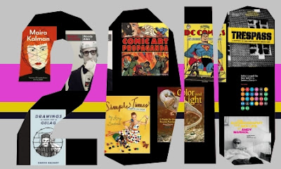
I’m grateful to Margarita Korol of the news and culture website Jewcy.com for picking “Color and Light” as one of the top ten art books of 2010.
--------
Jewcy's Top Ten Art Books
Also, thanks to John Fleskes and to Greg Newbold ("Santa Brought Art Books") for pluggin' the tome.
Color and Light on Amazon internationally: USA | CA | UK | FR | DE | JP
Color and Light signed (and doodled in) by me, from the Dinotopia Store

“It is college. From James Gurney, whose Imaginative Realism fed the hungry brains of fantasy artists internationally, this new book is recession-friendly real world wisdom and poised to become a classic guidebook for the century. If you’ve felt like a failed artist all year, starting twenty eleven well-trained will get you on the right track.”
--------
Jewcy's Top Ten Art Books
Also, thanks to John Fleskes and to Greg Newbold ("Santa Brought Art Books") for pluggin' the tome.
Color and Light on Amazon internationally: USA | CA | UK | FR | DE | JP
Color and Light signed (and doodled in) by me, from the Dinotopia Store
Labels:
Color and Light Book
Thursday, December 30, 2010
A Distraction
Roger Bansemer, a plein air painter and videographer from Florida, contends with a first-rate distraction in this short video.
-------
Roger Bansemer's website
-------
Roger Bansemer's website
Labels:
Plein Air Painting,
Video
Chromatic Adaptation
Have a look at the photo of the dinosaur Bix on the right in the photo below. The colors are split down the middle, with a cyan cast on the left half and a yellowish cast on the right.
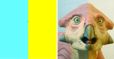
Now stare for 20 seconds at the little “+” on the line between the color fields on the left. (Click on the whole image to make it bigger.)
When you look back at the "+" on the nose of Bix, the color distortions disappear and Bix looks normal, at least for a while.
This is a demonstration of chromatic adaptation, our visual system’s “white balance” control. Whenever the illumination changes in color temperature around us, the sensitivity of our color receptors changes in relative proportion, resulting in a balanced impression of color.
Labels:
Visual Perception
Wednesday, December 29, 2010
Stylelessness
One of the requirements of a backdrop for a museum diorama is that it creates an illusion of real space. If it makes you think of paint on a wall, it’s not working.
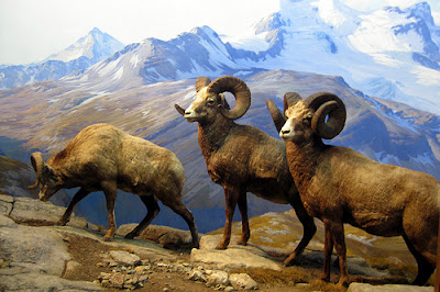
To really succeed, you have to paint a scene without any individual style. Some people call it “painting actuality.” It’s carefully composed, but composed to be artless, that is, it doesn’t make you conscious of the means it took to produce it. (Above, bighorn sheep diorama in New York, with background byJames Perry Wilson correction: Belmore Brown.)
Carl Akeley, who helped develop the art of the diorama to its highest level at the American Museum of Natural History in New York, put it this way:
William R. Leigh, one of the backdrop painters for the AMNH said painting backdrops "calls for the utmost measure of truth; there is in it no place for individuality."
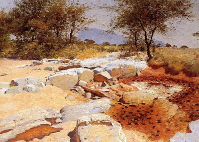
Leigh did brilliant studies in Africa (above) as preparation for his diorama paintings. But great as he was as a painter, some of his backdrops were criticized for their distracting style. Trained in Germany in the Dusseldorf tradition, he had a hard time getting rid of the very theatrical lighting, brushwork, and unnatural colors that served him well as an easel painter. The backdrop below is by W.R. Leigh.
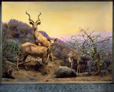
The person who fit into the role perfectly was James Perry Wilson, who I’ve mentioned a few times before in other contexts. Wilson came from a background in architectural illustration, and was largely self-taught. He first worked at the museum assisting Leigh, who was 20 years older. Wilson learned the craft, and then applied his own intellect to the unique challenges of the art form.
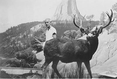
Wilson (above) was a slow painter and a bit aloof in his personality. The detailed story of what he went through to navigate the museum politics is told in the latest chapter of Wilson’s life by online biography.
This chapter is no ordinary blog post. Wilson’s story is being written by the Peabody Museum’s own Michael Anderson, who originally planned it for a book, but is publishing it online instead, chapter by chapter.
---------
Wilson Biography, Chapter 5: Joining the American Museum of Natural History (scroll halfway down for the discussion of stylelessness).
Quote is from W. R. Leigh, Frontiers of Enchantment. 1939, p.49.
The big book on the AMNH diorama is Windows on Nature by Stephen Quinn
Previously on GJ: "James Perry Wilson's Dioramas"

To really succeed, you have to paint a scene without any individual style. Some people call it “painting actuality.” It’s carefully composed, but composed to be artless, that is, it doesn’t make you conscious of the means it took to produce it. (Above, bighorn sheep diorama in New York, with background by
Carl Akeley, who helped develop the art of the diorama to its highest level at the American Museum of Natural History in New York, put it this way:
"The landscape painter who has cultivated a style or manner is not any good…the painted background must display a complete unity with the mounted animals. The painter must make the beholder forget that he is looking at paint, and feel that he is looking at nature itself. The artist must forget himself in his work. We must set the standard to which others will have to rise."
William R. Leigh, one of the backdrop painters for the AMNH said painting backdrops "calls for the utmost measure of truth; there is in it no place for individuality."

Leigh did brilliant studies in Africa (above) as preparation for his diorama paintings. But great as he was as a painter, some of his backdrops were criticized for their distracting style. Trained in Germany in the Dusseldorf tradition, he had a hard time getting rid of the very theatrical lighting, brushwork, and unnatural colors that served him well as an easel painter. The backdrop below is by W.R. Leigh.

The person who fit into the role perfectly was James Perry Wilson, who I’ve mentioned a few times before in other contexts. Wilson came from a background in architectural illustration, and was largely self-taught. He first worked at the museum assisting Leigh, who was 20 years older. Wilson learned the craft, and then applied his own intellect to the unique challenges of the art form.

Wilson (above) was a slow painter and a bit aloof in his personality. The detailed story of what he went through to navigate the museum politics is told in the latest chapter of Wilson’s life by online biography.
This chapter is no ordinary blog post. Wilson’s story is being written by the Peabody Museum’s own Michael Anderson, who originally planned it for a book, but is publishing it online instead, chapter by chapter.
---------
Wilson Biography, Chapter 5: Joining the American Museum of Natural History (scroll halfway down for the discussion of stylelessness).
Quote is from W. R. Leigh, Frontiers of Enchantment. 1939, p.49.
The big book on the AMNH diorama is Windows on Nature by Stephen Quinn
Previously on GJ: "James Perry Wilson's Dioramas"
Labels:
Paint Technique
Tuesday, December 28, 2010
Bama’s Monsters
When James Bama was a six years old, he went to see the classic Universal monster movies: Wolfman, Frankenstein and Dracula. “They were seriously done and beautifully crafted,” Bama said. He was so scared afterward that he had to sleep in his mother’s bed.
When he later became a professional illustrator, he got the the assignment to illustrate the plastic model box covers. He used movie stills as reference for Frankenstein, the Wolfman, and Dracula.
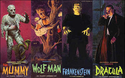
But parents complained that the actual plastic models didn’t live up to the painted covers. So starting with the Mummy, he worked instead from reference photos of the completed models. Despite the truth in advertising, the painting based on the actual model might not be quite as successful at presenting the fantasy.
In all, Bama did 23 model covers, contributing to the Baby Boomer’s monster craze of the 1960s.
------
Images from:
Monster Kid
Full story and large color reproductions in: James Bama, American Realist, published by Flesk Publications.
When he later became a professional illustrator, he got the the assignment to illustrate the plastic model box covers. He used movie stills as reference for Frankenstein, the Wolfman, and Dracula.

But parents complained that the actual plastic models didn’t live up to the painted covers. So starting with the Mummy, he worked instead from reference photos of the completed models. Despite the truth in advertising, the painting based on the actual model might not be quite as successful at presenting the fantasy.
In all, Bama did 23 model covers, contributing to the Baby Boomer’s monster craze of the 1960s.
------
Images from:
Monster Kid
Full story and large color reproductions in: James Bama, American Realist, published by Flesk Publications.
Labels:
Golden Age Illustration
Monday, December 27, 2010
Posing in the Picture-Show
In 1922, Punch magazine published the following E.H. Shepard cartoon:
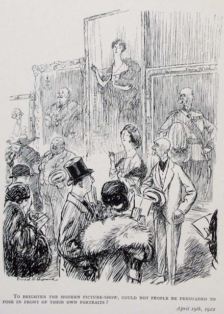
“To brighten the modern picture-show, could not people be persuaded to pose in front of their own portraits?”

“To brighten the modern picture-show, could not people be persuaded to pose in front of their own portraits?”
Labels:
Comics/Cartooning,
Portraits
Pester Your Teachers
If you know who David Briggs is, you’ll know why I’m elecrified to read his review of Color and Light: A Guide for the Realist Painter.

David Briggs is none other than the mastermind behind the website “Dimensions of Color.” It’s one of the best resources on light and color on the Internet. I owe much of what I’ve learned on the topic to Mr. Briggs. For example, check out his analysis of "The Basics of Light and Shade/ Specular and Diffuse Reflection."
Along with his review of the book on a Concept Art forum, Mr. Briggs also offers a long list of links to free PDF versions of the out-of-print books listed in my bibliography.
---------
David Briggs Color and Light review on ConceptArt
The Dimensions of Color (huevaluechroma.com)
Color and Light on Amazon internationally: USA | CA | UK | FR | DE | JP
Color and Light signed (and doodled in) by me, from the Dinotopia Store

“ Any single book on this subject can only be an introduction, but what an introduction this is! The book is very generously illustrated with his own works, plus those of many of his favourite past masters. These images fully justify their place by showing us what it is possible to achieve, especially from the imagination, by those who are willing to go beyond a simplistic approach to ‘colour theory.’
“...I'm quite certain that Color and Light will mark the beginning of the end for the simplistic approach to color that still predominates in art teaching. If you are an art or design student, get this book, study it, and then pester your teachers ceaselessly until THEY study it.”
David Briggs is none other than the mastermind behind the website “Dimensions of Color.” It’s one of the best resources on light and color on the Internet. I owe much of what I’ve learned on the topic to Mr. Briggs. For example, check out his analysis of "The Basics of Light and Shade/ Specular and Diffuse Reflection."
Along with his review of the book on a Concept Art forum, Mr. Briggs also offers a long list of links to free PDF versions of the out-of-print books listed in my bibliography.
---------
David Briggs Color and Light review on ConceptArt
The Dimensions of Color (huevaluechroma.com)
Color and Light on Amazon internationally: USA | CA | UK | FR | DE | JP
Color and Light signed (and doodled in) by me, from the Dinotopia Store
Labels:
Color and Light Book
Saturday, December 25, 2010
Christmas Donkeys
We took a walk to the farm to see Joy, the donkey who was born exactly one year ago.
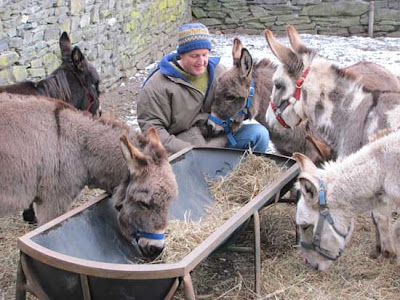
That’s Joy, the dark brown one one behind on the left. Lenny was asked to care for eight other donkeys temporarily. He needs to find homes for them because their owner died unexpectedly.
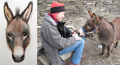
I don’t even know the name of this donkey, but she was very friendly, nibbling on my fingers (and the sketchbook) as I did her portrait. Handsome, the barn cat, curled up on my lap and swung his tail across the drawing.
-----
Previously on GJ:
Christmas Surprise (birth of Joy)
Joy in the Farmyard (one week old)
Donkey Portrait (Peanut)

That’s Joy, the dark brown one one behind on the left. Lenny was asked to care for eight other donkeys temporarily. He needs to find homes for them because their owner died unexpectedly.

I don’t even know the name of this donkey, but she was very friendly, nibbling on my fingers (and the sketchbook) as I did her portrait. Handsome, the barn cat, curled up on my lap and swung his tail across the drawing.
-----
Previously on GJ:
Christmas Surprise (birth of Joy)
Joy in the Farmyard (one week old)
Donkey Portrait (Peanut)
Labels:
Animals,
Pencil Sketching
Flash Mob Performs Messiah
I don’t know what would be more inspiring: to be one of the singers popping up in the mall food court, or one of the bedazzled onlookers, surprised by glory?
Direct link to YouTube video
Thanks, Bob
Direct link to YouTube video
Thanks, Bob
Friday, December 24, 2010
Suitcase Santas
Best wishes to all who are traveling today. Right now some of you are waiting in airports, driving on busy roads, or standing on train platforms.
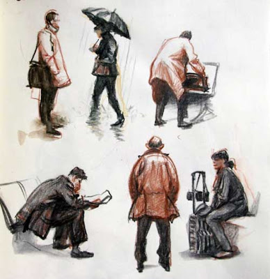
To all of you suitcase Santas, safe journeys, and may the season bring you closer to those you love.

To all of you suitcase Santas, safe journeys, and may the season bring you closer to those you love.
Labels:
Pencil Sketching
Thursday, December 23, 2010
Parka Blogs Contest
The art-book review blog Parka Blogs is asking readers to comment on their favorite art books of 2010.

I’m excited to know that Color and Light is in the running with splendid books like The Art of How to Train Your Dragon, Framed Ink, and Cover Run by Adam Hughes. On Parka Blogs, there are also reviews and video flip-throughs of most of these books.
Winners of the contest will receive a free gift of two books of their choice.
----
Parka Blogs Contest
On Amazon: The Art of How to Train Your Dragon
Framed Ink
Cover Run
Art of Tangled
Art of Drew Struzan
Icons by Jim Lee
Avatar the Last Airbender
Art of Uncharted
Dofus 2.0 Artbook
Color and Light on Amazon internationally: USA | CA | UK | FR | DE | JP
Color and Light signed (and doodled in) by me, from the Dinotopia Store
Labels:
Color and Light Book
Wednesday, December 22, 2010
How to Make a House Fly
Remember the little drawing I did a couple years ago of the science fiction museum in Switzerland taking off and flying? It's also on page 213 of Imaginative Realism.
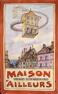
Friends of Maison d'Ailleurs have made a video showing how it's done. It proves what's possible with a small budget and a big imagination.
------
Link to YouTube video
Maison d'Ailleurs, museum of science fiction and utopias in Yverdon, Switzerland
Imaginative Realism at Amazon
2008 GJ post on opening of Verne Museum and Dinotopia Exhibition
Labels:
Video
Step-by-Step Satire
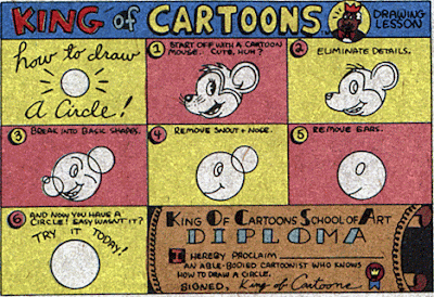
How to draw a circle.
How to draw an owl. Step 1. Draw some circles. Step 2. Draw the rest of the #%@** owl.
---------
Mouse / Circle from PeeWee's PlayhouseOwl from Car Design Fetish
Thanks, Matt Connery!
Labels:
Comics/Cartooning
Tuesday, December 21, 2010
Action Figures in Action
A couple of action figures glued to the saddle of a homemade Deinocheirus filled the bill for helping imagine an olympic event in Dinotopia.
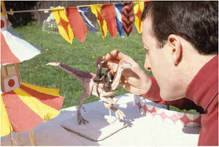
I also built a maquette of the pagodas, made from wire, dowel rods, and tissue paper. I discarded the paper pagodas after the photo shoot, but by then they had served their purpose.
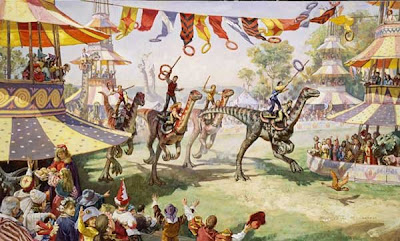
Here's the finished painting, which is currently on exhibit, along with the dinosaur maquette (and the little action figures) at the Berkshire Museum in Pittsfield, Massachusetts, through Jan. 2.
In addition, the show of children's book art has two original paintings from Norman Rockwell's "Willie Was Different," original art by Tasha Tudor, and more.
--------------
The Berkshire Museum's Festival of Trees through January 2
This process is documented in Imaginative Realism: A Guide for the Realist Painter. (Available at Amazon, or signed at the Dinotopia Store)
Previously: Backyard Posing Party

I also built a maquette of the pagodas, made from wire, dowel rods, and tissue paper. I discarded the paper pagodas after the photo shoot, but by then they had served their purpose.

Here's the finished painting, which is currently on exhibit, along with the dinosaur maquette (and the little action figures) at the Berkshire Museum in Pittsfield, Massachusetts, through Jan. 2.
In addition, the show of children's book art has two original paintings from Norman Rockwell's "Willie Was Different," original art by Tasha Tudor, and more.
--------------
The Berkshire Museum's Festival of Trees through January 2
This process is documented in Imaginative Realism: A Guide for the Realist Painter. (Available at Amazon, or signed at the Dinotopia Store)
Previously: Backyard Posing Party
Labels:
Dinotopia,
Imaginative Realism,
Miniatures
Monday, December 20, 2010
Imagining Flower Fairies
When Cicely Mary Barker (1895-1973) moved into a Victorian house in south London, she had a studio built out back in the garden. Meanwhile her sister ran a kindergarten in one of the rooms of the house.
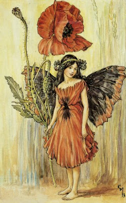
The kindergarten provided a steady supply of child models for Barker’s Flower Fairy characters. The children wore costumes that were stored in a trunk in the studio. Barker made the fairy wings from twigs and gauze, taking the elements apart after each picture to be recycled into future costumes.
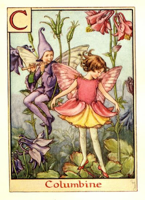
All of her fairies were based on specific kinds of flowers. The plants were painted from observation in her own garden and from the botanical collection at Kew Gardens.
------
Complete Book of the Flower Fairies, at Amazon, published by Warne.
Photo of CMB and more complete bio at “Through The Looking Glass Children’s Book Reviews”
Labels:
Golden Age Illustration,
Models Posing
Sunday, December 19, 2010
Blended-Stroke Method
In a 1956 article in American Artist, Harry Anderson described how he used an uncommon practice in gouache painting.
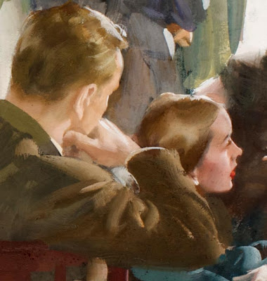
He said he used “two different colors on a single bristle brush in painting objects whose color might run from light to dark—as on a cylinder. First I load the brush with the lighter hue and then with a section of the brush I pick up the darker paint so that, when the stroke is made, very interesting accidentals result.”
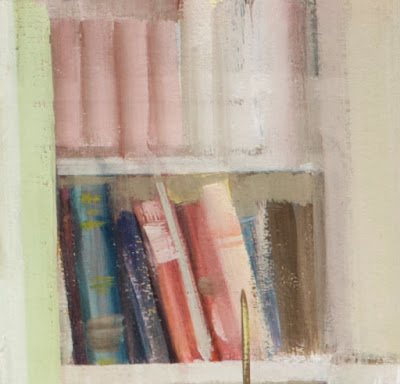
“This works very well on small objects,” Anderson says. You can see Anderson’s blended-stroke method in the rendering of the bookcase, where each book’s spine was made with a minimum of strokes.
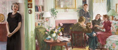
These enlarged details are from the painting “The Widow,” which appears as a double-page spread on page 10-11 of Color and Light: A Guide for the Realist Painter.
--------
Quotes from: “Harry Anderson Discusses his Painting in Tempera,” American Artist, May, 1956. (“Gouache,” “tempera,” and “opaque watercolor” are all roughly the same thing.)
Color and Light on Amazon internationally: USA | CA | UK | FR | DE | JP
Color and Light signed (and doodled in) by me, from the Dinotopia Store

He said he used “two different colors on a single bristle brush in painting objects whose color might run from light to dark—as on a cylinder. First I load the brush with the lighter hue and then with a section of the brush I pick up the darker paint so that, when the stroke is made, very interesting accidentals result.”

“This works very well on small objects,” Anderson says. You can see Anderson’s blended-stroke method in the rendering of the bookcase, where each book’s spine was made with a minimum of strokes.

These enlarged details are from the painting “The Widow,” which appears as a double-page spread on page 10-11 of Color and Light: A Guide for the Realist Painter.
--------
Quotes from: “Harry Anderson Discusses his Painting in Tempera,” American Artist, May, 1956. (“Gouache,” “tempera,” and “opaque watercolor” are all roughly the same thing.)
Color and Light on Amazon internationally: USA | CA | UK | FR | DE | JP
Color and Light signed (and doodled in) by me, from the Dinotopia Store
Labels:
Color and Light Book,
Paint Technique
Saturday, December 18, 2010
Painting a Plane
If you thought painting a canvas or a mural was a big job, how about painting a jet? This time-lapse video shows all the prepping, spraying and frisketing involved.
It takes more than 50 gallons of paint to cover a commercial jet, and that layer adds about 400 pounds to the weight.
Some airlines have chosen a brushed aluminum finish to save on the weight and increase efficiency.
------
Direct link to the Virgin Atlantic video.
A different time lapse video, painting a Delta jet using cherry pickers instead of scaffolding.
Via Best of YouTube
Labels:
Rabbit Trails
Friday, December 17, 2010
Icy Blockhead
Sometimes when I think too much about art, my head overheats.
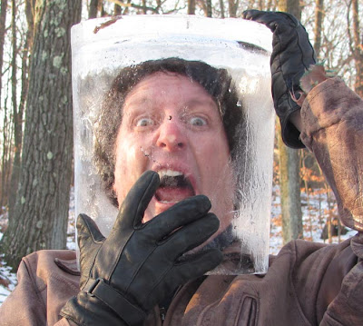
When that happens I just freeze it in a block of ice to cool off.

When that happens I just freeze it in a block of ice to cool off.
Labels:
Rabbit Trails
Thursday, December 16, 2010
Texture on the Moon Man
When an object is lit by direct sunlight, the texture is not equally prominent throughout the form. The texture in the shadow should not just be a darker version of the texture in the light, because that’s not how the eye sees it.
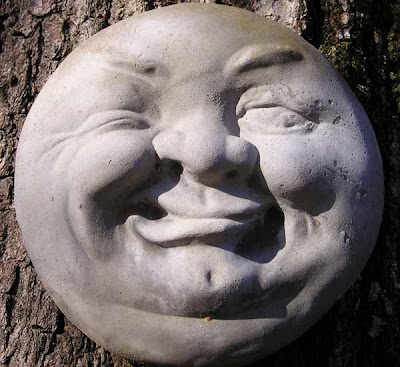
This concrete moon-face is a good example. The texture is very difficult to see at all in the shadow region. It’s also not terribly prominent in the fully lit areas of lighter halftone, such as the forehead and the left hand edge of the form.
What you tend to see in those light halftones are variations in local color--in other words, freckles rather than pores.
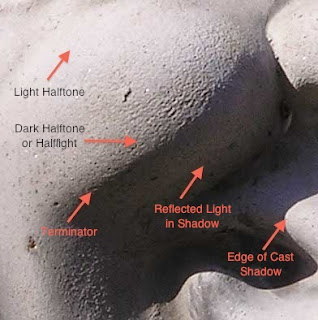
The place where you really see the texture is in the darker halftone, just before the terminator divides the light side from the shadow side. In this moon man it appears in the cheeks, the tip of the nose, the lower lip, and the chin. This region is sometimes called the halflight, an area of raking light where any bumps in the surface stand out dramatically.
-------
This example amplifies the discussion on page 46 of the Color and Light: A Guide for the Realist Painter.
Previous GJ Posts: Texture in the Halflight and Light and Form (The Form Principle)
Color and Light on Amazon internationally: USA | CA | UK | FR | DE | JP
Color and Light signed (and doodled in) by me, from the Dinotopia Store

This concrete moon-face is a good example. The texture is very difficult to see at all in the shadow region. It’s also not terribly prominent in the fully lit areas of lighter halftone, such as the forehead and the left hand edge of the form.
What you tend to see in those light halftones are variations in local color--in other words, freckles rather than pores.

The place where you really see the texture is in the darker halftone, just before the terminator divides the light side from the shadow side. In this moon man it appears in the cheeks, the tip of the nose, the lower lip, and the chin. This region is sometimes called the halflight, an area of raking light where any bumps in the surface stand out dramatically.
-------
This example amplifies the discussion on page 46 of the Color and Light: A Guide for the Realist Painter.
Previous GJ Posts: Texture in the Halflight and Light and Form (The Form Principle)
Color and Light on Amazon internationally: USA | CA | UK | FR | DE | JP
Color and Light signed (and doodled in) by me, from the Dinotopia Store
Labels:
Lighting
Wednesday, December 15, 2010
Fearlessness
Here are some wise words from the landscape painter Birge Harrison, about 100 years ago.
But what is fearlessness in painting? Is it the same as courage? It is the opposite of timidity? What fears must each of us overcome? The fear of starting, of finishing, of failing, of not selling?
One thing I tell myself is that I can’t get hurt if I try something bold or different. So what if it doesn’t work out? I won’t sprain a finger. I might just wreck a piece of paper.
Fearlessness comes to mind when I’m working in pen and ink or watercolor. These two media require absolute commitment, or conviction as Harrison might call it. I also think about fearlessness when I’m embarking on a composition, to urge myself to avoid playing it safe--to push things to extremes.
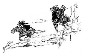
Maybe fearlessness is really another word for letting loose that wild impulse, the artistic imp. We all have it, and it has to be let out of the cage more often, especially if the judicious, analytic part of us is the one usually holding the pencil. But fearlessness isn’t the same as recklessness. Both chaos and control must be at work together.
-------
The excerpt is from Landscape Painting by Birge Harrison, 1910, available as a free PDF on Google Books.
Drawing by J.C. Coll. More about Coll at BPIB.
But what is fearlessness in painting? Is it the same as courage? It is the opposite of timidity? What fears must each of us overcome? The fear of starting, of finishing, of failing, of not selling?
One thing I tell myself is that I can’t get hurt if I try something bold or different. So what if it doesn’t work out? I won’t sprain a finger. I might just wreck a piece of paper.
Fearlessness comes to mind when I’m working in pen and ink or watercolor. These two media require absolute commitment, or conviction as Harrison might call it. I also think about fearlessness when I’m embarking on a composition, to urge myself to avoid playing it safe--to push things to extremes.

Maybe fearlessness is really another word for letting loose that wild impulse, the artistic imp. We all have it, and it has to be let out of the cage more often, especially if the judicious, analytic part of us is the one usually holding the pencil. But fearlessness isn’t the same as recklessness. Both chaos and control must be at work together.
-------
The excerpt is from Landscape Painting by Birge Harrison, 1910, available as a free PDF on Google Books.
Drawing by J.C. Coll. More about Coll at BPIB.
Labels:
Golden Age Illustration,
Pen and Ink
Tuesday, December 14, 2010
Animals in Perspective
Perspective doesn’t apply just to architecture. Everything follows its laws, including people and animals. Some perspective teachers suggest drawing a box around an animal, and that’s a good idea.
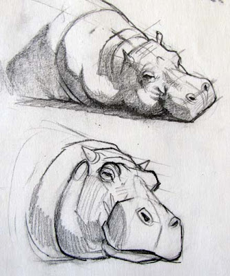
An even simpler idea is to draw a set of lines across the form of any animal or person. It’s a quick way check the placement of all the features. If they’re out of position, you’ll know right away.
In these zoo sketches of a hippo, each head has a set of parallel lines to make sure the ears, eyes, and nostrils are kept in their proper relationship. In the top sketch, I’ve also lightly drawn the center line of the form. I tried to simplify the lighting by massing the shadow as a light, uniform tone.
In the lower sketch, I simplified the forms a bit (note the spherical forms around the eyes). The shading lines follow the cross-section contours, which helps even more to describe the form.
Labels:
Animals,
Perspective
Monday, December 13, 2010
Growing Up With Art
What is it like to raise kids in an artist’s studio? I’ll share our experience, then I’d love to hear yours.
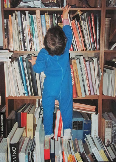
We’ve always had the studio as part of the home, which meant having our kids coming and going while I’ve been painting. Whenever I really needed to concentrate, I had to learn how to say, “I’m sorry, I can’t answer you right now,” rather than just acting grumpy.
We didn’t child-proof the studio, yet somehow our kids never got into trouble with the sharp tools, ink bottles, and oil paint. They had their own art supplies that they could use.
To give them something to do during the long painting hours, we had a huge tray of Legos in the middle of the floor. I felt lucky to have my kids around when they were growing up.
But sometimes, when clients called, I had a hard time making my studio sound like a serious place--I remember once I was on the phone with a paleontologist who stopped to ask about the squeak toy that he heard in the background.
I don’t think my kids regarded a dad who draws dinosaurs as anything special. One time my son had a friend over. I heard the friend say in a stage whisper, “Does your dad have a job?”
No, my son replied. “He just stays home and draws dinosaurs all day.”
I’d be interested in your experience, either as an artist-parent or as a person who grew up around art.
Saturday, December 11, 2010
Making-A-Mark Review
Thanks to Katherine Tyrell of "Making a Mark" for the generous review of Color and Light: A Guide for the Realist Painter.
----------
Making-a-Mark review "Color and Light" http://makingamarkreviews.blogspot.com/2010/12/book-review-color-and-light-by-james.html
Also, don't miss Making a Mark's:
Resources on selling and shipping art
Art product reviews
Blogging tips and reviews
Color and Light on Amazon internationally: USA | CA | UK | FR | DE | JP
Color and Light on Barnes & Noble.com
Color and Light on IndieBound (Independent booksellers)
Color and Light signed (and doodled in) by me, from the Dinotopia Store
Labels:
Color and Light Book
Youth and Age
The bus ride from downtown Florence to the airport takes twenty minutes.
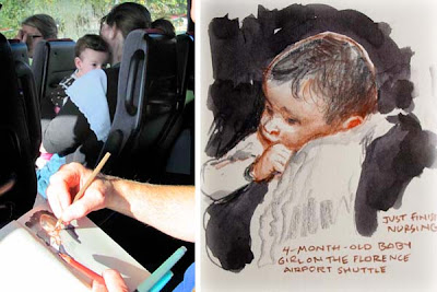
Across from me, a mother tenderly holds her four-month-old baby girl. The baby rests on her mother’s shoulder. The little girl lifts her head from time to time, enjoying the feeling of balancing as the bus moves.
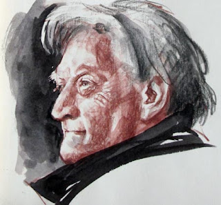
A man stands on the bus, looking out a window. His eyes scan the traffic. He glances at the people around him and smiles at the baby. He has taken a long journey inside his skin and bones since his mother held him on her shoulder.

Across from me, a mother tenderly holds her four-month-old baby girl. The baby rests on her mother’s shoulder. The little girl lifts her head from time to time, enjoying the feeling of balancing as the bus moves.

A man stands on the bus, looking out a window. His eyes scan the traffic. He glances at the people around him and smiles at the baby. He has taken a long journey inside his skin and bones since his mother held him on her shoulder.
Labels:
Pencil Sketching,
Portraits
Plein Air at North Bennington
On view through December 31 in the Center Gallery of the Bennington Museum in Vermont is an exhibit of eight paintings from the North Bennington Plein Air Quick Draw Competition, including "Powers Market" and "1938 Buick."
--------
Museum press release
North Bennington Plein Air Compeition
Previously on GJ: Powers Market, and Quick Draw painting of 1938 Buick
--------
Museum press release
North Bennington Plein Air Compeition
Previously on GJ: Powers Market, and Quick Draw painting of 1938 Buick
Labels:
Museum Visits,
Plein Air Painting
Friday, December 10, 2010
Underbelly Project
Is it still art if no one can see it?
That’s one of the philosophical questions posed by the Underbelly Project, where graffiti artists collaborated to decorate an inaccessible subway platform hidden beneath New York City.
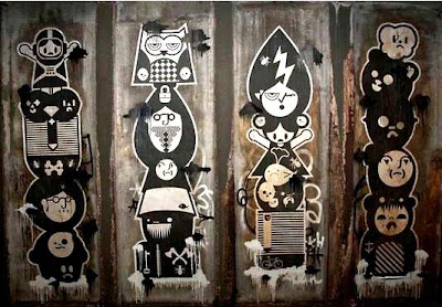
Getting there involved crossing over hot third rails and risking arrest. The organizers have kept the location a secret. After the artists finished their work, they closed it off again, and at the moment no one from the general public can get back down there.
Luckily the artists took some photos, so we can see the art from the comfort of our computers.
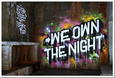
The notion of inaccessible art isn’t new. Many of the painted caves of Lascaux and Altamira were never easy to get to. Some of the Taino carvings I’ve seen in caves in Puerto Rico involve an underground traverse over a mile and swimming across underground lakes. And many ancient cultures with a belief in the eyes of spirits have created elaborate painted tombs, sealed off to the living.
---------
Previously: Camuy Cave Exploration.
Read and see more about the Underbelly Project at the following links:
Second Avenue Sagas
Street Spot Blog
New York Times
Thanks, Frank.
That’s one of the philosophical questions posed by the Underbelly Project, where graffiti artists collaborated to decorate an inaccessible subway platform hidden beneath New York City.

Getting there involved crossing over hot third rails and risking arrest. The organizers have kept the location a secret. After the artists finished their work, they closed it off again, and at the moment no one from the general public can get back down there.
Luckily the artists took some photos, so we can see the art from the comfort of our computers.

The notion of inaccessible art isn’t new. Many of the painted caves of Lascaux and Altamira were never easy to get to. Some of the Taino carvings I’ve seen in caves in Puerto Rico involve an underground traverse over a mile and swimming across underground lakes. And many ancient cultures with a belief in the eyes of spirits have created elaborate painted tombs, sealed off to the living.
---------
Previously: Camuy Cave Exploration.
Read and see more about the Underbelly Project at the following links:
Second Avenue Sagas
Street Spot Blog
New York Times
Thanks, Frank.
Labels:
Rabbit Trails
Thursday, December 9, 2010
Jacob’s Questions
I’m not usually able to answer art-related questions that are emailed to me offline—there just isn’t time. But once in a while, I can tell someone has really been grappling with a challenge. He or she has read the books and blog material, and they still have some interesting questions that others might relate to.
So here are the questions of Jacob Cook, a high school student, along with my answers. And I’ll bet you get more answers and resources in the comments.
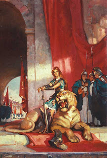 1. I know from your books and your blog that you make use of photographic reference in your large-scale paintings that involve humans - for example, this type of painting: "Warrior Woman." But of course, that's not the whole story - to make a painting like that requires that you place the figures in an invented space, and do it convincingly. How do you approach that task? How do you give your figures a sense of weight and dimensionality within a scene?
The key to making multi-figure scenes is to practice drawing compositions from imagination and observation, so that when you need to create a large-scale painting, you can take it pretty far entirely out of your head. After you’ve done that, you can call in the models and use photography if you want. (“Warrior Woman” was done from life studies but no photography.) Either way, let your imaginative idea guide the process.
Getting weight in figures comes from thinking about the force of gravity when you do your figure drawing. Take the pose yourself, and you’ll know things you miss when just looking at it. Dimensionality comes from a solid understanding of perspective, form modeling, and optics.
2. How much anatomical knowledge do you possess? Do you have what could be called a working knowledge of the body, or have you learned about the body at a deeper level, like the names of the bones and muscles? I ask because I'm getting to be very interested in the technical details of the human body. I've been filling sketchbooks with studies of the skeleto-muscular system, and I even bought a life-sized model skeleton to study from. I'm wondering how much of that sort of thing you've done.
I’m not really an expert on anatomy compared to some of my friends. But when I was a student I went through the standard figure texts: especially Bridgman, Peck, Vanderpoel, and Loomis. I copied a lot of the plates and learning the names of the major bones and muscles. Doing copies is a good path to understanding. The next level is to sculpt a figure from the skeleton outward, muscle by muscle. Some of the academies, such as Grand Central Academy, offer such training, and that way the knowledge really gets into your hands.
I was like you as an art student. I bought a miniature plastic skeleton, a real human skull, and a bunch of plaster casts. I also recommend purchasing a couple good ecorché figures and placing them near you in your studio when you’re puzzled over something.
3. If you're making a quick sketch of a human figure, which elements do you make sure to draw first? Which parts of the figure are essential in conveying the action of the pose? Is it the head and spine? The ribcage and pelvis? Some combination, or something I haven't thought of? Is this even the right question to be asking?
Yes, it’s definitely the right question, but I don’t think there’s a hard and fast answer to any these questions, and I don’t follow any single system, because sometimes I try to think like an animator, sometimes like a painter, and sometimes like a caricaturist. Different schools of the figure will give you different approaches, and I think you should learn them all.
Some schools concentrate on the movements of the spine and skeletal frame, others look for rhythmic gesture lines running through the whole pose, others look for contours which sweep inside the form and pick up other contours. A painter who thinks primarily tonally will look for movement and linking of tonal shapes first and foremost. If there’s a general principle, it’s to start with the big and the simple, and progress toward the smaller details.
4. In the People chapter of Imaginative Realism, you show examples of preliminary life drawings next to the finished product. But they're never exactly the same; some limb is in a different place, or the head is turned a different way. What does it take to do that with confidence? Knowledge of anatomy? Prior experience drawing such poses?
The figure studies in that chapter are works in progress--that’s why they’re not overly finished. They’re like a rough draft. You can’t get married to any idea at that stage. Often when it comes to placing a figure into the final composition, there will be a problem with how the figure overlaps with another element in the scene. Sometimes you might simplify the drapery or you might exaggerate the pose a bit more. Everything gets changed and revised all the way to the finish. Drawing the figure as a means to an end rather than an end in itself is incredibly liberating. It gives a drive and a purpose to figure drawing that guides all of your choices.
Great questions, Jacob. They show a lot of thought on your part, and I wish you well.
---------
Previously: Ecorche,
Anatomy of the Ear
On Amazon: Vanderpoel, Loomis, Peck, Bridgman
So here are the questions of Jacob Cook, a high school student, along with my answers. And I’ll bet you get more answers and resources in the comments.
 1. I know from your books and your blog that you make use of photographic reference in your large-scale paintings that involve humans - for example, this type of painting: "Warrior Woman." But of course, that's not the whole story - to make a painting like that requires that you place the figures in an invented space, and do it convincingly. How do you approach that task? How do you give your figures a sense of weight and dimensionality within a scene?
The key to making multi-figure scenes is to practice drawing compositions from imagination and observation, so that when you need to create a large-scale painting, you can take it pretty far entirely out of your head. After you’ve done that, you can call in the models and use photography if you want. (“Warrior Woman” was done from life studies but no photography.) Either way, let your imaginative idea guide the process.
Getting weight in figures comes from thinking about the force of gravity when you do your figure drawing. Take the pose yourself, and you’ll know things you miss when just looking at it. Dimensionality comes from a solid understanding of perspective, form modeling, and optics.
2. How much anatomical knowledge do you possess? Do you have what could be called a working knowledge of the body, or have you learned about the body at a deeper level, like the names of the bones and muscles? I ask because I'm getting to be very interested in the technical details of the human body. I've been filling sketchbooks with studies of the skeleto-muscular system, and I even bought a life-sized model skeleton to study from. I'm wondering how much of that sort of thing you've done.
I’m not really an expert on anatomy compared to some of my friends. But when I was a student I went through the standard figure texts: especially Bridgman, Peck, Vanderpoel, and Loomis. I copied a lot of the plates and learning the names of the major bones and muscles. Doing copies is a good path to understanding. The next level is to sculpt a figure from the skeleton outward, muscle by muscle. Some of the academies, such as Grand Central Academy, offer such training, and that way the knowledge really gets into your hands.
I was like you as an art student. I bought a miniature plastic skeleton, a real human skull, and a bunch of plaster casts. I also recommend purchasing a couple good ecorché figures and placing them near you in your studio when you’re puzzled over something.
3. If you're making a quick sketch of a human figure, which elements do you make sure to draw first? Which parts of the figure are essential in conveying the action of the pose? Is it the head and spine? The ribcage and pelvis? Some combination, or something I haven't thought of? Is this even the right question to be asking?
Yes, it’s definitely the right question, but I don’t think there’s a hard and fast answer to any these questions, and I don’t follow any single system, because sometimes I try to think like an animator, sometimes like a painter, and sometimes like a caricaturist. Different schools of the figure will give you different approaches, and I think you should learn them all.
Some schools concentrate on the movements of the spine and skeletal frame, others look for rhythmic gesture lines running through the whole pose, others look for contours which sweep inside the form and pick up other contours. A painter who thinks primarily tonally will look for movement and linking of tonal shapes first and foremost. If there’s a general principle, it’s to start with the big and the simple, and progress toward the smaller details.
4. In the People chapter of Imaginative Realism, you show examples of preliminary life drawings next to the finished product. But they're never exactly the same; some limb is in a different place, or the head is turned a different way. What does it take to do that with confidence? Knowledge of anatomy? Prior experience drawing such poses?
The figure studies in that chapter are works in progress--that’s why they’re not overly finished. They’re like a rough draft. You can’t get married to any idea at that stage. Often when it comes to placing a figure into the final composition, there will be a problem with how the figure overlaps with another element in the scene. Sometimes you might simplify the drapery or you might exaggerate the pose a bit more. Everything gets changed and revised all the way to the finish. Drawing the figure as a means to an end rather than an end in itself is incredibly liberating. It gives a drive and a purpose to figure drawing that guides all of your choices.
Great questions, Jacob. They show a lot of thought on your part, and I wish you well.
---------
Previously: Ecorche,
Anatomy of the Ear
On Amazon: Vanderpoel, Loomis, Peck, Bridgman
Labels:
Composition,
Figure Drawing,
Preliminary Sketches
Mathematical Doodling
Knot theory meets notebook doodling in this video.
The rapid-fire commentary explains the geometric logic while bemoaning the cluelessness of most contemporary math teaching. The pace of the presentation proves how fast we can digest new information if visuals and words are paired.
"Professional Doodling" via Best of YouTube
The rapid-fire commentary explains the geometric logic while bemoaning the cluelessness of most contemporary math teaching. The pace of the presentation proves how fast we can digest new information if visuals and words are paired.
"Professional Doodling" via Best of YouTube
Labels:
Video
Mort Drucker Video
Stephen Silver has made a documentary about Mad magazine caricaturist Mort Drucker. The teaser does its job. I want to see more!
Teaser on YouTube
Teaser on YouTube
Labels:
Comics/Cartooning,
Pen and Ink
Wednesday, December 8, 2010
Offhand Flourishing
Humans are capable of amazing things when a cool mind is connected to nimble fingers. Here are a couple of mind-boggling examples from YouTube:
World championship yo-yo tricks.
Radio control helicopter aerobatics.
In the art of penmanship, the ultimate showcase of skill is called offhand flourishing. This combination of drawing and calligraphy was a natural outgrowth of decorations in pointed pen lettering. It was created at one shot without much in the way of preliminary drawing, which is where we get the figurative sense of the word “offhand.”

(Click to enlarge the picture above, which is from an 1880 penmanship manual called “Real Penwork Compendium of Penmanship.”)
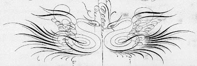
It may not look like anything more than squiggly doodles to the uninitiated, but pictures made from flourishes are incredible difficult. It takes deep practice, good breathing, perfect posture, and a clear mind.
Here’s how master penman W.E. Dennis, in his 1914 book Studies in Pen Art, describes the challenge:
Studies in Pen Art, by W.E. Dennis, available as a free PDF download.
Collection of free PDFs from IAMPETH (International Association of Master Penmen, Engrossers, and Teachers of Handwriting)
World championship yo-yo tricks.
Radio control helicopter aerobatics.
In the art of penmanship, the ultimate showcase of skill is called offhand flourishing. This combination of drawing and calligraphy was a natural outgrowth of decorations in pointed pen lettering. It was created at one shot without much in the way of preliminary drawing, which is where we get the figurative sense of the word “offhand.”

(Click to enlarge the picture above, which is from an 1880 penmanship manual called “Real Penwork Compendium of Penmanship.”)

It may not look like anything more than squiggly doodles to the uninitiated, but pictures made from flourishes are incredible difficult. It takes deep practice, good breathing, perfect posture, and a clear mind.
Here’s how master penman W.E. Dennis, in his 1914 book Studies in Pen Art, describes the challenge:
“It is doubtful if anything in penwork requires more real skill, sureness of stroke, delicacy of touch and absolute freedom of arm and hand than Off-hand Flourishing. Certainly none of the other work in this book offers the technical difficulties found in the flourished designs, the most difficult of all being the two swans facing each other. Lettering is more or less mechanical, but flourishing is quite the opposite. In this work the mind must conceive quickly the arrangement of harmonious, well-balanced curves, and the hand must reproduce them without hesitation. In addition to this, the penman should have in mind some harmonious design, pleasing in effect as a whole.”--------
Studies in Pen Art, by W.E. Dennis, available as a free PDF download.
Collection of free PDFs from IAMPETH (International Association of Master Penmen, Engrossers, and Teachers of Handwriting)
Labels:
Lettering,
Pen and Ink
Tuesday, December 7, 2010
Gumball Machine
Let’s face it: laundromats and oil painting don’t mix. But there I was with my paint kit, a beautiful gumball machine in front of me, and three hours to kill.
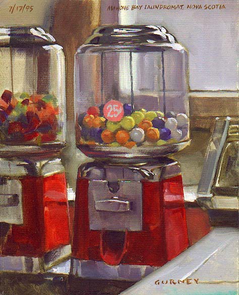
I set up my easel and my folding chair next to a washing machine, which is visible in the right of the painting. I left just enough floorspace for people to squeeze past me with their laundry hampers.
It took a while to draw in all those darned colored gumballs. As I painted them, my worst fear was that someone would actually buy a gumball and mess up the arrangement.
Sure enough, a kid snuck up behind me and jammed a quarter into the slot. He spun the handle before I could say anything. Each time he cranked it, all the gumballs shuffled around inside.
“Hey, my still life!” I protested weakly.
He popped the gumball in his cheek and narrowed his eyes. “What are you doing?” he said, between chews. “You an artist?”
---------
This painting is reproduced full-page in Color and Light: A Guide for the Realist Painter. (in the context of "local color.")
Thanks to Dan Dos Santos of the blog "Muddy Colors" for recommending Color and Light in the Top Ten Art Books of 2010.
By the way, I’ve been filling all your mailed-in orders, and I just want to compliment all of you wives who are giving the book as a gift to your husbands—and vice-versa. That’s really nice of you!
If you mailed in an order and are wondering when it will come, I’ve been turning them around within 24 hours after receiving them. Today I mailed out orders that were postmarked between November 30-Dec.3 and received yesterday.
Labels:
Color and Light Book,
Plein Air Painting
Monday, December 6, 2010
Specular and Diffuse Reflection
In specular reflection, light rays bounce off the surface of an object at the same relative angle that they approached it. In diffuse reflection, light rays bounce off in many directions.

For example, under normal conditions a rooftop has a matte surface which reflects the light diffusely. The rooftops in the painting on the left show diffuse reflection on a dry, sunny day. The sketch on the right shows slate rooftops after a rainstorm. The thin surface of water remaining on the rooftops now reflects the light more specularly.
“Speculum” is Latin for mirror; the rooftops in the second sketch do act more like a mirror, revealing reflections of the dark chimneys.
Many surfaces are a combination of specular and diffuse reflections. When you polish a shoe or an apple, what you’re doing is increasing the relative proportion of specular versus diffuse reflection.
Whether you’re rendering digitally or traditionally, you can think of the specular pattern as a separate layer added on top of the usual form-modeling factors that you would use to render a matte object. In the 3D realm, surface modelers have to consider the normal modeling factors that you would study on a plaster cast plus the specular effects.
---------
More about specular and diffuse reflection on David Briggs' Huevaluechroma.com
Wikipedia on specular reflection
"The Physics Classroom" on the comparison, with diagrams
Previously on GJ: Shadows vs. reflections on water.
Labels:
Color and Light Book,
Plein Air Painting
Sunday, December 5, 2010
Abandoned Icons
These forlorn icons are from the abandoned Six Flags theme park attraction in New Orleans.
--------
From Web Urbanist
Labels:
Rabbit Trails
Crayon Factory
Who knew that the making of colored crayons could be so beautiful?
Thanks, Roberto
Previously on GJ: How Printing Ink is Made
Thanks, Roberto
Previously on GJ: How Printing Ink is Made
Labels:
Color
Saturday, December 4, 2010
Elder Mad Man
Some artists of advanced age might feel that they’re too old to really make a mark in their field. The business belongs to the young, they might think.
Consider the career of Norman Mingo (1896-1980), Mad Magazine’s most celebrated cover artist. A veteran of the World War One, he painted his first Mad cover in 1956 at age 60.
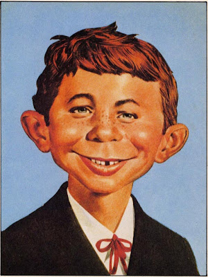
And what a cover! It was the definitive portrait of the cheerful simpleton Alfred E. Neuman. Every Mad artist thereafter has been required to match Mingo’s version, and they agree: no one can top it. The painting sold at auction two years ago for more than 200,000 dollars.
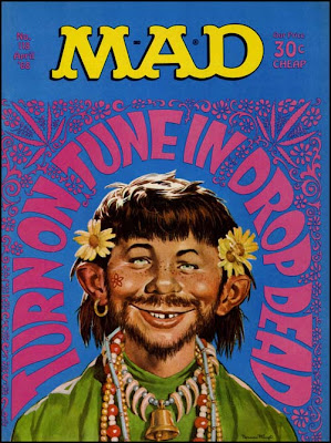
Norman Mingo went on to paint well over a hundred classic covers for Mad, up until his death in 1980. His influence on the current generation of American picturemakers is right up there with Frank Frazetta, Jack Kirby, R. Crumb, Chuck Jones, and Jim Henson.
-------
The book “Mad Art” by Mark Evanier tells the story of Mingo and the other Mad artists.
Norman Mingo on Wikipedia
Consider the career of Norman Mingo (1896-1980), Mad Magazine’s most celebrated cover artist. A veteran of the World War One, he painted his first Mad cover in 1956 at age 60.

And what a cover! It was the definitive portrait of the cheerful simpleton Alfred E. Neuman. Every Mad artist thereafter has been required to match Mingo’s version, and they agree: no one can top it. The painting sold at auction two years ago for more than 200,000 dollars.

Norman Mingo went on to paint well over a hundred classic covers for Mad, up until his death in 1980. His influence on the current generation of American picturemakers is right up there with Frank Frazetta, Jack Kirby, R. Crumb, Chuck Jones, and Jim Henson.
-------
The book “Mad Art” by Mark Evanier tells the story of Mingo and the other Mad artists.
Norman Mingo on Wikipedia
Labels:
Comics/Cartooning,
Portraits
Friday, December 3, 2010
Peeling Paint Letters
Note how the letter shapes of “SELLES sur CHER” alter as the thin blue material shrinks.
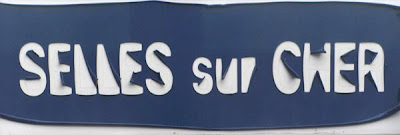
Starting with the small peninsula-shapes, it delaminates and curls back. There’s a faint line remaining at the original boundaries of the letters. It would be fun to design a type face using this idea.

Starting with the small peninsula-shapes, it delaminates and curls back. There’s a faint line remaining at the original boundaries of the letters. It would be fun to design a type face using this idea.
Labels:
Lettering
Thursday, December 2, 2010
Shrunkenheadman Club
Someone spilled paint on a stool in an art school in San Jose, California.
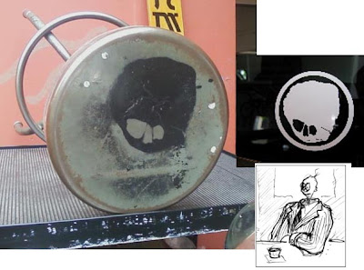
The blob of paint ended up looking like a shrunken head. Student David Gustlin (now a faculty member) looked at that shrunken head shape and sketched the guy that he imagined it belonged to.
A myth was born.
The art students at San Jose State University knew they had the perfect mascot for their campus organization. They called it the Shrunkenheadman Club.
The Shrunkenheadman Club was formed in 1995 to to create a sense of community among students in animation and illustration. The club arranges for figure drawing sessions, visiting lecturers, and an annual costumed draw-off known as “D-Day.”

They sponsored me to give my Color and Light lecture a few weeks ago in October. That’s me and my buddy John Fleskes standing out in front of the school.

The students at SJSU ordered 65 copies of Color and Light, which I signed for them today and put in the mail. To make the books extra special, I made a custom rubber stamp using the club mascot. The stamp is made from craft foam glued to a wood block, and then stamped using a rainbow-colored pigment stamp pad.
If another art school, game company, or movie studio would like to put together an order for 40 or more books, I’ll be glad to come up with something equally customized.
------
Shrunkenheadman history / Official site
Shrunkenheadman program
Ordering signed "Color and Light"books from the Dinotopia Store
Previously on GJ: San Jose State University Art Program.
John Fleskes blog

The blob of paint ended up looking like a shrunken head. Student David Gustlin (now a faculty member) looked at that shrunken head shape and sketched the guy that he imagined it belonged to.
A myth was born.
The art students at San Jose State University knew they had the perfect mascot for their campus organization. They called it the Shrunkenheadman Club.
The Shrunkenheadman Club was formed in 1995 to to create a sense of community among students in animation and illustration. The club arranges for figure drawing sessions, visiting lecturers, and an annual costumed draw-off known as “D-Day.”

They sponsored me to give my Color and Light lecture a few weeks ago in October. That’s me and my buddy John Fleskes standing out in front of the school.

The students at SJSU ordered 65 copies of Color and Light, which I signed for them today and put in the mail. To make the books extra special, I made a custom rubber stamp using the club mascot. The stamp is made from craft foam glued to a wood block, and then stamped using a rainbow-colored pigment stamp pad.
If another art school, game company, or movie studio would like to put together an order for 40 or more books, I’ll be glad to come up with something equally customized.
------
Shrunkenheadman history / Official site
Shrunkenheadman program
Ordering signed "Color and Light"books from the Dinotopia Store
Previously on GJ: San Jose State University Art Program.
John Fleskes blog
Labels:
Art Schools,
Color and Light Book
Subscribe to:
Posts (Atom)


