Sunday, August 31, 2008

What Do Rainbows Mean?

In our scientific age, we tend to see the rainbow as a purely optical phenomenon, or we might think of the end of the rainbow as the place where leprechauns hide the elusive pot of gold.

The Greeks believed the rainbow was a path between the earth and heaven. In Norse mythology the rainbow was seen as a bridge between Ásgard and Midgard, the realms of the gods and mankind respectively. In Chinese mythology, the rainbow was regarded as as a slit in the sky sealed with stones of five different colors.

In the story of Noah, the rainbow serves as a sign of God’s promise that the earth will never again be flooded. In the Stuppach Madonna by Matthias Grünewald (c.1475-1528), above, or the painting by Joseph Anton Koch (1768-1839), below, it serves more broadly as a symbol of God’s covenant.


Durer’s famous engraving Melancholia features a rainbow, though scholars differ on whether to read it as a hopeful or a pessimistic sign.

Next week we’ll look at rainbows in more scientific terms. But for now we might notice that Grünewald breaks a basic optical law of rainbows, namely that the colors of the rainbow should always be lighter than the background, because the colored light of the rainbow is added to the light in the scene behind it.
------------
Further Reading: Rainbow Bridge by Raymond Lee, link.

Saturday, August 30, 2008

Brushes

I use three basic categories of brushes for oil painting: bristles, white nylon flats, and sables. The bristle brushes are made from Chinese hogs. These inexpensive brushes are stiffer than the others, and are useful for blocking in big areas, and manipulating thicker paint.

Bristle brushes are good for keeping your painting direct and simple, with a greater likelihood of getting soft edges. Generally the stiffer the brush the softer the edges. I like flats and filberts. Brights are like flats, but shorter. The Silver company makes an "extra-long filbert," which has a wonderful touch.

White nylon flats are excellent for detailed painting of architecture and technology. They’re available in widths as narrow as 1/4 of an inch to 1 inch wide brushes for laying in a transparent wash of thin paint. A flat brush should have a chisel tip, which you can use for a wide stroke or a thin line.

Nylon brushes are fairly inexpensive, but they don’t last long. Most of the manufacturers, like Dick Blick, Grumbacher, and Simmons make versions of these, and they’re all pretty good.

For small detail work, I use Kolinsky sable rounds. They're made from the reddish tail hairs of a kind of weasel, not a sable (which is a kind of marten). They’re intended for watercolor, but they work equally well for oil. These are the most expensive brushes, but they respond very sensitively to detail work.

The Winsor and Newton Series 7 has always been the standard, but they’re overpriced, and you can get good Kolinsky sables from Escoda, Silver, and other makers. Most often I use Raphael 8404, which is fairly priced, and as good as any others.

Friday, August 29, 2008

Dean Sketch

In honor of this season of speeches and campaigns, here's an on-the-spot sketch from five years ago at a Howard Dean rally.

Jeanette and I were driving through Hudson, New York on September 20, 2003 when we saw huge crowds down by the river. We parked the car and got as close as we could. I was hoping to do a portrait, but I was too far back, so I drew the audience instead.

Dean is just a light dot with a necktie to the right-hand side of the gazebo. After his speech as he was leaving the venue he stopped and signed the sketch.

Thursday, August 28, 2008

Accent Color

You can spice up a black and white sketch with a little dash of color. It’s just like sprinkling adobo on a bowl of beans.


When I sat across the street from this corner market in Rincon, Puerto Rico, I worked up the sketch in pencil and gray ink wash. I enjoyed trying to suggest the abstract detail seen through the window. But the sketch needed something to perk it up.

I dug down in one of the pockets and found a yellow marker for the fire hydrant and the “escuela” sign.

If you carry a red or yellow colored pencil or marker along with the rest of your sketch set-up, it just might come in handy for a spicy little accent.
--------
More on the "line and wash" technique, link

Wednesday, August 27, 2008

ABC: Tendril of Anger

Wednesday is the day for our group sketch game called "Art By Committee." Each week I share an actual excerpt from a science fiction manuscript and each week you visualize it.

This week’s quote was “The old man felt a tendril of anger rising.” How many of us think of anger in terms of “tendrils?” Some of you developed the storytelling to include the source of the anger: a fly in the soup, or a high phone bill, and some used the design idea of the tendril to great artistic effect.

Mark Heng (Website and Blog)


And the one from the original sketchbook.

Next week we have a slightly different challenge. Many years ago I gathered up a bunch of business cards that were stuck on the wall of a restaurant, and I glued them in the back of the ABC book. The game is to imagine what the owner of the business card might look like just by looking at the card.

Have fun! Please scale your JPG to 700 pixels across and please compress it as much as possible. Title it with your name, send it to: jgurneyart(at)yahoo.com, subject line ABC, and let me know in your email the full URL of the link to your blog or website if you have one (even if you gave it to me before). Please have your entries in by next Tuesday at 10:00 AM Eastern Time USA.

Tuesday, August 26, 2008

Studio Lighting

Whatever your studio situation, it helps to work under a good volume of color-balanced light, and there are many ways to set it up.

Regular incandescent lights peak the orange and red wavelengths, and tends to be weak on blue. That’s why red colors in your picture look so good—and blue colors look so dead—under normal incandescent light. Some artists prefer to work under an array of halogen or blue-tinted incandescent bulbs, which can give excellent light, and which simulate the track lights used in galleries and museums. The downside of incandescent is that it uses a lot of electricity.

Standard “warm white” and “cool white” fluorescent lights overemphasize yellow-green. They’re made to give the most light in the range of wavelengths that the human eye is most sensitive to. If you’re using flourescent light, try to select "color-balanced" or "full spectrum" bulbs (such as Vita-Lite or Verilux brands) with as high a “CRI Index” as possible. The color rendering index is a measure of how well artificial light simulates the full range of wavelengths in natural sunlight. The quality of light that a fluorescent light delivers depends on phosphors that the manufacture uses to line the tube.

A measure of this color output is the graph of “spectral power distribution,” which any specialty lighting salesperson should be able to show you for a light you’re considering. It’s not as technical as it sounds, once you start comparing these charts.

The simplest solution, popular with art students, is a “Luxo” type lamp that combines fluorescent and incandescent light.

In my studio now, I have a north window to my left (because I’m righthanded). In the daytime, I turn off the fluorescent lights and use the natural daylight. North light is the traditional artist’s studio lighting, but I find it to be a little too cool and variable on its own. (By the way, note the mirror to the left of the curved window, for getting a fresh eye.)

Some artists in the past used sunlight from a south-facing window diffused through white cloth. This is a great solution, because it’s free and abundant. The best cloth I’ve found is white ripstop nylon from the fabric store. The window should be blocked off on the lower half so that the glare doesn’t go into your eyes while you're working.

This inspired me to diffuse the light from an overhead skylight as a supplement to north light. Directly above the work area is a four-foot skylight opening. The opening channels the light from two skylights, one on each side of the roofpeak. The skylight well is lined with Mylar-coated card stock that I found at a craft store. This reflective lining bounces and multiplies the sunlight that finds its way into the skylight well. The direct sunlight is diffused into a white nylon panel held in place with a homemade square frame of PVC tubing.

Flanking the skylight are fluorescent fixtures with 12 four-foot color-balanced bulbs.
----------------
Wikipedia on Spectral Power Distribution, and Color Rendering Index
Color output chart courtesy Salsburg.com.
Incandescent chart from Neon.com

Monday, August 25, 2008

Candlelight

Godried Schalcken (1643-1706) earned a reputation for rendering candlelight and lamplight. In his paintings, the brightness diminishes quickly as forms recede from the flame. At twice the distance, the light is only one-fourth as bright.

Schalcken, like Georges De La Tour and other candlelight painters, used the trick of hiding the light behind the hand to show the subsurface scattering through the flesh of the hand.

Adolf von Menzel’s painting Flute Concert shows candles placed near the music of each of the players. The frail, flickering light gives way to soft gloomy passages in the outer boundaries of the scene.

The chandelier has about 20 candles. It is reflected in a mirror on the far wall. To the side of the reflection are sconces with about four more candles each. Because of the smoke from all those candles, there’s an atmospheric quality to the distant part of the room, with no deep darks in the vicinity of the light sources.

In Woman with a Burning Candle, Alfonse Mucha achieves a strong feeling of glowing illumination without using Schalcken’s deep darks at all. He keeps most of his values in the mid range or lighter, and he lightens and warms the background colors as they approach the flame. This color corona effect simulates the way the aqueous humor in our eye scatters the light and makes a halo around any point source. Note that the figure is not really lit by the candle, but rather by a cool overhead light.

The film Barry Lyndon, directed by Stanley Kubrick, contains one of the few scenes in film history shot entirely by real candlelight, not faked with artificial light. The extremely dim conditions required special lenses, film stock, and reflectors. The cinematographer John Alcott recalls:

“the set was lit entirely by the candles, but I had metal reflectors made to mount above the two chandeliers, the main purpose being to keep the heat of the candles from damaging the ceiling. However, it also acted as a light reflector to provide an overall illumination of toplight.
------
More on Alcott's recollections about Barry Lyndon, link.
Previous Gurney Journey post on subsurface scattering and color corona.

Sunday, August 24, 2008

Martyr to Rainbows

The Italian Baroque printmaker Pietro Testa (1611-1650)--his work is inset below--was obsessed with color and light, according to his biographer Baldinucci. He had a fatal fascination with moon rings, sun dogs, halos, reflections, and especially rainbows.

One night in 1650 a doleful accident befell him. He was standing on the bank of the Tiber, drawing and observing some reflections of the rainbow in the water, when, whether because he was jostled, or because of the softness of the slippery bank, he tumbled into the river and drowned. (from John Gage, Color and Culture)

Testa was perhaps the first martyr to the rainbow. Over the next few Sundays, I’m going to take a closer look at rainbows: what they’ve signified through art history, what causes them, and other curious phenomena.

Saturday, August 23, 2008

Turkey and Cow

I was loitering in the poultry house again this week at the Dutchess County Fair in Rhinebeck, New York. The owner of this 40-pound grand prize tom let me reach in and feel his bumpy head. The turkey was too busy strutting to notice me.

He was 16 weeks old. The owner told me that these meat turkeys can’t live to adulthood because before long they can’t hold up their weight. That kind of creeped me out so much that my sketch came out strangely, a mixture of sympathy and revulsion.

I moved on to the cow shed and sketched this Jersey. Try to imagine that lower jaw going up and down as she chews her cud.

I used three water-soluble pencils along with a Kuretake water brush filled with clear water. The pencils were brown, russet, and black in a brand called Suprasoft II by Caran d’Ache.

I started with a quick outline to establish the big shapes. Then I added some some colors and tones with the dry pencils. I then wet down the surface with the water brush to melt the colors, and smeared them around.

When the base washes were dry, I came back with the black pencil to add detail—wrinkles, etc.

I had been standing all the while alongside the rear ends of another row of cows. Thanks to a timely warning from a young 4-H kid (Erik, 4-H is an agricultural youth organization), I stepped away from a cow before she let loose with some “projectile excrement.” It was a narrow escape, typical of the hazards of the Artist’s Life.
----------
Earlier GJ posts on this technique here. and here.

Friday, August 22, 2008

Interactivity

I’m told it’s relatively easy these days to render a photo-real character in CGI—as long as that character stands by itself. But to have one CGI character throw a bucket of water on another and then grab him by the shirt….well, now that’s a challenge.

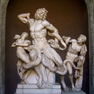
How about having a couple of figures wrestling with a snake, as in the classic sculpture Laocoön? How would a computer deal with the complex muscular dynamics and surface interactions?

In 3-D computer animation, this problem is sometimes called interactivity, and it’s one of the frontiers that is engaging the finest minds of the business. When Jeanette and I visited some of the post-production special effects houses last fall, like ILM, Imageworks, and Rhythm and Hues—or the CG animation outfits like DreamWorks and Blue Sky, I often asked what is the toughest problem to solve in CGI: Hair? Foliage? Fabric? Water?

On their own, each one of these “holy grail” materials is really coming around. The real challenge is to have these effects interact with each other, to have a couple of figures in loose tunics mudwrestling at the edge of a swamp, or a burning flag flapping in the wind.

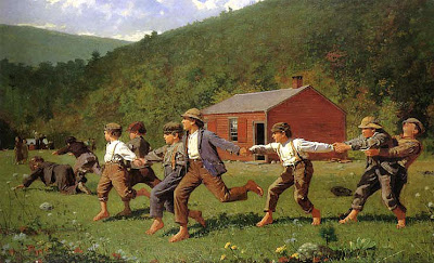
In the painting by Homer above, consider the physics involved in a scene of kids running and holding hands while cracking the whip. Each figure is both self-propelled by the feet, but also externally propelled by the large system of forces delivered through the hands as the momentum builds.

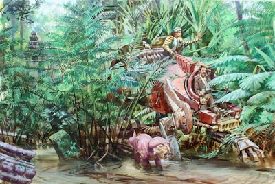
I was thinking about maximizing interactivity when I painted this scene from Dinotopia: The World Beneath. A walking vehicle wades through water and weeds. Painting it is no big deal, but realizing it in CGI would take some doing.

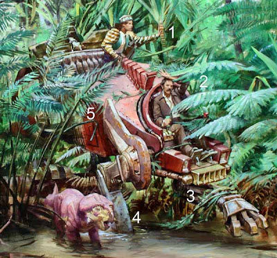
One figure is pushing on a palmetto (1), while another is brushing away a fern (2), while the leg of the walking vehicle is dragging some plants out of the water (3), while the other leg is splattered with mud and half-submerged (4), while the body of the vehicle is pushing aside another stand of plants.

I can only speak with any knowledge as a painter, but I have wide-open admiration for my brother artists and scientists in CGI. Their work excites me because it’s the meeting point of art, physics, mathematics, and materials science.

The advances and challenges in CGI causes us to think about the visual world differently. The geeks behind the scenes who are making the big contribution in this arena don’t get the credit they deserve because their work doesn’t seem as glamorous or comprehensible as the work of the visual development designers.

When you watch the credits roll by on the next CG animated film, give a cheer for the people that figure out the science behind interactive effects.
------
Read about our visits to the movie studios last fall, link.

Thursday, August 21, 2008

Cartoon Guy

Yesterday at the Dutchess County Fair, I sketched a portrait of Mark M., "The Cartoon Guy." He was working under a white tent near the tattoo vendor and the lawnmower dealer.

He does quick cartoon portraits using a Sharpie marker. They’re good portraits, and they only cost $5.00 (head only) or $10.00 (head and shoulders).

He was an artist in the Navy, and has been doing cartoon portraits for 34 years. He said that since his divorce, he is temporarily homeless. He travels around in a minivan, going from fair to fair, occasionally doing corporate gigs.

He loves observing people while doing his job. “Sometimes moms will come and talk for their kids, even 13 year olds,” he said. “They won’t let them grow up.” The hardest customers to please are good-looking teenage girls. “They’re raised to be vain.”

But in all his years doing portraits, only three have been rejected. One happened a couple of weeks ago. The portrait came out great, and the girl liked it, but he misspelled her name, and he was too busy to redo it, so he refunded her money.

He told us he wanted to slow down and paint. “The VA said they could get me a job as a park ranger,” he said. “What I want to do is paint nature.”

Photo courtesy Fred Bellet, Tribunephotogs, link.

Wednesday, August 20, 2008

ABC: Sorcery

Wednesday is the day to have a little fun with our group sketch game called "Art By Committee." Each week I share an actual excerpt from a science fiction manuscript and each week you rise to the challenge of illustrating it. And this one was a challenge.

The quote was “The man spasmed against the snow. ‘Gods, no! No! No sorcery—‘ ‘Hold him,’ I said calmly, as he tried to leap up and run.”

An ominous scene, with spooky overtones, but you responded with drama, whimsy, and beauty. Some people mentioned that their solution is not like their normal work, so click through the link to learn more about what each the artists really do.

Damian Johnston

Mei-Yi Chun

Andy Wales

Chris Oakey

Michael Geissler Tony Upton
(who recommends this link he found for cool snow globe art)
Patrick Waugh

António Araújo


And the one from the original sketchbook.

Here’s next week’s quote: “The old man felt a tendril of anger rising.”

Have fun! Please scale your JPG to 700 pixels across and please compress it as much as possible. Title it with your name, send it to: jgurneyart(at)yahoo.com, subject line ABC, and let me know in your email the full URL of the link to your blog or website if you have one (even if you gave it to me before). Please have your entries in by next Tuesday at 10:00 AM Eastern Time USA.

Tuesday, August 19, 2008

Nature Sketchbook

I have an old leatherbound sketchbook that is half full. It is 20 x 30 cm or 8 x 11.5 inches. Inside are studies of tree roots, pigs and goats, stream rocks, mushrooms, and flowers.

Sometimes when the world is too much with me I sit outside alone on the weedy hillside near my house with the ants at my feet, the bees at my ears, and the clouds drifting overhead, and I try (usually in vain) to hear the soft, strange music of Nature.

Monday, August 18, 2008

Pochade Boxes


Today on his art blog Lines and Colors, Charley Parker gives a thorough description of all the pochade boxes on the market. Pochade boxes are popular portable easels for plein air painters. Thanks for the link and the mention, Charley!

As he says, I do recommend an Open Box M, but in fairness to the other brands, I just haven’t tried them. I have the 8x10 and the 10x12 sizes. I made a few modifications to the Open Box M 10 x 12 inch box. Mine came with a side panel, which I drilled with holes of various sizes to hold brushes that are not in use, as well as slots for the palette knife and mahl stick. A lot of artists use a special metal holder for the brushes. I also drilled big holes for Nalgene cups (for Grumtine and Liquin.)

I either clip a rag to the side or hang a paper towel roll underneath. Instead of mixing the paint on the wood palette surface, I cut up freezer paper to 9x12 inches and paper clip it to a mat board, and drop the mixing pad into the recessed area. That way I don’t have to scrape off old paint.
--------------
Here’s a post where I explain my set-up a little more, link.
Charley Parker’s post on Lines and Colors, link.
Also, check out the site Outdoor Painting for more on plein air equipment, link

Drawing Made Easy

This book taught me how to draw. I relied on books because I never had a drawing teacher (except my older brother) until I was in my early 20s. I searched for the books on drawing that I could find. This was the one that helped me the most. And as I look at it again, I still think it’s one of the best.
The method was simple. Draw a simple outside shape first and keep that shape in mind as you subdivide the big shape into smaller details and shading. The shape is made of straight lines that enclose the form in a kind of envelope.

Although Drawing Made Easy was intended for children, the method is virtually identical to the way drawing was taught a hundred and fifty years ago in the French Academy. Charles Bargue’s drawing course (below) uses the same basic idea.

When I was still in grade school I ran across another book called The Natural Way to Draw, by Kimon Nicolaides. I was attracted to this book because it offered a serious regimen for teaching yourself drawing. And it introduced two simple-to-understand but contrasting methods: contour drawing and gesture drawing.

I diligently tried both of the methods that Nicolaides recommended. But I wasn’t happy with the results. My contour drawings came out terribly because by moving my eye like an ant on one small part of the pose, I lost track of the whole. My gesture drawings came out too unfocused and sloppy. Maybe I was doing something wrong. But my feeling was that this was the unnatural way to draw.

Although I couldn’t have articulated this when I was eight years old, I had a sense that the contour drawing idea was unhelpful because drawing is more a process of interpolation than extrapolation, of subdivision rather than extension. To put it another way, drawing is a hierarchy of successive approximations from large shapes to small shapes.

In the first steps of making a drawing, broad estimations of length and slope and shape give way to progressively smaller estimations. Those smaller measurements are always made with the original large view in mind. Turning that method on its head may give a momentary experience of an artist’s way of seeing, but, for me at least, it didn’t lead to good drawings.

And gesture drawing was not useful for me because drawing is neither all loose nor all tight. Drawing blends freedom and control at every stage.

I think I would have loved Betty Edwards’ book Drawing on the Right Side of the Brain if it had been available when I was in elementary and junior high school. She successfully reintroduces some of Nicolaides’ methods (and many other ideas) by interpreting the experience of drawing from the standpoint of modern cognitive science.

There’s no single way to draw, and no single way to teach drawing. But a lot of art teachers in the 1950s and 60s threw out the common-sense method of books like Drawing Made Easy in favor of other methods that were supposed to enhance expression. The big-shape analysis offered by Drawing Made Easy may not make drawing easier, but it yields results, both for imaginative and observational drawing.

Maybe our friends over at Dover Publications will consider bringing D.M.E. back into print.
-------------
Note: There's a current book series called Drawing Made Easy: Discover Your Inner Artist that has nothing to do with the original book from almost a ninety years ago.

E.G. Lutz also wrote about about animation that influenced Walt Disney, link.

Drawing on the Right Side of the Brain website, link.

Charles Bargue illustration courtesy the blog Learning to See, which has a nice post about his method, link.

ADDENDUM: Blog reader Patty has shared this link to an online book called "Practical Drawing" by E.G. Lutz which shows his methods presented to adult readers, link. Thanks, Patty!

Sunday, August 17, 2008

Color in Vermont

How much do we love color? From late September to early October, nearly four million people visit Vermont to see the color of the fall foliage. The favorite trees are maples, oaks, and birches. The number of visitors is almost seven times the state’s population. They spend almost a billion dollars.
-------
Plein air painting was from River Road in Rhinebeck in mid-October.
The numbers are from Idyll Banter by Chris Bohjalian, link.

Saturday, August 16, 2008

Getting a Fresh Eye

When I work on a painting I literally get too close to it, and I grow accustomed to its faults. There are at least six ways to get a fresh eye on a work in progress.

1. Turn it upside down and look at it (or work on it) inverted. I spend about one-fourth of my painting time working on my fantasy paintings inverted, either to see them objectively or to get a better angle on the strokes and perspective lines.

2. Step back from it, squinting and tilting your head.

3. Use a reducing glass—a double concave lens that will make your full composition fit handily into the palm of your hand.

4. Shoot a digital photo of the painting and look at it in the LCD, flip it 180 degrees or process it in Photoshop to see how it works in two values.

5. Set up an adjustable mirror on the wall behind and above your shoulder (see above). Mine is mounted on a wall bracket with an adjustable ball in socket joint. Making the painting both smaller and reversed will help you spot problems right away.

6. Ask a trusted friend, family member, or visitor to take a look at it. They don’t have to be an art expert. What interests me most about someone’s reaction to my picture is what strikes them first, what they notice most. It’s not always what I was intending.

Friday, August 15, 2008

Scrap File

In most fantasy or science fiction scenes, some elements are completely invented, but the majority of elements are no different from what we see around us every day. You can draw upon existing photos as source material for these effects whenever you need real-world texture in your picture.

Here’s the art for a paperback cover called Homecoming by John Dalmas. His novel, the sequel to Yngling, was set on a barbaric post-plague Earth. This scene shows neoviking horsemen challenging a low-flying spacecraft.

Of course I had to come up with the spacecraft design by sketching a lot of doodles like this out of my head.

Even though this is an imaginary scene, the sky presents the same kinds of clouds and light as it would today. Grass and dirt would have looked the same in this world as it would for the rest of us. Horses in all sorts of poses, armor, trees, stormy skies—all these effects can be adapted and inspired by existing photos.

At Art Center where I went to school, this was called "scrap," by others call it "clip art," "swipe," "morgue," or just "reference."

Existing photos are of great value for such visual details. You can get the photos from anywhere. I like to fish old magazines out of the bin at the recycling center or pick them up at yard sales. Nature magazine, old National Geographics, and architectural magazines are all treasure troves for light, color, and surface texture. Magazines of food and cuisine often have photos with interesting color schemes that can be turned upside down and used purely for their component colors.

I flip through stacks of magazines and blade out the photos that strike me as interesting. I also include photos that I’ve taken myself, particularly of things like stones and roots that are hard to find in magazine photos. I also have some individual drawings of zoo animals and other forms mixed in the file folders with the photos.

The images are stored in legal size manila folders inside a pair of strong filing cabinets. The folders include categories for particular forms like animals, architecture, and vehicles, but also more subjective categories like light conditions, color schemes, atmospheric conditions, and photograhic effects. The “people” category alone has 54 separate folders, including “Poses: pointing” and “Groupings: parades,” for example. You should divide your file according to the categories that are important to you.

Of course you may want to use the Web for finding your images. Internet-sourced images are really helpful, but consider the advantages of a traditional scrap file:

1. When you do a Google search for, say, “mountain stream,” you and everyone else get the same 50 photos first; in your own scrap file, you’ll have images no one else does.
2. Clipped photos are cheaper, better color, and higher resolution than images you print out from the Web or from your own digital photos.
3. If you surround your painting with scrap images, the images will be in the same light as your painting, so you can compare the colors to your paint mixtures more accurately.
4. With paper photos, you can draw on many influences at once, taking a small influence from each one.

Thursday, August 14, 2008

Turner Exhibition

The curators who wrote the wall captions for the J.M.W. Turner exhibition (Metropolitan Museum, through Sept 21) ran out of words to describe Turner’s brand of imagination, because they used the word “Sublime” 14 times in within the first room alone.

Whatever word you want to use: sublime, awesome, dramatic, mind-blowing, soul-stirring, it’s a gigantic show, with over 140 watercolors and oils. The works of the first room showed Turner (1775-1851) at the full height of his powers. His shipwreck scene (above) from 1805 has more whirling energy than anyone else has crammed onto a single canvas.

His early watercolors and oils, like “Tintern Abbey” done when he was 17, have a precision of perspective and a control of value that make them a good example of a romantic spirit disciplined by controlled observation.

One of Turner’s gifts is the modulation of tones across large expanses of the composition. Instead of defining passages of architecture, clouds, or rock masses with sharp contrasts, he holds them to close value ranges. Contrary to the rule that the eye seeks out maximum contrast, these parts of the picture attract the eye more readily than other passages rendered in strong accents of black and white.

Strangely, though, his figure work never obeys the tonal rules he establishes for everything else. The figures are always a jumble of tone, spotty, and poorly conceived. Even in a historical painting like the Battle of Trafalgar (detail, above, and full composition inset below), where the figures are ostensibly the center of interest, they are awkwardly and embarrassingly drawn.

The painting seems to be divided into two different worlds: the sails and smoke, wreathed in magical vapors, and the figures, strewn about like boneless rag dolls on the doorstep of the scene.

Turner was at his best when his eyes were open. “Ivy Bridge, Devonshire” shows an appetite for the natural tangle of vegetation while at the same time giving equal attention to the surrounding light and vapor. His small watercolors from 1824 are sensitive and exquisite. The show includes a few very early plein air paintings from 1805, painted from a boat floating in the Thames.

As Turner’s career progresses, he grows more in love with light and atmosphere, and more indifferent to earthbound form. He maintains his sense of drama or the Sublime, but the more paintings you see together, the more his devices and tricks start to show. He falls into a conventionalism of color, composition, edges, and values.

In his painting of Venice, because of the cast shadows and the vertical streaks of reflections, the boats appear frozen in ice rather than sitting on water.

With the later work, it was as if a film began to cover his eyes. In “Ulysses Deriding Polyphemus” (1829), lauded by John Ruskin as his greatest work, the ship looks like a comical wedding cake. No one standing with us around the painting was entirely sure which smudge or cloud was supposed to be Polyphemus. It was like standing beside a goldfish pond looking for goldfish and not seeing any.

Yellow and red, he learned from Goethe, represent life and spirit, while blues stand for darkness and denial. In his attempt to rise to Goethe’s poetic conception, Turner began to use these colors in a more and more habitual way. A glance across any of the rooms in the second half of the exhibition revealed Turner’s fixed color template: warm lights and cool darks, never mind the truth of Nature.

In the final section, where he descends into pure abstraction, the limitations of his resources become even more apparent. One wall shows five paintings in a row with the same compositional formula: light at the center, dark around the edges, with a small spot of light in the foreground.

The conventional view of art history is that Turner in his later paintings entered a realm of pure light and atmosphere, setting the stage for the revelations of Impressionism. I wanted to follow him into his universe of mistiness, but I got stuck in the paint. And as much as I love light and vapor, I love the earth too much—trees and rocks and ships and buildings and people, none of which have a place in Turner’s later paintings.

The critics throughout his career complained of “indistinctness,” “negligence,” and “coarseness.” It’s hard to disagree with them. As much as I love Ruskin’s writing, his defense of Turner on the grounds of truth to nature is absurd and illogical.

In the end, Turner deserves credit for the raw power of his visual ideas. Rough, crude, or maddeningly vague as he may have been, he was a cyclone of visual energy, and his fundamental innovations are powerful and unforgettable. Later artists in the romantic tradition, like Frederic Church, Alphonse Mucha, Thomas Moran, and Ivan Aivazovsky (above), took Turner’s ideas and ran with them, making luminous, radiant statements without losing track of their love of material things.

In response to his critics, Turner said, “Atmosphere is my style.” But atmosphere without form is like music without notes or speech without words. It’s unintelligible, and therefore meaningless. Perhaps, as his contemporaries worried, he suffered from a touch of madness or perversity. Maybe he imbibed too much lead white. As one visitor wrote in the guest book at the end of the exhibition: “What was this guy on?”

Wednesday, August 13, 2008

ABC High Pitched

It’s Wednesday. And that means it’s time for “Art by Committee,” the game that stretches our visualization muscles. Your assignment was to come up with a picture to go with this quote that I snipped out of an actual science fiction manuscript: “Their voices were high-pitched, piercing…but human.”

These solutions were so good that they practically shattered all the windows and wine glasses in our house.


And the one from the original sketchbook, drawn by a bunch of artists at a restaurant.

Next week’s quote is: “The man spasmed against the snow. 'Gods, no! No! No sorcery'—'Hold him,' I said calmly, as he tried to leap up and run."
Have fun! Please scale your JPG to 700 pixels across and please compress it as much as possible. Title it with your name, send it to: jgurneyart(at)yahoo.com, subject line ABC, and let me know in your email the URL of the link to your blog or website if you have one (even if you gave it to me before). Please have your entries in by next Tuesday at 10:00 AM Eastern Time USA.

Tuesday, August 12, 2008

Silhouette, Part 2

Silhouettes don’t have to be black cutouts in side view seen against a white background. All shapes present silhouettes, and vision researchers have shown that one of the first tasks of perception is to be able to sort out the silhouette shapes of each of the elements in the scene.

A good rule of thumb is that the most important part of the pose, often the hands or the face, should be brought into the silhouette, rather than embedded inside the pose. In the painting "Forge of Vulcan" by Velasquez, the sun-god Apollo has arrived at the Cyclops' forge to break some bad news to Vulcan. The artist has made sure to bring Apollo's upraised finger into the silhouette to make it clear that he is relating a narrative.

Silhouettes can have dramatic, unexpected shapes, like the wind-blown cape of the pirate Billy Bones by N.C. Wyeth. Only the hat, the tip of the elbow, and the end of the spyglass break the outside shape, literally concealing the hand of the pirate, and making his intentions seem more mysterious.

Try to imagine the poses of your important figures converted into a simple silhouette, either black against white or white against black. If the shape standing alone still conveys the action, it will probably work fully painted, too.

The most important element of the pose should be placed with the strongest contrast against the background. The background can be designed so that it gradates up to a bright halo behind that element, while the other parts of the silhouette can be left a bit closer in value. In this N.C. Wyeth painting, the head is the featured part of the silhouette.

In this little sketch of a fellow artist that I did during a figure group, I chose to lighten the background behind her hand, rather than behind her head, because I thought it was more important.

Related posts: Edge Induction, link. Flagging the Head, link.

Monday, August 11, 2008

Silhouette, Part 1

The silhouette is the outside shape of an object against the background, especially when it is filled in with a solid color.

Here, for example, is an illustration by Barbara Bradley turned into a silhouette. The silhouette by itself still communicates the idea of a girl beside a chair holding up a piece of cloth.


Here's the illustration in full color.
The silhouette helps us to immediately recognize animals, plants, or figures. It's a great way to sketch, and you can do it conveniently with a black brushpen. These are some sketches I did of tree silhouettes in southern California.

The silhouette conveys essential information about the mood and action of the pose. By carefully considering the silhouette, you can give your design more impact.

A face in profile is a common kind of silhouette. In the old days you could get a cheap portrait cut from black paper by a skilled artist.

The character Uncle Doodle is shown as he appeared in Dinotopia: The World Beneath.

Here is the same figure converted to a black silhouette. The whole pose, including the face and both hands, is clear enough from the silhouette alone. This kind of broad comic posing suggests pantomime stage acting from the Vaudeville era, and was popular with golden age American Illustrators, especially Maxfield Parrish, J.C. Leyendecker, and Norman Rockwell.
----------
Thanks Leif Peng for the Bradley, link.
Tomorrow: More on silhouette

Sunday, August 10, 2008

The Hudson River School for Landscape

A group of over 30 landscape painters has been working for almost a month in Hunter, New York, in the heart of the Catskill Mountains. They’re participating in the second annual Hudson River School for Landscape, founded by Jacob Collins, who is also renowned for his atelier called Grand Central Academy of Art in New York City.

Travis Schlaht produced this painting of the Stream at Kaaterskill Falls during last year’s five-week session.

The lodging and tuition are provided for free of charge thanks to a generous fellowship from the Catskill Mountain Foundation. Over a hundred people applied for the positions, and Jacob told me it was very difficult to make the selection. The participants are young and talented, and they hail from as far as Spain, Germany and Australia. “It’s a little intimidating, honestly,” Jacob told me, and I agree.

I joined the group for a day of painting (Jacob Collins at left and me at right), and I probably brought bad luck because a torrential downpour opened up as soon as we got going.

Scott Balfe switched to a sombrero and Army-issue poncho to head off the downpour.

Here's my 11x14 painting of Scott (sans sombrero) alongside Schoharie Creek, with Jacob’s dog Finney wading in the shallows.

Once a week or so, the group gathers with their work-in-progress. I joined them last Wednesday for a supper, and I gave a slide show about the working methods of the early plein-airists.

The artwork that the group exhibited included sensitively-observed close views of stream rocks and mossy trees in muted colors and controlled brushwork, though there were also some rapidly-painted sunsets.

The curriculum is modeled on the methods of Asher Durand, Frederic Church, Sanford Gifford and other pre-Impressionist painters, achieving a high level of finish in pencil and oil, mostly with multiple sittings. When they get home, the artists will develop a larger composition based on the studies. Use of photography for reference is discouraged.

I believe that this group will have a significant and lasting effect on the future of American—and perhaps international—landscape painting.

My own painting of “Artists along the Schoharie Creek,” along with two other plein-air studies, are currently being exhibited and offered for sale at Windham Fine Arts Gallery in Windham, New York.

---------
Hudson River School for Landscape home page, link.
Exhibition of last year’s class, link.
Three Gurney plein air paintings at Windham Fine Arts, link.
Jacob Collins home page, link.
Previous GJ post on painting with J. Collins, link.

Color Wheel Question

Blog reader Emily emailed me a question that I couldn’t answer, so she gave me permission to post it to the group mind.

"I was opening up a new file in Painter today and started thinking about that little color wheel it shows you - the standard computer color wheel with all the colors in the wheel and the brightness and darkness controlled by a slider on the side. I noticed that the blue and red seem to have the illusion of spokes of more intense color poking into the wheel and the teal, purple, and yellow appear to have light spokes poking out of the wheel. Only the green just looks nearly flat all the way across. If you desaturate the whole wheel, all the tones are perfectly even. Any idea why this is?"

Saturday, August 9, 2008

Arthur Keller’s Portfolio

Arthur Keller (1866-1924) was an American illustrator who studied at the National Academy and the Munich Academy. In 1920 he gathered up his preliminary studies from the costumed model, photographed them on glass negatives, and produced two portfolios of 11x13 inch plates.

According to an Oct. 20, 1920 New York Times review, the portfolios were popular with art students and fellow illustrators because they gave “an opportunity for the public to know a competent illustrator in his moments of preparation, of direct and prompt notation, the salient features of his subject emphasized, a gesture, expression or pose given the importance it has to an artist concentrating his attention upon the significant elements of a composition.”
--------------
Related GJ post on working from costumed models, link.
Biography of Arthur Keller on Jim Vadeboncoeur's BPIB, link.
Thanks to Steven Kloepfer and Barry Klugerman

Friday, August 8, 2008

Technique and Training

In Jean-Léon Gérôme’s atelier, by all accounts, there wasn’t much talk about technique or method. Hamilton Easter Field, an American student of Jean Leon Gerome, recollected in 1913,

“In the years I spent in Paris I never heard the Frenchmen discussing technique. Simon, Menard, Gaston La Touche, Fantin-Latour, indeed, all my French friends were intent on expression and never bothered about brushwork.”
Kenyon Cox, another American student of Gerome, remembered:

“I think there is a general impression that he is very rigid in his methods of instruction and that his pupils become, almost of necessity, his imitators. As a pupil of his during three years, and one who owes him much, I feel that this impression should be corrected. During all the time I was working in L’Ecole des Beaux Arts under his instruction I saw but two pupils whose work showed any decided imitation of Gerome’s own methods of painting, and I never saw any attempt on the part of the master to change the methods of his other pupils. Gerome has a method of setting his palette which differed somewhat from that employed by most artists: a method which could, I think, only be employed by an artist exclusively devoted to form and comparatively indifferent to qualities of color. When I began to paint for the first time under his instruction he recommended this method to me. I had already acquired other methods and did not change them, and he never again recurred to the matter. His criticism was always of results, and never, after that first time, of methods.”


The American illustration teacher, Howard Pyle, also downplayed the technical side of painting to his summer students at the Brandywine school. According to biographer Henry C. Pitz, “Pyle spent little time on drawing or technique. He looked for a creative spark, a picture that talked back.”

I was surprised to run across these quotes, because I had imagined that 19th century art students were getting a thorough training in paint-mixing and practical methods.

This revelation leads to other questions. First of all, what do these writers mean by “technique?” Cox mentioned “setting the palette.” Do they also mean such things as paint application, brushwork, paint chemistry, color mixing, underpainting methods, or methods of accurate drawing? If the academic masters weren’t teaching technique, was that because they were accepting students who had already received such training? Where was this knowledge gained? What were Gerome and Pyle teaching instead? (Their schools were very different, of course.) And finally, given the differing circumstance of our own times, what role should technique play in the design of an effective art training curriculum?

I did a little more reading and found a few preliminary answers, at least about Pyle.

Pyle himself wrote, “The students who come to me [at the Brandywine School] will be supposed to have studied painting and drawing as taught in the schools.” “My class,” he said, “was formed more for the purpose of encouraging imaginative drawing in the more advanced students.” To life classes, he told the students “not to copy the model but to make a picture.” Students should be taught, he wrote, that “all they are learning of technque is only a dead husk in which must be enclosed the divine life of creative impulse.”

The remaining questions remain unanswered, and I welcome your thoughts.
-----------
Preceding quotes from Pyle are from Howard Pyle: A Chronicle, by Charles Abbott, 1925
Cox quotes from The Lure of Paris, Barbara Weinberg, p. 111-112.
Howard Pyle, Diversity in Depth, p. 14, Henry Pitz
The Hamilton Easter Field book is online, link.
Gerome image from ARC, link.

Thursday, August 7, 2008

Skateboarding Parakeet

Ever since my parakeet started watching those YouTube videos of the skateboarding bulldog, I can't keep him on the perch anymore. He's heard of Tony Hawk, and now he wants me to call him Tony Budgie.

Music Poll Results

In the recent music poll, 339 of you voted, and here are your favorite things to listen to while doing art:

1. Soundtrack Music 118 (votes)
2. Classical 115
3. Rock (Contemp) 108
4. Rock (Classic) 98
5. Other 86
6. Folk 69
7. Prefer Silence 62
8. Jazz 60
9. NPR 56
10. TV or Film Audio 56
11. Recorded Books 55
12. International 50
13. New Age 48
14. Blues/Soul 42
15. Shows/Musicals 26
16. Rap/HipHop
17. Country 19
18. Opera 18
19. Radio Drama 17
20. Christian/Gospel 14
21. Great Courses 8

Are artists different? According to InfoPlease and Nielsen SoundScan, CD sales by genre in 2007 rank are as follows (sales in millions):
1. R&B 96 (million CDs in 2007)
2. Alternative 89
3. Country 63
4. Metal 53
5. Rap 42
6. Christian/Gospel 34
7. Soundtrack 25
8. Classical 18
9. Jazz 14
10. New Age 3

Wednesday, August 6, 2008

ABC: Swollen Shut

Wednesday is the day for our group sketch game called "Art By Committee." I present an actual excerpt from a science fiction manuscript and you illustrate it.

This week’s quote: “his left eye was swollen shut” was open-ended enough to bring out everything from playful and whimsical to various shades of macabre. I’m always amazed how many different ways there are to visualize something. I hope you’ll click on the names beneath each picture to find out more about the artists who created them.


And the one from the original sketchbook.

Here’s next week’s quote: “Their voices were high-pitched, piercing…but human.”

Have fun! Please scale your JPG to 700 pixels across and please compress it as much as possible. Title it with your name, send it to: jgurneyart(at)yahoo.com, subject line ABC, and let me know in your email the full URL of the link to your blog or website if you have one. Please have your entries in by next Tuesday at 10:00 AM Eastern Time USA.

Tuesday, August 5, 2008

Newsprint

I know—it’s not archival. In time it will get yellow and brittle at the edges.

But I love the way newsprint responds to charcoal. It takes a sweeping stroke of vine charcoal like a piece of sourdough takes butter. It answers to compressed charcoal with a black like midnight. It’s so dirt cheap that it encourages me to take a chance and try something new. There are more elegant varieties out there, but good old newsprint is the one I like to warm up with. It’s the Cinderella of art papers.

Monday, August 4, 2008

Alternate History

Alternate history is a subgenre of science fiction which explores what would happen if events followed a different course from some key point of divergence. For the vehicle designer, this opens up a rich vein of possibilities for plausible forms that might have been.

The paintings in this post were paperback covers from a series of science fiction novels by Kirk Mitchell. His first in the series, Procurator, began with Pilate pardoning Jesus instead of Barabbus and the Roman army defeating the barbarians. From that beginning, a chain of events allowed Rome to flourish and develop advanced technology.

How would Romans design an airplane? First I wanted to use an unusual configuration that looked somewhat believable. I tried a canard design with a pusher prop, and a variety of design features that suggest the look of Roman galleys.

Many alternate histories are premised on Hitler winning World War II, or the Confederacy winning the American Civil War, or the Spanish Armada conquering England. History would have taken an alternate pathway. New technologies would have been invented, but they would have followed different lines.

From the design perspective, an alternate history premise offers a lot of scope for invention. The author mentioned “sand galleys” and I imagined them as fortified tanks that could cover a variety of terrains.


My beginning point was to fill a few pages of a sketchbook with drawings of actual Roman material culture: the costumes, weapons, vehicles, and architecture, noting their characteristic colors and symbols. Then I tried to extrapolate those features into new technologies. Above are some of the development sketches for the sand galley, an open-topped troop carrier, battle platform, and siege weapon built along the lines of a trireme.
-------
Wikipedia on "Alternate History," link.

Sunday, August 3, 2008

Color in Mountain Streams

While I was painting this 11x14 inch plein air study of Esopus Creek, I was thinking of a quote by John Ruskin’s (from The Elements of Drawing).

He said that he likes to paint

“mountain streams when the water is shallow, and the tones at the bottom are rich reddish-orange and black, and the water is seen at an angle which exactly divides the visible colors between those of the stones and that of the sky, and the sky is of clear, full, blue. The resulting purple, obtained by the blending of the blue and the orange-red, broken by the play of innumerable gradations in the stones, is indescribably lovely.”

I don’t know if I succeeded in capturing what he was talking about, but he sure has a wonderful way of describing the colors of mountain streams. I’ve noticed that when you look at a stream with gray stones and clear water on a sunny day, there’s far more color beneath the surface of the water than above it.

What I’ve been trying to understand, and am still grappling with (maybe you can help me), is why the stones on a shallow bottom of the stream shift to warm, brownish colors, and then the colors get progressively cooler as you go deeper than about three feet of water. In other words, why does the color of the streambed get warmer than the local color of the stone, and then cooler as it gets deeper?

My hypothesis is that a foot or two of water depth subtracts, through scattering, the cool wavelenths of the light that bounces off the bottom. Therefore, light passing through the water and illuminating the bottom, returns to our eye relatively warmer. It’s also darker because of the light lost to reflection off the surface (which we covered in previous posts: part 1, part 2, and part 3.).

I hesitate to show a Sargent in the same post as my own work, but he captures and accentuates these effects so beautifully. Note the warm stream bottom at the right of the painting below, called "Dolce Far Niente." The cooler colors at left are not from depth effects so much as from the addition of cool sky light off the surface.

Why are the deeper parts cooler, even in the absence of reflection? The second half of my theory is that in deeper water we’re seeing less of the light simply bouncing off the bottom; we’re seeing more of the blue light that has been scattered in all direction—the same reason that infinite depths of air looks bluer.

I don’t know: maybe I’m wrong, or maybe someone can explain it better. Anyway, I love the Sargent above, which shows a stream that's not deep enough for the blue-depth color, but it has the warming effect in the shallows, and a miraculous feeling of the image of the bottom distorted by the rippled surface of the water.
-------------
The Sargents are from the Brooklyn Museum, link.
Previous GurneyJourney posts on transparency of water, link.
and water reflections, part 1, part 2, and part 3.

Saturday, August 2, 2008

Vanderbilt Vista

Monday was a perfect day for painting along the Hudson River.

As an added pleasure, we were joined by two artists I greatly admire: Erik Tiemens (on bench to the left), one of the main conceptual designers for Lucasfilm, and Bill Mather, concept artist, matte painter, and author of Drawn to Beauty.

The park ranger of the Vanderbilt Estate appeared from nowhere and started telling us about the place.

He told us that the view we were painting was immortalized by Currier and Ives (above) and “painted by a lot of amateurs, like yourselves,” he said, gazing at my painting. He kindly overlooked the fact that Trusty Rusty spent three hours in the 15 minute parking lot.

After we finished, it was fun to see how all four of us brought out different aspects of the scene.

Jeanette did the small watercolor in the Moleskine book at lower left. Erik did a vertical composition in gouache, after sketching a couple of exploratory thumbnails. Bill worked patiently in pencil to describe the foliage textures. “I’m approaching it as if it was an etching,” he said.

Mine is the one in oil, 8x16 inches. The air was so misty that you could barely see the Catskill Mountain range, just a faint hint behind the white dots of the convent on the far shore.
-------------
Erik has a blog called Virtual Gouache Land, and a website, Water Sketch.
Bill has a blog and a web gallery.
The great art blog Lines and Colors has covered Erik, link, and Bill, link,
We were painting at the Vanderbilt Mansion site, link.
Currier and Ives image courtesy The Old Print Shop, link.

Friday, August 1, 2008

Music While Painting

I’m curious what you like to listen to when you’re painting and drawing. Is there a certain kind of music that gets you into the zone? Can your left brain listen to books-on-tape while your right brain is doing art? Are there times you just prefer silence?

In the column at left is a blog-reader poll. I invite you to vote for the kinds of music that you listen to the most when you’re working.

In the comments, please recommend your favorite links for free podcasts, or share some funny stories about people listening to music in studios or sketch groups. I’m curious to know how music or talk radio interacts with your visual tasks. Do different parts of your creative process (preliminary sketching, blocking in, or finished painting) seem to call out for different kinds of music?