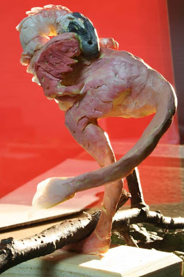
 For a pose as unusual as this, I knew I had to build a maquette to understand the three dimensional spiraling and overlapping of the form. Where should that tucked leg go? And what should happen with the tail? At this angle, you can't see the tucked leg, but it's there.
 The maquette was made over a wire armature from three kinds of Fimo: soft, regular, and effect. The last kind fires to a translucent and flexible material. I then painted it in acrylic.
 As I built and painted the maquette, I checked a lot of reference photos from my physical and digital scrap files. I came up with dozens of pictures of birds (aquatic birds, songbirds, and many others) in this classic pose. Photos of actual backlit birds helped with edge lighting and color corona.
 Here's the final oil painting, which appears in the current issue of Ranger Rick magazine.


14 comments:
he looks rather sweet here, but I'm sure he'd chew my arm off when he woke up.
I love the backlit quality of this, and the use of photo effects in paint, like the out-of-focus background.
Nice usage of the subsurface scattering of the model.
And what an unconventional red glowing background.
I think this is the Ranger illustration I like best so far.
Just beautiful!
Thanks for sharing this Jim! Great post. I love the painting!
Dear Mr. Gurney,
I run a podcast about comics and sequential art at the Savannah College of Art and Design. I am a faculty member there. I also teach a conceptual Maquette Design class. I was wondering if you would be willing to do an interview on our podcast? I have read your blog for a number of years and always send my students your way since you are informative, instructional, and more importantly hilariously inventive. Either way please let me know. Thank you! jlarison@scad.edu
I agree with Erik, this is my favorite RR painting so far. I like that little "starburst" of light near the head. As always, it's fascinating to see the process behind the painting.
And Jim, in case you missed this, grab your checkbook(s) and make a quick trip to Las Vegas. A casino is auctioning off its dinosaur skeletons. The ultimate armatue for maquettes! There must be room back in Rhinebeck. There are photos at:
http://marketplace.publicradio.org/standard/display/slideshow.php?ftrv_id=113492
another stunner. thanks again for sharing your process. And it would be awesome to hear you interviewed on SEQALAB.
As usual, you capture that elusive quality of life. All the research really pays off and yet it is not a dry reference image...truly art.
Thanks for sharing it.
How do you think Fimo compares to Sculpey? Is one better all around or is it a situational question?
Holy cow, Jim! This looks amazing! I absolutely love it. Such great lighting, thanks for posting such great process, as always.
Hey, thanks, everybody. The Fimo can be mixed with Sculpey without any problem, and you can mix the different kinds of Fimo together in the same sculpt.
The one to experiment with is the Effect Fimo. Its flexibility and translucency is quite nice because you can do fine forms like tendrils or fins. When it cures, it's not brittle, but rather quite flexible.
This is also my Favourite RR illustration. I love how much fully saturated colour you've enfused into the image - the red in the distance & the green/blues in the FG shadows.
p.s. does anyone want to help out a Gurney fan who happens to live in New Zealand? I need a contact that would be willing to get the new book shipped to their address, then forwarded to my address. Any help would be much appreciated. You can reach me through send.andrew.mail@gmail.com
LOVE the use of color and light in the final painting! Really sets the mood. Thanks for sharing the process. :)
Final painting looks awesome!:o)
Love the glow of the feathers and the depth of field on the finished version.
Thanks for showing us the process!
Post a Comment