


But you may wish to start with a very different objective—changing what you see to match a mental impression. That’s what I did here with a sketch of a rock formation drawn while sitting high on a cliff at Mohonk Preserve in New York.
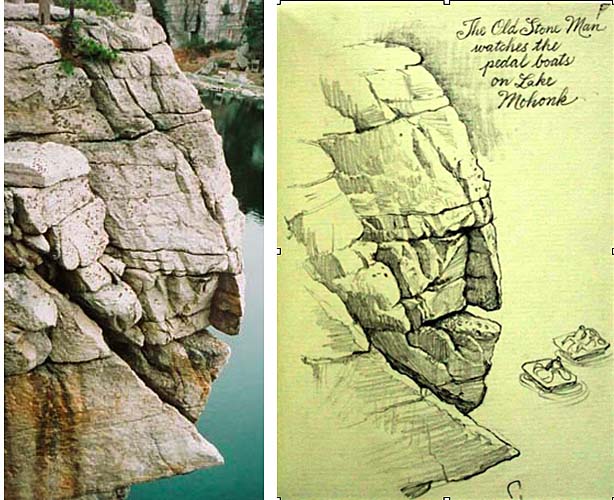 What struck me about the formation was that it looked like an old man’s craggy face. In this case, I wasn’t interested in a literal interpretation. I wanted to exaggerate the forms just a bit to make my idea come across. Note the changes:
1. Make face area larger, forehead area smaller.
2. Bring out chin.
3. Downplay peripheral areas of the scene and focus the strongest accents on eyes, nose and mouth.
4. Emphasize the the brow wrinkles and the creases on the bottom lip.
You could do the same idea with craggy roots or robot-like mechanical forms.
7 comments:
I just read this quote of British painter E. J. Poynter in a book I just got about J. W. Waterhouse--seems to fit. "The highest art is that which gives form to the imagination of the artist, not that which records impressions received immediately from Nature herself."
Altho it couldn't hurt to have a little of both......
It reminds me of the rock biter character from The Never Ending Story.
It totally looks like a rock biter! :) It's all interesting how familiar things come out of natural elements. Like a person's face out of the rocks.
A few years ago we visited Seven Falls near Colorado Springs. The drive into the park has a map and at least a dozen 'rock faces' for people to identify, things like 'The Mouse ' The Squirrel,' 'George Washington' and the like. We all enjoyed finding them!
Reminds me of the "Old Man in the Mountain" of New Hampshire that fell off several years back.
The new issue of "ImagineFX" arrived yesterday with a nice A2 size poster advertising "Light and Color".
you have such nice handwriting :D
Post a Comment