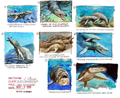
At left is the first idea for a breaching Tylosaurus, obviously based on a humpback photo.

Another sketch at top center arranges the scene with the Tylo’s flipper on the left.
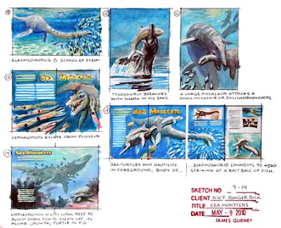
The assignment included scenarios for other illustrations, including a Kronosaurus and an Elasmosaurus. After researching online and in books and videos, I came up with lots of sketches, each one about the size of a business card.

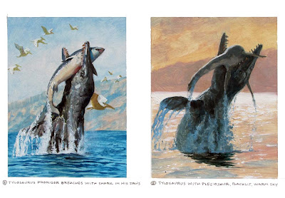
Once the editors had narrowed down the images to the final three ideas, I tried additional sketch variations to see if I could improve the color and design. These are painted in oil, about 4 x 5 each.
For example, which is better? The front-lit Tylo with blue water, or the backlit version with the warm tonality? The final painting incorporates aspects of both.
----
Ranger Rick magazine's current October issue has the final illustration
See the finished painting in Sea Monster, Part 1


11 comments:
I wonder how much freedom you had over design and colour after your final sketches were selected. Do the editors get ivolved much at this stage? Combining the original two colour schemes really works perfectly, a fantastic image!
I definitely prefer the the front lit study with the blue water. For a scene as brutal as that, i prefer it to be more matter of fact. The other study has more romantic sort of lighting, which seems a little out of place, even if its a great painting.
@ sirfrancisdrake
The backlit evokes a more romantic mood, that's true, but by showing this picture in a romantic way makes the scene even more brutal.
I prefer #2. I think in #1, the shark and the pterosaurs in the upper left form a bit of a tangent. Plus, the number of pterosaurs (particularly the larger one behind the tylosaur's head) are distracting from the focal point.
I really like how you angled the pterosaurs in the final piece onto a plane closer to orthogonal with the viewing plane. That added a lot of space into the picture. In study #1, they're all flying in planes parallel with the viewing plane.
At least, that's my bumbling opinion.
This blog is quite educational. Thanks for posting so much theory and process on here. It's a good resource to have!
www.humzakhan.com
www.humzakhan.blogspot.com
I will have to go with #1. Despite that I personally like #2. Okay I know I just made no sense, let me explain. #1works better for the assignment for Ranger Rick Magazine, better image of the creatures for viewing and educating, meets the criteria of what that magazine is teaching their young readers. #2 to me as a artist and adult, I do not need to "learn" about the creatures but prefer to look at the image as a painting over subject matter. Does any of this rambling make sense?
I had never considered this until I looked at your #1 option: do you think Pterosaurus would flock like that? Seems kind of weird to me, always thought of them as loners :). Looks beautiful, though.
I think Kurt makes a good point, but I'd go with #2 without a doubt, 'cause I'm a bit selfish and I just think its so beautiful it had to be made :)
#2 because the arching gesture is more curved and feels more dynamic, but #1 because the cold stark and jarring effect of this monster suddenly breaking that cool surface and taking it's prey off guard. The drama is violent a bit and jarring, but that makes it exciting and natural. #2 is more sentimental, and beautiful, nothing wrong with that...I just like the discovery channel kind of moment of #1. Superb work no matter how you dice it.
Your thumbnails have so much information and attention, it's just spectacular to see your thought process as you go through a piece.
Thanks, everybody, for this interesting feedback. Some of you make a good case for color sketch #1. One of the main reasons I went with #2 was because the other two illustrations that I did for the story had a strong bluish cast, and I needed a warm tonality to serve as a contrast from the undersea color schemes.
Wow, That's really great works.
Post a Comment