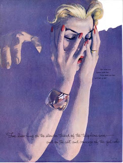
Here, Al Parker chooses to show us detail in the hands and face. He sinks everything else into a flat tone.

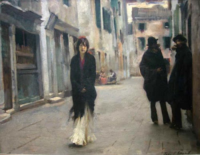
John Singer Sargent could have detailed every paving stone and roof tile in this Venice street scene. Instead he softened and simplified the background areas and put the focus on the faces.
This selectivity isn’t arbitrary. The detailed areas correspond with the parts of the picture that we want to look at anyway. As we’ve seen in previous posts, eye tracking studies have demonstrated the cognitive basis of selective attention. Viewers’ eyes consistently go to areas of a picture with the greatest psychological salience: things like faces, hands, and signs. We’re hard-wired for it.
What happens if you combine eye tracking data with computer graphics algorithms to automate the process of selective omission? Would the result look “expressive” or “artistic?”

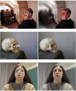
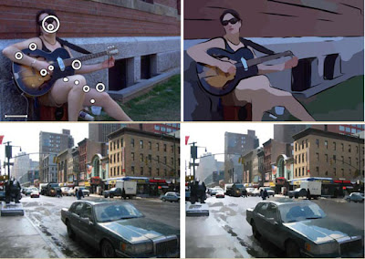
(Click to enlarge) In his doctoral thesis for Rutgers University, Anthony Santella did just that. The photographs on the left include a set of overlapping circles showing where most people spent their time looking in each image. The larger the circle, the longer the concentration on those areas.
Santella combined that data with a rendering algorithm which simplified other areas of the image. In the top image, note the flattening of the far figures and the arches above them. In the bottom image of the woman, note how the wrinkles in the drapes and the textures in the sweater are rendered with flat tones. But her eyes, nose and mouth are still detailed.

The rendering algorithms can be designed to interpret the source photo in terms of line and color. Or the shapes can modulated in size according to the interest factor. Note how the outlying areas of each rendering is simplified.
Whichever rendering style one desires, the output image has a sense of psychological relevance, more so than rendering algorithms based merely on abstract principles such as edge detection. As a result these computer-modified photographs have a sense of something approaching true human artistry.
The results of this interaction between eye-tracking data and computer rendering algorithms suggests a heretical thought: What we think of as a rare gift of expressive artistic judgment is really something fairly simple and logical, something you can teach a machine to do.
"THE ART OF SEEING: VISUAL PERCEPTION IN
DESIGN AND EVALUATION OF
NON-PHOTOREALISTIC RENDERING"
by Anthony Santella
www.research.rutgers.edu/~asantell/thesis.pdf
Final two sets of images are courtesy this online graduate thesis.
Previous related posts on GurneyJourney:
Abstraction Generator
Automated Painting
Al Parker at the Rockwell
The Eyes Have It
Stroke Module
Eyetracking and Composition, part 1
Eyetracking and Composition, part 2
Eyetracking and Composition part 3
Introduction to eyetracking, link.
How perception of faces is coded differently, link.


15 comments:
Totally fascinating! Thanks for posting. Hope soon common artist can use this to track our own wandering eyes to help us find a focalpoint/detail to paint?
This is an interesting post. This idea of focus verses unfocused areas is something I struggle with in my own work and I like how you presented it is a logical process. Like you say, if this selectivity can be "taught" to a machine it seems someone like me or anyone might be able to train himself to use this to create better paintings that have a more artistic look.
Again your posts are so relevant and interesting and I thank you once again for your constant intellectual and artistic searches and explorations.
I never noticed before, but this post made me realize that I find most all of John Singer Sargent's compositions to be fairly humdrum and bland once you get beyond his otherwise masterful and expressive painting technique.
I've also heard that term referred to as "Selective Realism".
Even in an image where there's a lot of stuff going on, it's important to concentrate on one or two focuses. As a comic artist, I know that. Humans are creature of order and we look for order in what we see. If we can't find order, then our brain will try to piece together a sense of order. Having pure chaos in an image can lose a reader or viewer - hence why it's necessary to focus on a particular element in an image.
By explaining great line, we have not explained line.- Heinrich Wolfflin
Yet another very interesting "Art Meets Science" article.
What an interesting experiment. The selective focus seems to work best on the city landscape. Maybe that's because there is more depth in the photograph?
I love Al Parker - Do you know of a book that has a collection of his work?
This would be awesome research for game developers to look at - what needs to be rendered and what resources can we cut back on? could create an interesting game experience..
Perhaps future cameras will have this device in them, judging what is relevant and what isn't. They already have face recognition and smile recognition.
Rachael, there's supposed to be a big book on Parker in the works. For now there's just an exhibition catalog from the Norman Rockwell Museum, which is slim but nice.
Chris, I like the city landscape treatment, too, because the editing is hardly noticable.
Olaf and Seren, yes, it would be fun to see this work for cameras, games, and CG animated films. Now, depth of field does a similar thing, but this edits an image with content factors rather than depth cues.
For me, the whole advantage of the photographic medium is its ability to capture "infinite detail". The trick in photography is to choose a subject, compose a subject, or arrange elements of a subject that stimulate the eye everywhere in the picture. This does not mean that every corner of the frame be of equal interest, just that the detail and texture play a role everywhere. To soften details in a photograph just lessons the power and potential of the medium, and when done badly, reduces it to a cheap imitation of painting. Selective focus in photography has its purposes, but the soft regions of a photograph will not hold the interest of the viewer in the same way that that the softened regions of Sargent's painting do. There is still delicious texture in those broad brush stokes, and we admire the economy in which Sargent achieves the effect, serving as a kind of sub-plot to the brilliance of his handling of the primary areas of interest. No such pleasures are found in the out of focus regions of a photograph. So why not play to photography's strengths rather than amplify its weakness?
Incidentally, I adore that painting. It's in the National Gallery in DC.
Walter,
All good points. Your beautiful work with the "Can You See What I See" and "I Spy" books make the case just as eloquently. It's a joy to explore a richly detailed photographic universe. (And I love to paint such images.) And you're right that a Sargent is still textured even in his blurriness.
But I think there are and will be hybrid forms between photography and painting that will be very satisfying new art forms. And I think we've only scratched the surface of the potential to input eye-tracking and other visual perception data into semi-autonomous rendering algorithms, especially for interactive visual environments like video games or architect's renderings. Who knows where it will lead us?
The recent sophisticated "visualizer" programs for generating moving images to music would have blown the mind of Walt Disney.
James,
I agree there will be exciting new hybrid forms of photography, digital art, and painting (I'm exploring that myself), but to scrub the micro details from photography really pushes it into the realm of graphic arts and illustration. When done successfully it will not be photography but photo-based work. It may not even matter what the origins are.
When photography tries to meet the goals of painting it often fails big time. Consider the comparison of the Vermeer's Girl with Pearl Earring with that of Scarlett Johansen in the same pose at the link below. You could pose it better, get a better expression, and scrub the photo till you get a better match, but it's a pointless exercise.
Now consider that terrific 1911 picture of the Emir you posted on your here earlier. It does needs no such corrections. It would be a crime to touch it. It's a perfect example of what photography does best. It needs no idealization. Every crack in the concrete contributes.
http://xiziluo.wordpress.com/2010/10/23/lingering-eyes/
Walter, what a fabulous example and a great link. Food for thought!
It also brings to mind the efforts of the "Pageants of the Masters" in Laguna, where people form group tableaus to simulate paintings. I agree that whatever hybrid art forms emerge, they will do best in becoming more than curiosities by not trying to ape another art form.
Link for the Pageant: http://www.arizonafoothillsmagazine.com/valleygirlblog/travel/laguna-beachs-pageant-of-the-masters
Post a Comment