


It's natural to assume that Falter found this idea readymade somewhere, but he had to construct it first in his imagination using a tracing pad.

Here is how another idea looked at sketch stage. A group of planners hold up a drawing for a highway cutting through a hill. Surveyors drive in stakes in the background. The old farmhouse is in the way.
The figures are drawn very simply, with very little detail. Falter is not hiring models yet.

He places another page of tracing paper over the first sketch. Falter changes his mind and explores another concept. He's still working from his imagination. The old house changes to a one-room school. The planners hold up a drawing of a new district school.

For the final cover, he returns to his original concept of the new highway threatening the house.
The final painting is not as successful as "Snowy Ambush." Perhaps the problem is that the characters aren't developed, so it's hard to tell how Falter feels about the situation. Also, he accurately shows the engineers using a blueprint, but blueprints don't read quickly enough to make immediate sense on a cover.
All these problems need to be solved at the tracing pad stage. It's worth spending tireless effort on the early sketch stages, because no amount of rendering will fix a problem that lurks on the tracing pad.
-----

Addendum: I posed the question:
"I was wondering how Rockwell would have approached this whole situation. I imagine he would have focused on the plight of the property owner whose place has been condemned by eminent domain. That could have been done with poignant humor and sympathy."
....and Matthew Mattin suggested this example, which I had forgotten about. Thanks, Matthew!
Wikipedia on John Philip Falter
Wikipedia on John Philip Falter
11 comments:
The brown-dressed man looking at the blueprint - I recognized his hat. It's hanging there in Falter's studio chamber;-)
Love that "Snowy Ambush", it has got atmosphere. Agree, it beats the "planners".
In the second example, I think Falter has done an admirable job of conveying narrative without any support from text (as it's a cover illustration). It doesn't have any particular formal beauty, but that's not necessary for a successful illustration that should be focused on narrative. I also think we shouldn't know specifically how Falter feels about the situation; he's portraying the cool indifference of the engineers...in fact, I believe Falter would rather have us inject ourselves into the painting to empathize with the land owners as they struggle with the concept of eminent domain.
Sir, did the old masters use tracing paper when doing their studies? like bouguereau, leonardo da vinci, jacques louis david etc...
Schnider, yes, in an earlier post, I shared a photograph of Pascal Dagnan-Bouveret in the 1880s with sheets of tracing paper taped on the wall next to him:
http://gurneyjourney.blogspot.com/2009/03/using-photo-reference.html
That first sketch looks as though the characters were traced to me. The foreshortening of the man's right arm looks like a quick trace instead of a rough gesture or lay-in.
Could he have been using some stock photography in the early stages? Or am I crazy and those figures are all just from his imagination?
On an unrelated note, the captcha texts are super hard now lol.
What an interesting comparison! Snowy Ambush is clearly stronger than the highway illustration, but the reasons seem to me to be complex and multi-layered. On the narrative level, Ambush sets out an absolutely classic dramatic situation: our protagonist has a goal, he needs to advance towards it, his path is clear, and yet - he hesitates! A conflict looms. What will our hero do? In the picture, this single idea dominates, and every line and shape serves to support it. Besides the narrative element, the pictoral elements of composition, light, and atmosphere are very good and reward the viewer long after the cute storyline has been absorbed.
The highway illustration actually has the very same dramatic set up: the protagonist's path is blocked, creating a dilemma - but in the case the action is muddied. Instead of one protagonist, we have four; the effort of figuring out which one to focus on takes attention away from the main point. The organically occurring perspective lines that in Ambush indicated both the hero's path and the waiting insurgents are missing here, so they have been replaced with the pointing finger, the stakes in the ground and distant figures, which require too much cognitive effort to decypher. And, unlike the evocative rendering of the tree lined street in the winter gloaming, the setting is rather banal, and the various elements seem to be pasted on, not part of a coherently imagined world.
Matthew
Matthew, that's a great analysis, and I think you put your finger on why I was puzzled by the second cover. Four protagonists is too many. In the background, I thought those two figures were a catcher and an umpire in a baseball game.
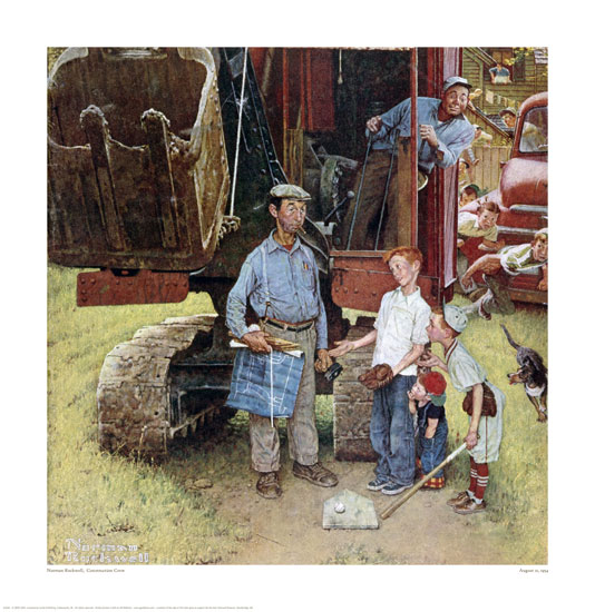
I was wondering how Rockwell would have approached this whole situation. I imagine he would have focused on the plight of the property owner whose place has been condemned by eminent domain. That could have been done with poignant humor and sympathy. As EtcEtc points out, it doesn't matter to him whether it's "progress" or wanton development.
Quoting James Gurney:
"I was wondering how Rockwell would have approached this whole situation. I imagine he would have focused on the plight of the property owner whose place has been condemned by eminent domain. That could have been done with poignant humor and sympathy."
Something like this maybe?
http://store.nrm.org/browse.cfm/4,2997.html
A better link...
http://www.normanrockwellvt.com/giclee_construction_crew.htm
I feel like I am always thrust into the role of antagonist on art blogs; I hope you don't misinterpret it as disrespect, James. Certainly the Rockwell is executed in his typical manner which is nothing short of technical mastery and genius. But I feel like this is a comparison between a tragedy and a comedy; the light-hearted fare of Rockwell here, if it is going to be compared, trivializes the non-trivial, mature, tension-filled seriousness of the subject matter of eminent domain. It's seen from a child's perspective, not that of an adult. And there is a blueprint also; in both cases I think it reads much more quickly than the hidden children in the first example.
Post a Comment