


 On the GJ Book Club, we're looking at Chapter 14: "Unity of Mass" in Harold Speed's 1917 classic The Practice and Science of Drawing. The following numbered paragraphs cite key points in boldface. If you would like to respond to a specific image or point, please precede your comment by the corresponding number.
This is another core chapter of Speed's book, with invaluable advice on tonal organization.
1. The modifications in the relative tone values of objects seen under different aspects of light and atmosphere are infinite and ever varying.
In other words, the color you mix on your palette for a given object can be greatly altered by the light and atmosphere of a given situation.

2. The painting of flesh higher in tone than the sky was201 almost universal at many periods of art, and in portraits is still often seen.
This is an artistic convention, which makes some sense compositionally, but it doesn't look naturalistic. That's a Tiepolo.
3. A black glass, by reducing the light, enables you to observe these relationships more accurately.
He's referring to a Lorrain mirror.
4. There should never be pure white or pure black masses in a
203picture.
This is one of the best reasons to mix your "blacks": you get color character in the darks that way. You can't go as low in value, but you don't want to. How often do pianists hit the lowest note on their keyboard? This power in reserve is also true of chroma. "Keep a shot in your locker," as Pyle and Dunn used to say.
5. Speed continues: "Also, the highest lights in nature are never without colour, and this will lower the tone; neither are the deepest darks colourless, and this will raise their tone."
Keep in mind that highlights partake of both the color of the light source and the local color of the object. Solar highlights with a little cadmium yellow look brighter than pure white.
6. Painting light to dark vs. dark to light
Interesting discussion here about painting sequence and value keying. What do you all think of his view of this?
7. These tone values are only to be perceived in their true relationship by the eye contemplating a wide field of vision.
When he says "wide field of vision," I believe he doesn't mean viewing angle, but rather scope or range of awareness.
8. Light and shade and half tone are the great enemies of colour, sullying, as they do, its purity; and to some extent to design also, destroying, as they do, the flatness of the picture.
Sometimes the strongest color effects can happen when the chiaroscuro of form lighting are minimized, and the objects are shown more or less as flat shapes. He says, "Large flat tones give a power and simplicity to a design, and a largeness and breadth of expression that are very valuable, besides showing up every little variety in the values used for your modelling; and thus enabling you to model with the least expenditure of tones."
9. The nearer these tones are in the scale of values, the more reserved and quiet the impression created, and the further apart or greater the contrast, the more dramatic and intense the effect.
Strong light and shade divides forms into light and shadow shapes, as he points out, but it also introduces cast shadows. All these things can complicate a picture unless you go out of your way to group values by shape welding.
10 Straight lines = flat tones. Curved lines = gradated tones.
I love the equivalency he draws here, which makes perfect sense, especially if you paint a still life of a polygonal vs. a rounded form. The lines and the tones are related.
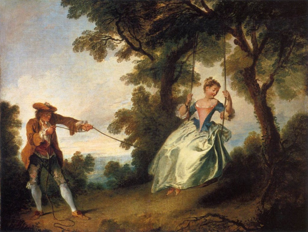
11. Watteau created a dream country of his own.
Example above. So did Maxfield Parrish and Dulac and Moebius and Syd Mead.

12. Gradation
Pencil diagrams like the ones Speed demonstrates are a valuable way to study old masters. He mentions the magic of Turner and Watteau for their use of large gradations, and I would add the Hudson River School painters, especially Church and Bierstadt.
He also echoes Ruskin when he points out that these gradations should be looked for not only in large areas, but also in the rocks and leaves.
13. The desire of so many artists in these days to cut loose from tradition and start all over again puts a very severe strain upon their intuitive faculties
An interesting point. He also says that the lack of a traditional system "keeps them occupied correcting things that more knowledge of some of the fundamental principles that don't really alter and that are the same in all schools would have saved them. Knowledge in art is like a railway built behind the pioneers who have gone before; it offers a point of departure for those who come after, further on into the unknown country of nature's secrets—a help not lightly to be discarded."
 This is traditionally know by the Latin line: Ars est celare artem: True art is the concealment of artifice.
-----
Harold Speed (Dover ed.)
The Practice and Science of Drawing is available in various formats:
1. Inexpensive softcover edition from Dover, (by far the majority of you are reading it in this format)
2. Fully illustrated and formatted for Kindle.
3. Free online Archive.org edition.
4. Project Gutenberg version
Articles on Harold Speed in the Studio Magazine The Studio, Volume 15, "The Work of Harold Speed" by A. L. Baldry. (XV. No. 69. — December, 1898.) page 151.
and The Windsor Magazine, Volume 25, "The Art of Mr. Harold Speed" by Austin Chester, page 335. (thanks, अर्जुन)
GJ Book Club on Pinterest (Thanks, Carolyn Kasper)
GJ Facebook page
Overview of the blog series
Announcing the GJ Book Club
Chapter 1: Preface and Introduction
Chapter 2: Drawing
Chapter 3: Vision
Chapter 4: Line Drawing
Chapter 5: Mass Drawing
Chapter 6: Academic and Conventional
Chapter 7: The Study of Drawing
Chapter 8: Line Drawing, Practical
Chapter 9: Mass Drawing
Chapter 10: Rhythm
Chapter 11: Variety of Lines
Chapter 12: Curved Lines
Chapter 13: Variety of Mass
Chapter 14: Unity of Mass
Chapter 15: Balance
Chapter 16: Proportion
Chapter 17: Portrait Drawing
Chapter 18: Visual Memory
Chapter 19: Procedure
Chapter 20: Materials
8 comments:
6. For me... if painting, I do better with dark to light i.e. starting with the darks in a grisaille, then lights, and finally adding color... however, if doing pastels, I do better starting with hard pastels which always seem to give me a "blah" mid tone drawing; then I spray with acrylic, let it dry, and come back with soft pastels for the darkest darks and lightest lights... and that "fixes" it.
4. There should never be pure white or pure black masses in a picture.
Sorry James, but I disagree with your inference that Speed was in any way suggesting the use of a mixed black is the way to go. If that were the case, I think he would have stated outright that it is better to use a mixed black than a tubed black. The way he states it I would interpret as one shouldn’t use black in its purest form, just add another color to it. Isn’t this is the same advise he gives for using white? Also, he’s talking about masses, not small accents. Just my two cents worth.
14. Would this also apply to images where you don't see the reference used, say the pose and or figure, but can SEE the reference used simply by the language of the composition?
Dash, I'm not sure I understand your question, but Speed is talking about light and shadow and the transitions between them as it applies to modeling form and designing a composition. So it applies whether you're working from life or from reference.
Marvin, Yes, what Speed advises about black is very interesting. He says that after studying Velazquez in the Prado, he started setting his palette with two blacks: a warm black and a cool black. If he couldn't find suitable tubed versions, he warmed up one batch by mixing burnt sienna with regular black and the other with cobalt blue. But we'll get to that when we cover his next book on painting.
Arturo, My way is a lot like yours when I'm working in oil. I really like to establish the dark masses early, even if I stop short of the final values that I'll be using.
Jenna, It is a little difficult to follow, but it has to do with the initial steps in painting, and which areas you define first. This has partly to do with the sequence of areas that you establish as you cover the canvas with paint (assuming you're using oil). He'll go into all this more later in this book and in the next one.
#6. Dark to Light, Light to Dark, Both ends to the middle; Three approaches towards developing your tonal values, with different advantages and limitations, all depending on the desired effect. But I’m surprised that Mr. Speed didn’t mention the fourth, and most common and natural approach, which is to build your values in the mid-tones, and working out to the darks and lights, as Arturo has mentioned. This seems to me to be the most intuitive approach, as most images begin w a lay-out or sketch, and blocking in of the larger mid-tone masses etc.. Even when working on a grisaille or a toned ground, its all pretty much mid-tones building to the extremes.
As Speed points out, Dark to Light is very good when accentuating the contrasts w chroma or lights and highlights, or developing more subtle nuances in the shadows, and also very useful w decorative techniques as well, but usually requires more planning, and/or under-painting; and the danger when working ala-prima is to make a muddy mess.
Light to Dark works well for portraits and over-exposed lighting effects, but also when using glazing techniques.
I don’t think I’ve ever worked both ends against the middle, except when doing copy work (and the values are already established) but that’s not the same as developing an original piece. I’ll have to give this a fling.
#7. This is really the main point of the whole book, and really what it’s all about. Developing a wider field of visual awareness. This is the key to the whole thing: Learning to ‘See’. Both being aware of what your eye is telling you about what is going on ‘out there’, and developing an inner-vision and a sensitivity to one’s own response and an inner-awareness to what is important. This is the hardest thing to teach and the hardest thing to learn. It all comes from doing, and participating in the creative process. Ride the train as far as it will take you, then you’re on your own. What a great journey! -RQ
I tend to lay out the basic composition in line-form, paint my purest (whitest) areas, my darkest, then fairly-pure color (within reason) everywhere else. Reason being that you can always "muddy" or darken color but you can never "re-purify" without letting the whole thing dry completely. (I work in oils).
Post a Comment