


Don’t paint the leaves all one color. Notice how the green shifts from emergent leaves to mature leaves to dying ones. In the case of the milkweed above, the older leaves at the bottom are lighter and yellower.

In this foliage, it's the opposite. The younger leaves are a lighter, yellow green, and the older leaves are darker.
Look for variations within the leaf, too, and try to convey the shadows cast on top of the leaves by the rest of the plant.

This is one of ten top tops for painting flowers outdoors in the magazine feature coming out in the next issue (#117) of International Artist Magazine.
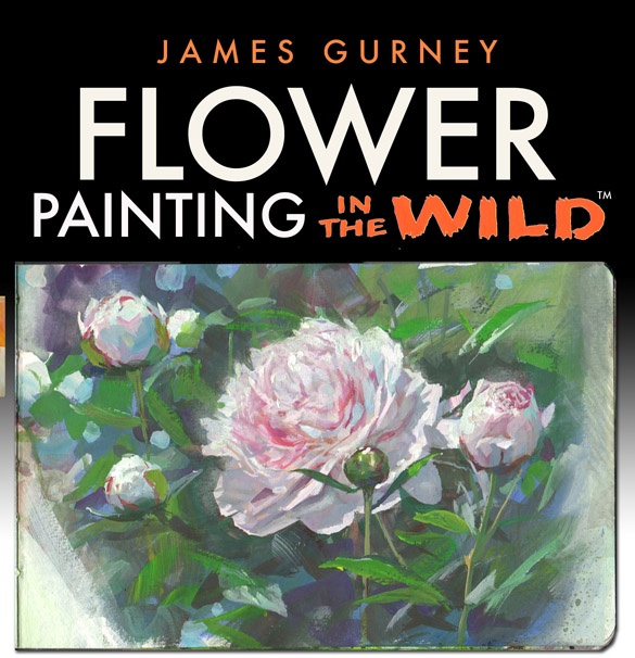 It's also one of the tips I talk about in my new video, Flower Painting in the Wild. "Whether you are just starting out or have mastered your own technique, to behold a fresh alla prima painting in plein air is a treat for any artist."
—Michael Klein, East Oaks Studio
1 comment:
These insights are always helpful. Not only for the sake of naturalistic description, but also (perhaps mainly) for the study of that sort of 'rhytmic variation' of nature that makes artworks appealing to the human eye and mind, whether figurative or abstract.
Would you suggest to render this effect even in the distance, where foliage should be regarded more as a mass than as made up of tiny detailed leaves? If yes, How would you?
Spring landscapes often offer many examples of this kind of gradation in one scene, on the other end insisting eccesively could impair lightness and brilliance. In addition I believe it could be worth paying attention to this effect in an imaginative painting to enhance the illusion of realism.
Post a Comment