Yesterday, this hand painted sign along Highway 116 in South Hadley, Massachusetts beckoned us down a winding dirt road into the woods. We had a few minutes before the lecture at the Eric Carle Museum, and I have a weakness for funky roadside dinosaur attractions.
The parking lot at the Nash Dinosaur Tracks Museum and Curio Shop was more like a bulldozed clearing, empty except for a scattering of pale yellow leaves, a rusting truck bed and a cement dinosaur.
Inside the cinderblock building we met Cornell Nash, museum director, amateur paleontologist, and gift shop manager. He has collected dozens of dinosaur footprints from the quarry behind the museum. Most prints are three-toed, roughly the size of a human handprints, from a dinosaur the size of a Coelophysis. A few are larger—a foot and a half or so—from a meat-eater often identified Dilophosaurus.
Nash doesn’t have enough glass cases to house the rest of his oddities, most of which are for sale—trilobites, ammonoids, cereal-box plastic sauropods, and yellowed trading cards.
He told us that when early American settlers found the trackways in the late 1700s and early 1800s, they had a very different explanation for them. The most popular idea was that Noah had released some giant ravens from the Ark, and let them run around on the vast mudflats after the Deluge.
When I first saw tracks like these many years ago, it sparked the idea for the Dinotopian footprint alphabet, which is the way in Dinotopia many dinosaurs are able to compose their thoughts.
Sunday, September 30, 2007
Tracking Dinosaurs
Labels:
Dinosaurs,
Journey to Chandara,
Museum Visits,
road tour
Saturday, September 29, 2007
The Flash-Glance Method
When you’re sketching people or animals in the real world, it’s pretty rare to find a subject that holds still for a long time. When I was a teenager, I used to wait for my parents to fall asleep in front of the TV on their Barcaloungers. Then I’d grab my sketchbook and get started, because I knew they’d be snoring away for an hour or two.
A few other subjects are guaranteed rock-steady—Irish flutists, for example, especially if they are playing into a microphone. They tend not to budge an inch, so you can settle into a careful drawing.
But what do you do when you want to sketch a person or an animal that is moving constantly? First off, don’t bother trying to fill the page with just one pose. What I do is start in the upper left and draw a lot of quick little sketches. Each sketch shows one basic pose taken like a snapshot from the continuous action going on in front of you.
I did these pencil sketches of a hen, for example, at a friend’s farm. We dumped a big pile of compost in the yard and let the chickens run around pecking and strutting. All I was able to observe from each momentary phase of action was the basic shape and pose.
Here’s a tip for making your eyes work like a high-speed camera. As you watch your subject, snap your eyes closed from time to time. The last pose will hover for a few seconds on your eyelids. Once you get used to doing this, you can work from the short-term memory or the “flash-glance” as I call it, enough to do a quick sketch anyway. These sketches of a symphonic conductor were done that way. Give it a try, and let me know if it works for you.
Labels:
Animals,
Pencil Sketching
New England Booksellers
Yesterday I signed books for more than two hours at the New England Independent Booksellers Convention in Providence, Rhode Island. It's a joy to be around people who love books as much as we do, and we're very grateful for their enthusiasm.
Labels:
Journey to Chandara,
road tour
Friday, September 28, 2007
By Hand or by Mouse
I have a fondness for cranky obsolete tools like circle templates, Speedball pens, and parallel rules. I love the feeling of stuffing sticky beeswax into a Lectrostik waxer. My pulse quickens at the smell of Higgins Eternal ink. I can still dimly remember how to construct a pentagon with nothing but a compass.
But I also appreciate the quicksilver speed and convenience of the computer. When it came to creating Dinotopia: Journey to Chandara, I gave a lot of thought to what steps to do by hand and what to do digitally.
For the first time I designed and wrote the book in Adobe InDesign. In the past I designed the Dinotopia books by typing out galleys on paper and sticking them down with hot beeswax onto cardboard paste-up sheets.
This time I had low-res digital image files shot from the original art, and I dropped them into an InDesign template. Then I inserted temporary "greeked" columns of type to match the storyboard. With just a few months to go before press time, I wrote the text and captions to fit into the layout. In this way I could juggle around all the page elements, trimming here and expanding there to carefully control the column length and page breaks.
During this design/comp stage I used two custom digital fonts that were made to simulate my own 19th Century-style hand lettering. These digital fonts appear in the final layouts of my second book, The World Beneath.
The digital fonts were fine for the comprehensive stage, but they never look like real handwriting. I’m getting a bit tired of looking at digital letterforms masquerading as real hand lettering. When it came to the final appearance of the new Chandara book, I wanted everything to be as authentically handmade as possible.
So I dug in the back of my studio drawers and found my old friends, the steel pen nibs by the name of Gillott and Speedball and Brause. They were rusty and so was I, but I got into the swing of it after a while.
I drew all the maps with ruling pens, circle templates, and dip pens. The captions were lettered with an oblique nib holder and a Gillott 170. The lettering didn’t take that long, and it was fun to put on a fancy flourish here and there.
Let me take this opportunity to thank my editor, Dorothy O’Brien at Andrews McMeel Publishing, for her patience and faith in this unusual process, and to Tim, Holly, Mackenzie, and the whole team at AMP for their incredible job of putting the elements into final design and production.
Labels:
Illustrated Books,
Journey to Chandara,
Lettering,
Pen and Ink
Thursday, September 27, 2007
Gallery Flambeau
In the back of every artist’s closet is a stack of failed efforts, the paintings that just didn’t work out for one reason or another. I’ve got my share of clunkers. But an artist should not bequeath too many bad paintings to posterity.
Your reputation rests on your overall average. If you have a lot duds floating around after you’re gone, your grandchildren will be in a tough spot. They won’t want to get rid of your bozos, so you should now.
That’s why, with the help of my teenage son Franklin, I invented the “Gallery Flambeau.” This solar-powered, environmentally friendly device uses a 4-foot wide array of parabolically positioned, laser-mounted mirrors to magnify the power of the sun over 300 times. Displayed under its unforgiving glare, a painting magically transforms into a cloud of smoke and a shower of ash. Gone forever. Press delete. Your Artistic Average goes up a tiny notch.
Remember, kids, don't play with fire, and protect your eyes from the intense brightness of the hotspot by always wearing the approved Mongolian Mountaineering Safety Goggles.
Labels:
Painting Gear,
Plein Air Painting,
Rabbit Trails
Wednesday, September 26, 2007
Credit to Mr. Penrose
M.C. Escher’s famous lithograph Ascending and Descending (1960) shows a stairway that appears to go forever up and down in each direction.
I’ve been fascinated by this illusion since I was a kid, because nothing in your brain tells you it’s an impossible object. When I started reading more about it, I discovered that the father-and-son mathematician team L.S. and Roger Penrose dreamed up the idea and published it in 1959. They shared it with Escher and became friends with him. None of them were aware that even earlier, around 1950, a Swedish artist named Oscar Reutersvärd had independently come up with the very same idea.
I started wondering if such a stairway might exist in Dinotopia. How would it look in the early morning lit by lamplight? Instead of being just an endless stairway going nowhere, what if it was used to connect two buildings? That way you could have two groups using the stairs, one group with low status—say, college freshmen—always forced to travel upstairs to and from class, while the upperclassmen could have the luxury of going downstairs to the same place.
My version from Dinotopia: Journey to Chandara owes a debt to Escher, of course. But I also want to give credit to Mr. Penrose and his son.
So in the new book, next to my illustration of the "Scholar's Stairway" there is a banner for the "Pen and Rose Fraternity." It shows a feather pen intertwined with a rose. The words “Pen” and “Rose” are written alongside in Dinotopia’s unique footprint alphabet.
Labels:
Journey to Chandara
Tuesday, September 25, 2007
Signs and Dinosaurs
Shane asked for a few plein air studies, so here are some streetscapes with plastic signs. These are mostly little paintings, 8x10 inches or so, painted outdoors. In this one I was interested in the color that a white house appears to be when backlit against a bright hazy sky. I was also interested in the mixed commercial and residential zoning. I get a kick out of doing these scenes of ugly beauty as a change from dinosaurs and utopias. I don’t do them to sell, just for fun.
Come to think of it, there’s a connection between dinosaurs and McDonald’s signs, because this entire mad enterprise will be extinct one day. A hundred years from now it will all have passed forever from the earth—McDonald's, Walmart, and Dunkin Donuts—and we’ll be nostalgic for it.
Labels:
Plein Air Painting
Monday, September 24, 2007
Acting It Out
Norman Rockwell held out for a long time against using photos for reference, preferring to make charcoal studies directly from live models. The reason he finally started taking photos was to capture kids and animals, who can’t be induced to hold a pose for very long.
I’ve always admired the work from Rockwell's early period of the 1920s and 30s, but I suppose he was right about kids and animals.
Especially if you’re painting an action scene, you really have to let them act it out, and take what reference you can.
When it came to shooting scrap for a Dinotopian festival, I recruited my sons, wife, nieces, and nephews at a big family reunion to actually test out the games. We played a tug-of-war game called “Tuggle,” and a team coordination game called “Plank Walking.” The kids had fun wiping me out every time in Tuggle, because a small kid with good timing can beat out an adult every time.
Acting it out not only gave me the reference I needed (for the people at least), but it gave a reality-check for whether the games worked the way I had imagined.
The downside of using photos is that I'm easily swayed by their compelling actuality, and lured into copying the details too closely, forgetting what I had in my mind's eye. Both of my pictures fail because the clothes and the people look too contemporary, especially in their clothes and hairstyles, and not exotic enough to look Dinotopian. Maybe you can leave a suggestion for how to use photos and avoid this problem.
Sunday, September 23, 2007
Excursions into Enchantment
“The soul has an absolute, unforgiving need for regular excursions into enchantment.” --Thomas Moore
"Be kind, for everyone you meet is fighting their battle too." --fortune cookie
Labels:
Pencil Sketching,
Portraits
Saturday, September 22, 2007
Blue Sky Studios
Yesterday Jeanette and I kicked off the Road Tour with a visit to Blue Sky Studios in White Plains, New York. Blue Sky created the CG animated features Ice Age and Robots. I presented the behind-the-scenes PowerPoint show about the making of Journey to Chandara to a group of their designers, animators, and directors.
Everyone at Blue Sky is informal and friendly and very enthusiastic about what they do. Check out the studio’s website, which describes their filmmaking process and what it’s like to work there. We were so impressed with the level of talent there, in so many departments— character design, story, layout, color scripting, effects, and lighting.
They’re currently deep in production on Dr. Seuss’s Horton Hears a Who for a March 14, 2008 release. The designers showed great respect for the style and spirit of the original book. It promises to be the best Seuss adaptation yet.
Labels:
Movie Studios,
road tour
Friday, September 21, 2007
Paint Brands
I'm so impressed with all the comments from the last post on how-to art books. Thank you all. I'll have to track down some of your recommendations.
Someone wrote me the other day and asked me what was my favorite brand of oil paints, I have to say I don't really have a favorite. I’m not that picky. I try them all. Even the cheapest paints, like Lukas’s student brand ($2.00 a tube) seem to work OK most of the time. I get so nervous when a tube of paint costs more than a tank of gas that I'm afraid to squeeze out any. But maybe I'm missing something, and I'd love to hear what you think.
To me, brushes matter more. A good Kolinsky sable really is worth it. I usually buy the second most expensive brand of brushes. I assume those companies work harder than the most famous brands.
Labels:
Painting Gear
Thursday, September 20, 2007
My Favorite How-To Books
A good how-to book is like a time machine that transports you right into the studios of the great artists of the past.
Here’s a list of my favorites. These are the ones I keep returning to for inspiration. They’re packed with insight and information from masters who knew their craft and were good at explaining it. We’re lucky that people like Norman Rockwell and Andrew Loomis took time out to write down not just their techniques, but the thinking behind their working practice.
Some of these books are available free online. Some are still in print in book form and are cheap and easy to get; others cost an arm and a leg, but they’re all worth seeking out.
The Practice and Science of Drawing by Harold Speed, 1917. Sensible overview of drawing and composition from a teacher who painted very well in the academic manner. Also The Practice and Science of Painting by the same author. Both are in print from Dover in inexpensive editions.
The Enjoyment and Use of Color by Walter Sargent, 1923. Also from Dover, a solid presentation of color theory as it applies to the actual practice of painting.
Disney Animation: The Illusion of Life, by Frank Thomas and Ollie Johnson, 1981. This is the bible for animators, but there’s so much on composition, design, and characterization that every illustrator should have a copy, too. Written by two of Disney’s classic “nine old men” who have generously downloaded much of their vast knowledge, with hundreds of great examples dug out of the Disney archives.
Creative Illustration by Andrew Loomis, 1946. In one volume, the best instruction by a master of painterly illustration from the Chicago school. Loomis has absorbed lessons of design from Howard Pyle, as well as painting and drawing principles from Sargent and Zorn. In a cheery tone, he works through the laws of line, tone, edges, and storytelling in a way that makes solid sense for any painter or illustrator. Loomis’s books on figure drawing and head drawing are also excellent. There’s a website and another dedicated to saving this material.
The Famous Artists Course, by Rockwell, Al Dorne, Parker and others. Started around 1950, this set of four binders was originally a correspondence course, but the lessons still apply today. The instruction breaks down storytelling illustration into topics about figure drawing, design, and composition from the great American magazine illustrators. Not particularly strong on painting and color. Get the sets from the mid-50s; the quality of instruction suffers later. The book Rockwell on Rockwell from Watson Guptill is based on Rockwell’s own lessons for the Famous Artists School, and gives you the core of his teaching. Also the book Norman Rockwell, Illustrator by Arthur Guptill has an appendix that outlines his method.
The Academy and French Painting in the Nineteenth Century by Albert Boime, 1971. Not a how-to book so much as a scholarly reconstruction of the methods and thinking used in the French academies, including their unique terminology for painting. Several books have talked about the academies in a sort of vague art-historical way, but this one really lays out the actual practice that was used in the classrooms.
I'd love to hear about your encounters with any these books, or recommendations of your own favorite how-to books.
Wednesday, September 19, 2007
Mirror Studies
Over the next week or so, I’ll be doing a few posts about models and posing, so I thought I'd start with the most mega-retro method.
A great way to get reference for a painting a character is to pose yourself in front of a mirror and make a charcoal study on tone paper. I learned this method from Tom Lovell, whose work I have always admired. There’s a full-length mirror mounted on a piano hinge on my studio wall just for this purpose. I set up the drawing paper on an easel and act out the pose, sketching a little at a time.
A few years ago, I needed to create the character of a warrior riding an armored dinosaur. I took the pose myself, wearing a wig and scowling in front of the mirror. During a break I forgot to take off the wig, much to the amusement of FedEx man, who chose that moment to come by the house.
Here's a detail of the final painting, which appeared as a gatefold in Nintendo Power magazine to announce the Dinotopia GameBoy game “Timestone Pirates.”
This picture of Will Denison from Dinotopia was also based on a mirror study. Even if you’re not exactly the right type for the character you’re portraying, you can make plenty of little adjustments. What you’re looking for is the basic action of the pose, something to begin with.
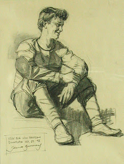
The final painting appeared in Dinotopia: The World Beneath.
Artists have worked from mirror studies for centuries, and it’s still a viable method as long as the pose is possible to hold for a while. It's just about as fast as shooting scrap. Although in recent years I refer to photos a lot more than I used to, I still like working from drawn studies when I can, because they give me only the information I need, unlike photographs, whose details can be compellingly seductive.
Tuesday, September 18, 2007
Reverse Atmospheric Perspective
We’re all familiar with the principle that warm colors advance and cool colors recede.
This picture of West Point from a few miles away is a good example of the way the warm colors tend to drop out in the distance, and the darks become progressively lighter and cooler.
But in wonderful, rare instances, the rule is reversed, and the whole scene gets warmer as it goes back. This happens when moist vapors or dust clouds hover in the air near sunrise or sunset. You have to be looking directly toward the sun to see it. The color of bright or white objects, like the sun itself, becomes increasingly orange-colored as it recedes, because the blue wavelengths are subtracted out of it. I took this photo recently in the Catskills--no filters or Photoshop whatsoever. The effect lasted only a short time.
This painting, called “Light on the Water,” from Journey to Chandara, explores this strange phenomenon. The foreground is actually cooler than the distance. The light of the setting sun spills out into the surrounding atmosphere, warming the outlines of the towers in the distance. The vertical bar of reflected light in the water melts the silhouettes of the boaters and swimmers nearby.
In my clipping file I have a folder of photos with a variety of atmospheric color progressions. Some of these might have been manipulated by filters or image processing. When I'm painting, I also refer to my own plein air studies, and if you're interested I can show you some more of those in future.
The Hudson River School masters Sanford Gifford and Frederic Church loved to work with the effect that I call "reverse atmospheric perspective." I believe they were influenced less by the sort of technical analysis of light that we're familiar with than by the vision of writers like Goethe and Emerson who expressed the poetic idea of light as a “consuming celestial fire” having the power, as Emerson put it, “to burn until it shall dissolve all things into the waves and surges of an ocean of light.”
Monday, September 17, 2007
Speed Blur
Here’s a painting of Will Denison that appears near the beginning of Dinotopia: Journey to Chandara. It follows a finicky establishing shot of Waterfall City. The idea was to grab the reader with fast movement.
Maybe you’re like me, and you love to stop-frame DVDs during fast action sequences (drives some people crazy). I got this idea by frame-grabbing during scenes where the camera is tracking a fast-flying object through tight spaces. The whole background blurs radially from the vanishing point along the path of movement. The blur gets more extreme toward the edges of the picture. Forms closest to the “camera” blur the most. Only the edges perpendicular to the movement get the blur treatment; the ones running along the path of action stay sharp.
Yeah, I know there are Photoshop and 3D programs that can create this effect, but I wanted to do it the “inconvenient” way with good old oil paint. I laid in the whole scene wet-into-wet, and swooshed the edges with a white nylon blender.
Labels:
Journey to Chandara
Sunday, September 16, 2007
Character Maquettes
I’ll wrap this "maquette miniseries" with the best known kind—the character maquette. Whether the character is human or animal, exaggerated or realistic, animators and illustrators use maquettes to stay “on model” with a character even in weird angles or light situations.
I made this bust of the explorer Arthur Denison because I couldn't find a real person with exactly the features I was looking for. I used Sculpey modeling compound, which can be shaped like clay and then baked hard in the oven.
With a maquette in front of your drawing table, you can experiment hundreds of different combinations.
You can also accessorize the maquette with a hat, turban, or whatever. The head on the right is a simplified “plane head” that I sculpted based on the anatomy teacher George Bridgman’s analysis of form. The plane head helps me to see the head’s basic construction without getting distracted by the features. The head is mounted on a flexible metal tube from the hardware store, which allows you to tilt the head to any angle you want.
Here’s one of the paintings that used these maquettes for reference.
Labels:
Journey to Chandara,
Miniatures,
Portraits
Saturday, September 15, 2007
Maquettes for Architecture
Yesterday’s post took a look at a few methods for making quick maquettes for landscape forms like snow and sand. Maquettes are also a big help for painting architecture, because they give you those little accidental effects of lighting and texture that you would never dream up. In this post I’ll share some studio tricks for architectural maquettes.
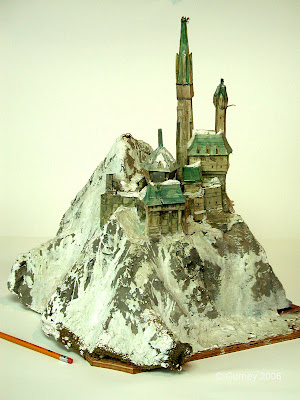
This model, which I made for a painting in the first Dinotopia book, is constructed from plaster-soaked burlap for the mountain forms, and mat board for the buildings, assembled with a hot glue gun. The whole thing is coated with gesso and colored with acrylic.
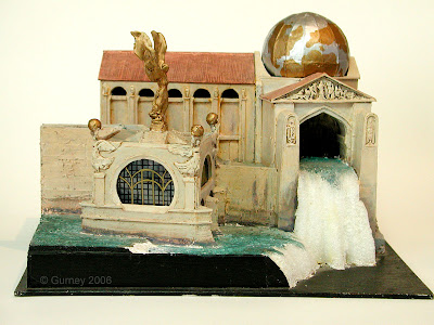
This corner of Waterfall City has about four days of work in it. It served as reference for several different paintings in The World Beneath and Chandara. It's made from cardboard, styrofoam, and two-part epoxy putty for the sculptural details. The original maquette is currently on view in the Dinotopia exhibition at the Los Angeles Public Library.
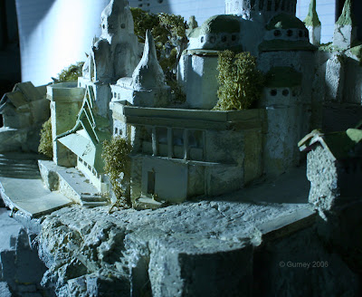
I made this little model for a painting of Chandara, but I’ve had it kicking around the studio, and I’ve used it in other ways. Here the light is tinted with a blue gel to suggest moonlight. The rough texture in the foreground is the broken surface of the styrofoam. I took the photo with a digital SLR set to a high f-stop and a long time exposure to give it maximum depth of field. Printed out on paper, the photo was one of many that provided a starting point for a painting of the desert city of Khasra in the new book. The trees are bits of dried moss from my backyard.
This 45-minute clay maquette also helped with Khasra. It shows how quick and loose an architectural maquette can be and still give you plenty of lighting information. Note the beautiful light bouncing into the shadows on the right side. The shadows on the tower on the extreme right are much darker because they lack reflected light. That's the kind of information I'm interested in.
The arch here is hot-glued from foam-core and mat board, with domes of styrofoam balls. I coated the structure with gesso and modeling paste and painted it in acrylic. I set up the model alongside toy wooden blocks as a kind of 3-D sketch for the marketplace scene below. A miniature set like this can be placed under an artificial spotlight or outdoors in direct sunlight.
The silver Christmas tree ball provides a record of the entire surrounding light environment. You need this information to really understand the combined effects of various light sources on any given object in the scene. If you look closely at the reflection in the silver ball you can see the arched window and skylights of my studio, and my own dome behind the camera. If the photo had been taken in outdoor light, the light effects would be slightly different, and so would the reflection in the silver ball.
Many of these methods of using miniatures are low-budget home versions of techniques used in the film special effects industry. They really don’t take much time—you can build and shoot a model in half a day—but they yield great dividends in your final results.
Labels:
Architecture,
Journey to Chandara,
Miniatures
Friday, September 14, 2007
Landscape Maquettes
How would you go about painting a realistic scene of a sand dune or a snowy mountaintop? Short of scouting real locations, you might browse through stacks of photos of the Sahara Desert or the Himalayas. I tried that, but came up short. There was a specific composition and lighting idea that I had in mind for each scene and I couldn’t find anything like it.
I knew that if I tried to invent the whole thing from my storyboard sketch, it wouldn’t be convincing, because the key to realism is lighting. Whenever I base a painting on a real form in real light, I notice little accidents of truth that I could never imagine.
Artists (and animation studios) often use maquettes, or reference models, but they’re typically created only for characters or vehicles. Maquettes are just as useful for landscape elements. Maxfield Parrish collected jagged rocks, which he photographed as reference for his rocky mountainscapes.For the sand dune painting I used a light tan modeling clay, or plasticene, warmed up in the oven and shaped into a dune. I then arranged a small plastic model of a Brachiosaurus and photographed them both in the same lighting condition.
The combination of references gave me what I needed to paint “Skeleton Dune.”
To create a maquette for a snow-covered mountain, I made a rough base from styrofoam, then draped some plaster-impregnated burlap over the base. I then built up a very rough model of an alpine castle from modeling clay and cardboard.
This was the work of no more than three hours--and I threw it out when it was finished--but it gave me the information I needed for the painting “Thermala: Alpine Hideaway” in Dinotopia: Journey to Chandara.
Labels:
Journey to Chandara,
Miniatures
Subscribe to:
Posts (Atom)