Monday, November 30, 2015

Golden Age of Illustration, Volume 3

The Illustrated Press has released the third of its limited edition surveys of classic American Illustration, called "The Golden Age: Masterworks from the Golden Age of Illustration — Vol. 3"


The large format hardcover book is purely pictorial, with 224 pages of full-page artwork. The images are arranged alphabetically in a survey that ranges from about 1900-1960. As with all of Dan Zimmer's publications, the quality of the printing and binding is excellent.

Tom Lovell and Orson Lowell
So you get one, or sometimes two, illustrations by the well-known illustrators, along with a good sampling of lesser-known names. I find these books to be useful for stimulating new visual ideas and for snapping me out of my pictorial habits.

Gordon Johnson and Victor Kalin
You can preview the whole book online in thumbnail form here and see if it's got what you like. The special collector's edition version is sold out, as is the first volume in the series. But the regular editions of Volumes 3 and 2, priced at $44.95, are still available.

Also, available for pre-order is the new Dean Cornwell book by Illustration Press, which is also limited to 1000 copies, and is sure to sell out.
-----
The Golden Age: Masterworks from the Golden Age of Illustration — Vol. 3

Developing the Painting Style of The Dam Keeper


I somehow missed this mini-doc when it came out. (Link to YouTube) Directors Robert Kondo and Dice Tsutsumi describe how they worked with a group of young painters to evolve the style for their 2D-computer-animated short "The Dam Keeper."

Sunday, November 29, 2015

Rainy Grocery

I did this quick sketch from the car yesterday while Jeanette was in the market. It's 3 x 3 inches in gouache. The colors are: titanium whitecadmium yellow lightburnt sienna, and Prussian blue in a watercolor sketchbook

I wrote a five-word story to go with it. There's still a month left if you want to enter the Six-Word Story Challenge. It's free to enter. You can browse the entries that have come in already on the special Facebook event page we've set up for the Six-Word Story Challenge.

Saturday, November 28, 2015

John Rogers, Sculptor for the People


John Rogers was a late 19th century sculptor who was as well known and beloved in his day as was Norman Rockwell in his. 


He sculpted table-top sized figural groupings based on literature or the Civil War. He then had a team reproduce them in plaster. The casts were painted in brown or gray tones so that they wouldn't show dust. 


The plaster casts sold for about $14 —about $425 in today's dollars, so nearly everyone could afford one. Rogers produced about 80 different subjects, with about 80,000 reproductions in all. They showed up in shop windows and homes everywhere. Even Abraham Lincoln had one.
-----
Resources
John Rogers was a 19th-Century Sculptor for the Common Man
In 2012 the New-York Historical Society had a retrospective called John Rogers: American Stories

Friday, November 27, 2015

Harold Speed on Modern Art, Part 2


Today we'll take a look at the second half of Harold Speed's chapter on Modern Art from his 1924 art instruction book Oil Painting Techniques and Materials.

I'll present Speed's main points in boldface type either verbatim or paraphrased, followed by comments of my own. If you want to add a comment, please use the numbered points to refer to the relevant section of the chapter.

1. The "extreme impressionist movement" was the product of an age of scientific discovery.
Since we often think of Impressionism as a nostalgic style, it's easy to forget that it was founded on new scientific theories of light and vision. Speed is receptive to the gains that impressionism brought to painting, particularly in the freshening of the palette.

Childe Hassam - Une averse
2. "Aspects of nature that had been hopelessly unpaintable on the old formulas were found to lend themselves to expressions in colour."
The Impressionists were revolutionary not only to their approach to color and painting, but also to their subject choices, painting contemporary life at unusual times of day or atmospheric conditions.

3. "...it did not lead art very far and had no possibilities of development."
There had to be a "but" in there. Speed sees the development into Post-Impressionism and Cubism as a consequence of the inevitable dead end of the "extreme impressionist movement."

4. Cutting with the art of the past
He argues that a flaw of the extreme impressionist position was to "entirely cut with the art of the past." That attitude exists even today among many academics, curators, and art historians. For example, a college near us built a big art museum, but they only show work of the later 20th century and beyond. All of their traditional realist paintings are either put in storage or relegated to a private, locked building that the public is not allowed to enter. The result is that the art of pre-20th century is effectively obliterated from consideration.

Had he lived into the 1960s, Speed would have been shocked to see the fervor for dumping the past as art schools gleefully pushed their plaster cast collections out of second-floor windows to crash in pieces on the ground. Speed is arguing that the extreme end of any ideological or religious movement can get destructive. He says, "There is something of Puritan austerity, a love of destroying pleasing things, and a dislike of seeing things going on too comfortably, in many of these modern movements....and a secret pride in being misunderstood, and if possible, persecuted."

"La Mont Sainte Victoire" by Paul Cezanne
5. "There is something about Cezanne, something about his uncompromising attitude toward all the softer graces of expression, and his love of uncouth directness, that makes him particularly attractive to a very large body of young painters." 
It is remarkable what a large shadow Cezanne cast over painters in the 20th century. If you look at 1950s American Artist magazine, you can see realist painters trying to absorb Cezanne into their way of seeing. He was rapturously elevated all the time in our art-school composition classes. Speed says: "He was deeply concerned with the third dimension in painting." I don't personally see that—maybe I never "got" Cezanne. His work has always struck me as rather concerned with flatness, and full of deliberate distortions.

6. Art, like religion, holds that these emotional perceptions put us in touch with things transcending the material world...and open up a correspondence with the world of ultimate realities.
This is an important value of art that was often overlooked in the era Speed was talking about, and is still often overlooked today, as many people are concerned with painterly surface and natural appearances. Speed seems to be acknowledging that the modern movement (meaning primarily Impressionism) was sound and valid at its core, but that the extremists were distorting the value of it by forgetting spiritual values, good design, and subtlety.

Painting by Thomas Moran
7. In modern "ism" movements, the aesthetic approach is to openly flout every other artistic consideration, and to limit the statement to a single principle.
To me, this was the problem with the abstract painting movement. I love the beauty of abstraction, but the abstract artists weren't the best at it. I always thought that the best abstract painters were realists like Thomas Moran or Andrew Wyeth, perhaps because they were accountable to nature. As Speed puts it: "Abstract ideas "gain their full significance in painting and sculpture only when associated with the representation of nature. Unassociated with anything but themselves, such abstract lines, tones, or colours become mere geometrical diagrams."

Most abstract-only painters have had a clumsy sense of color and design. Other abstract artists, it must be admitted, found their way to this way of painting because it doesn't require the drawing skills of realist painting.

Some abstract artists were sincerely trying to find in the visual arts some equivalent to the pure expression of music, but for reasons I'll have to cover in another post, visual art and auditory art are fundamentally different, making the goal of "painting aspiring to the condition of music" an impossible goal. Or at least that the goal of achieving pure abstraction in the visual arts is reached most perfectly by music visualizer programs, wallpaper, or motel art (not to disparage any of those forms—they all have their purpose).

8. "I am inclined to believe that every age has the art it deserves."
Maybe so, but I think we deserve better. Given that the Internet has created a level playing field where young artists can immediately find their way to the work they love, there's no reason that our age can't be the breeding ground of great work in every field of art. Speed here talks about a theme he developed earlier in the chapter, associating the art that is ascendant in any age with the cultural values that circulate around it.

9. "There are formulas at the basis of all good artistic design."
...but he says the life of the art is not in the formula. Art escapes the formula.

10. "There is no modern art any more than there is any modern truth. There is just Art and Truth. There is good and bad art, as there is truth and untruth."
Speed says that when you have to put an adjective in front of a kind of art, such as "Futurist Art" or "Post Impressionist Art" it marks it as second rate.

Speed concludes with some interesting points:

"The vigor and directness of expression one finds in good primitive art may be the thing we need in these days, but the scrapping of all traditions of fine painting and going back to a crude primitive means of expression is not the only way of reinculcating it.... The true advance in art is along the middle lines, in tune with a tradition of natural truth."

"What is original is only what is true, a newly perceived truth."

Next week: Chapter 3, The technique of painting.
-----
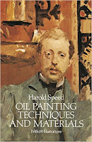
In its original edition, the book is called "The Science and Practice of Oil Painting." Unfortunately it's not available in a free edition, but there's an inexpensive print edition that Dover publishes under a different title "Oil Painting Techniques and Materials," and there's also a Kindle edition.

Thursday, November 26, 2015

SCAD Atlanta makes Scroobius Pips

SCAD Atlanta instructor Rick Lovell says on his blog:

"Two classes worked on the Scroobious Pip project this fall quarter. The project was inspired by two different things; James Gurney's video demo called "How I Paint Dinosaurs", and a silly poem by Edward Lear called "The Scroobious Pip," a nonsense story about an animal that is a little of everything."

Scroobius Pip maquette by Sally Geng
"The students created their version of the Scroobious Pip in polymer clay; it begins with a wire armature, is bulked out with aluminum foil, is covered in Super Sculpey, sculpted, baked and finally painted."

Scroobius Pip illustration by Sally Geng
"The maquette is lit and photographed and is used as a model for a finished illustration that tells a bit of a story about each Pip."

Scroobius Pips on the SCAD Illustration blog

Wednesday, November 25, 2015

Warm vs. Cold


With the thermometer dropping, it's getting a little chilly to paint outdoors.
In this little 4x4 inch gouache study I was thinking about warm vs. cold in terms of color temperature, too. The fading warm sunlight only partially melts into the icebergs of the buildings. 

I'm using three colors plus white here: Prussian blue, burnt sienna, and cadmium yellow.

On a different topic, blog reader Jim Douglas asked:
"After following your creative habits for years now I've gleaned you often make a sketch study of a subject then move on to a new subject to make a fresh start. New sketchbook page, new subject. Sketches, especially ones as excellent as yours, can certainly stand on their own as works of art, but do you ever have the urge to develop a sketch and produce a larger scale work based on it? I've only known you to develop sketches into a larger piece of artwork as part of a commission, and I'm curious to know if you ever follow that rhythm when making art for yourself." 

Jim, thanks for the compliment and question. As you say, my sketchbooks are very much an end in themselves, a way of seeing and sharing the world. I'm not doing those paintings to sell, and am making a living in other ways. The benefit of keeping the paintings bound together in sequence in a sketchbook offsets the limitation of not being able to frame them individually on the wall. 

At the same time my sketchbook paintings (maybe I should call them "studies" rather than "sketches") are valuable to me as a means to at least three other goals. One, of course is video production. The instructional documentaries are one of my primary creative outlets at the moment and an important source of income. I'm also looking into ways of publishing those sketchbooks both digitally and physically. And, of course, I do use my sketchbooks as reference when doing studio work. 

And finally, it's funny you should ask about larger scale works, because I just completed two larger separate paintings that will be the subject of the next video. I haven't really shared those images on the blog yet. They're both concept art pieces created entirely on location. Compared to the little sketchbook pages, 11x14" and 12x16" seemed huge. The new video is in voiceover and final edit and will be released in a few weeks.

Tuesday, November 24, 2015

Portrait of a Theorbo Player


It's not every day that you get to paint a theorbo, which is sort of a lute on steroids.

When I heard that theorbo specialist Simon Martyn-Ellis would be playing in Poughkeepsie, I made sure to get a seat in the front row.
I used watercolor pencils to outline the shapes. I painted the black areas with two water brushes, one filled with water and the other filled with dark gray water-soluble ink. I had all those tools ready in the left hand before the concert started so I wouldn't have to reach in my bag or move too much.

During intermission I painted the background and the skin tones with gouache and did the lettering with a fountain pen, then spent the second half of the concert finishing the details. 

"Soldier Playing the Theorbo" by Meissonier, oil on wood
8.5 x 11.5 inches, in the Met's collection, but not on view
In the back of my mind was this small study by Ernest Meissonier, where I first became aware of the theorbo.
----
Previous posts on sketching at concerts:
The Orchestra Now
James Bagwell Conducts
Maestro Bagwell
James Bagwell at a Rehearsal
The "Flash-Glance" Method
Gouache portrait of an Irish whistle player
Sketching a vocal concert  
Violinist in ink wash
Horn Player
Mirko Listening
Club Passim Gig
Shapewelding Sketching 
The Cello and the Pencil
Concertgoer
Mass in C
Handel's Messiah
-----
GurneyJourney YouTube channel
My Public Facebook page
GurneyJourney on Pinterest
JamesGurney Art on Instagram
@GurneyJourney on Twitter


Monday, November 23, 2015

Renaissance Recorder / The Third Panel


My wife Jeanette joined a Renaissance band. She got her old recorders out of a closet and is putting new corks in the joints.


For me, that will mean the chance to paint the musicians when they practice. This one is in gouache.

Thirty five years ago, she was associated with a group called "The Third Panel." The name jokingly refers to the right hand section of a triptych called Garden of Earthly Delights by Hieronymus Bosch more than 500 years ago.


The painting shows a musician's hell. Some of the tortured souls are shown crucified on the harp and lute, and a choir sings from a musical score written on a pair of buttocks.

According to Wikipedia, "Musical instruments often carried erotic connotations in works of art of the period, and lust was referred to in moralizing sources as the "music of the flesh". There has also been the view that Bosch's use of music here might be a rebuke against traveling minstrels, often thought of as purveyors of bawdy song and verse."


Here's a sample of some Renaissance music played by masterfully by the Praetorius Consort. (Link to YouTube)
-----
Wikipedia: Garden of Earthly Delights
GurneyJourney YouTube channel
My Public Facebook page
GurneyJourney on Pinterest
JamesGurney Art on Instagram
@GurneyJourney on Twitter

Sunday, November 22, 2015

Transparents and Opaques in Mixtures


The folks at Vasari put together this video showing what happens to cadmium yellow lemon (opaque) and Indian yellow (transparent) when you mix them with reds and whites. The factor of transparency greatly affects the value and chroma of the mixtures (Link to YouTube).

If you want to make such tests yourself, you can use a palette knife on glass with a black backing, or you can mix them in the form of a chart in a canvas paper pad.
-----
Vasari oil colors
Color and Light: A Guide for the Realist Painter


Saturday, November 21, 2015

Computers are learning to caption photos

For decades, one of the apparently insurmountable challenges in artificial intelligence was getting a machine to see.

 Caption:  “A person riding a motorcycle on a dirt road.”  Source: Io9
In order to approach the human capabilities of vision, a computer must be able to distinguish objects from their surroundings in a wide range of environments, even if those objects are partially obscured or shadowed, or turned in weird angles.

On top of that, a computer must be able to sort out the salient features of that object and identify what it is—what category it belongs to. Even more difficult is the ability to explain the relationship between objects—what's going on. Finally, in order to create a caption for an image, the computer also needs to be able to translate its understanding into natural sounding language.

 Caption: “Two pizzas sitting on top of a stove top oven.” Source: Io9
Can computers do it? They already have. The caption on the images above was generated a year ago by a computer, not by a human. The human caption for the picture above was “Three different types of pizza on top of a stove.”

The human's answer is better because he or she recognized that there were three different kinds of pizza, and that the pizzas were resting on a stove, not a "stove top oven."


At this stage, computers don't always get the captions right, and it's fascinating to see how they get it wrong. For example, the computer mistakenly believed the child in the knitted hat was blowing bubbles.

The problem all along with developing computer vision was that programmers were trying to solve it top-down by telling the computer what it needed to do. Part of the solution has been a bottom-up approach using deep learning to allow the computer to rapidly improve its performance.

Google has been at the forefront of this research, and here's a link to one of their research papers about how they're getting their computers to auto-caption photos. The process involves not only their object-recognition capability, which they've already had for a few years, but also a syntactic ability that's closely related to their language translation software.

Computer vision presents us with some immediate potential benefits: artificial systems will be able to help blind people, assist in manufacturing, and drive us around safely in cars.


But artificial intelligence in its darker potential manifestations presents an existential threat to humans, outlined in a current article "The Doomsday Invention" in the New Yorker, and in this TED talk (link to YouTube)
------
Computer vision on Wikipedia

Friday, November 20, 2015

Harold Speed on Modern Art, Part 1

We continue the Friday Book Club with Chapter 2, "Modern Art" in Harold Speed's 1924 art instruction book The Science and Practice of Oil Painting.

Let's take Roberto's suggestion of breaking this chapter into two parts, so we'll stop at page 20. I'll present Speed's main points in boldface type either verbatim or paraphrased, followed by comments of my own. If you want to add a comment, you can use the numbered points to refer to the relevant section of the chapter.

1. "A considerable body of artists have deliberately set aside fine craftsmanship in order to express themselves more freely...there has been such a fashion for the crude methods of savages and primitive peoples."

Speed's racist comments, coming at the beginning of his book, have probably turned off a lot of readers to the useful material that comes later in his treatise on painting. That's unfortunate. But let's take a look at his views one by one and see whether there's anything that makes sense to us today.

England after World War 1 was seeing its empire rapidly eroding. Because of widespread press and travel, the doors were thrown open to an awareness of non-European cultures and art.
Andre Derain, The Dance, 1905-6
At the same time, Modern Art, which was primarily a European phenomenon, presented a direct threat to an artist with academic skills. The fact that Speed invokes "savages" and "primitive peoples" and he shows illustrations of African carvings is not altogether surprising since some of the European Moderns around Speed were called "fauvists" (which means wild animals). He was writing not long after the scandalous premieres of such works as The Rite of Spring by Stravinsky, which deliberately evoked primordial rituals of non-European cultures.
Ivory Coast, Spirit Spouse.
Wood, Ht: 18."
Baule ethnic group,
early 20th Century.

I think most everyone nowadays would recognize that the art from non-European cultures—whether African or Pacific-Ocean or Native American — presents no threat whatsoever to traditional European academic painting. On the contrary, personally I find them hugely inspiring because of their language of abstraction.

In my mind non-Western art occupies a completely different category than Modern art does, despite the fact that many Modern artists used it as a jumping-off point. One can copy the outward style of any type of art, and that's totally fine. But if an artist doesn't know much about the culture or mind that produced that "exotic" art, it will be different from the original article.

Speed admits that some 19th century painters became overly concerned with naturalism, which he says led to "enfeeblement," so he has left the door open a bit to recognizing the value of Modernism.

Speed then proposes some sociological reasons for the rise of modernism:

2. Mass culture sets the dominant cultural note of the modern age
Speed suggests that there's a dominant cultural note in every age, such as that set by aristocratic patrons in the 18th century, and realism in the 20th century when middle-class values were in the ascendancy.

In other words, the power that buys the art shapes the art.

He then chalks up the trends of what he sees as crudeness in art to the rise of the power of the middle and lower classes. He says, "a great deal of the unrest and fretful violence that is disturbing the traditions of culture in all directions is due to the coming of this new cruder element into the cultural feast."

This argument strikes me not only as elitist, but wrong. If anything, it has been the cultural elite—especially academics, critics, and investors—that have promoted and supported Modernism.

Modernism has never been terribly popular in a widespread way among the lower and middle classes, compared to the art in comic books and magazines. What has truly captured the imagination of all socioeconomic classes in the West, from poor to rich, has been the "other" modern art movements found in comics, animation, and illustration.

3. "Now nobody waits until he has developed his mind before expressing an opinion."
What would he think of the Internet?

4. "The greatest works of art have been produced by small communities, such as existed in Athens and the independent states of Italy in the Renaissance." 
Interesting point, and perhaps it has a grain of truth to it, but I'm not sure that's always true. I believe art of great quality can appear anywhere, including in commercialized mass culture.

5. "It is only those whose work shouts at you, who have much chance of any immediate notice."
Speed equates bright colors with swearing and other inflated forms of language. He raises an interesting question for our time: Can art with quiet, sober virtues find an audience in our own age of ubiquity and image overload?

Speed observes that as Modernism began to emerge, artists were interested in the exotic. He says, "Whistler, Aubrey Beardsley, Conder, and the exquisite decadent art of the fin de siècle was the fashionable note. This has been followed by the craze for Cézanne, Van Gogh, Matisse, and Picasso."

He predicted that people would grow bored with such novelties. But history has proven otherwise, at least in the realm of the auction market and the museums. What may have surprised Speed were he to visit us today is how polymorphous the art world is. Whatever stuff you like, you'll find someone doing it.

6. "anaemic people painted life-size drinking the blood of freshly killed bullocks"
Speed makes reference to a specific painting at the (French?) Salon. Anyone know what painting he's referring to?

7. "I am not at all sure that the columns of literature it has produced, are not of much greater value than the works of which they are supposed to treat."
This is reminiscent of the point of Tom Wolfe's book The Painted Word, which argued that modern paintings serve primarily as illustrations of ideas that have their real life in print, and that the cart is driving the horse.

Tip to young artists: give critics and historians something to write about. 

8. Quotes from Roger Fry on page 16 and 17.
Roger Fry was an interesting character in all this, a promoter of Post-Impressionism and a detractor of Sargent. Rather than try to explain him further, here's the Wikipedia page on him.

9. "The great influence the Press has on modern life has brought into existence a new variety of artist, one who ministers to the demands of art critics."
There were publications cropping up everywhere in Speed's day which acted as tastemakers and gatekeepers. With those publications, Speed argues, comes a professional class of art critics who never existed before. He suggests that "the art-critics have strengthened their position recently by the control they have been able to exercise upon the purchasing departments of our public galleries."

Food for discussion:
a) There are still art critics in newspapers and magazines, but do they have the cultural influence they once did?
b) Has social media made art critics irrelevant?
c) What kind of artworks or artists are being fostered by the proliferation of forums like Facebook, Instagram, Twitter, and Blogger?

10. "Good craftsmanship is a healthier soil for art to grow in than fine theories about aesthetics."
This is a fascinating point, that art is the finest flower growing on a base of craftsmanship running through all of a culture's production. Can there be fine painting without a corresponding value placed on fine furniture and architecture and wallpaper and typography? This idea is reminiscent of William Morris, who believed that all things in a person's world should be conceived artistically.
We'll cover the second half, starting at "Technical Influences," next week.
-----
In its original edition, the book is called "The Science and Practice of Oil Painting." Unfortunately it's not available in a free edition that I know of, but there's an inexpensive print edition that Dover publishes under a different title "Oil Painting Techniques and Materials," and there's also a Kindle edition.
----
Speed's drawing book: Chapter 1: Preface and Introduction

Thursday, November 19, 2015

The Blot Drawings of Alexander Cozens


Eighteenth century British landscape painter Alexander Cozens promoted a novel technique for generating compositions. He called them "blot drawings" and their purpose was to unlock the imagination by suggesting random shapes and forms.


Cozens described a blot as a "production of chance with a small degree of design." 

It wasn't a completely new idea. Chinese artists had used similar methods for centuries, and Leonardo da Vinci had suggested in his notebooks that artists might find ideas for compositions in wood grain or stains on the wall.


Cozens' student Henry Angelo, recalled that he:
"dashed out upon several pieces of paper a series of accidental smudges and blots in black, brown, and grey, which being floated on, he impressed again upon other paper, and by the exercise of his fertile imagination, and a certain degree of ingenious coaxing, converted into romantic rocks, woods, towers, steeples, cottages, rivers, fields, and waterfalls. Blue and grey blots formed the mountains, clouds, and skies'. An improvement on this plan was to splash the bottoms of earthenware plates with these blots, and to stamp impressions therefrom on sheets of damped paper."

Cozens published a description of the method in his pamphlet: "A New Method of Assisting the Invention in Drawing Original Compositions of Landscape" (1785-6). 

Cozens' ideas later inspired the Surrealists and Abstract Expressionists to develop techniques such as automatism, where freely-created abstract designs were generated by random or unconscious processes.

Wikipedia on Alexander Cozens