Monday, December 31, 2018

A Dinosaur on a Bicycle

Yes, dinosaurs can ride bicycles. And they'll give you a lift.
Don't worry if you're riding in the back seat. Civilized dinosaurs poop intentionally.
-----
From: 
Dinotopia: Journey to Chandara (Signed copies on my website)

Sunday, December 30, 2018

Shishkin's 'First Snow'

First Snow by Ivan Shishkin, 1875 
The snow has melted in contact with the relatively warm, wet ground, but it still clings to the branches, surrounded by the colder air. 
----

Saturday, December 29, 2018

Is it cheating to base my art on computer-generated images?

Artistic-looking mages created by computers
courtesy Medium essay "What are Creative Adversarial Networks?" 
Barrett asks "I've seen these new CGI tools that can generate any kind of scene in any artistic style, and it makes me wonder: Is it OK for a painter to use computer-generated imagery for reference and inspiration? Sometimes it seems like the computer is doing the artistic work for me, and making aesthetic decisions, and I wonder if it's cheating for me to use them?" 

My answer: Like photography, these new computer techniques merely present us with another way of seeing.

Artists have always been sponges for new imagery. You can see the effect of photography on painting over the last 150 years. There are so many types of lenses, films, and processes before you even get into digital manipulation and CGI. Photography lets us freeze action, see through things with x-rays, and witness wildlife action up close. Photography has given us new eyes.

That doesn't mean we have to project and copy the random detail of a single given photo, though that's OK, too, if that's what you want to do (as long as you take the photos yourself or you have cleared the copyrights, of course).

The more we understand how cameras see, and now how computers can generate images, the more we appreciate the little "meat cameras" we were born with. And the more we learn about technologically-derived imagery, the more we realize our eyes and our visual brains behave very differently.

In my case, I'm usually trying to interpret my experience of reality directly into a sketchbook, or I'm trying to visualize a scene from the ancient past or from a science fiction future. I often think about photos I've seen and the effects they create, and I'm influenced by those images.

In some cases I want my paintings to look like photos so that they can fit into a magazine presentation that's mostly comprised of nature photos. To get those effects, I try to learn the theory behind photography, and I also surround my easel with a lot of different reference photos, taking a little from one and a little from another to make something new.

I don't know how the CGI technology will influence me, but I welcome it and am not threatened by it. Some CGI video imagery blends abstraction with reality in ways that resemble hallucinations or hypnagogic dreaming.

So I would say, embrace it all, vacuum it up into your eyes and see where it takes you. But don't forget to develop your skills, and to trust your own imagination and memory. It's essential to get beyond style and technique, beneath the surface, and dig down to an authentic expression that belongs to you. To get there, sometimes you have to unplug from all references and tunnel inside your own mind.

In the end, whatever tools you use, as long as your work is original and it communicates your own experience, it's not cheating.

Friday, December 28, 2018

Thérèse Schwartze paints a portrait

A Dutch portrait painter named Thérèse Schwartze (1851-1918) was invited to paint the daughter of the mayor of a coastal town.


She packed up her portable easel and paints and set up in a temporary studio in the mayor's attic. Fortunately someone took photos of her at work.

The girl sits in a chair facing a high window, supervised by a nursery maid. The artist's back is to the window.


Thérèse Schwartze, Portrait of Geradine
Marguerite van Hardenbroek,
 1903
Here's the portrait that resulted from the sessions. 

Thursday, December 27, 2018

Catskill Center Residency Now Inviting Applicants


The Catskill Center is now accepting applications for its little red cabin, perched at the top of Platte Clove, one of the wildest regions in New York State. 


A jury selects artists to stay in the primitive cabin for week-long residencies from July 1 - September 30. There's running water, a propane stove, a refrigerator, an outhouse, basic electricity and no internet.

The location was a favorite spot for Hudson-River-School painters such as Asher B. Durand and Thomas Cole, although the long vistas are more hemmed-in by trees these days. The nice thing about staying up there is that you can walk outdoors and paint streams and waterfalls from morning to night. 

Wednesday, December 26, 2018

Two WWII Posters

Recently we saw the exhibition of World War II posters at the FDR Library and Museum in Hyde Park.

Out of all the posters in the show, let me focus on just two of them with a very similar concept: machine gunners in action. Let's compare the compositions:

"Your Metal is their Might!" 1943 Jes Wilhelm Schlaikjer (American, 1897–1982)
The Schlaikjer painting shows three figures, a background that's light and dark, lots of bullet casings flying, and a slight upward angle of the gun barrel.
"Let's give him Enough and On Time" Norman Rockwell
What strikes me is how much simpler and more memorable the Rockwell is. There's just a single figure; we don't see the gunner's face; the background is black; the image is divided by a straight diagonal line; and the typography reads clearly against the light yellow background. 

By leaving out non-essential information, Rockwell makes a much stronger statement. In a poster, simplicity is crucial.   


Rockwell usually started out with a sketch made purely from his imagination and built his final concept around it. This germinal idea, which says "Are you backing me up?" is similar to the final, except that the soldier is turned toward us.
----
The exhibition "The Art of War: American Poster Art 1941-1945" ends December 31, but unfortunately, because of the government shutdown, the museum will be closed.

Tuesday, December 25, 2018

Merry Christmas, 2018

Santa Claus by James Gurney, Oil on canvas, 24 x 36.
Hoping the holiday season brings you good fun and togetherness.


Monday, December 24, 2018

'Christmas Eve' by Fritz von Uhde

Fritz von Uhde (German, 1848-1911) painted "Christmas Eve: Winter Landscape" in 1890. 


Mary leans against a farm fence on a winter night. A delicate halo floats above her head. Joseph has left her alone for the moment as he heads through the snow to find a place to stay.


The painting appears online in a couple different versions. This one appears grayer and softer.

Fritz von Uhde combined his practice of plein-air painting with his devotion to spiritual subjects. He said, "Many of the French artists wished to find the light in Nature. I wished to find the light within the figure that I was presenting."
-----
Fritz von Uhde on Wikipedia

Sunday, December 23, 2018

Extracting and Animating a 2D Character

Scientists have developed software that can extract a figure from a 2D painting or photo and bring it to life. 


The computer fills in the background and animates the character, so that it can walk or run out of the picture frame. (Link to YouTube)

The software works with photos, drawings, or even Picassos. Once the computer recreates the figure in 3D space, it can create a video or even a virtual projection that can be viewed with augmented reality goggles.
-----
Scientific Paper: Photo Wake-Up: 3D Character Animation from a Single Photo
Thanks, Dorian

Saturday, December 22, 2018

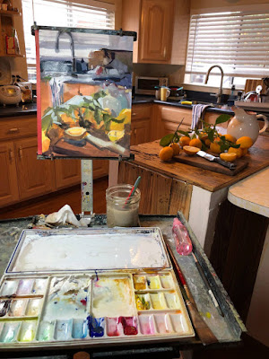
"Paint a Kitchen Challenge" Results

A few weeks ago, I announced the "Paint a Kitchen Challenge," inviting you to paint a scene in your kitchen, or a commercial kitchen somewhere.  

A lot of you took time from your busy schedule and brought your supplies into an active location with challenging lighting. There were both experienced painters and beginners, but you all deserve applause for your bravery and enthusiasm.

Because there were so many artistic and interesting results, it was hard to pick out the finalists, but here they are. Pentalic art supply company joined in to add some fun things to the prize packages.

Grand Prize Winner: Bhavani Krishnan 


Bhavani's painting shows a family member pouring coffee, with an open dishwasher in the foreground. She's an experienced painter, and colors she used echo in endless beautiful variations throughout the picture. 

She says: "Morning cuppa joe.. the usual morning routine in my kitchen.. gouache on moleskine sketchbook.. I used permanent yellow-orange, aliz crimson, turquoise blue, ultramarine blue and white." 
-----

Shawn Fields


Shawn captured a magical feeling of kids working in the kitchen. There's beautiful atmosphere with this one, and this is a picture the family will treasure. 

Palette: cadmium scarlet, cadmium yellow light, manganese blue hue, ivory black, titanium white.
------

Ada Alexander 


Ada captured a variety of surfaces: tile, stainless steel, formica, and enamel, all with a limited palette. 

She says: "I've been following James Gurney's painting from life challenges for a while, but it's the first time I plucked up the courage to actually do it :) It was challenging, but I've learnt a few things from it, so I am really happy I did it. It was also nice to go back to painting in gouache, which I haven't used in a while (in favour of watercolors). For this painting I used Yellow Ochre, Vermilion Red Light, Ultramarine Blue, Black and White."

Justin Pastores
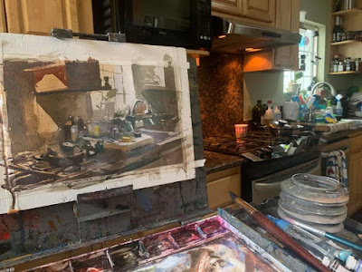


You can see at a glance that Justin has a lot of painting experience, with a relaxed touch and a fine ability to suggest mood and atmosphere.

Details: "7:30-9:00am Size: 7x10 Medium: Watercolor Colors: Cobalt turquoise, Lavender, New gamboge, Pyrrol orange, Titanium white.
------

Heather Martin
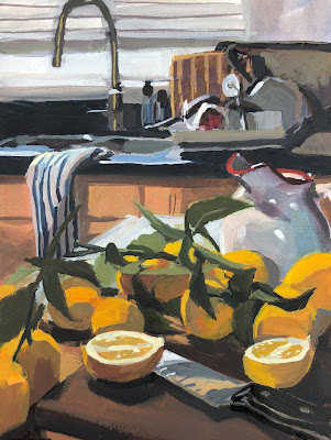


Heather undertook a complicated scene with lots of overlapping. The painting leads my eye through layers and layers of space and detail.

She says: "Our yard is always overflowing with juicy lemons at this time, and this year was no exception. I decided to hack away at some of the thorny branches to add some color to our kitchen on the overcast winter day. Colors used: Titanium White, Ultramarine Blue, Yellow Medium, Burnt Umber, and Quinacridone Red. Da Vinci gouache was new to me, but impressed me with a thicker paint feel. Thank you for the challenge!"
----

Zoungy Kligge 


Very nice sense of light under the vent hood of the range, contrasted with the cool window light on both sides.

"This is a painting of my mother's kitchen "in action." I had considered adding her from photo reference but decided to just do the kitchen from life. In total I spent a few hours on this, maybe about 1/4 time on the drawing and 3/4 on the painting. My materials are Holbein gouache in a Pentalic 5 x 8 watercolor journal, plus Caran D'Ache Supracolor pencils. I did the initial value lay-in with the pencils and some water and used a white pencil for the steam effect. My paint pigments were Permanent White, Burnt Umber, Burnt Sienna, Yellow Ochre, and Ultramarine. I accidentally photographed a Black paint tube instead of Ochre, but any black in the painting was made with Ultramarine and Umber mixed together, not Black pigment. My "easel" is yet to be built, so I experimented, first with holding my sketchbook and paint thumb palette only, and finally settled on holding a baking sheet, with everything I need on it. I hope you all enjoy the painting. Oh-- it gave me an excuse to break in my first Pentalic sketchbook which I'd been saving for some special occasion. This was the one."
----

Tim Hodge 


Tim set up his sketchbook right next to the pizzas and captured the unique ovens in the kitchen. 

He says the art is "5x8” in my sketchbook. I went to a local pizza shop and sat at the bar that looks into the kitchen and wood burning ovens. My palette consisted of burnt umber, ultramarine blue, spectrum red, permanent yellow deep and white. Oh, and the pizza was great, too!
----
Finalists, please email me your mailing address so that I can send you the embroidered patch, and I'll let Pentalic know so that they can send you the art goodies. 

Thanks to everyone for participating. If you do Facebook, please see all the results of the "Paint a Kitchen Challenge" on the special Facebook Event Page, and it would be great if you could add a like and a comment there.

Friday, December 21, 2018

Dudley Hardy's Sketchbook

Dudley Hardy (English, 1867-1922) was a cartoonist and illustrator who specialized in art for humorous postcards and posters.


He also kept a sketchbook to capture poses from and types around him in England and France. His sketches were quick expressions of gesture and personality.


An 1893 article in Studio Magazine admired the simplicity of his sketches, "There is great interest in such rough humour chiefly founded upon suggestion of notes or sketches. Indeed, were I the editor of a weekly illustrated paper I would rather use them than carefully finished drawings; but, of course, I should be foolish, since in Art matters the British public insists upon having the t's crossed, the i's dotted, and demands exact punctuation and proper capital letters—otherwise it seems unable to read. How can it be otherwise when the phrase about genius and taking pains is commonly supposed to be a justification for elaborate over-finish?
----
Dudley Hardy on Wikipedia 


Thursday, December 20, 2018

Studying Color and Light: Online Resources


What's the best way to teach yourself about color and light? There are a lot of books available, and resources online. This blog post by Luiz Celestino of São Paulo, Brazil gathers together a lot of sources together—not just by me, but also YouTube videos by folks like Tonko House, Nathan Fowkes, Rocket Jump, Stan Prokopenko, and Criswell Cinematography 

Blog Post: Color and Light do James Gurney - Como estudar este livro? The post is in Portuguese, but most of the videos are in English.

Wednesday, December 19, 2018

Caricatures by Artificial Intelligence


These caricatures were created by artificial intelligence, not by humans.


The system uses Generative Adversarial Networks (GAN), and doesn't require any input from humans to create the caricatures. Scientists developed this AI system to use a two-stage process, a combination of style transfer and geometric exaggeration of facial metrics.

The artistic styles are developed by training the network with large data sets of human-created caricatures from Toonpool and Pinterest. Ideally you'd want to give the computer examples of direct comparisons between photos of people and artistic interpretations from those specific photos, but there's just not a large enough set of those to use for training the computer.

Then they trained the system to distort the artistically-styled image to emphasize the factors that make the face differ from an average face. The scientists explain: "Shape exaggeration is not a distortion, which is complete denial of truth. The exaggerated shape should maintain the relative geometric location of facial components, and only emphasize the subject’s features, distinct from others. The final appearance should be faithful to visual styles of caricatures, and keep the identity with the input face, as addressed in other face generators." 


The system can also be used for animation. These are stills from a video where each frame is created by the computer.

Most of the reactions I've seen to this fall into two camps: "It's coming to take my job" or "It's not that good." To the first I'd say it depends on what your job is, but it might force many of us to change our jobs somewhat if we want to stay in business. For some artists who want to use these tools, more power to you, and these methods may lead to new art expressions that we've never seen before. 

To the second objection, I'd say that this is just a first baby step. How far the neural network strategy will take us is anyone's guess. Some say GANs are superficially impressive but that the method has hit a wall, and it can't begin to rival the complexity and sophistication of the human brain. 

As blog reader Eugene Arenhaus puts it: "It tells more about our preconceptions about what our brain can do, than about AI. Turns out certain functions require far less brain than previously thought - and not unique to humans, as a less snobbish look at animal intelligence had been showing in the past 15 years. But there is a lot of complexity in human cognition that these primitive NNs can achieve, although the people driving hype try hard to pretend otherwise and make wild promises."

For my part, I don't regard this as a direct threat to my livelihood, but more of a reminder that I'll have to evolve my art as these tools get more powerful—similar to the way artists had to evolve with the advent of photography. I also am fascinated to learn how these AI systems work, because those insights can help me understand better my own human thought process when I make a picture.

Tuesday, December 18, 2018

The Euphonia, a Victorian Talking Machine

Before the modern era of digital speech synthesis, engineers experimented with mechanical means of recreating the sound of the human voice.


"In the Victorian Era, the Euphonia was a 'talking machine' that had the ability to simulate human speech, designed by German inventor Joseph Faber. Her ghostly voice and vacant stare left many spectators scared and running for the exit." (Quote from Twitter user 41 Strange,)


Atlas Obscura says: "The Euphonia was the product of 25 years of research and an undeniably impressive feat of engineering. Fourteen piano keys controlled the articulation of the Euphonia’s jaw, lips, and tongue while the roles of the lungs and larynx were performed by a bellows and an ivory reed. The operator could adjust the pitch and accent of the Euphonia’s speech by turning a small screw or inserting a tube into its nose. It was reported that it took Faber seven long years simply to get his machine to correctly pronounce the letter e."


"With a conviviality akin to 2001: A Space Odyssey’s HAL 9000 computer, the Euphonia began the exhibition at Egyptian Hall by saying: 'Please excuse my slow pronunciation…Good morning, ladies and gentlemen....It is a warm day....It is a rainy day....Buon giorno, signori.' Spectators were then invited to ask the Euphonia to speak whatever words they wished in any European language."


Once the 20th century arrived, most of the energy for inventing 'talking machines' went into phonographic recording. By 1939, electromechanical voice synthesis systems such as the Voder began to produce results (YouTube link).

Apparently there aren't any existing prototypes of the Victorian Euphonia technology in action, though some people have tried to create mechanical talking robots using silicone mouth parts.

Read more online on these blogs:

Monday, December 17, 2018

Make Your Own Curved Track Dolly


Putting a camera on a curved dolly can add production value to a low-budget video. It's easy and inexpensive to build one. (Link to 13 minute YouTube video)


If the curvature is a section of a circle, and the camera is pointed toward an object placed on the center of a circle, that object will stay in the center of frame.


The movement of the camera is controlled with a geared down Lego motor. This one travels about one foot every 15 minutes, or about an inch minute.  


The cart is also made from Lego. I remove the tires from normal wheels and run the cart on the rims. The track is made from flexible Pex pipe, which you can get from the hardware store. 


Sunday, December 16, 2018

Painting a Cellist


The music department of Bard College presented its Winter Songfest last night. My wife is a member of the Symphonic Chorus, so I was able to tag along to one of the rehearsals.


I painted a cellist in the conservatory orchestra. I use a small palette of gouache: white, black, yellow ochre, light red, and ultramarine blue. 


The gouache allows for a few corrections and adjustments that aren't possible in plain watercolor. I'm holding everything in my lap, and am being extremely neat and careful. 


Above is a video (link), so you can see the work in progress. Starting with a pencil and transparent washes, I cover the surface with tones. Halfway through I have second thoughts about the warm-colored background, so I change it to light and cool using opaques.
------
You can also see this video on my Instagram post.

Previously posts about sketching at concerts:
James Bagwell Conducts
Maestro Bagwell
James Bagwell at a Rehearsal
The "Flash-Glance" Method
Gouache portrait of an Irish whistle player
Sketching a vocal concert
Violinist in ink wash
Horn Player
Mirko Listening
Club Passim Gig
Shapewelding Sketching
The Cello and the Pencil
Concertgoer
Mass in C
Handel's Messiah

Saturday, December 15, 2018

Sargent Painting Mrs. Fiske Warren

Photo of John Singer Sargent painting Mrs. Fiske Warren (Gretchen Osgood) and her daughter Rachel at the Fenway Court in Boston (now the Isabella Stewart Gardner Museum), where Sargent had set up a temporary studio.

Sargent painting Mrs. Fiske Warren, 1903

The painted figures are approximately life size. The large canvas held vertically with the subjects' head in the painting close to Sargent's line of sight. 
"Sargent arranged Mrs. Warren and her daughter in grand Renaissance armchairs, and used an elaborate gilt candelabra and a fifteenth-century polychrome Madonna and Child as a backdrop. This sculpture inspired the unusual pose of mother and daughter: Rachel rests her head on her mother’s shoulder in imitation of the tender gesture of the Virgin and Child." Read more on the Museum of Fine Arts website.
-----