Saturday, April 30, 2011
Crumb and Bouguereau in New York
Today is the last day for the exhibit “R. Crumb: Lines Drawn on Paper.” The exhibit showcases Crumb’s irreverent and outrageous comics and sketches going back to the Zap and Motor City comics of the late 60’s. It’s at the Society of Illustrators at 128 East 63rd Street.
Over at the Hirschl & Adler galleries on 730 Fifth Avenue, it’s also the last day for "Bouguereau & His Milieu," a small show of six paintings by William Adolphe Bouguereau. The show is a celebration of the recently published two-volume catalogue raisonne of the artist's paintings spearheaded by Fred Ross, founder of the Art Renewal Center.
-------
Labels:
Museum Visits
Friday, April 29, 2011
Lines and the Brain, Part 4
In a previous post, I mentioned that the visual brain uses a lot of cues, not just lines, to piece together its understanding of the world.

Even in the absence of outlines, we easily and automatically register shapes. The Kanisza square illusion shows that certain arrangements of forms create the perception of a shape where no line exists.
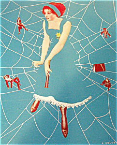
Coles Phillips was a Golden Age illustrator who used this phenomenon as a compositional device, making our brains see what isn’t there. He became known for the “Fadeaway Girl,” who disappears into the background.
------
Don't forget, Sunday is the deadline for the book trailer video contest!
Lines and the Brain Series,
Part 1
Part 2
Part 3
Part 4

Even in the absence of outlines, we easily and automatically register shapes. The Kanisza square illusion shows that certain arrangements of forms create the perception of a shape where no line exists.

Coles Phillips was a Golden Age illustrator who used this phenomenon as a compositional device, making our brains see what isn’t there. He became known for the “Fadeaway Girl,” who disappears into the background.
------
Don't forget, Sunday is the deadline for the book trailer video contest!
Lines and the Brain Series,
Part 1
Part 2
Part 3
Part 4
Labels:
Visual Perception
Thursday, April 28, 2011
Lines and the Brain, Part 3

However you define them, lines or edges are an exciting topic now because of new breakthroughs in vision science. Neuroimaging and other tools used to analyze brain function are rapidly increasing the understanding of how the visual system interprets the lines we encounter in the world around us.
The primary visual cortex, which lies at the back of the brain, has about 140 million neurons. These neurons are organized in groups that specialize in sorting the information into various properties. Some groups of neurons called orientation columns respond preferentially to vertical lines, some to horizontal lines. In the image at left, created from the visual cortex of a macaque monkey, neural clusters with different functions are grouped by color. Other clusters of neurons respond to size, color, and shape. Some are tuned to respond to vertical movement, and others to radial movement.
I asked Carl Schoonover:
Do the orientation columns perceive a vertical line as vertical even if the head is tilted or if the lines are receding in three point perspective?
“Orientation columns perceive orientation relative to the patterns of light that hit the retina. So if look at a vertical line and tilt your head 90 degrees, neurons that respond to vertical lines will go silent (aka that orientation column will go silent), whereas previously 'horizontal-preferring' silent neurons/orientation columns will then be activated.

“However, you may still perceive the vertical line as vertical, even if your head is tilted. This is because there's a lot more to the visual system than just one-to-one representation of visual space onto cortical space. In higher areas of processing, it is possible to maintain a more flexible representation of one's environment, irrespective of the exact pattern of light hitting the retina.”
“This is thanks in part to 'Helmholtzian' signals” (a centuries-old hypothesis that posits the stability of images despite our head movements). “This is useful for many reasons--for one, our heads our constantly moving as we walk, as our eyes saccade across visual space... but nonetheless our visual experience remains quite stable.”
I'll take a brief break tomorrow (Friday) and finish this up on Saturday.
------
More on orientation columns from the Journal of Comparative Neurology
Orientation columns image by Yevgeniy B. Sirotin and Aniruddha Das
Painting by John Berkey for a 1979 Brown and Bigelow calendar. Thanks, Jim Pinkowski, who has a big website of Berkey images.
Thanks, Carl Schoonover. More in his book "Portraits of the Mind"
Lines and the Brain Series,
Part 1
Part 2
Part 3
Part 4
Labels:
Visual Perception
Wednesday, April 27, 2011
Lines and the Brain, Part 2
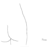 To artists, a line is a powerful geometric entity, whether it’s a straight or curved mark on a piece of paper. According to the author on neurobiology Carl Schoonover, the drawing by Picasso at left shows that we can distinguish shapes easily with a few lines, which he says “taps into our visual system's predilection for line.”
Yesterday I started to pose a few questions: Are lines merely abstract constructions—artificial conventions—that we have invented to represent nature? Do they have counterparts in the real world and in our minds? Do they reflect something basic going on in our brain when we look at the world?
These can be sensitive questions for artists who do most of their work in line. They are often made to feel that what they do is just a preliminary step, or that it isn’t as advanced as what a painter does. In fact, the management of line is one of the most sophisticated skills an artist can master, and it corresponds to some of the most basic and powerful experiences of visual perception.

We use lines to describe several things:
1. A boundary of a form (B, above).
2. An edge of a surface marking (A).
3. A plane change within a form (C).
4. Or an edge of a cast shadow (D).
5. Also, a line can describe a thin form, like a tree branch or a piece of spaghetti.
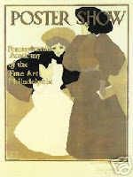
A shape boundary can be regarded as a type of line. Some images, like this poster by Maxfield Parrish, can be made up entirely of overlapping shapes.
At the initial level of visual processing, neuron groups in the visual cortex begin to process shape boundaries in a similar way that they process outlines drawn on white paper. But as we'll see in later posts, edge detection is just one preliminary step in object recognition. The brain constructs an understanding of shape and form and space by combining information from many different cues.

Our visual system has no trouble sorting out boundaries, surface marks, plane changes, and cast shadows (click to enlarge). But they are not trivial tasks when you’re trying to educate a computer, even a smart computer, to see. Edge detection and feature extraction are exciting frontiers for people at the intersection of computer science and visual perception.
----
That last photo is from Wikipedia on Edge Detection
Colored cube is from GurneyJourney "Color Constancy Illusion" post.
Lines and the Brain Series,
Part 1
Part 2
Part 3
Part 4
Labels:
Visual Perception
Tuesday, April 26, 2011
Lines and the Brain, Part 1
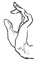 “There are no lines in nature, only areas of color, one against another” said Edouard Manet.
Perhaps not. But by the same logic there are no colors in nature, either.
Lines and colors are phenomena that manifest themselves in our our minds. At that level, lines are very real indeed. Perceiving boundaries is a fundamental aspect of our life as visual creatures. It is hard-wired into our perception.
According to
“Lines are the bread and butter of our visual experience. They define trees, horizons, the edges of things we don’t want to bump into. Our visual system is designed to rapidly extract this meaningful information in order to make sense of the world. Consequently, the area in the visual cortex that first processes information coming in from the eyes is configured in a manner that reflects this preference for lines.”
---------
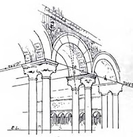 Quote from Carl Schoonover in “Portraits of the Mind,” (2010)
 Images from:
Vanderpoel, The Human Figure, 1908
Norton, Freehand Perspective and Sketching
Lines and the Brain Series,
Part 1
Part 2
Part 3
Part 4
Labels:
Visual Perception
Monday, April 25, 2011
Indian Paint Pots
If you stroll along the rocky beaches of the north shore of Long Island, New York, you can sometimes find what locals call “Indian paint pots.”

Also called "hematites," they’re chunks of iron ore conveniently encased in a saucer of rock. Sometimes the wave action has broken them open. If you wet the rusty iron oxide and scrub it with a toothbrush or a bristle paintbrush, you’ve got a very permanent dull orange pigment. Mix in a bit of gum arabic or acrylic medium or linseed oil, and you’ve got paint.
As far back as art’s cave-painting days, iron oxide has been a common and reliable pigment universally available to artists. That’s why brownish reds and oranges appear in all prehistoric art traditions. The best iron oxides were dug out of natural open pits in Siena, Italy, which gave its name (adding an extra “n”) to burnt sienna and raw sienna.
More on pigments (like what can you make from cysts on a whelk?) from Color and Light, page 90. Don’t forget that this coming Sunday is the deadline for the Book Trailer Video contest. Make your own quick video about the book and your art, get it seen by thousands, and if you get voted one of the finalists, you’ll win a signed and remarqued book.
Indian paint pots at auction
Labels:
Color and Light Book
Sunday, April 24, 2011
A Small Thought
Labels:
Pencil Sketching,
Portraits
Saturday, April 23, 2011
Antony and Cleopatra
One of the most magnificent images of Antony and Cleopatra was painted by the Victorian academician Sir Lawrence Alma Tadema (1836-1912).

Based on Shakespeare’s play, Tadema’s scene shows the fateful first encounter. Mark Antony has left his trireme in the distance and approaches the Egyptian queen’s royal barge. She holds the traditional flail and crook, lounging on a throne decorated with baboon figures. The royal barge is draped with cloth-of-gold and flowers. Slaves waft incense and her assistant plays the flute.
Alma Tadema’s archaeologically based paintings were a huge influence on the early Hollywood film spectaculars like Ben Hur, Intolerance, and the Ten Commandments.
This painting will be put to auction on May 5 at Sotheby’s in New York, with an estimate between three and five million dollars. You can see the original painting, along with an assortment of other 19th Century European paintings at the preview sessions from Friday, April 29th through Wednesday, May 4 from 10:00 AM - 5:00 PM.
Sothebys is in New York City at 1334 York Avenue at 72nd St. Tel: +1 212 606 7000
You can browse the e-catalog at Sotheby's Web site
Alma Tadema on Wikipedia
Labels:
Academic Painters
Friday, April 22, 2011
Bert Untooned
What would Bert from Sesame Street look like if you kept his cartoon proportions but made him otherwise real?

He’s still got those caterpillar eyebrows, bug eyes, top tuft, bulbous nose and wide grin. But when we see all his details and textures, he has an altogether different charm—or creepiness.
“Untooning” has been a hot internet meme over the last few years, and it raises all sorts of questions about verisimilitude.
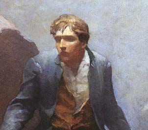
A face that has been abstracted can be just as real to us emotionally, maybe more so. Think of African masks. Character designers at CGI animation studios are also very conscious of dialing down the realism on human characters. Too much realism can drop us into the uncanny valley.
I think the same thing is true of storytelling paintings, such as this illustration by N.C. Wyeth from Kidnapped. It’s more of a mental image he was striving for. By not showing his eyes, Wyeth makes David Balfour seem more lost in the fog.
----------
Bert from BoingBoing
See Mario, Charlie Brown, and other Untooned characters at Huffington Post
Related GJ post about camera face detection

He’s still got those caterpillar eyebrows, bug eyes, top tuft, bulbous nose and wide grin. But when we see all his details and textures, he has an altogether different charm—or creepiness.
“Untooning” has been a hot internet meme over the last few years, and it raises all sorts of questions about verisimilitude.

A face that has been abstracted can be just as real to us emotionally, maybe more so. Think of African masks. Character designers at CGI animation studios are also very conscious of dialing down the realism on human characters. Too much realism can drop us into the uncanny valley.
I think the same thing is true of storytelling paintings, such as this illustration by N.C. Wyeth from Kidnapped. It’s more of a mental image he was striving for. By not showing his eyes, Wyeth makes David Balfour seem more lost in the fog.
----------
Bert from BoingBoing
See Mario, Charlie Brown, and other Untooned characters at Huffington Post
Related GJ post about camera face detection
Thursday, April 21, 2011
Guptill’s Right and Wrong Methods
Arthur Guptill’s book Sketching and Rendering in Pencil is one of the classic textbooks on pencil drawing. He wrote it in 1922, back in the days when it was OK to say a method of drawing was “right” or “wrong.”

The upper left drawing, labelled as the “wrong method,” shows the outline drawn around the outside edge of the form, starting at “A,” The pencil moves slowly along the edge to record every bump and undulation.
The method resembles the “contour drawing” approach recommended years later by Kimon Nicolaides in the influential 1941 book The Natural Way to Draw. The contour method was almost universally taught at the high school and college level when I was in school, and is still recommended by some teachers, especially as a way to help a developing artist to experience right-brain perception.
What’s wrong with that method? The result looks pretty good, but they're only going to be perfect in very experienced hands (see अर्जुन's anecdote after yesterday's post).
Guptill says the problem lies in the judgment of proportions: “However careful one may be in drawing each small portion as he goes along, the larger forms are almost sure to be wrong, which in turns means that the smaller proportions are wrong, too, in relation to one another."
In the case of the shoe, Guptill says, the ankle is too thick, the sole is to low compared to the heel, and the toe doesn’t point up high enough. These inaccuracies may not be a big deal with a shoe, but if they occur in a person’s face, the results will be disturbing.
So what’s the right method, according to Guptill? Instead of fixating right away on the little bumps and wrinkles, the artist should look for the big shapes and relationships first. The right method is to measure the slopes, check the vertical alignments, and double-check the proportional measurements. The small details like the wrinkles and laces are seen in relation to the big shapes. But the foundation must be right first.
Download Guptill’s copyright-free book from Google.
Thanks, Matt!
Labels:
Academic Painters
Wednesday, April 20, 2011
Ring Job
In case you need to draw somebody falling off a horse or flying through the air, you can suspend them from large metal rings hanging from a roof beam in your studio.
Cool idea. Can’t say I’ve tried that yet.
-------
From "Artists' Models in New York," by Charlotte Adams, The Century Illustrated Monthly Magazine, Volume 25, page 569.
Previously on GJ: Painful Poses
Labels:
Academic Painters,
Models Posing
Tuesday, April 19, 2011
Palatine Farmstead
Last Sunday I did a plein-air painting/drawing of the Palatine Farmstead, a historic home in the Hudson Valley of New York State.

The house dates back to about 1770. It’s one of the last surviving buildings from the Palatine German settlers, who came to the region after being uprooted by the Thirty Year’s War and lured to the New World by the British crown.
Until about a decade ago, a very old woman lived in the house with no plumbing or electricity. After her death, the house was donated to a historical society. A careful restoration project is underway to repair the damage from water, fire, rot, and bees. The back of the house, shown in this view, had to be almost totally reconstructed.
I wanted to do a present-day view with a retrospective flavor, so I turned to a monochrome treatment, using sepia watercolor and water-soluble colored pencils. It is 6 x 9.5 inches (15x 24 cm) on a large size (about 8 x 11") Moleskine watercolor sketchbook.
After drawing the lay-in with pencil, I covered the whole surface with a light wash of tone, leaving only the sunlit white planes of the house on the left. Then I drybrushed and detailed as much as I could with sable brushes, switching over to the colored pencil for the finer lines.

Here’s a closeup showing how the pencil and the watercolor combine to describe details like the chipping paint, the clapboards, the shutters, and the branches.
Photos of the house and restoration.
Moleskine sketchbooks

The house dates back to about 1770. It’s one of the last surviving buildings from the Palatine German settlers, who came to the region after being uprooted by the Thirty Year’s War and lured to the New World by the British crown.
Until about a decade ago, a very old woman lived in the house with no plumbing or electricity. After her death, the house was donated to a historical society. A careful restoration project is underway to repair the damage from water, fire, rot, and bees. The back of the house, shown in this view, had to be almost totally reconstructed.
I wanted to do a present-day view with a retrospective flavor, so I turned to a monochrome treatment, using sepia watercolor and water-soluble colored pencils. It is 6 x 9.5 inches (15x 24 cm) on a large size (about 8 x 11") Moleskine watercolor sketchbook.
After drawing the lay-in with pencil, I covered the whole surface with a light wash of tone, leaving only the sunlit white planes of the house on the left. Then I drybrushed and detailed as much as I could with sable brushes, switching over to the colored pencil for the finer lines.

Here’s a closeup showing how the pencil and the watercolor combine to describe details like the chipping paint, the clapboards, the shutters, and the branches.
Photos of the house and restoration.
Moleskine sketchbooks
Labels:
Pencil Sketching,
Watercolor Painting
Broadmore exhibit in Switzerland
The Maison d’Ailleurs (Museum of Science Fiction and Utopias) in Yverdon, Switzerland recently announced the opening of “Dr. Grordbort’s Exceptional Experience” (La très extraordinaire expérience du Dr. Grordbort’s).

The show chronicles the exploits of a retro-future Victorian adventurer conceived by author, sculptor, painter, and designer Greg Broadmore. Broadmore is also a concept artist for Weta Workshop, helping to imagine the characters, creatures, and weapons of Avatar, District 9, and Lord of the Rings.
The exhibit will continue through August 21, 2011.
Link to Maison d'Ailleurs (French)
Museum of Science Fiction and Utopias (English)
YouTube video interview with Greg Broadmore
Labels:
Museum Visits
Monday, April 18, 2011
JW West Pen and Ink
I wish today’s magazines had penwork on the level of this piece by J.Walter West.
This was just a bit of decorative art, but it’s a little gem. Part of the appeal is the variety of line: long, sweeping folds versus tight curling wrinkles. The bold areas of black hold all the fine line work together.
From the Magazine of Art, 1895. page V
This was just a bit of decorative art, but it’s a little gem. Part of the appeal is the variety of line: long, sweeping folds versus tight curling wrinkles. The bold areas of black hold all the fine line work together.
From the Magazine of Art, 1895. page V
Labels:
Pen and Ink
ACOPAL Deadline
Tonight at the stroke of midnight is the deadline for entering the ACOPAL competition.
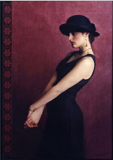
ACOPAL stands for the “American Chinese Oil Painting Artists League.” They’re inviting artists to submit works in an open competition. Winners will exhibit alongside members of ACOPAL in New York City. Then some of the paintings will be chosen to travel to China.
The membership of ACOPAL reads like a Who’s Who of contemporary realism:
Paul W. McCormack (whose work "Karen" is shown above), Steven Assael, Scott Burdick, Jacob Collins, Gabriella Dellosso, Gary T. Erbe, Nanette Fluhr, Chao Ge, Max Ginsburg, Gary Godbee, Daniel E. Greene, Michael Grimaldi, David Jon Kassan, Everett Raymond Kinstler, Valerie Larko, Jeremy Lipking, Susan Lyon, Pang Maokun, John Morra, Graydon Parrish, Charles Pfahl, Tony Pro, Christopher Pugliese, Guo Runwen, Anthony J. Ryder, Richard Schmid, Ronald N. Sherr, Dan Thompson, Joseph Todorovitch, Thomas Valenti, Anthony Waichulis, Patricia Watwood, Chen Yanning, and He Yeuhua.
---------
More about the competition at the official website.
Sunday, April 17, 2011
The Stone Figures of Ebulon
Inside the seated stone figures of Ebulon of Dinotopia are many levels of rooms hollowed out from the rock.

The sleeping chambers are on the top level, with windows looking out through the eyes of the statue. Below that are workshops and a privy or toilet to the right. The next level contains kitchens and dining areas. The bottom level of this cutaway view reveals a storehouse for barrels of salted fish, and a roosting area for the skybaxes, which leads out to a flight platform on the lap of the seated figure.
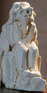
Various views of the Ebulon figures in the book Dinotopia: Journey to Chandara are all based on this rough clay maquette. It was about four inches high, and it only took about a half hour to sculpt. I recycled the clay after photographing it.
A physical maquette pays great dividends in the understanding of lighting. Note the warm reflected light in the shadow planes on the right of the figure, compared to the cool tones of the fill light. This information is very hard to invent, and it makes all the difference in convincing the viewer of the reality of an imagined world.
From Dinotopia: Journey to Chandara, published in 2007

The sleeping chambers are on the top level, with windows looking out through the eyes of the statue. Below that are workshops and a privy or toilet to the right. The next level contains kitchens and dining areas. The bottom level of this cutaway view reveals a storehouse for barrels of salted fish, and a roosting area for the skybaxes, which leads out to a flight platform on the lap of the seated figure.

Various views of the Ebulon figures in the book Dinotopia: Journey to Chandara are all based on this rough clay maquette. It was about four inches high, and it only took about a half hour to sculpt. I recycled the clay after photographing it.
A physical maquette pays great dividends in the understanding of lighting. Note the warm reflected light in the shadow planes on the right of the figure, compared to the cool tones of the fill light. This information is very hard to invent, and it makes all the difference in convincing the viewer of the reality of an imagined world.
From Dinotopia: Journey to Chandara, published in 2007
Labels:
Dinotopia,
Journey to Chandara,
Miniatures
Saturday, April 16, 2011
Mimetoliths
There's a name for them: mimetoliths. They're rock formations that look like faces or other living things.

The Grey Man of Merrick sits at the base of Merrick mountain in Scotland's Galloway Forest Park.
See more examples at Wired Science
Related post on Gurney Journey: Pareidolia and Apophenia
Thanks, Darren R.

The Grey Man of Merrick sits at the base of Merrick mountain in Scotland's Galloway Forest Park.
See more examples at Wired Science
Related post on Gurney Journey: Pareidolia and Apophenia
Thanks, Darren R.
Labels:
Visual Perception
Fantasy Art Article
Fantasy Art Magazine from Beijing, China has just published an 8-page interview feature on my new book Color and Light.
The magazine also contains work by John Bolton, Vincent DiFate, Chris Beatrice, Christian Pearce, and Igor Grechanyk.
The image on the cover is "Alpine Princess," which I did as a portfolio piece, and was used as the cover for the science fiction novel "Zanzibar Cat" by Joanna Russ.
The magazine also contains work by John Bolton, Vincent DiFate, Chris Beatrice, Christian Pearce, and Igor Grechanyk.
The image on the cover is "Alpine Princess," which I did as a portfolio piece, and was used as the cover for the science fiction novel "Zanzibar Cat" by Joanna Russ.
Labels:
Color and Light Book
Friday, April 15, 2011
First Impressions
Some people define “impressionism” as an approach to painting where the goal is to capture the first perception of a scene. The World Book Encyclopedia says that “impressionist painters try to show what the eye sees at a glance.”

The first-glance impact is usually represented by an image with simple masses of color, painted with big brushstrokes without much detail, often with soft edges between the masses, such as this haystack painting by Monet.
Typically, “impressionist” images have high-chroma dabs of color that resolve into a larger blurry image. Recognizable small details are conspicuously left out.

We’re told that this is how the eye perceives on the first glance. Let me see if I can simulate this idea using a photographic image. Here’s an unaltered photo of a street scene.

Here’s an “impressionist” take on the same scene (using the Photoshop filter “paint daubs” and a heightened color saturation).
I believe there are some assumptions here that need examining. Does our first impression really look like an impressionist painting?
If I’m really honest about my own experience of vision, my first-glance take on a scene is nothing at all like a Monet. What I see in the first two or three seconds are a few extremely detailed but disconnected areas of focus. Small individual elements, such as a sign, a face, or a doorknob, take on particular importance immediately, perhaps because the left-brain decoding process (seeing in symbols) is so heavily engaged in the first few seconds.

I’ve altered the photo to try to simulate this experience by sharpening and heightening these disconnected elements. What happens in the first few seconds for you? I don’t know how other people see, because I’m stuck inside my own head. Perhaps eye-tracking and fMRI studies can help us to better understand what really happens cognitively in the first few second of visual perception. Maybe it varies widely from person to person.
What I’m questioning is not the artistic tradition of impressionism, but rather our habits of thinking about it. The idea of trying to capture the broad, simple masses of a scene is a valid artistic enterprise. But even though I’m a plein air painter with impressionist leanings, I believe that kind of seeing emerges only after sustained, conscious effort and training, or not at all.

Above: Sir Alfred East, “Night in the Cotswalds.”
Perceiving big shapes requires a deliberate act of defocusing or squinting. These are rather unnatural kinds of perception. When I squint and defocus on a subway, people look at me like I’m insane. Painting teachers know that students don’t see the big masses naturally. They need to be taught to do it.
(Incidentally, this big-mass mode of artistic seeing was very much a part of 19th century academic training, and was by no means exclusive to the Impressionists—but that’s another topic.)
I realize that the term “impressionism” was not coined by the artists, but rather by their critics. In any event the word and that sense of the word have become irrevocably associated with the movement. Of course the word has other definitions, such as the portrayal of transient effects of light and color, or a painting style using short brush strokes, and those meanings of the word are valid.
But the notion that impressionist paintings are accurate representations of our first visual impressions strikes me as false dogma. I’m skeptical of the word when it’s used in that sense.
“Impressionism,” whatever its merits as a mode of picture making, may not describe a universal experience of perception, so much as a particular style of painting.
----------
Related previous posts on GurneyJourney:
Eyetracking and Composition, part 1
Eyetracking and Composition, part 2
Eyetracking and Composition part 3
Introduction to eyetracking, link.
How perception of faces is coded differently, link.

The first-glance impact is usually represented by an image with simple masses of color, painted with big brushstrokes without much detail, often with soft edges between the masses, such as this haystack painting by Monet.
Typically, “impressionist” images have high-chroma dabs of color that resolve into a larger blurry image. Recognizable small details are conspicuously left out.

We’re told that this is how the eye perceives on the first glance. Let me see if I can simulate this idea using a photographic image. Here’s an unaltered photo of a street scene.

Here’s an “impressionist” take on the same scene (using the Photoshop filter “paint daubs” and a heightened color saturation).
I believe there are some assumptions here that need examining. Does our first impression really look like an impressionist painting?
If I’m really honest about my own experience of vision, my first-glance take on a scene is nothing at all like a Monet. What I see in the first two or three seconds are a few extremely detailed but disconnected areas of focus. Small individual elements, such as a sign, a face, or a doorknob, take on particular importance immediately, perhaps because the left-brain decoding process (seeing in symbols) is so heavily engaged in the first few seconds.

I’ve altered the photo to try to simulate this experience by sharpening and heightening these disconnected elements. What happens in the first few seconds for you? I don’t know how other people see, because I’m stuck inside my own head. Perhaps eye-tracking and fMRI studies can help us to better understand what really happens cognitively in the first few second of visual perception. Maybe it varies widely from person to person.
What I’m questioning is not the artistic tradition of impressionism, but rather our habits of thinking about it. The idea of trying to capture the broad, simple masses of a scene is a valid artistic enterprise. But even though I’m a plein air painter with impressionist leanings, I believe that kind of seeing emerges only after sustained, conscious effort and training, or not at all.

Above: Sir Alfred East, “Night in the Cotswalds.”
Perceiving big shapes requires a deliberate act of defocusing or squinting. These are rather unnatural kinds of perception. When I squint and defocus on a subway, people look at me like I’m insane. Painting teachers know that students don’t see the big masses naturally. They need to be taught to do it.
(Incidentally, this big-mass mode of artistic seeing was very much a part of 19th century academic training, and was by no means exclusive to the Impressionists—but that’s another topic.)
I realize that the term “impressionism” was not coined by the artists, but rather by their critics. In any event the word and that sense of the word have become irrevocably associated with the movement. Of course the word has other definitions, such as the portrayal of transient effects of light and color, or a painting style using short brush strokes, and those meanings of the word are valid.
But the notion that impressionist paintings are accurate representations of our first visual impressions strikes me as false dogma. I’m skeptical of the word when it’s used in that sense.
“Impressionism,” whatever its merits as a mode of picture making, may not describe a universal experience of perception, so much as a particular style of painting.
----------
Related previous posts on GurneyJourney:
Eyetracking and Composition, part 1
Eyetracking and Composition, part 2
Eyetracking and Composition part 3
Introduction to eyetracking, link.
How perception of faces is coded differently, link.
Labels:
Paint Technique,
Visual Perception
Thursday, April 14, 2011
Skin Tone Test
Painters sometimes use color mixtures that seem far removed from the local color of actual skin.

Here’s a quick test you can do in an art museum to see what’s going on. Hold up your hand up in the air a few feet in front of the painting. (That’s my hand on the left and Jeanette’s on the right.)
This skylit gallery in the Worcester Art Museum in Massachusetts gave an even, white light. By looking at our hands under the same light, we now have a reference point to evaluate the color mixtures.
This painting is by the British portraitist Sir Joshua Reynolds (1723-1792). It must have been fashionable in his day to have what seems to us a sickly pallor. In this case he painted the portrait well to the gray-green side of our skin tones.
-----
Addendum: According to the website "Pigments through the Ages," Reynolds used the pigments "lead white, yellow ochre, ultramarine, orpiment, carmine lake, Naples yellow, and vermilion."
"Today many Reynolds’s portraits show pale faces. It’s known that even in his lifetime his paintings began to fade. Using transparent glazes over a monochrome under painting, he tried to reproduce the effects of Italian old masters, but the pigment he used for his flesh tones was not permanent and faded.
Labels:
Color
Wednesday, April 13, 2011
Cure for Middle Value Mumbling

If your work suffers from “middle value mumbling,*” here’s a cure.
1. Bring your sketchbook to a restaurant, bus station, lecture hall, or waiting room.
2. Draw the scene very lightly in pencil, just to work out the shapes. You’ll erase these lines later.
3. Choose a drawing tool that only makes black shapes, such as a wide calligraphy marker or a water brush filled with black ink.
4. Define all the shapes as either white or black. If the scene is strongly lit, you can make the shadows totally black and the light areas white.
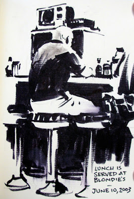
5. There are two rules:
a. DON’T DRAW OUTLINES. Let one black area run into another. Let white areas merge together. Resist the temptation to draw boundaries. You can see I started to forget this rule and outlined the top of the head and the base of the stool at right.
b. The other rule is DON’T DRAW MIDDLE TONES. This is hard to do. I desperately wanted to put in halftones and transitions in the man’s back.
5. Now erase the pencil lines. The result will probably look nothing like other drawings you’ve done. It might have a startling realism.
The viewer will have no trouble understanding the scene. The mystery can work very much in your favor. It’s excellent practice if you’re learning to paint, because these grouping decisions are a key to good tonal composition.

It’s also wonderful for giving your work more punch or more mystery. Dean Cornwell (above) in his early career was very interested in this kind of thinking.
*Middle value mumbling is the common tendency to mix all your colors in midrange tones, rather than pushing them to either the light or the dark. We all fall into this problem. It takes conscious effort to avoid it.
Previously on GurneyJourney:
Krøyer's Hip Hip Hurra
High Contrast Shape Welding
“Shape Welding”
Concert Sketching
Related concept called "notan" explained at Empty Easel.com
Labels:
Composition,
Lighting
Tuesday, April 12, 2011
Rocket Plume
This photograph shows the vapor plume from a space shuttle rising up into the evening sky. It illustrates several important points about the interaction of light and atmosphere.

The sun has just set behind us, and it’s six degrees below the horizon. Most of the plume is in the “earth shadow,” not touched by direct sunlight. As you follow the plume upward into the higher altitudes, it catches the light of the setting sun, first red, then orange, yellow, and finally white as you go miles above the earth.
The red colors come from sunlight that has traveled through the longest stretch of the earth’s atmosphere. The color of the sun itself goes through a similar color progression as it sets. Sunlight traveling on a near tangent to the surface of the Earth has had the most blue light scattered or removed from each ray, leaving the red color.
The moon is a few hours from full, and is therefore almost 180 degrees opposite the sun at the antisolar point. The plume is casting a shadowbeam through the illuminated atmosphere. That shadow points directly toward the antisolar point. You can think of the dark line as a slice of unilluminated vapor seen edge-on. If that slice were completely unilluminated, we'd see stars through it.
It’s a good reminder that the light blue color of the sky is merely “the blue dome of the sky itself is really a semitransparent film of air interposed over the blackness of space.”
------
(These points are further explained and illustrated in Color and Light, page 176, 180, and 190).
Image from Atmospheric Optics.
Previously on GJ: Shadowbeams
Labels:
Color,
Color and Light Book,
Effects/Phenomena,
Lighting
Sharks: The monsters tamed
Peter Benchley (1940-2006) and Steven Spielberg taught us to fear sharks. But this video presents a different image of them.
When Benchley later saw how "Jaws" led to the wanton destruction of sharks, he said: "[T]he shark in an updated Jaws could not be the villain; it would have to be written as the victim; for, worldwide, sharks are much more the oppressed than the oppressors."
Direct link to YouTube video.
When Benchley later saw how "Jaws" led to the wanton destruction of sharks, he said: "[T]he shark in an updated Jaws could not be the villain; it would have to be written as the victim; for, worldwide, sharks are much more the oppressed than the oppressors."
Direct link to YouTube video.
Epic Landscapes
A lot of magazines have been shrinking in size lately, such as the New York Times magazine and Rolling Stone. Even my phone book is tinier than ever.
But one magazine, ImagineFX, just got three centimeters taller. And just in time. The topic of issue #69 is Epic Landscapes, with a gorgeous feature on matte painter and concept artist Dylan Cole. The magazine comes with a big poster insert and a DVD, too.
The painting at left is an early visualization Dylan did as concept art supervisor for Avatar.
Labels:
Computer Graphics
Monday, April 11, 2011
Museum of Comparative Zoology
The Museum of Comparative Zoology is part of Harvard University’s Museum of Natural History in Cambridge, Massachusetts.

The collection was formed in 1859, beginning with the work of naturalist Louis Agassiz (1807-1873). It is one of the oldest and most extensive natural history collection on display in the western hemisphere.
It’s an animal sketcher’s paradise because there’s a huge collection of skeletons and taxidermy animals on display in glass cases with simple backgrounds.
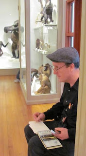 In the back room (which is less traveled), the skeleton and mounts are displayed side by side. If you’re lucky, you can find a folding stool or a chair or bring your own, which is allowed as long as you don’t block the corridors.
There’s everything ranging from a whale skeleton to a case of hummingbirds. Because the mounts are old, some of them are a little weird looking or cracking, which adds an odd vibe to the experience.
There’s an exhibit right now on color in the animal kingdom, and another on animal headgear--meaning mostly antlers and horns of wild deer and sheep. Part of the $9.00 museum admission is the Peabody anthropology museum and the world renowned Blaschka Glass Flowers collection.
My sketch of bison is done in watercolor and water-soluble colored pencils in a Moleskine watercolor sketchbook.
-------
Museum of Comparative Zoology website
Wikipedia's entry on the museum

The collection was formed in 1859, beginning with the work of naturalist Louis Agassiz (1807-1873). It is one of the oldest and most extensive natural history collection on display in the western hemisphere.
It’s an animal sketcher’s paradise because there’s a huge collection of skeletons and taxidermy animals on display in glass cases with simple backgrounds.
 In the back room (which is less traveled), the skeleton and mounts are displayed side by side. If you’re lucky, you can find a folding stool or a chair or bring your own, which is allowed as long as you don’t block the corridors.
 There’s everything ranging from a whale skeleton to a case of hummingbirds. Because the mounts are old, some of them are a little weird looking or cracking, which adds an odd vibe to the experience.
There’s an exhibit right now on color in the animal kingdom, and another on animal headgear--meaning mostly antlers and horns of wild deer and sheep. Part of the $9.00 museum admission is the Peabody anthropology museum and the world renowned Blaschka Glass Flowers collection.
My sketch of bison is done in watercolor and water-soluble colored pencils in a Moleskine watercolor sketchbook.
-------
Museum of Comparative Zoology website
Wikipedia's entry on the museum
Labels:
Animals,
Watercolor Painting
Sunday, April 10, 2011
Club Passim Gig

We had a nice turnout for Dan Gurney's traditional Irish concert at Club Passim, which was broadcast on Concert Window two hours ago.

And there were sketchers! Nice to meet you, Chris, Natalya, and Emily. Emily drew the band as a foursome of dinosaurs.
Here are my little portraits of the band--
Sean Earnest (guitar), Dylan Foley (fiddle), Isaac Alderson (flute and uilleann pipes), and Dan Gurney (accordion).
----------
P.S. Thanks, Boris Vallejo and Julie Bell for your nice review of Color and Light on your wonderful blog Paint and Brush!
Labels:
Pencil Sketching,
Portraits
A page from Byam Shaw's sketchbook
A page from Byam Shaw's sketchbook.
More on Byam Shaw (1872 – 1919) in a previous GurneyJourney post
More on Byam Shaw (1872 – 1919) in a previous GurneyJourney post
Labels:
Academic Painters,
Pencil Sketching
Saturday, April 9, 2011
Cinderella’s Live Action Reference
In their classic book Disney Animation, The Illusion of Life, veteran animators Frank Thomas and Ollie Johnston discuss how the Walt Disney studio shot live action film of actors to use as reference for the animation.
In the early years of the studio, film technology made it difficult to study reference footage frame by frame. Disney figured out a way to print “photostats” of each frame of a sequence so that they could be flipped through like animation drawings.
It was a mind-blowing revelation. Finally the animators could really study overlapping action and squash and stretch. They were amazed by the nuances that had completely eluded the early gag cartoon animators.
At first they brought in actors to help with a few sequences of each film. Vaudeville actors helped to work out gags and staging for Pinocchio (The recent DVD has special features showing the footage). The practice became more and more central to the process, particularly with films that used realistic characters.
When it came to producing Cinderella, money was tight after Fantasia, Bambi, and Pinocchio proved disappointing at the box office. Thomas and Johnston remember that “a new less expensive way to make the projected Cinderella as a full-fledged animated feature had to be found.”
The solution: live action footage was shot as a template for the entire film.
“All of Cinderella was shot very carefully with live actors, testing the cutting, the continuity, the staging, the characterizations, and the play between the characters. Only the animals were left as drawings, and story reels were made of those sketches to find the balance with the rest of the picture. Economically, we could not experiment....but the inventiveness and special touches in the acting that had made our animation so popular were lacking.”
Next month, ImagineFX magazine will include an article that I wrote called “My Preference for Reference,” about different kinds of reference and their pros and cons for illustrators. Watch for it.
Friday, April 8, 2011
Cambridge Music/Sketch Event this Sunday
I’ll be in Boston this weekend, and I invite you to join me for an impromptu sketch gathering.
The event is an Irish music concert at Club Passim, the little folk music venue in Harvard Square, Cambridge, Massachusetts where Joan Baez, Bob Dylan, and Joni Mitchell have performed.
The performers this Sunday will be my son Dan Gurney on accordion, along with Isaac Alderson (flute), Dylan Foley (fiddle), Sean Earnest (guitar), and Bridget Fitzgerald (song). They're all completely used to being sketched by people in the audience.
The concert will be webcast via ConcertWindow, so if you can’t make it, you can watch and listen for free on your computer. I’ll post my sketch at the end of the concert on this blog, so you can see the results.
Dan is planning a return trip to Ireland this summer to record a CD of traditional music, and he’s inviting sponsors via a Kickstarter page. If you click over to that link, there's a video where he describes his plans and tells you what you'll get in exchange for sponsorship.
Bring a sketchbook and I’ll see you there. It will be a great evening of sketching and listening.
CONCERT DETAILS: Sunday 4/10 at 4:30pm. $12/10 admission
Club Passim (Veggie Planet)
47 Palmer Street
Cambridge, MA 02138
Also live on www.concertwindow.com
Wikipedia on Club Passim
Labels:
Pencil Sketching
Lecture April 10 at the Rockwell
I thought I'd pass along the news about an interesting lecture coming up this Sunday, April 10, at the Norman Rockwell Museum in Stockbridge, Massachusetts:
"The fascinating transition at The Saturday Evening Post between two star illustrators—J.C. Leyendecker and Norman Rockwell—will be the subject of an upcoming lecture by Dr. Jennifer A. Greenhill. on Sunday, April 10, starting at 11 a.m.
"Dr. Jennifer A. Greenhill, Assistant Professor of Art History at The University of Illinois in Champaign, will examine the moment acclaimed illustrator J.C. Leyendecker left “The Saturday Evening Post,” and Norman Rockwell took over as the magazine’s star illustrator. The tenor of publishing during World War II, different approaches to “surface” in illustration, and the challenges that abstraction posed for artists working realistically will be explored. After the program, a brunch will be served in Linwood House, the Museum’s 1859 Berkshire cottage. Cost to attend the lecture is $25, $20 for Museum members. Pre-registration recommended by calling 413.298.4100, ext. 260, or e-mail: mgeorgeson@nrm.org." More information at this link to NRM.org
Image: "Rosie the Riveter," Norman Rockwell. 1943. Cover illustration for "The Saturday Evening Post," May 29, 1943. Private collection. ©1943 SEPS: Curtis Publishing, Indianapolis, IN
Labels:
Golden Age Illustration
Envelope Art Contest
After yesterday’s post, several of you suggested a gallery or contest of envelope art, and I think it’s a great idea. So let’s do it.

1. Decorate a standard size #10 envelope. It could be any style, subject, or medium.
2. Address it to “Envelope Art Contest, The Dinotopia Store, PO Box 693, Rhinebeck, NY 12572.”
3. If it’s part of a store order, I’ll ship your stuff and set your envelope aside for the contest. All USA entrants will receive a signed Color and Light poster. Artists from other countries are eligible too.
4. Entries must be postmarked byMay 30, 2011. June 1 (due to May 29 and 30 being postal holidays).
5. On June 10, I’ll post all the entries on the GurneyJourney blog. You’ll vote on them in a blog poll.
6. PRIZES: The winning entrant will receive a set of signed and remarqued posters: (Color and Light, Imaginative Realism, Journey to Chandara, and the Norton Museum show poster.) The second and third place finishers will get signed and remarqued "Color and Light" and "Imaginative Realism" posters.
7. People of any age, and any level of experience can enter. If you're 17 or younger, please write your age on the back of the envelope.
8. If you’re not sending a store order, you can just send a decorated envelope.
9. Entries can't be returned. All art becomes the property of BDSP, Inc. You’ll be credited on the blog with your website if you like (write that on the back of the envelope). If you don’t want your return address shown, please write it on the back of the envelope, or else I can blur it out.
Incidentally, can anyone guess who illustrated the envelope above? Hint: it’s a top animator at a big studio, drawn in 2003 when he was a first year art student.

1. Decorate a standard size #10 envelope. It could be any style, subject, or medium.
2. Address it to “Envelope Art Contest, The Dinotopia Store, PO Box 693, Rhinebeck, NY 12572.”
3. If it’s part of a store order, I’ll ship your stuff and set your envelope aside for the contest. All USA entrants will receive a signed Color and Light poster. Artists from other countries are eligible too.
4. Entries must be postmarked by
5. On June 10, I’ll post all the entries on the GurneyJourney blog. You’ll vote on them in a blog poll.
6. PRIZES: The winning entrant will receive a set of signed and remarqued posters: (Color and Light, Imaginative Realism, Journey to Chandara, and the Norton Museum show poster.) The second and third place finishers will get signed and remarqued "Color and Light" and "Imaginative Realism" posters.
7. People of any age, and any level of experience can enter. If you're 17 or younger, please write your age on the back of the envelope.
8. If you’re not sending a store order, you can just send a decorated envelope.
9. Entries can't be returned. All art becomes the property of BDSP, Inc. You’ll be credited on the blog with your website if you like (write that on the back of the envelope). If you don’t want your return address shown, please write it on the back of the envelope, or else I can blur it out.
Incidentally, can anyone guess who illustrated the envelope above? Hint: it’s a top animator at a big studio, drawn in 2003 when he was a first year art student.
Labels:
Color and Light Book
Thursday, April 7, 2011
"Color and Light" News
The reprint of my new book, Color and Light: A Guide for the Realist Painter, arrived in the warehouse earlier this week. However, because the wholesale orders were so heavy, the second printing immediately sold out of the warehouse at the wholesale level. The third printing is on another ship scheduled to arrive on April 23. May 23.

I’d like to thank all the customers who have been ordering signed copies from our little store. Some of you have drawn amazing pictures on your envelopes. Thanks, Tiovo, Raymond, and everyone else. I also really appreciate the personal notes some of you have written. You are all on amazing artistic journeys.
I’ll be extending my offer to do the painted rainbows with sketches of dinosaurs in everyone’s books through the months of April and May.
Don’t forget that there’s a contest for blog readers to create a short video about the Color and Light book. It can be about something you’ve learned from the book, or you can use the chance to show off some of your own artwork. It’s pretty open-ended—it just has to mention or show the book and it has to be less than three minutes. All entries will be posted on the blog. And there are prizes.
---------
Order Color and Light or Imaginative Realism signed at Dinotopia.com
Note: We regret that our online store can serve only USA customers. Sorry for the inconvenience for those who can’t get copies. Retailers: there is currently some stock at Ingram and Baker & Taylor.
Labels:
Color and Light Book
Smart Tracking Camera
New technology allows a camera to track an eye, a particular face, or any other specified object.
The inventor, Zdenek Kalal, takes it through its paces, showing how it can learn and adapt to a lot of tracking challenges.
The ominously named “Predator” has strong potential for autonomous driving systems, military targeting, consumer photography, wildlife filming, FX compositing, surveillance videography, image stabilization, industrial robots, and human/computer interface technology.
The field of machine vision is still in its infancy and largely limited so far to industrial applications. We’ve grown accustomed to surveillance cameras filming us. Next we’ll have to get used to seeing machines that recognize us and keep an eye on us.
-------
Via Best of YouTube
More at Wired.com's Gadget Lab
Labels:
Computer Graphics,
Visual Perception
Wednesday, April 6, 2011
Animals Indoors
French animal painter Rosa Bonheur (1822-1899) kept several animals in her studio, including an otter, a parrot, and various rodents. Sometimes she invited in a couple of old lions, goats, or horses.

The otter had “the bad habit of leaving the water and getting in between the sheets of Mme. Micas’s bed, so that all the bedclothes and even the mattress would sometimes be wet through.”
Rosa Bonheur grew up in a family that was at home with animals. Childhood friend Hippolyte Peyrol remembered playing hide and seek with a goat that the Bonheur family kept upstairs.
There was a tame squirrel living in the hollow leg of a plaster cast of a woman. The squirrel once gnawed through a picture hanging rope, which made the picture crash to the floor.
Rosa brought home some quail and let them loose in the studio after putting a screen over the windows. To make them feel at home she set up a little wild garden in the corner of a room.
------
from Reminiscences of Rosa Bonheur, edited by Theodore Stanton, 1910. It’s a book you can download and read from Google Books
Wikipedia on Rosa Bonheur
Previously on GJ: Bonheur Ram Studies
Friends of Rosa Bonheur (French website)
Labels:
Academic Painters,
Animals
Subscribe to:
Comments (Atom)


