The mailman delivered a little blue box wrapped in a ribbon.
We opened it and poured the contents on the table. It was a jigsaw puzzle, but there was no picture on the package. The pieces were crisply sawn out of cherry plywood.
They felt completely different from the usual cardboard puzzle pieces. They slid together with a satisfying snap. This was no ordinary jigsaw puzzle. It was a whole new tactile experience.
Some of the pieces were cut in silhouettes. There was a snake, a clown, a dollar sign, a dog, and a boy and a girl holding hands. Someone had carefully cut around the shape of a face.
Other pieces were designed to bamboozle the average puzzler, such as straight edges inside the puzzle, or irregular extensions that stuck out of the rectangular perimeter.
One piece was initialed with the name of the clever craftsperson who did the cutting.
The puzzle went together in 22 minutes, even without looking at the picture. HA, HA, HA….those devious puzzlemakers thought they could befuddle me. But no, you cannot fool the artist who painted the picture: It’s “The Uses of Soybeans.” I know every atom of that image.
We had such fun building the puzzle that we have decided to make it an annual tradition.
Stave puzzles is a new licensee for Dinotopia and my other artwork. They sent this puzzle as a gift to celebrate our new business venture. If you love puzzles, or if you want to experience puzzling on a whole new level, have a peek at their website.
They’ve got a nifty assortment of one-of-a-kind images by me, and they would be delighted to handcraft a brain-frazzling puzzle for you or for someone you would love to torment.
---------
Stave Puzzles.com introduces James Gurney (with a puzzle for a 20% discount ).
Stave’s JG assorted products
Saturday, July 31, 2010
Friday, July 30, 2010
Donkey Portrait
Peanut the donkey posed for me last evening after her munch of hay and her roll in the dust.
But the other donkey, Jezebel, wanted some attention too. She walked over and rested her heavy head on top of my sketchbook, wanting to be scratched on the top of her neck.
Labels:
Animals,
Pencil Sketching
Thursday, July 29, 2010
“Hard Times” Exhibit
Note: Event tonight in New York City (see end of post)
“A portentous stillness hangs over America; the affluence that we thought
would last forever has been replaced with apprehension, angst and anxiety,” says Traci Fieldsted, curator of the exhibition.
Clockwise from upper left, "Artist's Mother," David Kassan, 30 x 20, oil on canvas; "Wall Poster, " Burton Silverman, 48 x 40, oil on canvas; "Homeless, " Max Ginsburg, oil on canvas, 25 x 40.
The show is called “Hard Times: An Artists’ View” (at the Salmagundi Club in New York through August 20). The subjects are homeless people, manual laborers, and street vendors.
Warren Chang’s “Fall Tilling” shows field workers toiling with hoes. A woman sits on the ground, while a man talks on his cellphone.
The fourteen artists in the group show include such veteran realists as Harvey Dinnerstein, Burton Silverman, and Max Ginsberg. According to a caption, they “weathered the drought imposed by the modern abstract art establishment.”
Max Ginsberg’s “Snapple” shows a hot dog stand with tattered umbrellas. The sign in the store behind says “CLOSING OUT INVENTORY: EVERYTHING MUST GO.”
The paintings steer clear of overt narrative, sentimental pity, or political diatribe. Unfortunately, some images look like professional models impersonating down-and-outers. And some rely a bit too heavily on photographs.
The most convincing is a street scene with African-American young people painted by Garin Baker. Mr. Baker knows the neighborhood well, because he has worked for years on the street, developed a mural program with underprivileged artists in Newburgh, NY.
Marvin Franklin (1952-2007) painted authoritative watercolors of subway riders. Franklin taught at the Art Students League, working night shifts as a track cleaner on the subway, where he was killed in a freak train accident.
The show presents a brave direction to young realist painters, something meaningful to express with their skills. It stand squarely in the nineteenth-century realist tradition of Bastien-Lepage, Kramskoi (above: "Portrait of a Peasant"), and Dagnan-Bouveret, as well as the better-known Courbet, Millet, and Van Gogh.
The images are disquieting, reminding us of the hardships faced by the bottom margin of our society. Art can make us look at things we’d normally look away from. Such subjects are not easy choices for a career-minded painter. They are often made at the expense of an automatic sale.
Tonight there will be a lecture and panel discussion at the Salmagundi Club, including Fred Ross, Vern G. Swanson, Peter Trippi, Harvey Dinnerstein, and Burton Silverman.
Panel Discussion at the Salmagundi Club in New York City TONIGHT at 7:00 p.m. with a reception following
Art Renewal Center Article about the Exhibit
Warren Chang's Website
Max Ginsberg's Website
Garin Baker, Carriage House Studios
Salmagundi Club is at 47 Fifth Avenue New York, NY 10003
Hours: Monday - Friday 1:00 - 6:00 PM Weekends 1:00-5:00 PM
Labels:
Museum Visits
Wednesday, July 28, 2010
Restoring Art Programs
Comic art legend Joe Sinnott grew up in Saugerties, New York. At age 83, he still lives there and he still works for Marvel.
When the Saugerties school board decided to cancel the art program, he wrote a letter describing how he owes his career to the encouragement of art teachers.
Joe Sinnott’s entire letter.
Report on hopes to restore the art program at the Sauguerties School District
Image from Wizard's Keep, which has more art and a bio of Joe Sinnott.
When the Saugerties school board decided to cancel the art program, he wrote a letter describing how he owes his career to the encouragement of art teachers.
“I know that today it’s much harder to get into art schools and colleges, and that it is a necessity to have high school art credits to apply to these schools. The creativity starts in the early years, and I have lectured for the children at Riccardi, Cahill, Grant D. Morse and Saugerties High School to enthusiastic students. …Art is not just a fun subject. It is a career choice for many. Without it, many talents will be wasted.”
Joe Sinnott’s entire letter.
Report on hopes to restore the art program at the Sauguerties School District
Image from Wizard's Keep, which has more art and a bio of Joe Sinnott.
Labels:
Art Schools,
Comics/Cartooning
Tuesday, July 27, 2010
Slit Pupils and Intorsion/Extorsion
Yesterday's post about slit pupils and rotating eyeballs generated a lot of fascinating comments and links.
I spent the day yesterday beside a lily pond doing watercolor portraits of green frogs, who obliged me by posing very still——until a bug came along. Their attacks were lightning fast and very athletic. Speaking of slit pupils, frogs have them too!
In case you missed them, here are some of the links relating to these subjects:
Function of slit pupils. (Thanks, Kat!)
Rotation of eyeball in humans (intorsion and extorsion) (Thanks, Nick!)
Fun facts about gecko eyes and Wiki diagram of eye muscles. (Thanks, Don!)
Yesterday's post about goat eyeballs (with comments afterward).
Labels:
Animals
Monday, July 26, 2010
Rotating Eyeballs
Goats, like most hoofed mammals, have horizontal pupils. The purpose of those elongated pupils is to allow them to scan the horizon for possible predators.
When a goat’s head tilts up (to look around) and down (to munch on grass), an amazing thing happens. The eyeballs actually rotate clockwise or counterclockwise within the eye socket. This keeps the pupils oriented to the horizontal.
That seems impossible to believe. Eyeballs might be able to scan from side to side, or swivel up and down, but how could they actually rotate clockwise or counterclockwise?
To test out this theory, I took photos of Lucky the goat’s head in two different positions, down and up. I then tilted one of the photos so that the slope of his forehead (marked by arrows) was constant. The photos prove that the pupils actually swivel about 25 degrees within the head.
Labels:
Animals
Sunday, July 25, 2010
Draw-Through
Here’s the preliminary line drawing for a Dinotopia painting called “Flight Past the Falls.” I did it on a separate piece of paper, photocopied it, and transferred it to the canvas with an Artograph projector.
The rider on the pterosaur was drawn on a separate layer of paper and moved around until I got the position I wanted.
What I want you to notice is the “draw through,” which means the lines carried across to invisible parts of the form. For example:
1. Circular curve of the bottom half of the globe.
2. Chest of pterosaur hidden by wing.
3. Eye level or horizon hidden behind falls.
4. Curvature of Moorish arch hidden by the flanking buttresses.
Note also the centerline markings on the globe, and the winged sculpture. Also note the perspective grid on the side of the drawing.
Draw-through helps you keep track of what the form is doing when it slips behind something else. If you work out the draw-through on a separate piece of paper from the finished work you don’t have to worry about erasing the lines or covering them up.
You can apply the draw-through principle to figure drawing or any drawing, especially in the early stages. It will make your final drawing or painting more solid and convincing. When an architect draws a building elevation, she knows where the windows and doors are located on the back side of the building.
---------
Earlier GJ post about the skybax model and the finished image.
Labels:
Dinotopia,
Journey to Chandara,
Preliminary Sketches
Saturday, July 24, 2010
Tool People Report
Here at last are some images from the “Tool People” workshop I conducted at the Delaware Art Museum a little while ago.
This four-hour creature design class had a sold-out attendance that included people of high school age and older. Each person brought a tool from the workshop or kitchen and an action figure or a doll (One high school art teacher brought a whole backpack full of GI Joes to loan out).
The students set up around the long tables and started by accurately sketching the objects they were going to morph.
Then they came up with character concepts such as the “Scissors Bunny” and the “Lemon Squeezer Guy.” People experimented with bending, squashing, and stretching rigid forms to make them come to life. Some developed backstories and “frontstories” for their characters, and some even started generating a series of graphic novel panels right on the spot.
In high spirits we posed outside the museum for our class photo. Thanks to everyone who attended! It was great fun to meet you and work with you.
-----
Delaware Art Museum
Labels:
Art Schools
Friday, July 23, 2010
Rackham on Photo Illustration
Even as far back as a century ago, magazines were beginning to use photographs to illustrate stories and poems. Arthur Rackham, sensitive to the threat that the art of photography posed to him as an illustrator, challenged the practice:
--------
from James Hamilton's biography of Arthur Rackham
“Now your work, all your work, should be regarded as a work of imagination, as art. You are not copying-clerks or phonographers or recording angels. Yet there is some tendency now to illustrate even poetic works and fiction by photographs. Surely to place before your readers…the actuality you had before you when writing, is ruthlessly to rub off all the bloom of imagination, of temperament, of personal view, of atmosphere, which are your chief, your only, great claim to consideration.”
--------
from James Hamilton's biography of Arthur Rackham
Labels:
Golden Age Illustration
Thursday, July 22, 2010
Nephroid Caustics
Oh, I forgot to mention…there’s another kind of caustic reflection that’s as near to you as your coffee mug: a nephroid caustic. That’s the name for the little shape that forms when sunlight slants into an empty cup or bowl.
These mathematical figures are called “nephroid curves” because they sometimes have a kidney-like shape, and they’re called “caustics” because they’re focused rays, so they could potentially burn something (but dang, the won’t keep my coffee hot).
Note that in the photo there’s also a caustic halo bouncing off the outside of the mug, too. Any time you’ve got glass or metal objects in direct sunlight, there will be lots of caustic effects all over the place.
The giveaway that it’s a caustic effect (as opposed to plain old reflected light or highlights) is that the light is focused into a definite shape with a bright line or edge around it.
And now you have a topic that you can try out at the coffee machine to find out who are your kindred visual geeks.
----
Previously on GurneyJourney: Caustics, Caustic Reflections
Wikipedia on optical caustic effects and nephroid geometry.
CG Caustic rendering tutorial
Labels:
Effects/Phenomena,
Lighting
Wednesday, July 21, 2010
Caustic Reflections
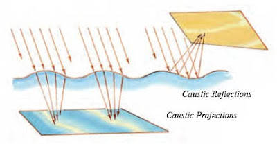
In a previous post we looked at the fun trick of optics is called caustics, where undulating waves act like lenses to cause a network of dancing lines on the sea floor. That’s called a caustic projection.
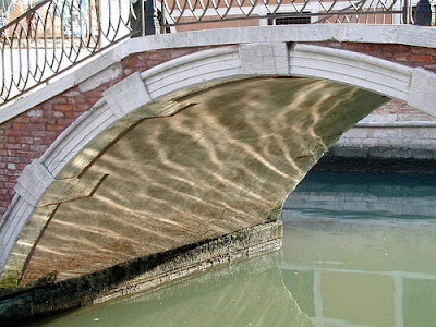
The same kind of thing happens when light bounces up from the water surface. It’s called a caustic reflection. It’s a common sight on the sides of docked sailboats or on the undersides of bridges in Venice.
In this case the caustic lines are fairly parallel to each other because the waves are, too. The light is hitting the water at a low angle (allowing a greater amount of light to be reflected upward), and the caustic reflections spread out and go a little out focus on the near side of the bridge.
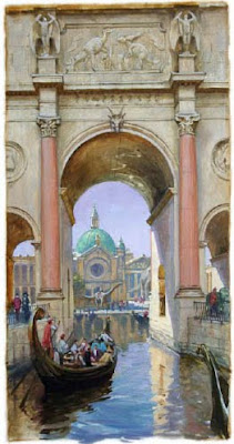
A caustic pattern appears on the inside surface of the vaulted arch in this painting from Dinotopia: Journey to Chandara.
This figure shows how the two kinds of caustics work. The waves act like curving mirrors and lenses at the same time.
-------
Photo by imappi2 on Flickr
Previously on GJ: Caustic Projections
Labels:
Effects/Phenomena
Tuesday, July 20, 2010
The Cal Arts Story
The CalArts Story from Christine Ziemba (CalArts) on Vimeo.
The cultural life of Los Angeles seemed like such a glorious dream when Disney produced this video promoting the planned Hollywood campus for the CalArts art school. The voice is Sebastian Cabot, aka "Bagheera" in Jungle Book.------
Previously on GJ: A visit to CalArts Animation.
Labels:
Art Schools,
Video
Monday, July 19, 2010
Skybax Maquette
In 1990 I constructed a reference maquette for the Quetzalcoatlus or “skybax” in Dinotopia.
If you’re thinking of making a maquette for a dragon or pterosaur, you might try some of these techniques.
I wanted to make this "hero" model to be fully posable so that I could position the wings in up and down flying positions. I also wanted to be able to fold up the wings so that I could imagine it perched on the ground.
It has a skeleton of aluminum armature wire running from head to tail and out through the wings. Toothpicks serve as wing bones, pipe cleaners as legs, and zigzagging floral wire support the wing. The head is made from a chunk of pine, with Sculpey bulking up the crest and eyes.
The neck is made from flexible squishy foam, allowing it to bend or twist. The prone rider is made from Sculpey, resting on a saddle glued together out of scraps of leather.
The wing membrane gave me the most trouble. My wife donated a pair of her old stockings, which I stretched over the wing bones and coated with a thin layer of latex. I added another layer of latex a few years later, but the wings got too thick and lost their elasticity.
The whole thing was knocked over several times by the cat. During one crash landing the rider lost an arm, so I replaced it with cardboard.
-----
Previously on GJ: Cellphone tour spotlighting "Skybax Rider" painting.
Labels:
Dinotopia,
Miniatures
Sunday, July 18, 2010
Influential Lion
The colossal lion from Nimrud was discovered by archaeologist Austen Henry Layard in 1849 and put on display in the British Museum.
The snarling muzzle and penetrating eyes apparently made an impression on English painter John William Waterhouse (1849-1917).
His 1887 painting “Mariamne” features a lion sculpture that seems to be influenced by the Nimrud lion.
The same Assyrian lion (and Waterhouse’s painting itself) must have influenced Edward John Poynter (1836–1919), who used lions of similar design to flank the royal stairway in his painting “The Visit of the Queen of Sheba to King Solomon,' 1890.
-----
I read about this in Elizabeth's Prettejohn's essay in "J.W. Waterhouse: The Modern PreRaphaelite"
Labels:
Academic Painters
Saturday, July 17, 2010
Critix Redux
The recent post “Gérôme’s Critics” brought about 57 comments so far. It “touched a nerve,” as one of you said. One reader created a doctored version (below) of “Cave Canem” (Beware of Dog). It now says "Cave Arte" (Beware of Art). Thanks, C.!
I appreciate everyone’s contribution so far in the insightful, respectful, and wide-ranging discussion. Although Gérôme was certainly beloved by his students, his critical reputation has indeed taken an especially heavy hit in the last hundred years because of the stand he took against the Manet exhibition and the Caillebotte bequest. Even in his day he was suffering slings and arrows, which may explain the bitter edge of his attitude toward critics.
I don’t want my earlier blog post to imply that I necessarily share Gérôme’s feelings about art critics. Most of the ones I’ve met are remarkably open-minded, well-informed and articulate. They have their likes and dislikes, of course, but they don’t take orders from anyone on matters of taste. Let’s face it: Art criticism nowadays a tough business. It’s like walking in a minefield because matters of taste can be so contentious and polarized.
In the field of classical music, by contrast, most performers have to develop the skills to perform the entire repertoire. As a result, most music directors, conductors, performers and critics have a practiced familiarity with many way of making music, from Palestrina to Schoenberg. That breadth of exposure helps to mute the polemics.
In the visual realm, the term “Art” has been so thoroughly discombobulated that it can mean almost anything. (Still, it commonly leaves out so many things, such as comics, animation and illustration.) Our contemporary culture just doesn’t have any universally shared values on the subject, compared to a century and a half ago.
So what’s an art critic to do? How can you critique if there are no generally accepted standards? Is aesthetic relativism possible or desirable? What sort of negative criticism is most useful?
I’d be interested in your opinion. I would suggest that the art critic’s job is to encourage us to look closely at something outside our normal range of vision, something we’d be inclined to dismiss at first glance. The critic should beware of leveling the lance at an artist he or she dislikes, unless there is at least some sympathy with the artist’s purpose, some insight into technical processes, or a sharp satirical gift. Someone once said, “The best cure for bad art is good art.” To which I’d add: “The second best cure for bad art is to ignore it.”
That’s why I think Christopher Knight’s review fell short of what it could have accomplished. By merely disparaging Gérôme, Knight granted him underdog status and made him stronger. Nor did he offer any new insights to those who may have been inclined to appreciate Gérôme. I’d rather have read a tough critique of Gérôme by an accomplished realist painter who started with more sympathy for Gérôme’s basic approach.
To that end, let me recommend some art blogs that do a good job of bringing attention and insight to all sorts of Art, though many of the authors would not consider themselves critics.
Underpaintings by Matthew Innis. Good roundup of current museum exhibits.
Illustration Art by David Apatoff. Currently a fascinating debates (with 162 comments) on the use of photography.
Lines and Colors by Charley Parker. Survey and bios of artists in many fields.
Life in the Studio by Jay Fullmer . A new blog, which started with a post about photographing in museums to get accurate color (Jay's image above).
Art and Influence by Armand Cabrera. Profiles of past masters, advice on business and contemporary working methods.
Bearded Roman by Micah Christensen. Deep insights into academic masters
Howard Pyle blog by Ian Schoenherr. A passionate collector of Pyle papers and expert on his life.
Stapleton Kearns Wide ranging painting insights from a master landscapist.
-----
GJ Post "Gerome's Critics"
The LA Times review of the Gérôme exhibit at the Getty Museum. Read down to the comments at the bottom, where Christopher Knight retorts: "[French] Academics looked to the Royal Academy for approval; Modern artists looked to themselves and their cohorts for approval; and Gerome, having neither the Academy nor the new artists on his side, turned to the general public, who liked what they saw." Huh?
--------
L.A. Times reviewer Christopher Knight (aka "Culture Monster") launches a fresh attack on Gerome in "The Strangest Roomful of Art in LA Right Now"
Labels:
Academic Painters
Friday, July 16, 2010
Norton Museum Video
Glenn Tomlinson of the Norton Museum of Art introduces the Dinotopia exhibition in this video.
Norton Museum website
For potential museum venues inquiring about possibly hosting the Dinotopia show, please contact Mary Melius at the Norman Rockwell Museum at mmelius (at) nrm.org
BTW, anyone know how I can keep from clipping the right side of the videos when they post? (Later: fixed! Thanks, Mike, Christopher, and SuperVillain)
Labels:
Museum Visits,
Video
Monkey King
I’m honored and grateful to receive the Monkey King award from CICAF, the annual animation festival in Hangzhou, China.
The painting that won the award is “Desert Crossing,” from Dinotopia: Journey to Chandara.
Next time I visit a troupe of wild monkeys, I will now demand respect as their true sovereign. I will not tolerate the lèse-majesté that happened on the previous occasion.
------
CICAF's Monkey King Award
Journey to Chandara
GJ Post: "Manhandled by Apes" and "Return Flight"
Labels:
Journey to Chandara
Thursday, July 15, 2010
Indigo Fading
“Bridge With Mountains” is a watercolor from J.M.W. Turner’s Cyfarthfa sketchbook.
It was on exhibition until 1905, when someone noticed that everything but the part covered by the frame had turned brown.
What happened to the blue? The same indigo that dyes blue jeans was used as a pigment, and it either faded or shifted under strong light.
------
from Turner's Early Sketchbooks, by Gerald Wilkinson
Labels:
Color
Wednesday, July 14, 2010
Realistic Dinosaur Suits
Labels:
Dinosaurs
Stout’s Hallucinations
Flesk Publishing has just released a new collection of artwork by William Stout called “Hallucinations.”
This is the first of two 48-page softbound collections of Stout’s watercolor and ink artwork. The subjects include dragons, genies, and witches, as well as scenes from Oz and Aesop. The penwork is ornate, intricate, and sometimes whimsical, with smaller details and subordinate characters adding levels of fascination to the pictures.
In the introduction, Stout credits the inspiration that he draws from the early 20th century children’s book illustrators, especially Edmund Dulac, Arthur Rackham, John Bauer, and William Heath Robinson.
This is the first of a two related volumes. The next one will feature women and wonders, and will be called “Inspirations.”
There is also a signed hardbound edition, limited to 500 copies, which is almost sold out.
Flesk Publications
William Stout official site.
Labels:
Book reviews,
Illustrated Books
Tuesday, July 13, 2010
Totentanz
Totentanz is the German term for a dance of death, often portrayed in late medieval art. The French call it danse macabre.
Above: “The Dance of Death” (1493) by Michael Wolgemut. Skeletons leap up from graves, play instruments and give each other high fives, with their tattered shrouds still wrapped around their shoulders.
This one is by Bernt Notke (click on image to enlarge). The skeletons alternate with popes, kings, artisans and commoners, arranged by rank. Death conquers and equalizes all social classes.
The skeletons are livelier than the living, kicking their heels in the air. The theme got a big boost with the Black Death from plague in the 14th century and from the slaughter of the Hundred Years’ War (1337-1453) between France and England.
The theme has turned up in many art forms, starting with poems, mime dances, and morality plays. Nineteenth century composer Camille Saint-Saëns wrote piece of music called “Danse Macabre” which sets the scene perfectly, with the xylophone playing the bones.
Saint-Saens performed on orchestra via YouTube
Note: Lots of links in the comments.
Monday, July 12, 2010
A. Wyeth at the Hyde Collecton
Today would have been Andrew Wyeth's 93rd birthday.
In celebration of his work, the Hyde Collection of Glens Falls, New York, is hosting an exhibition called "Andrew Wyeth: An American Legend," consisting of about 45 drawings, watercolors and egg temperas.
The exhibition closes September 5.
Hyde Collection Wyeth exhibit
Image "Long and Limb," 1999, from New York history blog,
which has more info about the show.
Labels:
Museum Visits,
Watercolor Painting
Sunday, July 11, 2010
Hofner Copy
A great way to get to know a painting is to do a little copy of it.
The original painting is called “The Little Shepherdess,” by Johann Baptist Hofner, painted in 1866.
The copy is in oil, four by six inches using a #2 bristle filbert. I chose the relatively big brush because I wanted to interpret the larger masses, not the tiny details—for example the head as a unit, not the individual features.
The poster reproduction I worked from had a different color atmosphere than this Internet picture. If you’re working from print or screen reproduction, try to gather four or five versions and then you can make a closer guess what the real painting looks like.
Labels:
Academic Painters
Saturday, July 10, 2010
Making Gargoyles
There are at least two ways to make a gargoyle: Carve it or sculpt it.
I carved this one out of poplar wood for the end of the handrail in the stairway to my studio. Poplar splits easily and I messed up on the other side---which is why I put the bad side to the wall.
But there’s an easier way if the piece is only decorative. You can sculpt the head out of the air-drying foam called “Model Magic,” and then paint it with acrylic to simulate wood grain. The whole process only takes a couple of hours.
That’s how Jeanette and I did the green men that live on the keystones of the arches over the studio windows.
Labels:
Miniatures
Friday, July 9, 2010
Gérôme’s Critics
Los Angeles Times art critic Christopher Knight gives the “thumbs down” to academic painter Jean-Leon Gérôme (1824-1904), who is featured in a large exhibition currently at the Getty Museum.
Knight dismisses Gérôme as a “populist painter” who “didn’t have a clue,” and who indulged in “sword-and-sandal melodramas.” He argues that he failed the Prix de Rome competition through lack of drawing ability, later selling out to commercial considerations.
According to Knight, “every artist we revere today was on the other side” of Gérôme and that he failed because he “disengaged with art’s possibilities” by limiting his artwork to mere illusionism.
Although Gérôme’s artwork is not above criticism, Mr. Knight’s assessment is regrettably narrow and unfair.
The documentary evidence from writers of Gérôme’s own day paints a more sympathetic and nuanced portrait of the man and his art.
Gérôme was genuinely respected by critics his day, and by his students, even many who pursued an impressionist approach to painting. He was admired not just for his ability as an artist, but for the breadth of his artistic vision.
Consider the following:
“Gérôme remains at sixty years of age the same as he was at thirty-six: as youthful, vigorous, active, and wiry; full of life and sympathetic. An agreeable, gay talker, pensive notwithstanding his good humor, respectful of his art, frank and loyal, adored by his pupils, he is the professor who teaches the young those rare and neglected virtues: simplicity, study, and labor. In a word he is a noble example of what a master-painter of the nineteenth century may be: an artistic soul with a soldier’s temperament, a heart of gold in an iron body.”
--French critic Jules Claretie, quoted in Nancy Douglas Bowditch, George de Forest Brush: Recollections of a Joyous Painter.
“I cannot but esteem him as one of the masters and most distinguished men of his age.”
--J. Alden Weir, “Open Letters.”
“As a teacher he is very dignified and apparently cold, but really most kind and soft-hearted, giving his foreign pupils every attention. In his teaching he avoids anything like recipes for painting; he constantly points out truths of nature and teaches that art can be attained only through increased perception and not by processes. But he pleads constantly with his pupils to understand that although absolute fidelity to nature must be ever in mind, yet if they do not at last make imitation serve expression, they will end as they began—only children.”
--George de Forest Brush, in “Open Letters: American Artists on Gerome,” Century magazine, February 1889.
“Oblivious to methods, seeking to develop each pupil’s peculiarities and temperament, he frowned upon any attempt to follow in his ways unless he thought it entirely within the sympathies of the pupil.”
--Wyatt Eaton, “Open Letters.”
Let us allow Mr. Gérôme to rise from the grave and answer Mr. Knight with his own words: “As to the self-styled critics, their approbation and their raillery have always found me indifferent, for I have always had the most profound contempt for these ignorant vermin, who prey upon the bodies of artists.…These art critics, whose ignorance is often deplorable,—quite encyclopædic in fact,—who have not learned the a b c of our profession, consider themselves fully competent to criticize it.”
-- Gérôme quoted in Century magazine, February, 1889, page 488 and 495.
The exhibition “The Spectacular Art of Jean-Léon Gérôme will remain on view at the Getty Museum in West Los Angeles through September 12, 2010. The first exhibit of its kind in nearly 40 years, it contains 99 works by Gérôme and his contemporaries.
LA Times review.
Getty museum website
Century magazine archives
Jean Leon Gerome.org (big database of image)
Thanks, Dave!
Knight dismisses Gérôme as a “populist painter” who “didn’t have a clue,” and who indulged in “sword-and-sandal melodramas.” He argues that he failed the Prix de Rome competition through lack of drawing ability, later selling out to commercial considerations.
According to Knight, “every artist we revere today was on the other side” of Gérôme and that he failed because he “disengaged with art’s possibilities” by limiting his artwork to mere illusionism.
Although Gérôme’s artwork is not above criticism, Mr. Knight’s assessment is regrettably narrow and unfair.
The documentary evidence from writers of Gérôme’s own day paints a more sympathetic and nuanced portrait of the man and his art.
Gérôme was genuinely respected by critics his day, and by his students, even many who pursued an impressionist approach to painting. He was admired not just for his ability as an artist, but for the breadth of his artistic vision.
Consider the following:
“Gérôme remains at sixty years of age the same as he was at thirty-six: as youthful, vigorous, active, and wiry; full of life and sympathetic. An agreeable, gay talker, pensive notwithstanding his good humor, respectful of his art, frank and loyal, adored by his pupils, he is the professor who teaches the young those rare and neglected virtues: simplicity, study, and labor. In a word he is a noble example of what a master-painter of the nineteenth century may be: an artistic soul with a soldier’s temperament, a heart of gold in an iron body.”
--French critic Jules Claretie, quoted in Nancy Douglas Bowditch, George de Forest Brush: Recollections of a Joyous Painter.
“I cannot but esteem him as one of the masters and most distinguished men of his age.”
--J. Alden Weir, “Open Letters.”
“As a teacher he is very dignified and apparently cold, but really most kind and soft-hearted, giving his foreign pupils every attention. In his teaching he avoids anything like recipes for painting; he constantly points out truths of nature and teaches that art can be attained only through increased perception and not by processes. But he pleads constantly with his pupils to understand that although absolute fidelity to nature must be ever in mind, yet if they do not at last make imitation serve expression, they will end as they began—only children.”
--George de Forest Brush, in “Open Letters: American Artists on Gerome,” Century magazine, February 1889.
“Oblivious to methods, seeking to develop each pupil’s peculiarities and temperament, he frowned upon any attempt to follow in his ways unless he thought it entirely within the sympathies of the pupil.”
--Wyatt Eaton, “Open Letters.”
Let us allow Mr. Gérôme to rise from the grave and answer Mr. Knight with his own words: “As to the self-styled critics, their approbation and their raillery have always found me indifferent, for I have always had the most profound contempt for these ignorant vermin, who prey upon the bodies of artists.…These art critics, whose ignorance is often deplorable,—quite encyclopædic in fact,—who have not learned the a b c of our profession, consider themselves fully competent to criticize it.”
-- Gérôme quoted in Century magazine, February, 1889, page 488 and 495.
The exhibition “The Spectacular Art of Jean-Léon Gérôme will remain on view at the Getty Museum in West Los Angeles through September 12, 2010. The first exhibit of its kind in nearly 40 years, it contains 99 works by Gérôme and his contemporaries.
LA Times review.
Getty museum website
Century magazine archives
Jean Leon Gerome.org (big database of image)
Thanks, Dave!
Labels:
Academic Painters,
Museum Visits
Thursday, July 8, 2010
The Flying Car
The flying car was a main theme of yesterday’s dreams of the future.
The requirements: it must fit in the garage, drive on a road, take off in a small space, and fly on its own power without adding or subtracting any parts.
Finally, there’s a prototype that seems to meet the test. Now we’ve just got to figure out how to deal with air traffic.
Cover image from PopSci.com “Dude: Where’s my Flying Car?”
Video via Best of YouTube
YouTube video
Wednesday, July 7, 2010
Cellphone Tour
Here’s a fun way that you can experience the Dinotopia exhibition that’s now in West Palm Beach, Florida.
In the back of one of the exhibition rooms is a painting called “Skybax Rider.”
If you have a telephone handy, dial the following number, and you can hear me in your ear talking about it. Dial 561-515-4185. Then hit extension #4.
------
Tour hosted by OnCell systems
"Dinotopia: The Fantastical Art of James Gurney" at the Norton Museum of Art
Labels:
Dinotopia,
Museum Visits
Tuesday, July 6, 2010
How to Refill a Fountain Pen
Some Waterman fountain pens come with a refillable cartridge.
By submerging the end of the cartridge into a bottle of water-soluble ink and twisting the little knob, a piston will draw the ink up into the cartridge. This way you can use whatever color of ink you want, such as a brown or gray.
Gray and brown are no longer generally available as standard disposable cartridge colors in Waterman pens. But it must be water-soluble ink formulated for fountain pens, not India ink.
You can refill any fountain pen, even if it doesn’t have one of those special refillable cartridges. A hypodermic needle works perfectly for injecting ink into spent cartridges. Here I’m refilling a Schaeffer calligraphy pen.
I got my hypodermic needle in a kit for refilling printer cartridges.
------
Step by step from Instructables, using different tools.
Labels:
Lettering
Subscribe to:
Posts (Atom)