Monday, October 31, 2016

Death at the Door

Adolph Menzel, Death as an Unwelcome Guest;
1844/1845. Watercolor and gouache.
5.1 x 3.6 in.© bpk/ Kupferstichkabinett/SMB/Volker-H. Schneider

Who is that at the door? It's Death, of course, coming to collect. He wears a heavy coat and tilts his hat forward so that he won't be recognized. The thin heel of his foot comes out of his slipper.


Not just yet. Death is banished out the window with a hail of wine bottles. Good riddance to you until another year!
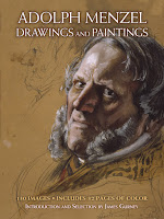
These two paintings are published together for the first time, and in color, in my new book of drawings and watercolors by Adolph Menzel. The book contains 130 images, including 32 pages of color.

Here's the link if you'd like to order a signed copy from my website store. 
Adolph Menzel: Drawings and Paintings. You can also get a copy from Amazon.

Sunday, October 30, 2016

Retiring Skies and Changing Light


Aaron Penley (British, 1807-1870) wrote an early book on watercolor painting. One of the principles he believes in is creating a sense of depth in a painting.
"One of the first essentials in Landscape Painting is the proper management of the sky, which should be made to retire, not appearing as colour or paint, but as air. It should be a representation conveying the idea of vacuity or space and not of surface, A clear and open sky is not, as the mere sketch would render it, blue colour, but rather a tone of the purest and most perfect character, into which the gaze can be made, as it were, to pierce ; and this cannot be effected by a simple wash of Ultramarine or Cobalt."

In other words it's easy to make a painting look like paint. It's much harder to make the surface disappear and to create miles of depth.

Thomas Girtin, (1775-1802)
When painting outdoors on partly cloudy days, the sun will spotlight some areas and other areas will drop into shadow. But you have to decide what effect you want to feature—and remember it— even as other exciting possibilities emerge. 

As Penley puts it, the artist "must take cognizance of different effects as they pass over the scene, and never lose sight of the impressions then so strongly made upon their minds." 

Or as contemporary painters often put it, "Don't chase light effects."

From "A system of water-colour painting : being a complete exposition of the present advanced state of the art, as exhibited in the works of the modern water colour school" by Aaron Penley free on Archive.org.

Saturday, October 29, 2016

Circles in Perspective

Here is some basic but valuable information about circles in perspective. 

Ellipses on the top and bottom of an object do not have the same degree. If you're looking downward at an object, they are skinnier at the top of the object, and they appear fuller as you look lower down on the object. 


This diagram comes from the Famous Artists Course. The instructors recommend constructing a transparent box around the lamp to help get the ellipses right. The eye level (or horizon) in this diagram is up at the top of the image, where the lines vanish to a dot. The square cross sections can be subdivided to find the center line, center points, and the square-in-perspective on which each ellipse can be fitted.

A circle at the height of the eye level would be seen perfectly edge-on, and would thus be a straight line.


The same principle applies to ellipses above the horizon. When I drew this round tower, I first established the eye level. It's near the bottom of the small arch-top window in the middle of the picture.

At that level the ellipse flattens to a straight line. I drew the other ellipses becoming progressively fuller as we approach the main ellipse of of the tower's roofline. Having those lightly drawn ellipses in my preliminary drawing helped me place the windows and the courses of stonework.
----
Check out my Instagram page, where I'm sharing theme park sketches.

Friday, October 28, 2016

Style Transfer

Computers are able to take any photo and reinterpret it in any given artist's style. You can give the computer some examples of an artist's work along with a photo of your own, and then the app will come up with an image that superficially resembles the style of that artist.


Neil deGrasse Tyson plus Kandinsky’s Jane Rouge Bleu.
Photo by Guillaume Piolle, Via Google Research

Modern apps can accomplish more than a Photoshop filter can, because they enlist neural algorithms to separate style from content when they look at images.

They appear to set up a hierarchy of what's important about an image. In the portrait above, they keep the eyes and mouth in place while scrambling the less important jacket and tie.

Image by Manenti1 using the Aptitude filter via Dreamscope
With all these deep learning apps, I notice that the realism of the photograph always asserts itself through the shapes and colors, much in the same way rotoscoping does with animation.

In order to better simulate childlike, subjective, or naïve styles, such as those of Cezanne, Renoir, or Matisse, the computer will have to redraw the image to make the placement and proportions deviate from photographic reality in ways that those humans practitioners do.


Nat and Lo, two Google employees who go around the company asking how things work, do a good job explaining how deep learning techniques help computers solve this problem. You may need to follow this link to watch the video on YouTube.

Understanding this process helps us understand how we humans see and interpret images, and it also can help us as artists if we want to develop our own style, or on the contrary, if we want to try to rid ourselves of stylistic conventions.
-----
Previous Related Posts:
Using Computers to Create a Typical Rembrandt
Image Parsing


Thursday, October 27, 2016

Interview Podcast with Eric Rhoads

Eric Rhoads, publisher of Plein Air Magazine recently interviewed me about how I got started and my thoughts on painting on location. You can listen to the interview at this link.

Eric is also the host of the upcoming 2017 Plein Air Convention in San Diego, which I will be attending as a faculty instructor.

I also recommend his earlier interviews with landscape / marine painter Don Demers (Episode 26), and editor / painter M. Stephen Doherty (Episode 5).
----

Wednesday, October 26, 2016

Grisaille with Warm Underpainting

I painted this creamer yesterday while waiting for my scrambled eggs. 
Creamer, gouache 3 x 3 inches
It's in black and white gouache, painted over a yellow-ochre square patch that served as an underpainting. I allowed the underpainting to shine through here and there. I painted that patch a few weeks ago. 

Sometimes it's nice to use paint that gives you a sealed or closed surface (that is, it won't reactivate if it gets rewet). On the lower left corner, I rubbed off the gouache paint with a damp rag to reveal the underpainting. 

I could have used acrylic or acryla gouache for the underpainting, but in this case, I used casein for the yellow square. 


Here's a very brief video with the voice of the diner's owner. If you're getting this post by email, you might need to follow this link to see the video.
------
Related previous posts:
Creamer in Casein
Transparency and Reflections (Creamer in Gouache)
Still Life in a Diner Booth
Nearly-Notan Gouache with Yellow Underpainting (VW Deakership)

Tuesday, October 25, 2016

The Leibl Way

Study by Wilhelm Leibl
When he was an art student, Hermann Ebers remembered learning to practice the "Leibl Way" of painting, based on the method of the German realist Wilhelm Leibl (1844-1900).


"Take a grateful model," his teacher told him, "for instance an old bearded head. Start off with a small spot and bring it forward until you think that you have got it."


"From there on, set tone next to tone with the utmost precision until everything is together as a whole."

Wilhelm Leibl
Such a method, when carried carefully to finish, can result in very accurate and sensitive studies.
-----
From "Heinrich von Zügel as a Teacher" by Hermann Ebers
Thanks to Christoph Heuer for the translation.
Previous post on Carolus-Duran's Mosaic Method

Monday, October 24, 2016

Mønsted Up Close

Christie's in New York City is currently showing an auction preview of 19th century European painting. 

Peder Mørk Mønsted (Danish, 1859-1941)
A View of Hornbæk, 1916, oil on canvas, 18 ¾ x 34 in. (47.6 x 86.4 cm.)

It includes this painting by Mønsted, which looks tight and photographic from a distance. But up close, it's a different story.


It's not fussily rendered at all. It's a good example of loose and rapid handling, rather than painstaking definition. 

The grass textures are suggested by dragging the brush lightly over the canvas, first with the brush thinly loaded with paint, and later with thick, generous impastos. 


For these tree saplings and thick grasses, he laid down that soft base layer of blended strokes and added thin light and dark strokes on top, with a few white sparkle dots on top. 

The dark strokes seem to be painted over dry paint, so if he painted this on location, I would guess it was a three or four day painting.


For the figures and the fenceposts, his treatment is rather soft and understated. The combined effect of this variety of handling adds to an overall impression of naturalism.

The close-up details here are rather large image files hosted by Google Photo. Please let me know if the page loads OK for you and if you like the files this large.
------
Christie's 19th Century European Art preview will go on through October 25th. The auction will take place on October 26 in New York at Rockefeller Plaza.

Sunday, October 23, 2016

Grand Central Terminal


It's raining in New York City. My train won't leave Grand Central Terminal for another 45 minutes. 


There are no benches in the main area. I sit on the terrazzo floor at the edge of one of the hallways. The window of a tourist booth glows in the semi-darkness.

The man inside the booth leans through the ornate grillwork to arrange his brochures. Tourists pause to take photos on selfie sticks or to point their cameras up toward the ceiling.


This video takes you there. I squeeze various gouache tube colors onto the mixing surface of the watercolor set: perylene maroon, viridian, cad yellow, cad red, raw sienna, and burnt umber, plus white.

On the train ride home I add some finishing touches, such as white gouache dots for the white light coming from the window.

If you're getting this blog post by email, you'll need to follow this link to see the video.
---
More info:
Check out my Gouache Page on Pinterest
Follow me on Instagram
Watch my Gouache Playlist on YouTube
Previous post about Gouache Materials
Photos and history of Grand Central Terminal
Gouache in the Wild tutorial video

Saturday, October 22, 2016

Spectrum Now Accepting Entries

Spectrum 24 Call for Entries Poster (detail) by Justin Gerard
The 24th annual competition of Spectrum Contemporary Fantastic Art is now accepting entries. For more than two decades, Spectrum has been the pre-eminent showcase of imaginative realism, which includes science fiction, fantasy, concept art, paleoart, comics, and imaginative sculpture. 

The jury this year includes Christian Alzmann, Laurie Lee Brom, Mark Newman, Victo Ngai and John Picacio, all leaders in the field.

It's a collection that art buyers notice. The organizers kept the entry fees low. If you get a piece selected, they send you a complimentary copy of the big book anywhere in the world.

Also, the latest annual, Spectrum 23: The Best in Contemporary Fantastic Art is back from the printers and now available. 

Spectrum 24 entry info

Friday, October 21, 2016

Dagnan-Bouveret's "An Accident"

Many of you expressed an interest in looking at compositions by doing pencil copies of them. Here is a painting that has always captivated me.

"An Accident" 1879 by Pascal Adolphe Jean Dagnan-Bouveret (French, 1852-1929)
at the Walters Art Gallery
The caption from the Museum's website says:
"After training with Alexandre Cabanel (1823-89) and Jean-Léon Gérôme (1824-1904), Dagnan-Bouveret turned from Classical themes to subjects drawn from everyday life. In this scene, a country doctor bandages a boy's injured hand, while his family looks on with varying expressions of concern. The artist witnessed an incident like this while traveling with a doctor friend in the Franche-Comté region of eastern France. When this painting was exhibited at the Paris Salon in 1880, it established the artist's reputation as both a perceptive reporter of rural customs and a Realist who explored the psychological states of his subjects."

Compositional study of Dagnan-Bouveret's "An Accident" by James Gurney
What struck me as I did my little pencil and gray-wash sketch was how the story is structured in terms of action and reaction. The center of the design and the area of highest contrast is the white shape of the bandage, the doctor's hands, and the boy's white shirt and face. 

Lesser lights in the design bring our attention to the faces of the people and the clock, which tells us that this event brought the work day on the farm to a halt.

Behind the white bandage is the profound black of the fireplace, and there's a remarkable use of sfumato or enveloping tone linking the surrounding dark values together. There are no edges demanding your attention unless they're important to the story.

Beyond pure design issues, I love the way the story is brought to life by character and psychology. Reaction is more powerful than action in video, and that's true here, too. Whatever injured the boy's hand — by 1872, that might have been a piece of farm machinery — we can see how bravely and stoically he is dealing with it, and we can study the variety of reactions of his parents and fellow farmhands. All the eye lines keep bringing us back to the center of interest. We can only imagine what this injury might mean to the fortunes of the farm.

This all goes back to the thoughts on the analysis of the Forsberg recently: Tonal organization isn't just a design issue, it's also a story issue.

Thursday, October 20, 2016

Moby's new video


Here's a new music video called "Are You Lost In The World Like Me?" by Moby & The Void Pacific Choir with animation by Steve Cutts in a 30's retro style. The subject is a little depressing—how people are all hooked on their devices—but it's incisive satire, an apt commentary on our times.

(Link to see the video on YouTube)

Peludópolis: A Lost Animated Film


Peludópolis was an 80-minute animated film by Argentine director Quirino Cristiani. Released in 1931, it was the first animated feature film with sound.


Unfortunately, all copies of the finished film were lost in a fire, so the film is best known from this making-of featurette. If you get this post by email, you might need to follow this link to YouTube to see the video.


The film was made by a novel paper cut-out process. 

The characters and background elements were drawn with white paint on black paper. The paper cutouts were then laid out, and shot with a reversal process.
Peludópolis on Wikipedia

Wednesday, October 19, 2016

DVD Set on Sale


Here is the ultimate gift for yourself or the artist in your life. 

At the GurneyJourney store, we've got the full set of eight art instruction DVDs on sale for 25% off the list price. The set includes four popular titles about plein-air painting: Portraits in the Wild, Fantasy in the Wild, Gouache in the Wild, and Watercolor in the Wild. 

Plus you get all four behind-the-scenes instructional documentaries The Mammal that Ate Dinosaurs, Tyrannosaurs: Behind the Art, Australia’s Age of Dinosaurs, and How I Paint Dinosaurs. 

You get eight full hours of running time, helpfully divided into chapters, plus slide shows, special features, and printed card inserts. Plus we'll include a signed door-hanger for the studio or art room. Save $50 off the combined list price of $200.00.  


(Meanwhile, I'm working on the final edit of Casein in the Wild....should be out in less than a month.)

Tuesday, October 18, 2016

Canaletto Up Close

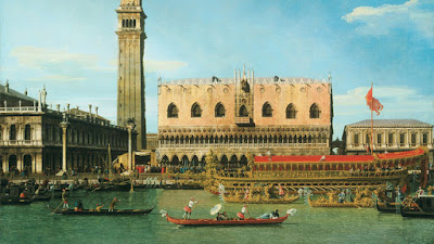
In honor of Canaletto's birthday today in 1697, let's take a look at one of his paintings. His method of painting is quite unusual.

Canaletto, The Bucintoro at the Molo on Ascension Day
Nowadays most oil painters would go for a general overall impression first and refine it further and further with spots of paint. 


Canaletto is rhythmic and precise, like visual music. The way he achieved this look was by painting the big background tones first. When those tones were completely dry, he would go back in with paint on a long thin brush and define the smaller forms almost like calligraphy. 

Because of the drying time, I would guess that he would have had several canvases going at the same time. 

Overlapping forms like figures and boats were painted from background to foreground. So those stairs going down to the water were painted all the way across and allowed to dry before the figures were added over them. 

As the paint has transparentized slightly over the centuries, you can see the earlier layers through the figures.

This method of painting takes some faith and some visualization, because you have to anticipate many steps ahead. The procedure would not work very well in oil on location unless you painted it in a two day session. But it would work extremely well with casein or gouache, where the drying time and opacity encourage such handling.

Monday, October 17, 2016

Forsberg's "Death of a Hero"

A secret to good composition is to group and simplify the tones. But the tonal organization must serve the story. 

Let's look at an example, along with my pencil sketch.

Nils Forsberg (1842-1934) La Fin d’un héros (Death of a Hero) 1888
Oil, 300 x 450 cm, Stockholm, Nationalmuseum

Story
At the moment of his death, a war hero is slumped on his improvised bedding. The setting is a church. A priest gives him last rites. His wife or mother grieves at the foot of the bed. His fellow soldiers pay last respects. On the left are other wounded patients laid out on other beds.

Tonal structure
The dying hero is the crux of the design. He is a light shape surrounded by the light-toned bedding. Those light patches are shape-welded to the illuminated vertical column behind his bed. 

I don't know if it was intentional, but that column ascends like an elevator to heaven. The only other light-toned figures are the altar boy with the candle and the attending priest. 

The rest of the mortals are mostly dark. The ailing figures on beds on the left are enveloped in darkness. Wherever possible, dark tones are grouped into large shapes to simplify the design. 

Perhaps I'm reading into it a bit, but the light seems to be associated with spiritual life or afterlife or redemption, and the darkness seems to be associated with mortality and suffering. The point is that tonal organization isn't just a design issue, it's also a story issue
-----
Previously: Shape Welding

Sunday, October 16, 2016

Small Landscapes at the Morgan

This alpine landscape by Calame is one of the early plein-air studies currently on exhibit at the Morgan Library and Museum in New York.

Alexandre Calame ( Swiss, 1810–1864)
oil on paper/ canvas, 17 3/4 x 12 in. (45.1 x 30.5 cm)
Calame's painting has a lot of depth and variety of paint handling, from generous impastos on the tips of the rocks in the foreground, to thin, delicate vapors of paint in the far atmosphere.

Carl Morgenstern (1811–1893), Jungfrau, Mönch, and Eiger
This little study by German artist Carl Morgenstern is just 10 x 14 inches, painted on paper and later laid down on cardboard. Early on-location painters often pinned the prepared paper into the lid of their paint boxes, and conservators later mounted the paper onto canvas or board.

Gilles-François-Joseph Closson (1796–1853) View in the Dolomites
Closson's painting is even smaller, just 4 1/4 x 9 5/8 inches, painted over a careful line drawing in pencil The pencil drawing is still visible in the lower right.

The landscape show is very small, just 12 paintings. So on its own, it's not worth a trip to the Morgan—except that there are a couple of other fascinating shows going on.

One of the major exhibits is Charlotte Brontë: An Independent Will, which includes examples of her elegantly handwritten manuscripts. I was also impressed with her early artwork, which was accomplished and diligent.

Charlotte Brontë's watercolor painting kit.
The curators explain how Brontë would have used her watercolor kit. She would have taken one of the cakes of pigment and rubbed it in water in the porcelain saucer. The brush is made from squirrel hair glued into the end of a goose quill.

As an added bonus, there's a portrait of Mrs. J.P. Morgan, Jr., by Sargent.

Also at the Morgan:
Word and Image: Martin Luther's Reformation
Dubuffet Drawings, 1935–1962
Hans Memling: Portraiture, Piety, and a Reunited Altarpiece
----
Morgan Library and Museum is at 225 Madison Avenue at 36th Street.
----
The best book on early outdoor painting practice is The Painted Sketch: American Impressions From Nature, 1830-1880
There's also an exhibition catalog called Alpine Views: Alexandre Calame and the Swiss Landscape (Clark Art Institute) about Calame and his contemporaries, based on a show at the Clark Art Institute.
Just a short walk from Grand Central and Penn Station

Saturday, October 15, 2016

Portrait In Union Square


Yesterday in New York City I did this stealth portrait of a guy on his cellphone. In the video I captured the moment as he walked away. If you receive this post by email, you may need to follow this link to see the video.

The sketch is in watercolor and gouache in a Pentalic Aqua journal, and the guy was sitting there for about 45 minutes.
-----

Friday, October 14, 2016

Winnie the Pooh Turns 90


Pooh turns 90 today. The original book, Winnie the Pooh, written by A.A. Milne and illustrated by E.H. Shepard, was published in 1926.

At first, Milne was not keen to have Shepard illustrate his Pooh stories, and he gave detailed instructions to the illustrator about what he expected in the pictures.


Shepard approached the challenge with considerable academic training under his belt, and he was an accomplished Punch cartoonist.

When he undertook to illustrate Milne's world, he traveled to Ashdown Forest to sketch the Sussex countryside that had inspired the stories. The relationship between author and illustrator was cordial and formal, but the two men were never close friends.

Late in life, Ernest Shepard gave 300 of his Pooh drawings to the Victoria and Albert Museum in London.
-----
Quotes from the art book Work of E.H. Shepard

Previously: E.H. Shepard's Academic Studies
E.H. Shepard's WWI Illustrations
All images copyright their respective owners.

Thursday, October 13, 2016

"Can I Borrow Your Paintbrush?"


From time to time when I'm painting outdoors, a funny thing happens. Tourists come up and want to borrow the paintbrush and pretend they're the artist. That's OK, I don't usually mind, but in this case there were a whole bunch of people who each wanted their turn!

Here's a brief video that takes you behind the scenes and shows a little of the painting process.


If you're getting this blog post as an email, you may need to follow this link to see the video on Facebook. It's an excerpt from a longer video on flower painting that I'm putting together for release in Spring 2017.

The original painting is on view and will be offered for sale at the American Masters show at the Salmagundi Club in New York City. Jeanette and I will be there tomorrow, Friday, October 14th, 6:00-8:30 for the Gala event.

The show will be on view through October 21. The Gala costs to attend, but seeing the show any other time is free.
-----
Previously: Top ten ways to deal with curious spectators
The problem of curious spectators