Yesterday at the Lime Rock race track, we stopped by the infield/ pit area and said hi to our cousin Alex before his Grand-Am road race.
Here’s me and Alex with my son Frank, visiting from Boston.
The crew fine-tuned the steering on the #99 Gainsco car right up until the green flag at 2:00. Team driver Jon Fogarty (signature in upper left) started in his qualifying position of 5th place.
Alex drove the middle segment of the two hour and forty five minute race, working his way up in the ranks. They ended up finishing in fourth place.
Ricky Taylor in the #10 car opened up the lead early and held onto it until the end. It was a nice day to be outside and a real blast to watch the action. Thanks, Alex!
------
Alex Gurney bio with videohttp://www.grand-am.com/drivers/driver.cfm?series=r&did=1024
Tuesday, May 31, 2011
Monday, May 30, 2011
Dan Gurney at the Indy 500
This is the 100th anniversary of the Indianapolis 500 car race. My cousin Dan Gurney and his team made a major contribution to the Indy 500 in the 1960s and ‘70s.
The Eagle race cars that he manufactured won the race in 1968, 1973, and 1975. As a driver, Dan came in 2nd, 2nd, and 3rd in 1968, 1969, and 1970. Dan, who just turned 80, is at the Indianapolis Speedway this weekend participating in the ceremonies.
That’s me and Dan at a race in Lime Rock, CT a while ago. Today, Jeanette and I are going to Lime Rock to watch Dan’s son Alex racing in the Grand-Am Rolex Series.
Book on Dan Gurney's Eagle Racing Cars
Gurney's All American Racers (official website)
Posts tagged "Dan Gurney" on the official blog of the Indy Speedway
Previous GJ post on ancestor Goldsworthy Gurney
Decoration Day
The American holiday of Memorial Day is a time to commemorate those who have died in war. It was once called “Decoration Day.”
The older custom was to decorate the graves, and honor the memory, of all of the dead, and then to have a party afterward. After the Civil War, the holiday became established more along military lines.
Let’s remember the soldiers, bur let’s also remember the musicians and artists and teachers and carpenters and farmers who have lived their lives and passed into our memory.
Wikipedia about Memorial Day / Decoration Day
Image: “To the Memory of Cole” by Frederic Church
Thomas Cole book by Earl A Powell
Labels:
Hudson River School
Sunday, May 29, 2011
Photos Imitating Art
How closely can a photograph of real humans match a painting or a sculpture?
See for yourself. Here is Vermeer’s painting “Girl With a Pearl Earring” and actress Scarlett Johansson dressed up for the movie of the same name.
The image on top is the actual Trevi Fountain in Rome. Below that is a staged reënactment performed during The Pageant of the Masters in Laguna Beach, California.
Vermeer comparison from “Eye for Detail”
Pageant of the Masters, Laguna Beach
Girl With The Pearl Earring on Wiki
Thanks, Walter Wick!
Saturday, May 28, 2011
Caustics inside eyes
Caustic effects are those little spots or arcs of light that happen when sunlight shines through wavy water or a water-filled glass. The curving surface acts like a lens to focus the light into a small area.
Caustics also appear within eyes when the direct sunlight travels diagonally through the cornea. Blog reader P.A. Farris sent me these photos she took of a black-crowned night heron. The caustic is an arc-like shape on the opposite side of the pupil from the highlight.
If the light comes from far enough to the side, the caustic becomes a focused point.
The same effects happen with human eyes. The light is coming from the right, and the caustic appears brightest as a curved shape at the edge of the iris. In the raking light on the iris, you can also see how the pupil bunches up.
Thanks, P. A. Farris
More on caustics in Color and Light: A Guide for the Realist Painter
Previously on GJ:
Caustics
Nephroid Caustics
Caustic Reflections
Wikipedia on caustic optics
Labels:
Effects/Phenomena
Friday, May 27, 2011
Pencil Sketch Vignette
Ernest Watson shows a nice trick for vignetting a pencil sketch.
He allows the outer edges of the drawing to gradually dissolve into simple construction lines. The windows are nicely varied, too. No two are alike.
This 1916 drawing is from Arthur Guptill’s book “Sketching and Rendering in Pencil" (republished as "Drawing and Sketching in Pencil,” available here in book form and here for free download.
Labels:
Pencil Sketching
The Page Turner
When I read a book on Google
Scanned from paper onto screen,
I forget the steady labor
Of the scanner, sight unseen.
Then I see your lovely fingers
You’re the one who took the care,
You’re the one who turned the pages.
Now I know you’re hiding there.
Scanned from paper onto screen,
I forget the steady labor
Of the scanner, sight unseen.
Then I see your lovely fingers
You’re the one who took the care,
You’re the one who turned the pages.
Now I know you’re hiding there.
Thursday, May 26, 2011
Exhibit showcases women’s student clothing
A exhibit at Vassar College examines the evolution of women’s student fashions from the 1860s to the 1950s.
This silk moire taffeta day dress with leg-o’-mutton sleeves dates from about 1895. The decorative velvet lapels and stand-up collar are inspired by menswear. According to the student curators, these details bespeak the desire for college-educated women to fit into a male world during the Gilded Age.
The exhibit gives a rare opportunity for artists to sketch antique dresses from observation. I made the drawing with violet and ochre colored pencils and a water brush. The dress was green, but I didn’t bring any green pencils, so I just picked two opposite colors and let them duke it out.
Fashioning an Education: 150 Years of Vassar Students and What They Wore is at the James W. Palmer III Gallery at Vassar College in Poughkeepsie, New York through June 12, 2011. It's free and open to the public. The exhibition will be open Thursdays, Fridays, and Saturdays from 1:00 to 4:00pm. For more information, call 845.437.5250.
While you’re in town, Vassar’s art museum also has an exhibit on Thomas Rowlandson and a nice collection of Hudson River School sketches. Nearby at the Mill Street Loft is the “Our Towns” cityscape exhibit.
Related book: Clothing through American History: Civil War through the Gilden Age
Caran d’Ache pencils
Niji water brush
Labels:
Museum Visits,
Pencil Sketching
Wednesday, May 25, 2011
Time Lapse
El Cielo de Canarias / Canary sky - Tenerife from Daniel López on Vimeo.
Here's a fascinating time lapse montage showing changing weather and night illumination on the island of Tenerife. The explanation (links take you to more information):
Visible in the above time-lapse movie include clouds that seem to flow like water, a setting sun that shows numerous green flashes, the Milky Way Galaxy rising behind towering plants, a colorful double fogbow, lenticular clouds that appear stationary near their mountain peaks, and colorful moon coronas. The above video was shot solely from the Teide National Park on Tenerife in the Canary Islands of Spain, off the north west coast of Africa. The video also features an unusual type of plant in several scenes -- can you identify it?
Labels:
Video
Tuesday, May 24, 2011
Ever Dream Land
When the Norton Museum of Art had its Dinotopia exhibition last year, students involved with the Museum’s PACE program (Progressive Afterschool Arts Community Education) at local community sites worked together to create their own utopias. These expressions of collective dreaming were exhibited in the museum near my own paintings and models.
The students of My Choice Community Development, a center in Riviera Beach, created a land inhabited by a marvelous menagerie of animals and plants, which they shaped out of clay. Students at Gaines Park, a West Palm Beach Parks and Recreation site, created an island called “Ever Dream Land.” The name was a reaction to the limits implied by the name “Never Never Land” of Peter Pan. Ever Dream Land is inhabited by a marvelous menagerie of humans, animals and plants, which they shaped out of clay.
They drew a map and invented up their own set of alphabetic symbols. They pictured themselves floating up on balloons over ice cream mountains and candy rivers, with soft round homes made of discarded packing foam.
Labels:
Dinosaurs,
Elementary Schools,
Museum Visits
Monday, May 23, 2011
Automated Selectivity
One of the reasons we like to look at paintings is that reality is filtered through someone's brain. Painters select the important elements out of the infinite detail that meets our eyes.
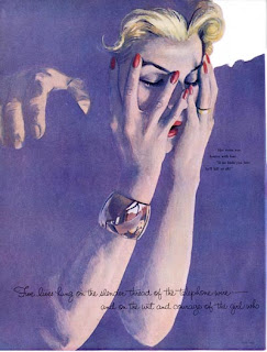
Here, Al Parker chooses to show us detail in the hands and face. He sinks everything else into a flat tone.
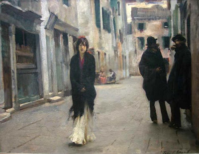
John Singer Sargent could have detailed every paving stone and roof tile in this Venice street scene. Instead he softened and simplified the background areas and put the focus on the faces.
This selectivity isn’t arbitrary. The detailed areas correspond with the parts of the picture that we want to look at anyway. As we’ve seen in previous posts, eye tracking studies have demonstrated the cognitive basis of selective attention. Viewers’ eyes consistently go to areas of a picture with the greatest psychological salience: things like faces, hands, and signs. We’re hard-wired for it.
What happens if you combine eye tracking data with computer graphics algorithms to automate the process of selective omission? Would the result look “expressive” or “artistic?”
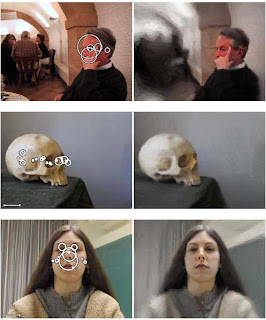
(Click to enlarge) In his doctoral thesis for Rutgers University, Anthony Santella did just that. The photographs on the left include a set of overlapping circles showing where most people spent their time looking in each image. The larger the circle, the longer the concentration on those areas.
Santella combined that data with a rendering algorithm which simplified other areas of the image. In the top image, note the flattening of the far figures and the arches above them. In the bottom image of the woman, note how the wrinkles in the drapes and the textures in the sweater are rendered with flat tones. But her eyes, nose and mouth are still detailed.
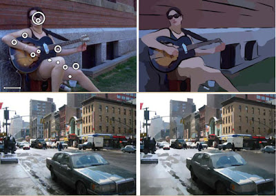
The rendering algorithms can be designed to interpret the source photo in terms of line and color. Or the shapes can modulated in size according to the interest factor. Note how the outlying areas of each rendering is simplified.
Whichever rendering style one desires, the output image has a sense of psychological relevance, more so than rendering algorithms based merely on abstract principles such as edge detection. As a result these computer-modified photographs have a sense of something approaching true human artistry.
The results of this interaction between eye-tracking data and computer rendering algorithms suggests a heretical thought: What we think of as a rare gift of expressive artistic judgment is really something fairly simple and logical, something you can teach a machine to do.
"THE ART OF SEEING: VISUAL PERCEPTION IN
DESIGN AND EVALUATION OF
NON-PHOTOREALISTIC RENDERING"
by Anthony Santella
www.research.rutgers.edu/~asantell/thesis.pdf
Final two sets of images are courtesy this online graduate thesis.
Previous related posts on GurneyJourney:
Abstraction Generator
Automated Painting
Al Parker at the Rockwell
The Eyes Have It
Stroke Module
Eyetracking and Composition, part 1
Eyetracking and Composition, part 2
Eyetracking and Composition part 3
Introduction to eyetracking, link.
How perception of faces is coded differently, link.
Sunday, May 22, 2011
Mirko Listening
I did this little sketchbook portrait of my friend Mirko last Sunday.
He sat a few seats away from me at a choral concert last week. He was deeply concentrating on the music of Schumann and Tchaikovsky. He didn’t notice I was sketching him.
Those blurry pools of dark ink on his coat were done by first wetting the surface with the clear water brush and then applying a second water brush filled with black ink.
In addition to the two water brushes, my left hand held three water-soluble colored pencils: russet, brown and black. To avoid distracting people around me, I minimized all my hand and head movements. The tools are absolutely silent on the paper.
He sat a few seats away from me at a choral concert last week. He was deeply concentrating on the music of Schumann and Tchaikovsky. He didn’t notice I was sketching him.
Those blurry pools of dark ink on his coat were done by first wetting the surface with the clear water brush and then applying a second water brush filled with black ink.
In addition to the two water brushes, my left hand held three water-soluble colored pencils: russet, brown and black. To avoid distracting people around me, I minimized all my hand and head movements. The tools are absolutely silent on the paper.
Labels:
Pencil Sketching,
Portraits
Saturday, May 21, 2011
A color photo from 1911
Here is the Emir of Bukhara, Alim Khan (1880-1944), in a photo taken in 1911.
This is just one of a rich collection of images from the Russian empire, called the Prokudin-Gorskii Photographic Record, now housed in the Library of Congress and available for viewing online.
The photograph was made by shooting three plates in quick succession using red, green, and blue filters. Originally they were intended to be projected by lantern slides using the same color filters. Technicians were able to digitally scan and recombine the plates into the image you see here. Color photography was thus possible long before it appeared elsewhere.
Empire that was Russia: Process
Pictures of Ethnic Diversity
Previously on GJ: Early Color Photos
Thanks, Kay!
Labels:
Color
Friday, May 20, 2011
Our Towns Exhibition
This TED lecture by James Howard Kunstler shows how postwar city planners sold us on dead-end dreams that have filled our world with blank malls and suburbia.
Thinking about such things makes me search my motives when I look for townscapes to paint. Am I just looking for nostalgic visions of the human-centered places that hardly exist anymore? Is the plastic franchise landscape worth painting?
For me, the answer is yes to both questions. What interests me most is time—how changes in human thought play themselves out in layers of architecture. I’m fascinated by odd juxtapositions: mom-and-pop stores next to mega corporations, or commercial and residential spaces butting up against each other.
Tomorrow, the Mill Street Loft will open a group exhibition called “Our Towns: the Cities and Towns of the Hudson Valley.” Nearly 30 artists in various media will be participating. The juror was M. Stephen Doherty of Plein Air magazine.
I’ll have four oil paintings in the show, three of which are plein air pieces. If you’re near Poughkeepsie, New York tomorrow, Saturday, May 21, please come by the opening reception, which is from 4-6 pm. I’ll be there, and I’ll also be doing a gallery talk on Thursday, June 9 at 6:00pm. The exhibition will be up through July 15, 2011. For more information, call 845.471.7477 or visit Mill Street Loft's website.
Reminder: Mill Street Loft’s other exhibit on Hudson Valley landscapes is still accepting submissions throughMay 23. Extended to May 31, 2011.
Related Previous Posts:
Powers Market
Dalleo’s Deli
All Three of the four paintings are reproduced in Color and Light: A Guide for the Realist Painter
Thinking about such things makes me search my motives when I look for townscapes to paint. Am I just looking for nostalgic visions of the human-centered places that hardly exist anymore? Is the plastic franchise landscape worth painting?
For me, the answer is yes to both questions. What interests me most is time—how changes in human thought play themselves out in layers of architecture. I’m fascinated by odd juxtapositions: mom-and-pop stores next to mega corporations, or commercial and residential spaces butting up against each other.
Tomorrow, the Mill Street Loft will open a group exhibition called “Our Towns: the Cities and Towns of the Hudson Valley.” Nearly 30 artists in various media will be participating. The juror was M. Stephen Doherty of Plein Air magazine.
I’ll have four oil paintings in the show, three of which are plein air pieces. If you’re near Poughkeepsie, New York tomorrow, Saturday, May 21, please come by the opening reception, which is from 4-6 pm. I’ll be there, and I’ll also be doing a gallery talk on Thursday, June 9 at 6:00pm. The exhibition will be up through July 15, 2011. For more information, call 845.471.7477 or visit Mill Street Loft's website.
Reminder: Mill Street Loft’s other exhibit on Hudson Valley landscapes is still accepting submissions through
Related Previous Posts:
Powers Market
Dalleo’s Deli
Labels:
Museum Visits,
Plein Air Painting
Thursday, May 19, 2011
My Preference for Reference
When you set out to do a painting of a scene from fantasy or history, you have a range of choices for reference.
There’s an argument for using no reference at all. If you train your memory, you can work entirely from your imagination, which helps particularly in the development stages of the idea.
And there are pros and cons of using traditional drawn studies of a model. Above is a charcoal mirror study of me posing in a pirate costume and the resulting painting.
There are also benefits of working from photo reference, especially when you’re dealing with kids, animals, or anything in movement. When I needed to paint a picture of a kid playing tug-of-war with a dinosaur, the first drawing I did from my head didn’t have the conviction that came later when I actually staged and photographed the action.
Photography has its benefits, but also its pitfalls. Copying a photo too much can drain the mythic magic from your painting. Photographic effects such as depth of field and motion blur belong in some images, but not in others.
Everyone has to develop a reference strategy that suits their goals. I’m a pragmatist on this issue: the desired results govern the choices, and I’ve used every kind of reference.
This meaty topic is the subject of a six page workshop that I wrote for the June, 2011 issue of ImagineFX magazine. You can pick up a copy at the local newsstand, or visit their website. The accompanying DVD has a couple of my short videos and lots of examples.
ImagineFX magazine
This topic is also explored in Imaginative Realism: How to Paint What Doesn’t Exist.
Tug-of-war image from Dinotopia: Journey to Chandara
Pirate image is from Dinotopia Lost by Alan Dean Foster
Previous posts on GurneyJourney
Acting it Out: (Tug of War)
Rackham on Photo Reference
Using Photo Reference (32 comments)
Model to Mermaid
P.S. I've just received word that the painter Jeffrey Catherine Jones passed away this morning from emphysema. R.I.P. There's more information at the blog Muddy Colors . Jeff was an acquaintance and fellow artist I had known for twenty years or so, and I'll miss Jeff's unique perspective.
There’s an argument for using no reference at all. If you train your memory, you can work entirely from your imagination, which helps particularly in the development stages of the idea.
And there are pros and cons of using traditional drawn studies of a model. Above is a charcoal mirror study of me posing in a pirate costume and the resulting painting.
There are also benefits of working from photo reference, especially when you’re dealing with kids, animals, or anything in movement. When I needed to paint a picture of a kid playing tug-of-war with a dinosaur, the first drawing I did from my head didn’t have the conviction that came later when I actually staged and photographed the action.
Photography has its benefits, but also its pitfalls. Copying a photo too much can drain the mythic magic from your painting. Photographic effects such as depth of field and motion blur belong in some images, but not in others.
Everyone has to develop a reference strategy that suits their goals. I’m a pragmatist on this issue: the desired results govern the choices, and I’ve used every kind of reference.
This meaty topic is the subject of a six page workshop that I wrote for the June, 2011 issue of ImagineFX magazine. You can pick up a copy at the local newsstand, or visit their website. The accompanying DVD has a couple of my short videos and lots of examples.
ImagineFX magazine
This topic is also explored in Imaginative Realism: How to Paint What Doesn’t Exist.
Tug-of-war image from Dinotopia: Journey to Chandara
Pirate image is from Dinotopia Lost by Alan Dean Foster
Previous posts on GurneyJourney
Acting it Out: (Tug of War)
Rackham on Photo Reference
Using Photo Reference (32 comments)
Model to Mermaid
Labels:
Imaginative Realism,
Models Posing
Wednesday, May 18, 2011
Mud Puddle
Yesterday I took my car to the shop because it needed an inspection. The rain was pouring down. There wasn't much space in the waiting room. So I sat under the awning out back between an old rusty engine and a forklift.
While I waited, I sketched the mud puddle beside me. The rain streamed off the corrugated roof and splashed the water, making big bubbles. The puddle was a sea of overlapping ripples.
I used watercolor and water-soluble colored pencils, scratching through the white vertical lines when I got home.
While I waited, I sketched the mud puddle beside me. The rain streamed off the corrugated roof and splashed the water, making big bubbles. The puddle was a sea of overlapping ripples.
I used watercolor and water-soluble colored pencils, scratching through the white vertical lines when I got home.
Labels:
Watercolor Painting
Tuesday, May 17, 2011
Three Dimensional Abstract
Usually abstract paintings are two dimensional shapes laid out on a flat surface. But you can also create abstract shapes in perspective, resulting in what I like to call a “three-dimensional abstract.”
Science fiction book covers are a perfect setting for such images, because it’s fun to contemplate strange forms whose function is a mystery.
This wraparound book cover, which I painted in oil, has just been released from IDW Press. It presents a starship interior going back into space. Like a child looking at the adult world, I don't know the purpose of each of the forms. I imagined that the forms were not so much designed by humans, as “grown” according to crystal-like rules.
Some forms have luminous panels, but overall, the scene is lit from a warm inside source behind us to the left, along with a cool sun out there in space, half-hidden by the window.
Read more about this deluxe edition of the novel by Harlan Ellison at IDW, the publisher's website.
Labels:
Composition
Monday, May 16, 2011
Publishers Weekly
Thanks to Marc Schultz and Publishers Weekly for the nice article today on how Color and Light and Imaginative Realism have been nurtured by the loyalty and enthusiasm of GurneyJourney blog readers.
"Every book is, in an intimate sense, a circular letter to the friends of him who writes it. They alone take his meaning; they find private messages, assurances of love, and expressions of gratitude dropped for them in every corner. The public is but a generous patron who defrays the postage."
"Dinotopia's Gurney Draws on Blog for Newest Hit," Publishers Weekly, May 16
Related posts on GurneyJourney:
How About a Book?
Why I Wrote Imaginative Realism
Cover Poll / Color and Light Book
Cover Poll Results
More about the New Book
Meanwhile, Somewhere in the Pacific Ocean
-------
Get a signed copy of either book from the Dinotopia Store
Color and Light: A Guide for the Realist Painter from Amazon
Imaginative Realism: How to Paint What Doesn't Exist from Amazon
"Every book is, in an intimate sense, a circular letter to the friends of him who writes it. They alone take his meaning; they find private messages, assurances of love, and expressions of gratitude dropped for them in every corner. The public is but a generous patron who defrays the postage."
—Robert Louis Stevenson
"Dinotopia's Gurney Draws on Blog for Newest Hit," Publishers Weekly, May 16
Related posts on GurneyJourney:
How About a Book?
Why I Wrote Imaginative Realism
Cover Poll / Color and Light Book
Cover Poll Results
More about the New Book
Meanwhile, Somewhere in the Pacific Ocean
-------
Get a signed copy of either book from the Dinotopia Store
Color and Light: A Guide for the Realist Painter from Amazon
Imaginative Realism: How to Paint What Doesn't Exist from Amazon
Labels:
Color and Light Book
When to switch to two point perspective
Here’s a painting called “Admiration” by Vittorio Reggianini (1858-1938).
A mishandling of perspective unintentionally gives it a funhouse quality. If you dropped a marble on the floor, it looks like it would roll off to the right.
The problem is that it goes into two point perspective when it should be treated as a one-point perspective picture.
A basic rule of thumb is that if the main vanishing point is within the central third of the picture, the other set of lines should stay horizontal. If that distant vanishing point were placed way over near the side of the picture, the lines in the floor and the window mullions could begin to slant a bit.
Labels:
Academic Painters,
Perspective
Sunday, May 15, 2011
Blue Light and the Circadian Clock
Researchers at the Rensselaer Polytechnic Institute's Lighting Research Center (LRC) in Troy, New York are proving that exposure to blue light is tied to the day/night sleep cycles of our circadian rhythms.
Mariana Figueiro, PhD., who heads the LRC’s light and health program explains:
A person attuned to the changing colors of outdoor light will notice that just after the orange-colored sun sets, the world is bathed in blue light from the twilight sky. So perhaps it’s not surprising that our body rhythms are tuned by this color.
In one LRC study, patients with Alzheimer’s disease experienced more hours of sleep per night after being exposed to blue LED lights than they did after being exposed to red lights.
“Blue sky is ideal for stimulating the circadian system because it’s the right color and intensity, and it’s ‘on’ at the correct time for the right duration—the entire day,” said LRC director Mark Rea, Ph.D.,
Presumably, since non-human animals also have the BY channel, they would respond to the same signals.
--------
Science Daily article about waking up teens with colored light
RPI Lighting Research Center article
Painting is called "Bonfire" by Isaac Levitan
Mariana Figueiro, PhD., who heads the LRC’s light and health program explains:
“Within the mechanism that affects the circadian system are two color opponent channels. One of those is the blue vs. yellow (BY) channel, which seems to participate in converting light into neural signals to the part of the brain that generates and regulates circadian rhythms.”
A person attuned to the changing colors of outdoor light will notice that just after the orange-colored sun sets, the world is bathed in blue light from the twilight sky. So perhaps it’s not surprising that our body rhythms are tuned by this color.
In one LRC study, patients with Alzheimer’s disease experienced more hours of sleep per night after being exposed to blue LED lights than they did after being exposed to red lights.
“Blue sky is ideal for stimulating the circadian system because it’s the right color and intensity, and it’s ‘on’ at the correct time for the right duration—the entire day,” said LRC director Mark Rea, Ph.D.,
Presumably, since non-human animals also have the BY channel, they would respond to the same signals.
--------
Science Daily article about waking up teens with colored light
RPI Lighting Research Center article
Painting is called "Bonfire" by Isaac Levitan
Labels:
Color,
Visual Perception
Saturday, May 14, 2011
Motion blur in pen and ink
Proto motion blur by Charles Dana Gibson (1867-1944).
Previously on GurneyJourney: Motion Blur
Gibson on Wikipedia
Previously on GurneyJourney: Motion Blur
Gibson on Wikipedia
Labels:
Comics/Cartooning
Color wheel masking in Italian
For those of you who are more comfortable reading in Italian, Alessandro Pedroni has begun a series of posts about the color wheel masking method on his blog PracticaL'Arte.
Color Wheel Masking on PracticaL'Arte
-----
Previously on GurneyJourney:
A digital gamut masking tool
Series on rethinking the color wheel:
Part 1: Wrapping the Spectrum
Part 2: Primaries and Secondaries
Part 3: Complements, Afterimages, and Chroma
Part 4: Problems with the Traditional Wheel
Part 5: The Munsell System
Part 6: Cyan, Magenta, and Yellow
Series on gamut mapping and masking:
Color Wheel Masking (Part 1)
The Shapes of Color Schemes (Part 2)
Gamut Masking "From Mask to Palette"(Part 3)
------
Color and Light signed from the Dinotopia Store
Color and Light on Amazon internationally: USA | CA | UK | FR | DE | JP
Labels:
Color,
Color and Light Book
Friday, May 13, 2011
Color Theory in Action
Jason Dowd, an instructor at the Laguna College of Art, asked his students to paint color wheels for his Composition and Color class.
They placed the high chroma colors on the outside edge, stepping down to gray at the center. They then explored the gamut masking method outlined in my book Color and Light to generate color schemes and to analyze classical paintings.
Isabelle Moore carefully considered the color gamut before executing this magnificent master copy of the "Harvester" by William Adolphe Bouguereau.
If other instructors are doing class projects based on ideas in Color and Light, please send me photos (jgurneyart at yahoo.com) and I’ll share them on the blog.
And if you want to assign Color and Light as your course guide, please let me know. At the Dinotopia Store, we can offer you discounts on group orders, and I can sign them for each of your students.
--------
Dinotopia Store
Laguna College of Art (LCAD)
Previously on GJ: a visit to LCAD
Labels:
Art Schools,
Color and Light Book
Warm Colors in the Distance
The newest installment of my magazine masterclass series on atmospheric perspective is about to hit the newsstands.
In the June/July issue of International Artist magazine, I explore an effect called “reverse atmospheric perspective,” where the colors get warmer rather than cooler as they go back. It’s a fairly rare phenomenon in nature, so it creates an exotic mood that’s just as popular in modern cinema and fantasy painting as it was for the Hudson River School painters.
The article includes a step-by-step sequence of the Dinotopia painting “Light on the Water” which has never been published before, either on this blog or in the book Color and Light.
The issue is packed with other interesting features, including a new feature on illustration curated by Rebecca Guay and a well illustrated interview with Dr. Johan Cederlund, director of the Zorn Museum.
-----
International Artist magazine
Subscribe to:
Posts (Atom)