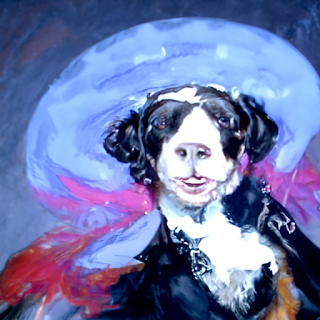
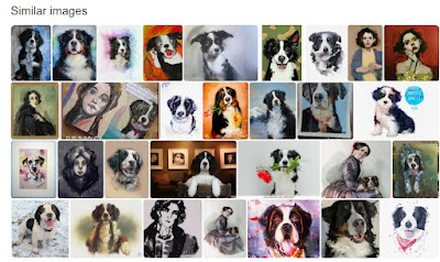
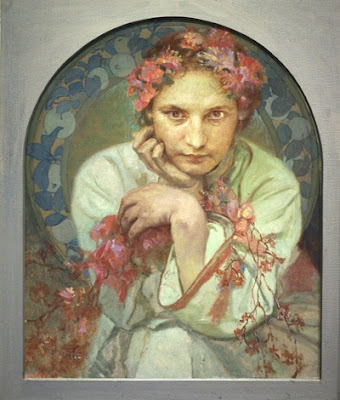
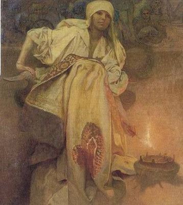
Have you seen this painting of Ada Lovelace, the Victorian lady who helped invent the computer? Her eyes are kind of close together, but you get the idea. The image was created by a computer.
Tuesday, November 30, 2021
A Funny Face
Monday, November 29, 2021
Pathway into the Glacier
Sunday, November 28, 2021
ImagineFX Magazine Reviews "Gradients"
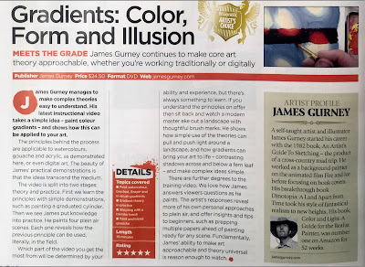
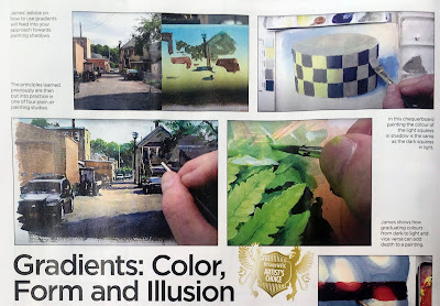
"James Gurney manages to make complex theories easy to understand. His latest instructional video takes a simple idea — paint colour gradients — and shows how this can be applied to your art.
Saturday, November 27, 2021
Your Questions about Plein-Air Painting in Oil
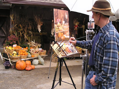
A: It’s a Jullian umbrella, designed to clamp onto a French easel, but I keep it on a C-stand so that it doesn’t blow over and bring my painting into the wreckage."
A: That’s an Open Box M easel, which may not be made anymore, but there are others like it, and there's a Facebook group about building your own.
bencrastinate "Does painting with an easel help? Ive always painted my canvas flat on my desk. What are the benefits of painting on a vertical surface?"
A: I find it helps my speed and accuracy to have my painting set up perpendicular to my line of sight, and directly adjacent to, the same size as, and in the same light as my subject.
grinningink "Since you used oil here, wasn’t it still wet when you sold it that same day? Was there something to protect it when the customer took it?"
A: Yes, this was for a paint-out. I framed it and it was auctioned same day. I knew the owner, and after it was thoroughly dry I borrowed it back to varnish and photograph it.
A: A lot of oil painters have used premixed colors. I was thinking mainly of Frank Reilly, but using an adapted version of his practice.
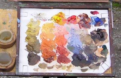
janice_skivington "Please list the names of oil colors on the pallet, looks like three primaries and white."
It’s the 5-color palette recommended by John Stobart in his book The Pleasures of Painting Outdoors: titanium white, cad yellow light, pyrrole red, burnt sienna, and ultramarine blue. You can paint almost anything with those five colors.
tomkatermurr "Would you also premix your colors when you paint with other mediums?"
In theory you could premix with water media, but the pools of color would tend to dry too fast.
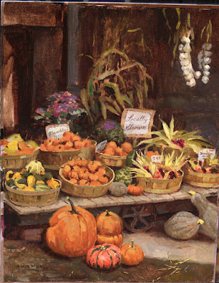
Related previous posts: Painting Pumpkins
Friday, November 26, 2021
Howard Brodie's Portraits
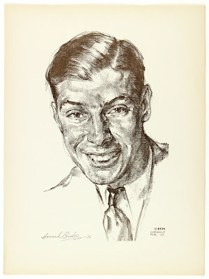
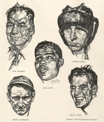
Before he worked as a war reporter and a courtroom sketch artist, Howard Brodie (1915-2010) produced a lot of portraits in crayon of sports figures for the San Francisco Chronicle.
Brodie drew from life whenever he could. According to Gene Byrnes, "He avoids any mechanical means of drawing, and says that when he is asked to use a photograph for factual reference he goes to considerable pains to avoid copying it."
Books: A Complete Guide to Drawing, Illustration, Cartooning, and Painting by Gene Byrnes
Drawing Fire: A Combat Artist at War : Pacific Europe Korea Indochina Vietnam
Thursday, November 25, 2021
Wednesday, November 24, 2021
Books are on their way
If you ordered a signed book today or yesterday, your package is on its way.
Tuesday, November 23, 2021
'Nature is Always New'
Monday, November 22, 2021
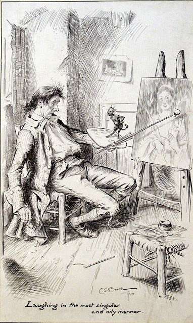
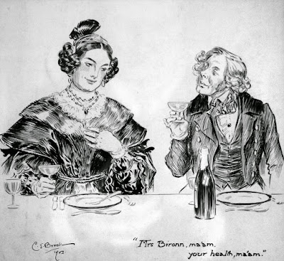
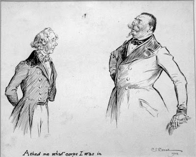
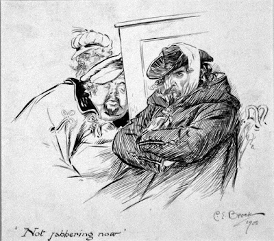
Brock's Paris Sketchbook
Charles E. Brock was an English illustrator who produced a series of illustrations for William Makepeace Thackeray's A Paris Sketchbook.
 "They owned a large collection of Regency era costume prints and fashion plates, and had clothes specially made as examples for certain costumes. Using these, family members would model for each other."
Sunday, November 21, 2021
Dinotopia Back in Stock
Signed copies of the Dinotopia hardback book are back in stock in our web store.
Saturday, November 20, 2021
Feature Article on Peter Helck
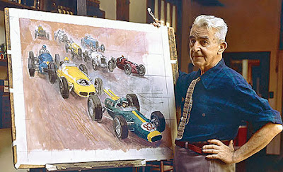
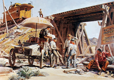
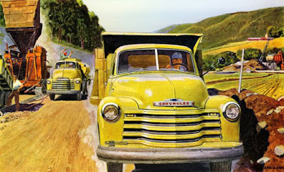
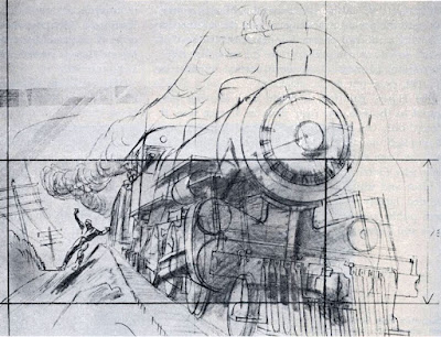
Helck was one of the instructors from the Famous Artists School, and no one could match his ability to paint cars and trucks.
Many of his exemplary preliminary drawings are included in the 112 page article. (The pictures in this post are typical of what's in the article, but not necessarily the same images.)
Peter Helck, This is My Birthright
The article starts with 18 pages of illustrated biography, followed by 90 pages of pictures, mostly reproduced from original art or vintage tearsheets.
--
Learn more: Visit Illustration Magazine's website to learn more about the special issue. Read my previous post about Peter Helck and check out Peter Helck's memoirs online. More on Helck's Wikipedia page.
Friday, November 19, 2021
Inside the Famous Artists School
The Famous Artists School, which was formed more than 70 years ago, was an early pioneer of remote learning.
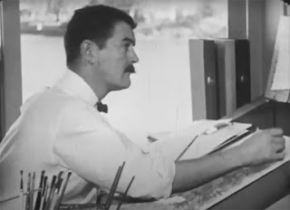
Some tantalizing glimpses of the correspondence course were featured in a half-hour TV program called "Operation Success." The Norman Rockwell Museum has posted the show on YouTube.
The school hired a team of professional instructors who in turn had studied with the master illustrators. It was the job of these F.A.S. instructors to read and respond to the student work and to keep their files up to date.
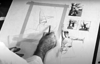
The voiceover says that this instructor is creating a painted criticism, based on student efforts mailed to the school from thousands of miles away.
--
• Here are my previous blog posts about the Famous Artists School and its instructors.
• It's still possible to find vintage sets of the Famous Artists Course.
• The Norman Rockwell Museum produced a single book about the history of the Famous Artists School.
• The other great source of instruction about mid-20th century illustration is Creative Illustration by Andrew Loomis.
Thursday, November 18, 2021
Using Traffic Cones for Street Painting
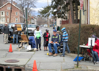
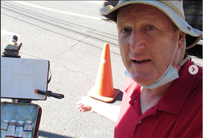
Chelsea, here's what happened. The library had an outdoor table with an extension cord going to it for computer users. To make sure no one tripped on the cord, they marked it with two cones beside the sidewalk. I figured they wouldn't mind too much if I borrowed one for a while.
The maintenance guy eventually DID notice and asked me what I was doing. He was concerned about someone potentially tripping on the cord and suing the library, but I assured him I would take responsibility. He was a nice guy and liked art so he very reluctantly agreed as long as I took responsibility and put it back soon, which I did.
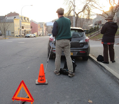
Without the cone keeping the space open, the painting would have been impossible and as soon as I returned the cone, a big van parked there and blocked the whole view.
Usually I travel with my own cones. You can get cones at Walmart or Amazon, and then you can make an official-looking stencil.
Wednesday, November 17, 2021
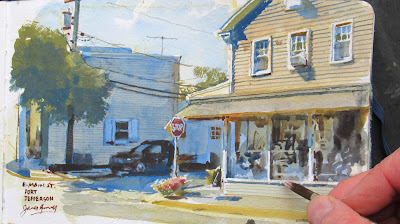
Painting Main Street at Port Jeff
This is the view looking across E. Main from the library in Port Jefferson, New York.
I've already had one guy park in front of me, so I hold the parking space open with a traffic cone.
I love the shopfront with its big glass windows, awning, and the upstairs residence, all set against the cool grey-blue of the far building in shadow.
Tuesday, November 16, 2021
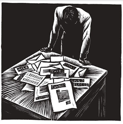
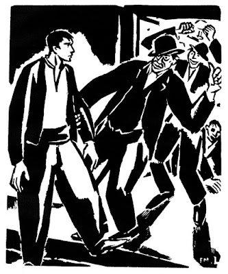
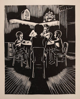
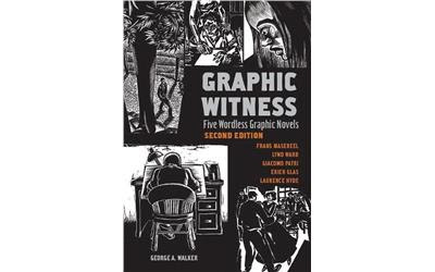
Review of Graphic Witness: Five Wordless Graphic Novels
Telling a story purely with illustrations is a challenge not unlike making a silent movie. There can be dramatic moments of action or conflict in a wordless graphic novel. Or the images can enshrine reflective and poetic moments.
But the connective tissue of a story, such as internal thoughts, sounds, or intentions can be challenging to convey.
Wordless stories flourished in Europe and America in the 1920s, '30s, and '40s, in part inspired by dramatic visuals of the silent movie era and expressionist art of the time.
In turn these works have inspired many contemporary comic artists, though the development of these wordless picture-stories is mostly independent of the pop-culture origins of modern comics.
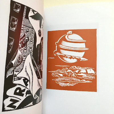
Many of the artists used the time consuming method of woodcuts for their illustrations, which allowed artists to produce small runs of books, which have been prized by collectors ever since.
The best known member of this group was Lynd Ward (1905-1985), who produced several stories without words such as God's Man and Madman's Drum, but there were other artists who contributed to the genre such as Frans Masereel (1889-1972), Giacomo Patri (1898-1978), Erich Glas (1897-1973), and Laurence Hyde.
The works of all of those artists are featured in the new book Graphic Witness: Five Wordless Graphic Novels, selected and edited by George A. Walker, himself a woodcut artist and professor.
The large trade paperback book consists of a separate image reproduced on each page, beautifully reproduced in black and white and occasionally a red-brown on good paper.
Here's more information about Graphic Witness: Five Wordless Graphic Novels.
Monday, November 15, 2021
Monster Eye
Sunday, November 14, 2021
Wyeth and More in Albany
There are four great exhibitions going on in Albany, and they're all in one museum: The Albany Institute of History and Art.
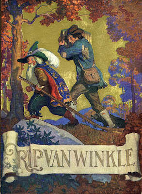
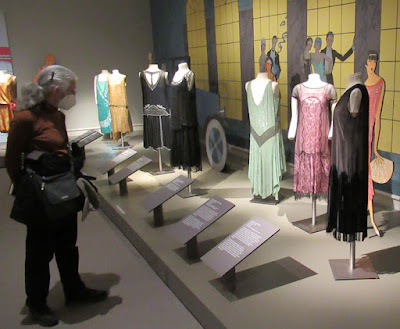
The first is The Wyeths: Three Generations: Works from the Bank of America Collection, which includes a couple dozen illustrations by N.C. Wyeth.And there's a show called Fashionable Frocks of the 1920s which presents dresses from the flapper era, extravagant and bejeweled and made for dancing. We tend to think of the '20s in black and white, but it was a time of subtle and impressive coloration.
Saturday, November 13, 2021
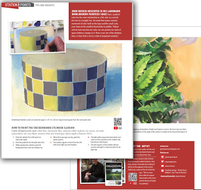
Article on Gradients in International Artist #142
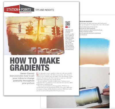
John Ruskin observed in his landmark book Modern Painters (1843) that a gradient color has the same relationship to a flat color as a curved line has to a straight line. He noted that nature contains movement of color both on the large and the small scale, even down to the smallest brushstroke or pebble: “Nature will not have one line nor color, nor one portion nor atom of space without a change in it. There is not one of her shadows, tints, or lines that is not in a state of perpetual variation.”
Friday, November 12, 2021
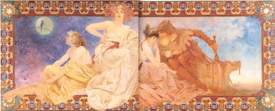
Mucha: 'Beauty is the Communication of Emotion'
In his lectures on art, he said: "The expression of beauty is by emotion. The person who can communicate his emotions to the souls of others is the artist."
"To communicate with the souls of man the artist must address himself to the senses of the body."


