Sunday, February 28, 2021

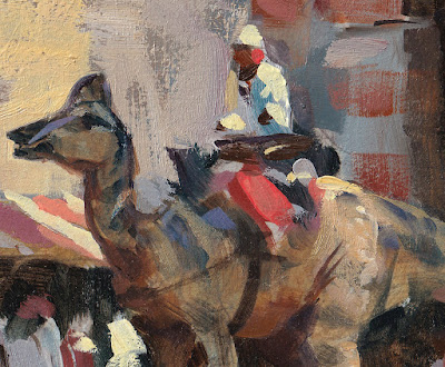
Route 209 in Kingston


Nothing to see here, just a state highway overpass seen from a parking lot. 

I'm pretty sure no one has painted this scene before. That is exciting to me, like being the first artist on Mars.

My friend Joe Paquet shared this quote with me: “If your daily life seems poor, do not blame it; blame yourself, tell yourself that you are not poet enough to call forth its riches; for to the creator there is no poverty and no poor indifferent place.”
― Rainer Maria Rilke, Letters to a Young Poet

Saturday, February 27, 2021

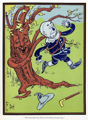
W. W. Denslow, Co-Creator of Oz

If someone asks who came up with the The Wonderful Wizard of Oz, most people think of L. Frank Baum, but the illustrator William Wallace Denslow helped to create the characters and the world.

Denslow was mostly self-taught, and he had experience creating colorful advertising posters and editorial cartoons. This background gave his work a different style from the book illustrators of his time.


It was a distinctly American fantasy, with characters who were flawed but lovable. 

The first edition of the book, when it appeared in 1900, was colorful and eye-catching, and it captured the public's imagination. 

Denslow and Baum shared the copyright and royalties in the first Oz book. They also worked together on a 1902 stage production where Baum wrote the script and Denslow designed the characters.

Income from these ventures made Denslow rich enough to buy an island in the Bermudas and build a mansion in the style of a castle. He dubbed himself 'King Denslow I.'

But he and Baum had a falling-out over who created Oz, and Baum chose other illustrators for the later Oz books.

Denslow independently adapted the characters of Father Goose, the Scarecrow, and Tin Woodman for comic-strip adventures. 

He tried to create his own separate world called "The Pearl and the Pumpkin" to rival Oz. He produced a book and an expensive Broadway stage version, but they weren't very successful. 

After three failed marriages, a drinking habit, and financial setbacks, he was forced to sell his Bermuda mansion, and died relatively poor, having made and lost his fortune.

The new issue of Illustration Magazine (#71) has a feature on Denslow, with 59 illustrations, mostly in color. You can order a copy here. It also has a feature article on Ken Riley. You can preview the issue at the link.

There's a facsimile copy of The Wonderful Wizard of Oz (Illustrated First Edition) with the Denslow illustrations.

William Wallace Denslow on Wikipedia 

Friday, February 26, 2021

Glazing in the Pits

A confused Lee Crabb from "Dinotopia: Journey to Chandara" is painted with a technique called “glazing in the pits” to bring out the impasto texture in his sleeves.
Glazing in the pits means dropping pigment into the hollows, nooks, and crannies of your impastos. To do this, build up your impastos either with acrylic modeling paste before you get started with the oil paint. Or you can build up impasto texture with some white oil paint mixed with a little cobalt drier to help it set up in a few days.

When it is completely dry, you can quickly glaze a thin layer of raw or burnt umber thinned down with turpentine. Most of that brown glaze will sink naturally into the pits.

When that layer is dry, you can lift off the hint of the umber layer from the tops by using a smooth cotton rag with just a hint of turpentine or a more gentle paint solvent. This will take away the glaze from the tops but leave it in the pits. But don’t try either of those last steps unless the surface is bone dry.

Glazing in the pits was used by Rembrandt, NC Wyeth, Norman Rockwell, and a lot of other painters. For illustrators, this method allows impastos to survive the flattening effect of copy cameras.

Thursday, February 25, 2021

Confetti Strokes

Quick concept sketch in oil, tossing strokes around like a handful of confetti.


Wednesday, February 24, 2021

Gasoline Alley Explores Comic Abstractions

Comic artist Frank King was fascinated by the way comics translate reality into abstract 2D graphic conventions such as word bubbles and panels.

In this Sunday Gasoline Alley page, he had fun with the idea with characters becoming silhouettes. 


Walt and Skeezix become cutout people who eventually contemplate the holes in the paper they were cut out of. 


This page uses a high viewpoint where the background continues from panel to panel as Walt walks across the beach. The panels suggest changes in time as well as space.

In this one, they draw everything with a compass (even the word bubbles).

In a previous post I shared how comic artists satired the strange abstractions of modern painting all the way from the early 1900s to Calvin and Hobbes. In case you missed it, here's another Gasoline Alley page where Walt and Skeezix explore the distorted worlds represented in abstract painting.


In art school, I had a perspective teacher who critiqued our student artwork as if the worlds we portrayed were an objective reality that we had to inhabit. "I wouldn't want to live in that building," he'd say. "The floors aren't level and the walls look like they're going to fall down." 

These Gasoline Alley pages take that premise of living inside your pictures to its logical extreme.

Collector Mel Birnkrant says: "I was slow to appreciate the greatness of Gasoline Alley...It all seemed so polite and sweet, and the level of stylization was not extreme. It was not until I finally examined some of the Gasoline Alley Sunday pages that I tuned in to the understated genius of Frank King. I was amazed to realize that many of these Sunday pages are excursions into surreal fantasy. Such flights of fancy were to be expected in Winsor McCay's Slumberland, but they are stunning when encountered in what purported to be day to day domestic reality."
--- 
Previously: 

Tuesday, February 23, 2021

Dinotopia Exhibitions

Photo by Chip Clark.
The entrance to the Dinotopia exhibition at Smithsonian's natural history museum in 2002, one of about 35 exhibitions of the original artwork in the USA, France, England, and Switzerland over the last 20 years. 
Here are some of them:
MUSEUM SHOW LIST (from recent back to 1992)
Stamford Museum and Nature Center, CT
Arkell Museum, Canajoharie, NY
The New Hampshire Institute of Art, Manchester, NH
The Lyman Allyn Art Museum, New London, CT
The Alden Dow Museum of Science and Art, Midland, MI
Palazzo Ducale, Lucca Comics & Games, Italy
Norton Museum of Art, West Palm Beach, FL
Delaware Art Museum, Wilmington, DE
Festival International de Science-Fiction De Nantes, France
Centre for Life, Newcastle, UK
Maison d’Ailleurs, Yverdon, Switzerland
Oshkosh Public Museum, Oshkosh, Wisconsin
Norman Rockwell Museum, Stockbridge, MA
The Alden Dow Museum of Science and Art, Midland, Michigan.
Oshkosh Public Museum, Oshkosh, Wisconsin
Palais Granvelle, Besançon, France
Maison d’Ailleurs, Yverdon, Switzerland
Smithsonian National Museum of Natural History, Washington, DC
Carnegie Public Museum, Three Rivers, Michigan
Richmond Children’s Museum, Richmond, Virginia
Cleveland Museum of Natural History, Ohio
Tiffany Windows, Tiffany & Co. Jewelers, Fifth Ave, NYC
Buffalo Museum of Science, Royal Tyrell Museum, Drumheller, Alberta, New Mexico Museum of Natural History.     

Monday, February 22, 2021

Cover for 'Never the Twain'


'Never the Twain' was a science fiction novel by Kirk Mitchell. I did the cover for Berkley/Ace books.


It tells the story of Howard Hart, who travels back in time to wreck the literary career of Mark Twain and improve the reputation of his ancestor, Bret Harte.


I needed to come up with a way to show the two men, their two worlds, and the device that made it possible to cross over. After reading the manuscript I made a lot of sketches. 

The visual metaphor for time travel had to be an object about the size of a standing man, something that could have existed in the past or the present. 


The grandfather clock seemed like a natural device, but the breakthrough idea was the interlocking double clock face.

Sunday, February 21, 2021

Old Tow Truck


This old tow truck is parked in front of Triebel's Garage in Red Hook, sketched in pencil and watercolor.

Friday, February 19, 2021

Art Mission to Mars

To celebrate the successful landing of the 'Perseverence' Mars rover, the California Art Club has arranged a virtual exhibition called 'Mars: An Artistic Mission.'
  

Artists include Bryan Taylor, Boris Vallejo, Julie Bell, William Stout, Peter Adams and me.

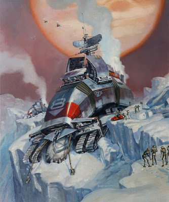
James Gurney, The Ice Rover, Oil on board, 20" x 14"

In this oil painting, which is for sale, autonomous fusion crawlers inch across the frozen landscape, deploying forward feelers, grinding heads, and communication arrays to transmit their discoveries back to Earth.

More info:
NASA Mars Mission site: Mars rover 'Persistence' 
California Art Club exhibit: 'Mars: An Artistic Mission.'

Thursday, February 18, 2021

H.M. Bateman's "The Man Who..." Illustrations

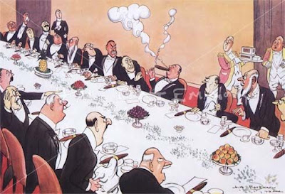
Henry Mayo Bateman (British 1887-1980) created a popular series of comic illustrations that show a man doing something socially inept and suffering the consequences.

Here's the reaction that happened to "The man who threw a snowball at St. Moritz."


Or to "The man who asked for a second helping at a city company dinner."

Or "The man who lit his cigar before the royal toast."

And finally "The man who stole the prize marrow." (What we in America would call a gourd.)
---
Henry Mayo Bateman on Wikipedia

Wednesday, February 17, 2021

Alpine Scene by E.T. Compton

The Grossglockner, 1880, watercolor, 40 cm (15.7 in) x 60 cm (23.6 in)

"Some say the world will end in fire,
Some say in ice.
From what I’ve tasted of desire
I hold with those who favor fire.
But if it had to perish twice,
I think I know enough of hate
To say that for destruction ice
Is also great
And would suffice."

—'Fire and Ice' by Robert Frost

Tuesday, February 16, 2021

Painting the Campfire

Painting expeditions are close to home these days. This time I just walk to the backyard to capture the warmth of the campfire. 


As William Shakespeare said, "Fire that's closest kept burns most of all."

Smooth the rescue husky chews on a deer's leg bone that he found deeper in the forest. 

Monday, February 15, 2021

Quadriga

A notable feature of the State Capitol in Saint Paul, Minnesota is a gilded statue of a chariot pulled by four horses. 

The four horses represent the classical elements of water, fire, air, and earth. The female figures standing among the horses represent agriculture and industry. 

The male charioteer represents prosperity. Added together, they represent civilization. The 1906 group called "Progress of the State" was sculpted by Daniel Chester French and Edward Clark Potter

This arrangement of sculptural elements goes back to ancient Rome and is known as a quadriga. They usually appear on triumphal arches. In ancient mythology, the chariots of the gods were in the quadriga configuration, with four horses abreast. The sculpted horses on St. Mark's in Venice were from a Byzantine group. 

Quadrigas were raced in the ancient Olympic Games, as demonstrated in the 1959 movie 'Ben Hur.' 

----
Wikipedia on Progress of the State and Quadriga

Sunday, February 14, 2021

Skin Tones in Sunlight

Could you imagine mixing these colors for the skin tones for a portrait? Hint: it's a light skinned woman in outdoor light. 

 
1. The patch in the upper left is taken from the side of her nose. 
2. The grayish color, top right, is from her cheek facing forward and catching sky colors. 
3. The deep red-orange color is from the side of her cheek facing us (admittedly a different local color).
4. The bright orange color, lower right, is from the top of her neck, catching mostly that orange transmitted light from the parasol.


Charles Courtney Curran (American, 1861–1942) On the Shores of Lake Erie, 1893
Oil on canvas size:18.12 x 22.12 in. (46 x 56.2 cm.)

The white local colors of her dress and gloves go through a similar range of colors.


Charles Courtney Curran studied at the Art Students League and in Paris. In those teaching environments, people were talking a lot about about the effects of colored light.
-----
Charles Courtney Curran on Wikipedia 


Saturday, February 13, 2021

Augmented Reality from The Met Museum

The Metropolitan Museum has recently offered new digital tools to share their collection during the pandemic. 
Deity Figure (zemí), ca. A.D. 1000. Dominican Republic. Taíno.
Wood (Guaiacum), shell, 27 x 8 5/8 x 9 1/8 in. (68.5 x 21.9 x 23.2 cm).

One is an Instagram app that lets users see how Met objects would look in their own home by superimposing an image of the object against the background of your life.
Met Museum blog says: "What would a van Gogh look like on your bedroom wall? How about showing off an iconic Taíno sculpture in your living room? Or maybe try out a Boccioni sculpture in your backyard? Using these effects, you can do that and more—no matter where you are in the world.  


Friday, February 12, 2021

How One Art School Adjusted to the Pandemic

Shutdowns and social distancing have presented real challenges to brick-and-mortar art schools. Anthony Walsh,  founder of the Montreal-based concept art academy called Syn Studio, was kind enough to answer some of my questions about how they have adapted.


What was the original vision for your school at Syn Studio?

Syn Studio started as a traditional art school offering life drawing and then oil painting classes. Back then we were just lucky that some of our first teachers were also incredible artists such as Charles Vinh and Geof Isherwood who were working on some of the most exciting illustration and concept art projects in Canada at the time. Teachers at other schools in Montreal began referring their students to us to get additional practical hands-on instruction in the fundamentals and we started to grow.

I began speaking with the students and discovered that many of them wanted to become professional concept artists and illustrators but that they couldn’t find any affordable and high quality training options in Canada despite the high concentration of entertainment industry companies here. So I set out a vision for Syn Studio to provide the highest value for money training available not just in Canada but anywhere on the planet. I wanted Syn Studio to become the go-to Concept Art School for students who don’t have an unlimited budget but want high quality education. I visited schools and consulted with experts from all around the world, most notably Scott Robertson who founded the Entertainment Design program at Art Center. And in 2020, Syn Studio was ranked The #1 Concept Art and Illustration school worldwide by The Rookies.


What classroom space did you occupy at the beginning and how many students did you have back then?

At the beginning, we had one classroom and four students. The whole school was located inside an old loft with hardwood floors and high ceilings where I also lived. A few years later, we were running classes every day and I moved out. Then we needed another classroom and for a short period of time, we had two nearby locations. During that time we found a great space that we could grow into inside of a historic downtown building on Montreal’s main street. With the launch of our Concept Art Diploma Program in 2016 we are now up to four physical classrooms.


What was your initial response to the Covid-19 pandemic?

In early 2020, before the pandemic was declared, we recognized that we had better get ready for a move to online learning just in case the virus spreads. We started exploring the various software options for this. When the pandemic was declared and schools were closed, it was still a huge challenge to move everything online within a week or two during a school term but it didn’t catch us completely by surprise. Our staff went all out and did an incredible job helping the teachers adapt and finish their classes. We had to delay a few classes but ended the term successfully online and were ready to start the next term fully online.


What do your teachers and students miss most about being together in a classroom or studio?

Bonding with fellow students and communicating face to face is best done in person and we know many of our students and teachers want things to return to normal. We encourage students to activate their webcams and participate actively in class and we hold many online social and artistic activities for our full time students to help them bond outside the physical school. However, until we develop the holodeck from Star Trek or similar technology, the virtual classroom, studio or lounge will never capture all the social and emotional benefits of in person presence. Covid isolation is really bad for some people and while we do what we can to help them cope, we hope things return to normal soon.


How has the pandemic affected your school's income?

Initially it dropped as people were just more focussed on pandemic news than registering for art classes. But now we’re doing better than ever and still growing at a good pace mainly due to the competitiveness of our affordable online art classes.


How do you see the pandemic changing your school, for better or worse?

Definitely for the better. Due to the pandemic, we’ve launched an Online Art School which is very successful and still growing. We have access to talent from all over the world now! We’ve learned to use new technology and still be highly productive while our staff is working remotely. Any school or team that successfully makes it through an existential crisis with everyone intact becomes a stronger school and team that is more prepared for the next challenge. Our vision of providing the highest value concept art and illustration education on the planet hasn’t changed. We’re more excited and more committed than ever and ready for whatever the future brings!
------
For more information, please visit the website of Syn Studio Concept Art School.
Previous posts on this blog about Syn Studio:

Thursday, February 11, 2021

How do you choose limited-palette colors?

On Instagram yesterday, @leetheillustrator asked: "How do you decide on what colours to include when selecting a limited colour palette?" 

Leeds, oil, 11 x 14 inches

Answer: In my experience, a limited palette can be made out of almost any two or three colors, as long as they're separated from each other on the color wheel. Ideally at one should be cool and the other should be warm.  

In this case I often choose the colors that seem most important in the scene. In this case it was the red signs versus the blue of the sky. They're not complements (red and green would be), but they're warm vs. cool.

But when choosing colors, the goal is often not to select which colors you want to include, but rather which ones you want to leave out, for interesting color schemes result from what you've left out of them.
 
Catskill Roadhouse, East Durham, New York. Casein, 5x8 inches. 
Cadmium red scarlet, ultramarine blue, and titanium white over a yellow underpainting.

For this painting I used ultramarine blue and cadmium red scarlet, together with white, and I left out yellow and green. The red and blue colors are near-complements, and I'm painting over a surface primed with yellow. The yellow is about 95% covered up, but where it peeks through, it energizes the color scheme like a pinch of spice. 

Here's a video that shows that painting in the works: Link to YouTube.


You might try orange + violet + white over a cyan underpainting, or yellow + cyan + white over magenta. You can also introduce black, either as an accent if you want to deepen the darks, or if you want to use it as a color of its own (such as black + orange + white over blue).

A two-color-plus-white palette has some advantages:
1. It's extremely fast to set it up and get it running. 
2. It's good for beginners because it reduces your choices to light or dark and warm or cool.
3. It puts you into realms of color that you would never think of if you had all the color choices available.
----
 TRIADS: Painting with Three Colors"  (plus white) is the subject of my recent Gumroad video

Wednesday, February 10, 2021

Shishkin's Sketch vs. Finish

A popular meme these days is "sketch vs. finish." Late last year I did a sketch/finish comparison of the Russian landscape painter Ivan Shishkin (1832-1898).

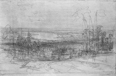
Here's another set of comparisons, starting with a preliminary sketch in pencil where he explores the overall composition.

A road leads back through fenced pastures to a gate. In the distance is a turn in the Kama River. 


He must have liked this design because he drew a grid over it for enlargement. 

Ivan Shishkin, The Kama River near Yelabuga (Кама близ Елабуги), 1895

Here's the finished painting. He arranged the lighting to put a spot of light on the road ahead. To get to that farther spot of light in the valley, you have to pass through the dark forest.

Shishkin used this basic idea in a night scene, apparently drawn in charcoal with gouache.

----

Ivan Shishkin on WikiArt

Previously: Ivan Shishkin's comments about photo reference

The classic book on Shishkin is this Russian edition from the 1980s.