In our scientific age, we tend to see the rainbow as a purely optical phenomenon, or we might think of the end of the rainbow as the place where leprechauns hide the elusive pot of gold.
The Greeks believed the rainbow was a path between the earth and heaven. In Norse mythology the rainbow was seen as a bridge between Ásgard and Midgard, the realms of the gods and mankind respectively. In Chinese mythology, the rainbow was regarded as as a slit in the sky sealed with stones of five different colors.
In the story of Noah, the rainbow serves as a sign of God’s promise that the earth will never again be flooded. In the Stuppach Madonna by Matthias Grünewald (c.1475-1528), above, or the painting by Joseph Anton Koch (1768-1839), below, it serves more broadly as a symbol of God’s covenant.
Durer’s famous engraving Melancholia features a rainbow, though scholars differ on whether to read it as a hopeful or a pessimistic sign.
Next week we’ll look at rainbows in more scientific terms. But for now we might notice that Grünewald breaks a basic optical law of rainbows, namely that the colors of the rainbow should always be lighter than the background, because the colored light of the rainbow is added to the light in the scene behind it.
------------
More about rainbows in my book: More in my book: Color and Light: A Guide for the Realist Painter
Previously: The Science of Rainbows
Further Reading: Rainbow Bridge by Raymond Lee, link.
Sunday, August 31, 2008
Saturday, August 30, 2008
Brushes
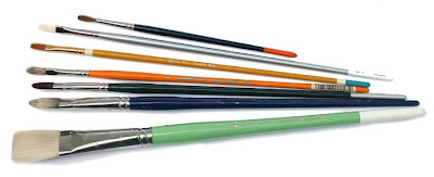
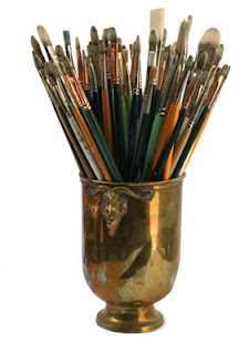
I use three basic categories of brushes for oil painting: bristles, white nylon flats, and sables. The bristle brushes are made from Chinese hogs. These inexpensive brushes are stiffer than the others, and are useful for blocking in big areas, and manipulating thicker paint.
Bristle brushes are good for keeping your painting direct and simple, with a greater likelihood of getting soft edges. Generally the stiffer the brush the softer the edges. I like flats and filberts. Brights are like flats, but shorter. The Silver company makes an "extra-long filbert," which has a wonderful touch.
White nylon flats are excellent for detailed painting of architecture and technology. They’re available in widths as narrow as 1/4 of an inch to 1 inch wide brushes for laying in a transparent wash of thin paint. A flat brush should have a chisel tip, which you can use for a wide stroke or a thin line.
Nylon brushes are fairly inexpensive, but they don’t last long. Most of the manufacturers, like Dick Blick, Grumbacher, and Simmons make versions of these, and they’re all pretty good.
For small detail work, I use Kolinsky sable rounds. They're made from the reddish tail hairs of a kind of weasel, not a sable (which is a kind of marten). They’re intended for watercolor, but they work equally well for oil. These are the most expensive brushes, but they respond very sensitively to detail work.
The Winsor and Newton Series 7 has always been the standard, but they’re overpriced, and you can get good Kolinsky sables from Escoda, Silver, and other makers. Most often I use Raphael 8404, which is fairly priced, and as good as any others.
Labels:
Painting Gear
Friday, August 29, 2008
Dean Sketch
In honor of this season of speeches and campaigns, here's an on-the-spot sketch from five years ago at a Howard Dean rally.
Jeanette and I were driving through Hudson, New York on September 20, 2003 when we saw huge crowds down by the river. We parked the car and got as close as we could. I was hoping to do a portrait, but I was too far back, so I drew the audience instead.
Dean is just a light dot with a necktie to the right-hand side of the gazebo. After his speech as he was leaving the venue he stopped and signed the sketch.
Labels:
Pencil Sketching
Thursday, August 28, 2008
Accent Color
You can spice up a black and white sketch with a little dash of color. It’s just like sprinkling adobo on a bowl of beans.
When I sat across the street from this corner market in Rincon, Puerto Rico, I worked up the sketch in pencil and gray ink wash. I enjoyed trying to suggest the abstract detail seen through the window. But the sketch needed something to perk it up.
I dug down in one of the pockets and found a yellow marker for the fire hydrant and the “escuela” sign.
If you carry a red or yellow colored pencil or marker along with the rest of your sketch set-up, it just might come in handy for a spicy little accent.
--------
More on the "line and wash" technique, link
Labels:
Color,
Pencil Sketching
Wednesday, August 27, 2008
ABC: Tendril of Anger
Wednesday is the day for our group sketch game called "Art By Committee." Each week I share an actual excerpt from a science fiction manuscript and each week you visualize it.
This week’s quote was “The old man felt a tendril of anger rising.” How many of us think of anger in terms of “tendrils?” Some of you developed the storytelling to include the source of the anger: a fly in the soup, or a high phone bill, and some used the design idea of the tendril to great artistic effect.
And the one from the original sketchbook.
Next week we have a slightly different challenge. Many years ago I gathered up a bunch of business cards that were stuck on the wall of a restaurant, and I glued them in the back of the ABC book. The game is to imagine what the owner of the business card might look like just by looking at the card.
Have fun! Please scale your JPG to 700 pixels across and please compress it as much as possible. Title it with your name, send it to: jgurneyart(at)yahoo.com, subject line ABC, and let me know in your email the full URL of the link to your blog or website if you have one (even if you gave it to me before). Please have your entries in by next Tuesday at 10:00 AM Eastern Time USA.
This week’s quote was “The old man felt a tendril of anger rising.” How many of us think of anger in terms of “tendrils?” Some of you developed the storytelling to include the source of the anger: a fly in the soup, or a high phone bill, and some used the design idea of the tendril to great artistic effect.
Patrick Waugh
John York
David Peterson
Michael Geissler
Mei-Yi Chun
Antonio Araujo
Roberta Baird
Andy Wales
Felipe Villela
Chris Oakey
Jesse Wummer
John York
David Peterson
Michael Geissler
Mei-Yi Chun
Antonio Araujo
Roberta Baird
Andy Wales
Felipe Villela
Chris Oakey
Jesse Wummer
And the one from the original sketchbook.
Next week we have a slightly different challenge. Many years ago I gathered up a bunch of business cards that were stuck on the wall of a restaurant, and I glued them in the back of the ABC book. The game is to imagine what the owner of the business card might look like just by looking at the card.
Have fun! Please scale your JPG to 700 pixels across and please compress it as much as possible. Title it with your name, send it to: jgurneyart(at)yahoo.com, subject line ABC, and let me know in your email the full URL of the link to your blog or website if you have one (even if you gave it to me before). Please have your entries in by next Tuesday at 10:00 AM Eastern Time USA.
Labels:
Art By Committee,
Comics/Cartooning
Tuesday, August 26, 2008
Studio Lighting
Whatever your studio situation, it helps to work under a good volume of color-balanced light, and there are many ways to set it up.
Regular incandescent lights peak the orange and red wavelengths, and tends to be weak on blue. That’s why red colors in your picture look so good—and blue colors look so dead—under normal incandescent light. Some artists prefer to work under an array of halogen or blue-tinted incandescent bulbs, which can give excellent light, and which simulate the track lights used in galleries and museums. The downside of incandescent is that it uses a lot of electricity.
Standard “warm white” and “cool white” fluorescent lights overemphasize yellow-green. They’re made to give the most light in the range of wavelengths that the human eye is most sensitive to. If you’re using flourescent light, try to select "color-balanced" or "full spectrum" bulbs (such as Vita-Lite or Verilux brands) with as high a “CRI Index” as possible. The color rendering index is a measure of how well artificial light simulates the full range of wavelengths in natural sunlight. The quality of light that a fluorescent light delivers depends on phosphors that the manufacture uses to line the tube.
A measure of this color output is the graph of “spectral power distribution,” which any specialty lighting salesperson should be able to show you for a light you’re considering. It’s not as technical as it sounds, once you start comparing these charts.
The simplest solution, popular with art students, is a “Luxo” type lamp that combines fluorescent and incandescent light.
In my studio now, I have a north window to my left (because I’m righthanded). In the daytime, I turn off the fluorescent lights and use the natural daylight. North light is the traditional artist’s studio lighting, but I find it to be a little too cool and variable on its own. (By the way, note the mirror to the left of the curved window, for getting a fresh eye.)
Some artists in the past used sunlight from a south-facing window diffused through white cloth. This is a great solution, because it’s free and abundant. The best cloth I’ve found is white ripstop nylon from the fabric store. The window should be blocked off on the lower half so that the glare doesn’t go into your eyes while you're working.
This inspired me to diffuse the light from an overhead skylight as a supplement to north light. Directly above the work area is a four-foot skylight opening. The opening channels the light from two skylights, one on each side of the roofpeak. The skylight well is lined with Mylar-coated card stock that I found at a craft store. This reflective lining bounces and multiplies the sunlight that finds its way into the skylight well. The direct sunlight is diffused into a white nylon panel held in place with a homemade square frame of PVC tubing.
Flanking the skylight are fluorescent fixtures with 12 four-foot color-balanced bulbs.
----------------
Wikipedia on Spectral Power Distribution, and Color Rendering Index
Color output chart courtesy Salsburg.com.
Incandescent chart from Neon.com
Monday, August 25, 2008
Candlelight
Godried Schalcken (1643-1706) earned a reputation for rendering candlelight and lamplight. In his paintings, the brightness diminishes quickly as forms recede from the flame. At twice the distance, the light is only one-fourth as bright.
Schalcken, like Georges De La Tour and other candlelight painters, used the trick of hiding the light behind the hand to show the subsurface scattering through the flesh of the hand.
Adolf von Menzel’s painting Flute Concert shows candles placed near the music of each of the players. The frail, flickering light gives way to soft gloomy passages in the outer boundaries of the scene.
The chandelier has about 20 candles. It is reflected in a mirror on the far wall. To the side of the reflection are sconces with about four more candles each. Because of the smoke from all those candles, there’s an atmospheric quality to the distant part of the room, with no deep darks in the vicinity of the light sources.
In Woman with a Burning Candle, Alfonse Mucha achieves a strong feeling of glowing illumination without using Schalcken’s deep darks at all. He keeps most of his values in the mid range or lighter, and he lightens and warms the background colors as they approach the flame. This color corona effect simulates the way the aqueous humor in our eye scatters the light and makes a halo around any point source. Note that the figure is not really lit by the candle, but rather by a cool overhead light.
The film Barry Lyndon, directed by Stanley Kubrick, contains one of the few scenes in film history shot entirely by real candlelight, not faked with artificial light. The extremely dim conditions required special lenses, film stock, and reflectors. The cinematographer John Alcott recalls:
More on Alcott's recollections about Barry Lyndon, link.
Previous Gurney Journey post on subsurface scattering and color corona.
Schalcken, like Georges De La Tour and other candlelight painters, used the trick of hiding the light behind the hand to show the subsurface scattering through the flesh of the hand.
Adolf von Menzel’s painting Flute Concert shows candles placed near the music of each of the players. The frail, flickering light gives way to soft gloomy passages in the outer boundaries of the scene.
The chandelier has about 20 candles. It is reflected in a mirror on the far wall. To the side of the reflection are sconces with about four more candles each. Because of the smoke from all those candles, there’s an atmospheric quality to the distant part of the room, with no deep darks in the vicinity of the light sources.
In Woman with a Burning Candle, Alfonse Mucha achieves a strong feeling of glowing illumination without using Schalcken’s deep darks at all. He keeps most of his values in the mid range or lighter, and he lightens and warms the background colors as they approach the flame. This color corona effect simulates the way the aqueous humor in our eye scatters the light and makes a halo around any point source. Note that the figure is not really lit by the candle, but rather by a cool overhead light.
The film Barry Lyndon, directed by Stanley Kubrick, contains one of the few scenes in film history shot entirely by real candlelight, not faked with artificial light. The extremely dim conditions required special lenses, film stock, and reflectors. The cinematographer John Alcott recalls:
“the set was lit entirely by the candles, but I had metal reflectors made to mount above the two chandeliers, the main purpose being to keep the heat of the candles from damaging the ceiling. However, it also acted as a light reflector to provide an overall illumination of toplight.------
More on Alcott's recollections about Barry Lyndon, link.
Previous Gurney Journey post on subsurface scattering and color corona.
Labels:
Academic Painters,
Lighting
Sunday, August 24, 2008
Martyr to Rainbows
The Italian Baroque printmaker Pietro Testa (1611-1650)--his work is inset below--was obsessed with color and light, according to his biographer Baldinucci. He had a fatal fascination with moon rings, sun dogs, halos, reflections, and especially rainbows.
Testa was perhaps the first martyr to the rainbow. Over the next few Sundays, I’m going to take a closer look at rainbows: what they’ve signified through art history, what causes them, and other curious phenomena.
One night in 1650 a doleful accident befell him. He was standing on the bank of the Tiber, drawing and observing some reflections of the rainbow in the water, when, whether because he was jostled, or because of the softness of the slippery bank, he tumbled into the river and drowned. (from John Gage, Color and Culture)
Testa was perhaps the first martyr to the rainbow. Over the next few Sundays, I’m going to take a closer look at rainbows: what they’ve signified through art history, what causes them, and other curious phenomena.
Labels:
Color
Saturday, August 23, 2008
Turkey and Cow
I was loitering in the poultry house again this week at the Dutchess County Fair in Rhinebeck, New York. The owner of this 40-pound grand prize tom let me reach in and feel his bumpy head. The turkey was too busy strutting to notice me.
He was 16 weeks old. The owner told me that these meat turkeys can’t live to adulthood because before long they can’t hold up their weight. That kind of creeped me out so much that my sketch came out strangely, a mixture of sympathy and revulsion.
I moved on to the cow shed and sketched this Jersey. Try to imagine that lower jaw going up and down as she chews her cud.
I used three water-soluble pencils along with a Kuretake water brush filled with clear water. The pencils were brown, russet, and black in a brand called Suprasoft II by Caran d’Ache.
I started with a quick outline to establish the big shapes. Then I added some some colors and tones with the dry pencils. I then wet down the surface with the water brush to melt the colors, and smeared them around.
When the base washes were dry, I came back with the black pencil to add detail—wrinkles, etc.
I had been standing all the while alongside the rear ends of another row of cows. Thanks to a timely warning from a young 4-H kid (Erik, 4-H is an agricultural youth organization), I stepped away from a cow before she let loose with some “projectile excrement.” It was a narrow escape, typical of the hazards of the Artist’s Life.
----------
Earlier GJ posts on this technique here. and here.
Labels:
Animals,
Pencil Sketching
Friday, August 22, 2008
Interactivity
I’m told it’s relatively easy these days to render a photo-real character in CGI—as long as that character stands by itself. But to have one CGI character throw a bucket of water on another and then grab him by the shirt….well, now that’s a challenge.
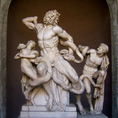
How about having a couple of figures wrestling with a snake, as in the classic sculpture Laocoön? How would a computer deal with the complex muscular dynamics and surface interactions?
In 3-D computer animation, this problem is sometimes called interactivity, and it’s one of the frontiers that is engaging the finest minds of the business. When Jeanette and I visited some of the post-production special effects houses last fall, like ILM, Imageworks, and Rhythm and Hues—or the CG animation outfits like DreamWorks and Blue Sky, I often asked what is the toughest problem to solve in CGI: Hair? Foliage? Fabric? Water?
On their own, each one of these “holy grail” materials is really coming around. The real challenge is to have these effects interact with each other, to have a couple of figures in loose tunics mudwrestling at the edge of a swamp, or a burning flag flapping in the wind.
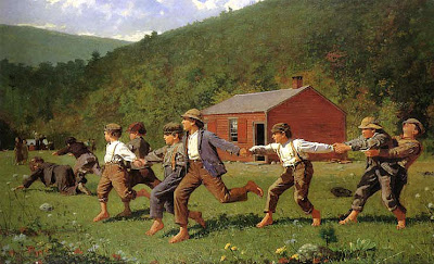
In the painting by Homer above, consider the physics involved in a scene of kids running and holding hands while cracking the whip. Each figure is both self-propelled by the feet, but also externally propelled by the large system of forces delivered through the hands as the momentum builds.
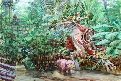
I was thinking about maximizing interactivity when I painted this scene from Dinotopia: The World Beneath. A walking vehicle wades through water and weeds. Painting it is no big deal, but realizing it in CGI would take some doing.
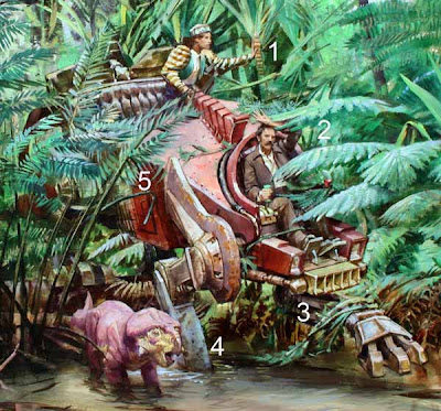
One figure is pushing on a palmetto (1), while another is brushing away a fern (2), while the leg of the walking vehicle is dragging some plants out of the water (3), while the other leg is splattered with mud and half-submerged (4), while the body of the vehicle is pushing aside another stand of plants.
I can only speak with any knowledge as a painter, but I have wide-open admiration for my brother artists and scientists in CGI. Their work excites me because it’s the meeting point of art, physics, mathematics, and materials science.
The advances and challenges in CGI causes us to think about the visual world differently. The geeks behind the scenes who are making the big contribution in this arena don’t get the credit they deserve because their work doesn’t seem as glamorous or comprehensible as the work of the visual development designers.
When you watch the credits roll by on the next CG animated film, give a cheer for the people that figure out the science behind interactive effects.
------
Read about our visits to the movie studios last fall, link.
How about having a couple of figures wrestling with a snake, as in the classic sculpture Laocoön? How would a computer deal with the complex muscular dynamics and surface interactions?
In 3-D computer animation, this problem is sometimes called interactivity, and it’s one of the frontiers that is engaging the finest minds of the business. When Jeanette and I visited some of the post-production special effects houses last fall, like ILM, Imageworks, and Rhythm and Hues—or the CG animation outfits like DreamWorks and Blue Sky, I often asked what is the toughest problem to solve in CGI: Hair? Foliage? Fabric? Water?
On their own, each one of these “holy grail” materials is really coming around. The real challenge is to have these effects interact with each other, to have a couple of figures in loose tunics mudwrestling at the edge of a swamp, or a burning flag flapping in the wind.
In the painting by Homer above, consider the physics involved in a scene of kids running and holding hands while cracking the whip. Each figure is both self-propelled by the feet, but also externally propelled by the large system of forces delivered through the hands as the momentum builds.
I was thinking about maximizing interactivity when I painted this scene from Dinotopia: The World Beneath. A walking vehicle wades through water and weeds. Painting it is no big deal, but realizing it in CGI would take some doing.
One figure is pushing on a palmetto (1), while another is brushing away a fern (2), while the leg of the walking vehicle is dragging some plants out of the water (3), while the other leg is splattered with mud and half-submerged (4), while the body of the vehicle is pushing aside another stand of plants.
I can only speak with any knowledge as a painter, but I have wide-open admiration for my brother artists and scientists in CGI. Their work excites me because it’s the meeting point of art, physics, mathematics, and materials science.
The advances and challenges in CGI causes us to think about the visual world differently. The geeks behind the scenes who are making the big contribution in this arena don’t get the credit they deserve because their work doesn’t seem as glamorous or comprehensible as the work of the visual development designers.
When you watch the credits roll by on the next CG animated film, give a cheer for the people that figure out the science behind interactive effects.
------
Read about our visits to the movie studios last fall, link.
Labels:
Dinotopia
Thursday, August 21, 2008
Cartoon Guy
Yesterday at the Dutchess County Fair, I sketched a portrait of Mark M., "The Cartoon Guy." He was working under a white tent near the tattoo vendor and the lawnmower dealer.
He does quick cartoon portraits using a Sharpie marker. They’re good portraits, and they only cost $5.00 (head only) or $10.00 (head and shoulders).
He was an artist in the Navy, and has been doing cartoon portraits for 34 years. He said that since his divorce, he is temporarily homeless. He travels around in a minivan, going from fair to fair, occasionally doing corporate gigs.
He loves observing people while doing his job. “Sometimes moms will come and talk for their kids, even 13 year olds,” he said. “They won’t let them grow up.” The hardest customers to please are good-looking teenage girls. “They’re raised to be vain.”
But in all his years doing portraits, only three have been rejected. One happened a couple of weeks ago. The portrait came out great, and the girl liked it, but he misspelled her name, and he was too busy to redo it, so he refunded her money.
He told us he wanted to slow down and paint. “The VA said they could get me a job as a park ranger,” he said. “What I want to do is paint nature.”
Photo courtesy Fred Bellet, Tribunephotogs, link.
Labels:
Comics/Cartooning,
Pencil Sketching,
Portraits
Wednesday, August 20, 2008
ABC: Sorcery
Wednesday is the day to have a little fun with our group sketch game called "Art By Committee." Each week I share an actual excerpt from a science fiction manuscript and each week you rise to the challenge of illustrating it. And this one was a challenge.
The quote was “The man spasmed against the snow. ‘Gods, no! No! No sorcery—‘ ‘Hold him,’ I said calmly, as he tried to leap up and run.”
An ominous scene, with spooky overtones, but you responded with drama, whimsy, and beauty. Some people mentioned that their solution is not like their normal work, so click through the link to learn more about what each the artists really do.
Here’s next week’s quote: “The old man felt a tendril of anger rising.”
Have fun! Please scale your JPG to 700 pixels across and please compress it as much as possible. Title it with your name, send it to: jgurneyart(at)yahoo.com, subject line ABC, and let me know in your email the full URL of the link to your blog or website if you have one (even if you gave it to me before). Please have your entries in by next Tuesday at 10:00 AM Eastern Time USA.
The quote was “The man spasmed against the snow. ‘Gods, no! No! No sorcery—‘ ‘Hold him,’ I said calmly, as he tried to leap up and run.”
An ominous scene, with spooky overtones, but you responded with drama, whimsy, and beauty. Some people mentioned that their solution is not like their normal work, so click through the link to learn more about what each the artists really do.
Damian Johnston
Mei-Yi Chun
Andy Wales
Chris Oakey
Michael Geissler Tony Upton
(who recommends this link he found for cool snow globe art)
Patrick Waugh
António Araújo
And the one from the original sketchbook.
Mei-Yi Chun
Andy Wales
Chris Oakey
Michael Geissler Tony Upton
(who recommends this link he found for cool snow globe art)
Patrick Waugh
António Araújo
And the one from the original sketchbook.
Here’s next week’s quote: “The old man felt a tendril of anger rising.”
Have fun! Please scale your JPG to 700 pixels across and please compress it as much as possible. Title it with your name, send it to: jgurneyart(at)yahoo.com, subject line ABC, and let me know in your email the full URL of the link to your blog or website if you have one (even if you gave it to me before). Please have your entries in by next Tuesday at 10:00 AM Eastern Time USA.
Labels:
Art By Committee,
Comics/Cartooning
Tuesday, August 19, 2008
Nature Sketchbook
I have an old leatherbound sketchbook that is half full. It is 20 x 30 cm or 8 x 11.5 inches. Inside are studies of tree roots, pigs and goats, stream rocks, mushrooms, and flowers.
Sometimes when the world is too much with me I sit outside alone on the weedy hillside near my house with the ants at my feet, the bees at my ears, and the clouds drifting overhead, and I try (usually in vain) to hear the soft, strange music of Nature.
Labels:
Pencil Sketching
Subscribe to:
Posts (Atom)