Saturday, April 30, 2016

Maquettes and Imagination at Millburn High


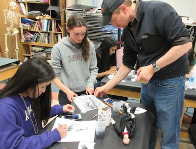
Yesterday I visited the advanced-placement art students in Millburn, New Jersey. Under the guidance of teacher and artist Kathleen Harte-Gilsenan, they built maquettes of a variety of creatures. 

When I got there, they lit and shot them and used them to inspire sketches in black and white gouache.


I did a demo in gouache, painting from a dinosaur maquette. I showed them lots of originals, and took them through some case histories of paleoart jobs, all the way from first thumbnail sketches to maquettes and comps to finished oil paintings.


We were lucky to have a surprise guest: Michael Mrak, gouache painter and Design Director for Scientific American. He brought in some originals from his collection, and he talked about visual communication from the perspective of magazine publishing. 

You can watch a brief video clip of these scenes on my Instagram page, Twitter feed, or Facebook page. While you're there, please subscribe to follow my feed.

Friday, April 29, 2016

Propeller Powered Sled


Here's one of the more unusual vehicles stored in the old barns out behind the Rhinebeck Aerodrome. Basically it's an aircraft engine and open propeller mounted on the back of a 1920s-era body, with sled runners instead of wheels. 

Old timers told me they would take this thing out on the Hudson River ice in the winter and zoom along at 60 miles per hour. 
-----

Thursday, April 28, 2016

Adventure Sketching in Nepal


After the earthquake in Nepal a year ago, artist Jeremy Collins traveled there with his GoPro cameras to record his adventures.


The video shows how he sketched people, painted murals on buildings, and drew while hang gliding.

Wednesday, April 27, 2016

Van Dyck Exhibition Report

Last Saturday I visited the exhibition of Anthony Van Dyck (Flemish/English 1599-1641) at the Frick Collection in New York.

Anthony van Dyck (1599–1641) Self-Portrait, ca. 1613–15
Oil on panel Gemäldegalerie der Akademie der bildenden Künste, Vienna

With approximately 100 works on view, Van Dyck: The Anatomy of Portraiture is the most comprehensive exhibition ever to focus on his portraiture, and the largest exhibition of his work in the US in more than 20 years.

Van Dyck was just a teenager when he entered the studio of Peter Paul Rubens. Several of the prodigy's self-portraits are included in the exhibition.

Anthony van Dyck (1599–1641) Lady Anne Carey,
Later Viscountess Claneboye and Countess of Clanbrassil,
ca. 1636 Oil on canvas The Frick Collection;
Henry Clay Frick Bequest Photo: Michael Bodycomb
He absorbed the Rubens training into his pores and combined it with an admiration for Titian that he picked up from time spent in Italy. Those influences fused into an elegant style of portraiture that defined the look of portrait painting in England for more than 250 years.

Anthony van Dyck (1599–1641) Portrait Study of Nicholas Lanier,
ca. 1628 Black chalk, heightened with white chalk, on blue paper
Scottish National Gallery, Edinburgh; Lady Murray of Henderland
gift 1860 as a memorial of her husband, Lord Murray of Henderland

The exhibition includes many of his etched and engraved portraits, tiny grisaille likenesses, and a variety of small drawings.

Van Dyck would typically do a chalk drawing of the full figure of the subject to capture their characteristic posture and the throw of the drapery. On those preliminary drawings, the face was only summarily indicated.

Source: WSJ

The drawings show tremendous sensitivity and descriptive ability. They never resort to mindless repetitive crosshatching, and giving no evidence of extensive construction lines, nor is there any sense if hurry or randomness. It's as if he just took his time and got it right the first time.

Anthony van Dyck (1599–1641) Portrait Study of a Man, Facing Right (detail),
ca. 1634 Oil on canvas, with paper extensions along the four sides Private collection
 
His practice when painting portraits was to schedule a one- or two-hour session for each person and to paint the face on the final canvas. If the canvas was too big, such as in a big group portrait, he would paint separate oil head studies.

After the hour was up he would dismiss that person and bring in another portrait subject. Between sessions, an assistant would wash his brushes and bring him a fresh palette of paints. By working simultaneously on several portraits, he kept a fresh eye on each.

When it came to the final painting, the master generally only painted the heads. Specialists in his studio painted the costumes, backgrounds, and sometimes the hands. Stand-ins modeled for the figure and the hands.

Anthony van Dyck (1599–1641) Hendrick van Steenwijck the Younger (detail),
ca. 1632−38 Black chalk, gray wash; incised for transfer Städel Museum, Frankfurt am Main
The catalogue for the show, Van Dyck: The Anatomy of Portraiture, is excellent, with numerous closeups and considerable scholarship about his process, all based on primary sources and current research.

Exhibition tips:
• It's OK to sketch in the show, provided you work in a small pad with pencil.
• No photography in the exhibition rooms, and no audio zombies.
• The drawing rooms thoughtfully provide magnifying glasses, so you can get a close look.
• Avoid Sundays, the guards advised me. Because the tickets are free, the crowds are thick.
• The standing portraits are very tall and hung very high. Because of the distance and the inevitable glare, it can be hard to see the faces in the full length portraits, so it might be a good idea to bring some opera glasses.
• There's no café, but you can bring a bag lunch and eat it in Central Park, or find coffee three blocks east at Lexington Ave.
-----
Catalogue: Van Dyck: The Anatomy of Portraiture
The exhibition Van Dyck: The Anatomy of Portraiture will be on view through June 5,
Survey the exhibition in expandable thumbnails at their Visual index
Video lecture by Stijn Alsteens: "Drawing for Portraits"
Previous post: Van Dyck Exhibition in New York

Tuesday, April 26, 2016

Sketching in Museums with Kids


Blog reader Joanna Hiltz says, "I've been sketching in art museums with my daughter since she was 4. It's a great learning tool. We will circle the room deciding what we like the most before settling in a nearby bench."


"The process requires her to slow down, be still, quiet and really study it as she works. I love the progress I've seen over the years of Saturday afternoons spent sketching in museums."


"Here's a side by side of one of Iris' (age 5) museum sketches."

"Isn't it interesting seeing what they like and dislike? It's far more unbiased than what adults do as they crowd around the popularized recognizable named artists and breeze by the lesser known. I always say, sketch what interests you the most."


"One time we were walking thru the contemporary wing of the Portland Art Museum, I sat down to sketch a sculpture, and she sketched this... Point taken."

Thanks, Joanna, and way to go, Iris!

Monday, April 25, 2016

Discussion of Sketching Bans on BoingBoing

Auguste Rodin, Feuilles de croquis, c.1871-1877 (Source)
Thanks to Mark Frauenfelder of the blog BoingBoing for bringing up the discussion about bans on sketching in special exhibitions.

How to Make Vintage Stop-Motion Dinosaurs


In this 1967 video from British Pathé, prehistoric model maker Arthur Hayward of London's Natural History Museum shows he constructs miniature dinosaurs for stop motion films. 


Thanks to all the people who told me about this: Torbjörn Lantz Jörgensen, Julia Lynn PowellSimon Davis, and Garin Baker

Sunday, April 24, 2016

On the Metro North

I got lucky this time. The guy sitting across from me on the train to New York yesterday spent most of the ride looking at his cellphone.

The sketch is mostly done in watercolor, in a Pentalic watercolor sketchbook, with a few touches of gouache, water-soluble colored pencils, and fountain pen with brown ink. Links take you to Amazon pages for more info.

You can see a brief video clip, and hear the sounds of the train, if you visit my stream on Instagram, Facebook, or Twitter. I demonstrate a variety of watercolor techniques on my tutorial Watercolor in the Wild.


Saturday, April 23, 2016

Bans on Sketching in Museums

Photo Oliver Wainwright, The Guardian
The Victoria and Albert Museum has installed signs banning sketching in the special exhibition Undressed: A Brief History of Underwear, according to the Guardian.

Such bans in special exhibitions have happened before at other museums. Several reasons are typically invoked: copyright restrictions, loan agreements, risk to the artwork, and traffic flow issues.

I don't know what museums can do about cellphone photography. That can get out of hand, with people backing up into artwork taking selfies and not even looking at the art.

John Singer Sargent, Sketch after Rembrandt, 1871
But banning sketching seems like an unfortunate policy. Museums should recognize the importance of sketching as a primary way that artists engage with the tradition. Rather than forbidding sketching altogether, it seems more reasonable to limit large drawing boards, easels, paints, sitting on the floor, or otherwise blocking visitors flowing through high-traffic exhibitions.

Artists copying at the Louvre by Winslow Homer
I think that sketching with pencil in a sketchbook 9 x 12 inches or smaller should be allowed anywhere. I'm not aware of any museum limiting note-taking with a pencil and a pad of paper. School kids routinely go through museums with clipboards. I see no reason to forbid sketching if it's done in neat, dry media in a hand-held pad.

Let's remember that many art museums began as extensions of art academies. Too many art museums these days think of themselves as extensions of the gift shop.

In the 19th century, institutions such as the Belvedere Museum and the National Gallery commonly set aside special days and times specifically for artists to visit and draw, according to Carole Paul.

There's hope. Some museums have taken the enlightened stance of encouraging sketching in quieter exhibits. Such programs as the Met's "Drop-in Drawing" and "Saturday Sketching" or the Getty's "Family Drawing Hour" are a step in the right direction.

I'd love to hear of your experiences in the comments.
-----
Five Tips for Sketching in Museums
Tips for sketching in museums from the U.K. blog Making a Mark
The First Modern Museums of Art: The Birth of an Institution in 18th- and Early- 19th-Century Europe by Carole Paul.
More at the Guardian (Thanks, Lucas)

Friday, April 22, 2016

Harold Speed on Oil Painting Mediums

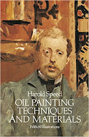
Welcome to the GJ Book Club. Today we'll cover pages 217-227 of the chapter on "Materials," from Harold Speed's 1924 art instruction book Oil Painting Techniques and Materials.

I'll present Speed's main points in boldface type either verbatim or paraphrased, followed by my comments. If you want to add a comment, please use the numbered points to refer to the relevant section of the chapter.

1. Oil is a more challenging medium than watercolor because it often tends toward muddiness and it doesn't lend itself to accidental effects.
Another way to say it is that in inexperienced hands, it's easier to get an awful painting in oil, but harder to get a great painting in watercolor.

Oil painting by G. Hayes before and after cleaning
(and maybe some Photoshop) from Oil Painting Restoration blog
2. Modern painters should use a more primitive medium, such as mosaic tiles.
How about aerosol spray cans, silk screen, and house paint? It's as if Speed got his wish. Oil paints are expensive, slow to apply, slow drying, and comparatively dull, so it's no wonder that modern painters adopted other methods.

3. Artists should have the experience of mixing their own paints.
He says we can learn something from house painters, who in Speed's day would still mix their own paints. By mixing your own paints, you can control all the variables of the paint mixture

House painter circa 1915-1920
4. House painters mix their early coats "sharp" 
Sharp means 'mixed largely with turpentine which leaves a dull surface with a good tooth to take the final coat; this final coat being mixed with more oil or varnish.'

5. Painting material books that Speed recommends:

6. Oil mediums and varnishes inevitably darken.
He notes that the early tempera pictures of the Italian school haven't darkened. Therefore, Speed recommends using as little oil or varnish as possible.

7. Linseed oil.
Regular state is a good drier; boiled linseed oil is a quicker dryer. Don't use too much or the surface may wrinkle in time.

8. Poppy oil.
Lighter than linseed, doesn't darken as much. Slower dryer

9. Turpentine spirit.
Test gum turpentine for purity by letting some dry off a white rag to see if it leaves a residue. He discusses how turpentine may be a factor in paint becoming more transparent over time.

10. Petroleum spirit.
Used in mixtures for oiling out. Use as little oil as possible when applying oil to freshen surface.

11. Copal, mastic, and amber varnish.
He says copal and amber are harder, used as painting mediums. "Picture copal" should be used only for a finish varnish. Mediums often include equal mixtures of oil and turps, or oil, varnish and turps.

12. Mastic varnish used in Speed's day for a finish varnish.
Speed recommends not varnishing unless you need to. As long as the painting doesn't depend on a lot of rich darks colors, relatively matte surfaces can show the colors better and be less subject to yellowing and darkening.


Next week—We'll continue with pigments on page 227.
-----
In its original edition, the book is called "The Science and Practice of Oil Painting." Unfortunately it's not available in a free edition, but there's an inexpensive print edition that Dover publishes under a different title "Oil Painting Techniques and Materials (with a Sargent cover)," and there's also a Kindle edition.
----
GurneyJourney YouTube channel
My Public Facebook page
GurneyJourney on Pinterest
JamesGurneyArt on Instagram

@GurneyJourney on Twitter

Wednesday, April 20, 2016

Impressionism in the Garden


Each summer the New York Botanical Garden chooses a theme to inspire its plantings and to guide its museum exhibition. Last year the Frida Kahlo theme attracted record crowds. This year, the topic is "Impressionism: American Gardens on Canvas."

John Singer Sargent, Terrace, Vizcaya, watercolor, via Architects + Artisans
The museum will be presenting more than 20 garden paintings and sculptures by John Singer Sargent, Childe Hassam, William Merritt Chase, and their contemporaries. Parts of the garden will be transformed with an American Impressionism theme, interpreted by Francisca Coelho—NYBG’s renowned curator and designer.

And I'm excited to announce that I've been asked to be the artist in residence.

On the Opening Weekend of May 14, I'll be oil painting in the Seasonal Border and Peony Collection. It won't be a workshop or teaching gig, rather more of a "paint in public" event, and you're welcome to come by and say hello. There will be costumed models, dancers, brass bands, silent movie screenings, and a general air of Belle Epoque festivity.

On June 4th and 5th, I'll be painting in gouache and casein in the Rose Garden, emphasizing portable sketching set-ups.


I also worked with the organizers to set aside June 19 for an invitational plein-air event. From 11 a.m.–5 p.m. I'll be joined by a unique gathering of established plein-air artists spread out across the Garden's grounds.

Here's the list of Invitational Artists
James Gurney
Garin Baker
Ricky Mujica
Armand Cabrera
Shari Blaukopf
Stewart White
Brad Marshall
James Coe
Eleinne Basa
Denise Dumont
Lisa Egeli
Zufar Bikbov
Chris Magadini
Mike Budden
Valerie Craig
Stapleton Kearns
Hongnian Zhang
Lois Woolley
Hiu Lai Chong
...plus a few others who still haven't confirmed.

You can watch us in action throughout the day using various media and techniques. Finished art will be made available for purchase by the individual artists on their websites. View a list of participating artists.

Denver Botanic Gardens by James Gurney, casein, 5 x 8 inches
The NYBG also wants to encourage all artists and art students to take part. There will be Plein Air Painting Drop-ins every weekend day from 12–3 p.m. in the vicinity of the Conservatory.

The official site says: "Drop in, grab a stool and some materials (watercolor paints, pencils, charcoal, or pastels, varying by weekend), and create an image of the Garden to take home! Instructors offer guided tips every half hour. Learn how to observe, draw, and paint people in gardens, much like the Impressionists did in their day. Lessons with an artist instructor will vary each weekend."

IMPRESSIONISM: American Gardens on Canvas

Tuesday, April 19, 2016

A few recent videos you may enjoy


Harvard Art Museums in Cambridge maintains a collection of thousands of pigments, which are useful primarily for authenticating or identifying paintings. (Link to YouTube)


A machine for time traveling into old photos. (Link shows how it was made)


A music video with a penny arcade that animates a song called ‘Ma’agalim’ by Jane Bordeaux.

Thanks to Dan and everyone else who recommended these.

Monday, April 18, 2016

Eyebrows and Face Recognition

Do you recognize these two people? In both photographs, the eyebrows have been removed. 

Here are the photos of the same faces. Is it easier to recognize them this way? This time the eyes have been digitally removed instead of the eyebrows. (Hint: one is a politician, and the other an actor) 

Richard Nixon and Winona Ryder
Scientists have done facial recognition experiments where subjects were presented with many faces altered to have either the eyebrows or the eyes removed. It turns out that subjects perform better on faces with no eyes, compared to faces with no eyebrows. 

As the authors put it, "The absence of eyebrows in familiar faces leads to a very large and significant disruption in recognition performance."

This came as a surprise to me, since I have always assumed that the eyes were the most important elements to help us recognize and remember a face, with the mouth being perhaps second most important.

Anselm van Hulle, 1649. Anna Margareta
It's remarkable that humans of both sexes have these patches of hair on our faces, compared to primates who generally have more facial hair. The muscles controlling their movement are sophisticated and largely unconscious. We express much about our emotional state to others, even at long distances away. This central role as a social signaler may be related to why eyebrows are also so important for recognition.

The authors of the paper note that:
"During the 18th century, in fact, in Western Europe full eyebrows were considered so essential to facial beauty that some upper-class women and courtiers would affix mouse hide to their foreheads. The perceived importance of the eyebrows for enhancing beauty has not waned to this day. Currently, it is relatively common cosmetic practice to use tweezers or depilatories to narrow and accentuate the arch of the eyebrows, as well as to remove any hair at the bridge of the nose. Cosmetics may also be used to alter the color (especially the darkness) and exaggerate the shape and length of the eyebrows."
----
J. Sadr, I. Jarudi, and P. Sinha, B, The role of eyebrows in face recognition, [Perception, vol. 32, pp. 285–293, 2003.