Tuesday, June 30, 2020
Teaching Art, Pre- and Post-Pandemic
Labels:
Art Schools
Monday, June 29, 2020
Limited Palettes and Constrained Writing
With no yellow and no green, this limited palette knocked me out of my color mixing habits and forced me to improvise in an alternate universe that felt alien, but still harmonious. Colors: ultramarine blue, burnt sienna, pyrrole red, and titanium white.
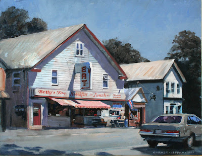

Writers have played with self-limiting challenges, such as E.V. Wright, who wrote the 1939 novel called "Gadsby" as a lipogram, without using the letter "e." Here's an excerpt: "Now, any author, from history's dawn, always had that most important aid to writing:—an ability to call upon any word in his dictionary in building up his story. That is, our strict laws as to word construction did not block his path. But in my story that mighty obstruction will constantly stand in my path; for many an important, common word I cannot adopt, owing to its orthography."
There are other examples of constrained writing, such as sonnets, limericks, and haiku, all of which thrive within strict limitations of form and meter, or palindromes, where the sentence reads the same forward, such as "Never odd or even."
----
Limited palettes are discussed in my book Color and Light: A Guide for the Realist Painter.
Labels:
Color
Sunday, June 28, 2020
Unfinished Portrait of Roosevelt
Elizabeth Shoumatoff started working on her watercolor portrait of President Franklin D. Roosevelt at about noon on April 12, 1945.
During lunch, the President complained that he had "a terrific pain in the back of my head" and he slumped forward unconscious. FDR died later that day of a stroke. The painting was never finished.
----
Labels:
Portraits,
Watercolor Painting
Saturday, June 27, 2020
Hopper's Light: Evocative or Illogical?
Did you notice that something is missing in this picture? It's the cast shadow from the horizontal sash of the window. Also, the shaft of light is far wider than the window, and the rays of light aren't parallel.
 |
| Sun in an Empty Room, by Edward Hopper |
Hopper also ignores the effect of the secondary source of soft blue skylight that would influence the base of the wall adjacent to the shadow, and he leaves off the baseboard moulding at the edge of the shadow.
John Walsh of Yale University gave a lecture on YouTube, which discusses Hopper's manipulations of light and geometry. The bottom image shows a digital reconstruction Wash commissioned to show the window shape necessary to achieve the light patch. To skip ahead, visit the video at about 12:00 and 47 minutes.
Are these faults or are they fair choices to make a more striking picture? I can see why Hopper didn't want to make the sun patch smaller or to cut it up with cast shadows. The painting is about emptiness and it's a big statement of light and shadow. There's not much else to look at here.
 |
| Rooms by the Sea by Edward Hopper, collection Yale Art Gallery |
There are a lot of things wrong here, too. He shows a slanting shape of light cut off on the left, as if it's limited by the top of the doorway. That's OK. But the bar of light across the floor has a similar angle. Something feels wrong about that.
Perhaps he remembered seeing the light effect and constructed it in a way that felt right to him geometrically. But it's completely impossible.
I set up a quick cardboard maquette to show the problem. That shadow across the floor shouldn't have an angle to it. It must be a straight line from the edge of the door to the base of the wall.
Do these criticisms seem trivial or pedantic? I hesitate to share them because I like Hopper's work.
But art should stand up to hard looking. Once I start noticing how illogical the light is (not to mention the perspective and the carpentry details), it's harder to appreciate the sentiment of the picture. It's like trying to walk with a pebble in your shoe.
An artist has freedom to do anything he or she can get away with if the resulting painting communicates more effectively. But its probably best to make a statement that's consistent with truth.
Labels:
Lighting
Friday, June 26, 2020
Zinn's Chalk Paintings on Sidewalks
David Zinn found an art form that doesn't need to begin with a blank canvas.
He draws chalk characters that interact with manhole covers, lampposts and other street fixtures. He's not only an ingenious artist, but he's also an excellent public speaker.
Thursday, June 25, 2020
Transforming Objects into Creatures
Sometimes the veggies in my still life start arguing with me.
Wednesday, June 24, 2020
Customers First
Tuesday, June 23, 2020
Henry Wheeler's Barn
Henry Wheeler’s barn has a horse weathervane. The electrical line goes to a small electric milker.
I've sat in the hayloft on a summer day. It's peaceful and quiet up there with a bright sunbeam slanting in the hayloft door.
One of the sheds has old wagons and carriages parked inside it, almost as if they're ready to return to the roads again in case those newfangled automobiles give up the ghost.
Labels:
Plein Air Painting
Monday, June 22, 2020
Seascape Sketchbook of William Trost Richards
William Trost Richards (American, 1833-1905) filled this sketchbook with remarkably detailed watercolor studies of English coastal scenery.
The Brooklyn Museum, which owns this sketchbook, says:
"Richards was a prolific artist who, as a leading member of the American Pre-Raphaelites, embraced the Ruskinian principle of truth to nature. Sketching outdoors played a significant role in his quest for accuracy of representation. Throughout his long career and extensive travels, he seems to have always carried a sketchbook with him, filling the pages with drawings of the places he encountered. The Brooklyn Museum owns more than twenty-five of Richards’s sketchbooks, including the ones on view here. Serving as pictorial diaries of his journeys, they also demonstrate the variety of his working methods, ranging from quickly rendered outlines to carefully modulated tonal compositions to finished color studies."
Sunday, June 21, 2020
New App Adds Detail to Blurry Image
New software is able to take a low resolution image and add missing detail.
Researchers at Duke University who developed it describe the process this way: "The system scours AI-generated examples of high-resolution faces, searching for ones that look as much as possible like the input image when shrunk down to the same size."
The resulting face is photographically detailed, and it fits the initial pixellated image, but it's really only one of several possible solutions.
-----
Articles about the process from Hypebeast and Techxplore
Labels:
Computer Graphics
Saturday, June 20, 2020
How do you mix a color you're looking at?
Malcolm Marcus asked: "I would really like to see a video on how to understand what colors you are looking at. Sounds kind of nutty, but for those of us relatively new to painting, it's often hard to figure out what color something actually is."
Answer: The color you're looking at is a consequence of four main factors:
1. The local color (or surface color) of the object.
2. The relative color of the light shining on it.
3. The relative amount of light shining on it.
3. The quality of atmosphere between the observer and the object.
You have to mentally combine all those factors in order to arrive at the color you will have to mix for that paint stroke.
For example, the girl's hat at left is a medium-value blue because it's a white hat lit by blue skylight which is less bright than the sunshine, and there's much atmosphere intervening.
The underside of her sleeve is a medium dull orange because it's in shadow, too, but this time the white material is picking up some bounced light from the warm-colored ground surface below her. Her skin is a dark brown because it's a light-skinned tan local color in relatively dim illumination. Backlit white subjects are popular with impressionist painters because they make make Factors #2 and #3 vividly clear.
Most beginning painters see only the local color, because they don't yet recognize how their perceptual systems are filtering out the effects of the next three factors.
Learning to paint involves recognizing how those perceptual filters work. Once you understand them, you can analyze a subject in terms of the the relative influence of the four factors.
I would recommend setting up a backlit white object on a sunny day and painting what you see. You could use a volleyball, skull, white cardboard box, or t-shirt. The experience of mixing the resulting colors will make these principles vividly clear.
-----
There's a lot of beginning painting instruction on my new Gumroad tutorial "Color in Practice: Black, White, and Complements." and in my book Color and Light, available signed from my webstore or from Amazon. There's also a lot of information in my book: Imaginative Realism: How to Paint What Doesn't Exist.
Labels:
Color,
Paint Technique
Friday, June 19, 2020
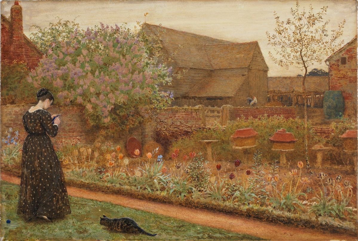
Frederick Walker's 'Old Farm Garden.'
Frederick Walker (1840-1875) started learning to draw by copying prints in pen and ink, and he studied in the British Museum. Later he studied at the Royal Academy and worked as an illustrator.
He painted in oil and in watercolor/gouache. In this example, a solitary woman in a patterned dress knits in a backyard garden, her cat about to pounce on her ball of yarn.
Frederick Walker died of tuberculosis in 1875, at a mere 35 years old.
-----
 |
| ‘The Old Farm Garden (1871) by Frederick Walker (British 1840-1875) Watercolour and Gouache, 30.2 × 40.6 cm (11.8 × 15.9 in) |
Note the brickwork, the lilacs and tulips, and the tiny weathervane on the barn.
The detail above is only about eight inches wide, showing the precision and delicacy that's possible with gouache.
-----
The painting is in the collection of the Courtlauld Institute, London.
Labels:
Academic Painters,
Watercolor Painting
Thursday, June 18, 2020
Aphantasia
What does your childhood home look like? How many windows across the front?
Can you imagine what a fortune cookie looks like? Can you visualize a ten-speed bicycle?
People who can't conjure up any images of these things at all may have a condition called aphantasia, the inability to visualize images in the mind.
My mental images are usually hazy at best, almost never vivid and clear. I've noticed that when I've had a very high fever, very clear images arise in front of my mind's eye, but they're largely involuntary.
I'm better at visualizing things when I attempt to draw them. There seems to be a feedback loop between drawing something and visualizing it.
An action that I've done with my body, such as splitting firewood. is also easier to visualize. I have a harder time visualizing milking a cow, because I haven't tried it, even though I've watched someone else do it.
According to Wikipedia, aphantasia is only recently named and not well studied. Here are some questions about it:
• What's the relationship between drawing something and imagining it?
• Does actual tactile experience with the world (like waxing a car) aid in visualizing?
• How does virtual interaction, such as in a video game, compare to actual experience?
• How is visualizing an object different from visualizing an action?
• Are the same parts of the brain active when mentally visualizing as when actually seeing?
• How is the condition related to inabilities to recognize objects or faces (prosopagnosia)?
Wednesday, June 17, 2020
John Sharman's "At the End of the Porch"
 |
John Sharman, At the End of the Porch, about 1918, oil on canvas, 36 x 34-1/4 in., Indiana Museum of Art |
“a beautiful, luminous and joyous picture of a place where one would like to be. It represents a glassed-in porch, in the summer, and a lady sitting at her work; through the windows may be seen masses of shrubbery and white blossoms. An admirable canvas, it has the quality of reserve, but that does not prevent it from conveying with singular aptitude a most artistic impression of a lovely scene.”
Labels:
Academic Painters
Tuesday, June 16, 2020
Compared to Hummingbirds, We're Colorblind
Birds can perceive colors in parts of the electromagnetic spectrum beyond what we humans can see.
 |
| Costa Rican hummingbird, from Ask a Biologist |
Humans have only three color receptors, but birds are tetrachromats, with four color receptors. In addition to birds, many reptiles, fish, insects, spiders, shrimp, and other invertebrates can see colors beyond our range of awareness. The scientists estimate that as much as 35 percent of the color experience of birds includes colors we can't even imagine, not just additional colors, but combinations of colors such as ultraviolet plus green.
Some birds that look plain to our eyes have patterns that can only be revealed by translating those extraspectral colors into visible light. According to NatGeo:
"This extra level of discernment might also have been a trait of dinosaurs, which are thought to have sported colorful feathers. Mammals evolved as nocturnal beings that did not need to see the rich hues of the daylight world, so most—like your pet dog and cat—are dichromatic, and have only blue and green cones. People evolved a third cone (red), possibly because early primates developed an appetite for ripening fruits."
-----
More online resources
Science Friday Podcast: A Bird's Eye View of Color
Monday, June 15, 2020
Painting a Spotlight Effect
New YouTube video (Link to YouTube) explains how to focus sunlight on one part of a plein-air painting using a spotlight underpainting. The car is a 1962 Chevy Impala.
Labels:
Lighting
Sunday, June 14, 2020
'We want no imitation'
"It is not the business of the artist to express what is obvious to every one," said Sir Alfred East (1849-1913). "If it were, he would prefer the actual fact to the painted one."
East continues: "We want no imitation, even if it were done to the point of deception; but what we do look for is the strong, vivid and frank impression of a cultivated mind."
 |
| Sir Alfred East (1849-1913), Opulent Autumn, 57½ x 87 in. (146 x 221 cm.) |
East continues: "We want no imitation, even if it were done to the point of deception; but what we do look for is the strong, vivid and frank impression of a cultivated mind."
East imagines Turner looking at a scene in nature and saying to himself: "'What does this convey to me, and what great phase of nature does this material serve to express?' What was useless for his purpose he deliberately ignored, and aggrandized the material which was to justify the purpose he had in view. So that nature to the painter, as well as to the builder, offers the material by which great things can be built; and we can read between the lines of the artist's work the exact mental attitude he held when he painted any particular scene."
----
—Sir Alfred East, introduction to Sketching Grounds, 1909
Labels:
Academic Painters
Saturday, June 13, 2020
Drawing of English Inn
Art and Ideology
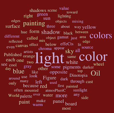
Word clouds are a graphic representation of how often certain words are used in a text. Words that are shown larger are used more frequently.
Color and Light: A Guide for Realist Painters
Imaginative Realism: How to Paint What Doesn’t Exist
Here's the word cloud for my book “Color and Light: A Guide for Realist Painters.” It appears the title accurately represents what's inside.
Here's “Imaginative Realism: How to Paint What Doesn’t Exist.” The reason the word "imagination" doesn't appear in the cloud is that the book is focused less on where ideas come from and more on practical methods for how to take a vague idea and make it real.
Finally here's John Ruskin's "Modern Painters." Even though he was a practicing artist, Ruskin doesn't really discuss the nuts and bolts of practical picture-making, but instead dwells in loftier realms of abstract, ideal principles. Art is almost a religion for Ruskin.
If you're interested in the ideology that drove realist painters, I would recommend reading The Art Spirit by Robert Henri, The Classic Point of View by Kenyon Cox, or Aims and Ideals of Art by George Clausen (Also available on Archive.org). Any other books on art and ideology that you would recommend — or not recommend?
----
Read moreColor and Light: A Guide for Realist Painters
Imaginative Realism: How to Paint What Doesn’t Exist
Exhibition catalog: The New Path: Ruskin and the American Pre-Raphaelites
Labels:
Writing
Friday, June 12, 2020
A Sci-Fi Cover with Classic Vibes
Here's a cover painting for The Pandora Stone, a science fiction paperback novel by William Greenleaf about the search for a powerful amber crystal of alien origin.
I spotlit the bottom edge of the power cone and let the top half fall into the shadow. That way, the glowing orb could read as light over dark. I also introduced the blue and gold smoke on the sides of the cone, and carried the blue and gold theme throughout the picture.
Thursday, June 11, 2020
Mildred Butler
Mildred Anne Butler (1858 - 1941) was an Irish painter who specialized in images of nature, farm life and gardens.
Much of her early training came from her father who documented the exotic plants and animals he found on his travels.
Mildred Anne Butler on Wikipedia
She was associated with the Newlyn School and became a member of the Royal Academy in 1893.
She painted outdoors from life, a practice that was unusual at the time.
In 1857, The Athenaeum wrote: ‘The young lady knows how to look at her subjects with the eyes of a well trained artist.’
 |
| Mildred Anne Butler, R.W.S. (1858-1941) A cockerel and hen in a cluster of marguerites pencil, watercolour and bodycolour with scratching out 10 x 6¾ in. (25.5 x 17.2 cm.) |
She painted outdoors from life, a practice that was unusual at the time.
 |
| The Wanderers, Mildred Anne Butler, 1898, Ireland, watercolor Location: Dublin City Gallery, 53.3 x 36.2 cm |
 |
| Mildred Anne Butler |
Butler's life and work was mostly centered on her family home in Kilmurry, though she traveled to England and France as well.
-----
-----
Wednesday, June 10, 2020
Godfrey Vigne: Saved by a Sketchbook
Godfrey T. Vigne (1801-1863) was a wealthy lawyer who happened to be an artist as well. He resolved to travel to the dangerous territories in the western Himalaya, entering Kashmir, Ladakh, with forays into Tibet and Afghanistan. All these regions were little known to Westerners in those days.
Accompanying him was another intrepid explorer Alexander Burnes of Scotland.
 |
| The Kuzzelbash of Kabul, Watercolour, Afghanistan, 1836, Pencil, pen and ink, and watercolour, Victoria and Albert Museum |
"Vigne got himself out of tight spots by drawing pictures, usually for alarmed villagers or angry chieftains, who would swing from 'fury to a chuckle' on seeing their faces rendered in watercolour. 'I put them in good humor by scratching off two or three caricature portraits, and distributing a little medicine.' As war brewed, Vigne escaped unnoticed; the flamboyant Burnes was later cut to pieces by an angry mob."
---
Quote from "Explorer's Sketchbooks: The Art of Discovery and Adventure," 1986.
Godfrey T. Vigne on Wikipedia
Labels:
Watercolor Painting
Tuesday, June 9, 2020
Bonington's Tiny Watercolor
Richard Parkes Bonington (1802-1828) did this plein-air watercolor at a small scale: 7½ by 6inches or 19.4 by 15.2cm., about the size of a paperback book or a travel guide.
The subject is the Castello Estense, Ferrara, and it was painted in 1827. That makes the section below about the size of a business card.
There's some rubbing out to lift out that texture on the wall. Near the top of the detail are some diagonal scratches with a fingernail or brush handle. He uses some white or body color. In the top white rectangle, he came in later with some blobs of darker tone. Some of those lines are extremely fine and careful, including the white mullion on the gray window.
----
Link to Sothebys listing
Thanks, Matt McCleer
Labels:
Academic Painters,
Watercolor Painting
Monday, June 8, 2020
Cleaning Out Gouache Brushes
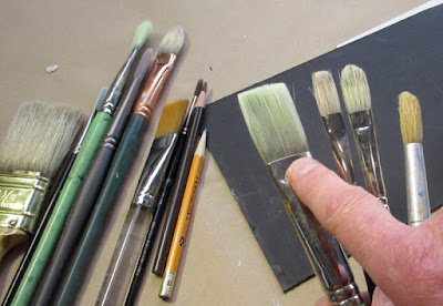
Answer: Yes, Rafal, you can reactivate gouache or watercolor that has dried in brushes and clean them thoroughly when you get home, because the gum arabic binding agent will always be water soluble.
Still, it's preferable to rinse out brushes while you're on location. For that I like to have a pint-size open vessel of water hanging from my easel to serve as a rinse-out tub. If you can't avoid coming home with brushes caked with gouache I would suggest gently soaking them to loosen up the dried paint, and then clean them with gently warm soap and water and a gentle hand soap or brush cleaning fluid.
With casein, Acryla Gouache, acrylic, or oil paint, though, you really have to get your brushes clean on location or immediately afterward.
-----
Sunday, June 7, 2020
Olana Eye Shows Famous View
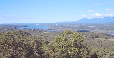
Olana, the home of landscape painter Frederic Church has installed a live skycam on its tower. Called "Olana Eye," it lets anyone stream the famous view of the Hudson River at any hour and in any weather.
 |
| Frederic Church, The ‘Bend in the River’ from Olana, c. 1870-73. Oil on academy board, 10 1/16 x 12 7/8 in. |
 |
| Frederic Church, "Winter Sunset from Olana" |
-----
Link to Olana Eye
Saturday, June 6, 2020
Complementary Color Scheme
Arthur Guptill said, "A rich effect can be obtained with only a limited palette. A warm and cool combination affords the student the best approach to his color problems, especially as they relate to outdoor sketching."
 |
| Greta Bridge by John Sell Cotman |
In his book on the history of watercolor painting, E. Barnard Lintott said, "For a young student there cannot be a better way of entering upon the study of water colour than by rigorously banishing all but two colours from his palette. It is the best and surest way to the study of full colour. The colours should be a cold and warm one; cobalt blue and warm sienna—or Prussian blue and burnt sienna—are two combinations which lend themselves to a great variety of treatment."
----
More about painting in complementary colors on m Gumroad tutorial "Color in Practice: Black, White, and Complements."
Quotes comes from Color in Sketching and Rendering, p. 71.
Labels:
Color
Friday, June 5, 2020
Where can you learn how to do botanical art from life?
When I dropped out of art school, my learning curve accelerated, because I gave myself the kind of assignments I really wanted, such as trying to understand botanical forms by painting them from direct observation on living plants.
As far as I knew around 1980 in Los Angeles, no art school was teaching botanical painting from life, so I had to figure it out on my own.
(Link to Instagram post) These studies became part of the book "The Artist's Guide to Sketching, 1982.
Other resources
Now there actually are a couple of schools devoted to the artistic study of plants, though of course at the moment they're closed with the Covid-19 precautions. One of them is in New York at the NY Botanical Garden, and another is in Denver at the Botanic Gardens. The Rhode Island School of Design has a Nature Lab, from which students can borrow specimens to study.
 Video tutorials
"Gouache in the Wild" (Download on Gumroad)
“How to Make a Sketch Easel” (DVD)
Flower Painting in the Wild
More info on gouache gear
Gouache Materials List
Watercolor Materials
Books
Color and Light: A Guide for Realist Painters:
Imaginative Realism: How to Paint What Doesn’t Exist
Follow me on Instagram and Pinterest
As far as I knew around 1980 in Los Angeles, no art school was teaching botanical painting from life, so I had to figure it out on my own.
(Link to Instagram post) These studies became part of the book "The Artist's Guide to Sketching, 1982.
Other resources
Now there actually are a couple of schools devoted to the artistic study of plants, though of course at the moment they're closed with the Covid-19 precautions. One of them is in New York at the NY Botanical Garden, and another is in Denver at the Botanic Gardens. The Rhode Island School of Design has a Nature Lab, from which students can borrow specimens to study.
 Video tutorials
"Gouache in the Wild" (Download on Gumroad)
“How to Make a Sketch Easel” (DVD)
Flower Painting in the Wild
More info on gouache gear
Gouache Materials List
Watercolor Materials
Books
Color and Light: A Guide for Realist Painters:
Imaginative Realism: How to Paint What Doesn’t Exist
Follow me on Instagram and Pinterest
Thursday, June 4, 2020
Fishermen
The guy holding the pole caught a fish. He says he doesn’t eat fish and gives them all away.
 |
| Fishermen on Santa Monica pier, 1981 |
I made this sketch on location at the Santa Monica pier using a brush and ink to capture the late-afternoon edge lighting. Regardless of the local color of each form, I rendered anything in shadow as black and left anything illuminated by the sun as the white of the paper.
---
From "The Artist's Guide to Sketching, 1982
Labels:
Lighting,
Pen and Ink
Tuesday, June 2, 2020
Art and Van's Illustration Techniques
The illustrator team Art Fitzpatrick and Van Kaufman painted glamorous cars set in posh backgrounds, and their art was reproduced in magazine advertisements in the 1960s.
Their teamwork started before beginning each gouache painting.
According to Hemmings Motor News: "The men would each travel with their cameras, bringing home thousands of 35-millimeter slides. They would then sort them to find the most promising backgrounds. In the meantime, Art would take hundreds of photos of the feature cars at GM's Tech Center: 'I used the turntable and cherry picker to capture different angles, and took most of the photos I'd use for one year in a few days. We would match a car's view and a suitable situation-it was all carefully thought out. We'd then do a pencil sketch of the background, indicating the shape of the car, and figure out what the color scheme would be.'"
"If Art's car was to be placed on Van's background, he painted in opaque watercolor gouache on one-ply Strathmore art paper. 'If I was working on a convertible or a car with a detailed background, I'd often only do the body, cutting along the windowsill with an X-ACTO knife. I'd turn the car over and sandpaper the edges to a knife-point so that they wouldn't show on the background-then I'd rubber-cement both surfaces, and paint the roof or other details right on Van's background.'"

"Art's willingness to adapt his technique earned them great acclaim. 'We came up with a different way of rendering the paintings," he recalls. "I started cropping part of the car out of the picture, making it too large to fit the page...they had impact. Clients liked how single-page magazine ads usually showed a side-view of their car, but they were paying for 'X' square inches of space and using only fifteen percent. My idea was to show a larger front view, cropped-the near headlamps look the same as the far ones, anyway.'"
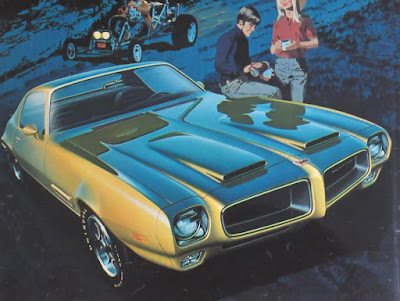
Read the rest of the Hemmings Feature about Art Fitzpatrick, by Mark J. McCourt
Thanks, Mike Geraghty
Monday, June 1, 2020
Bearded Vulture
Anyone who thinks predatory dinosaurs don't look intimidating with feathers should have a look at the bearded vulture.
 |
| Bearded vulture, photo on Imgur Via @41Strange |
However these carrion feeders have been known to be good human companions in captivity.
 |
| Photo via Mental Floss and 41 Strange |
----
More at Mental Floss and 41 Strange:
Subscribe to:
Comments (Atom)


