Saturday, December 31, 2011

Artists' Lay Figures, Part 2

When Edgar Degas painted his friend Henri Michel-Levy in 1878, he included a lay figure sprawled on the ground below him. 

How did lay figures hold a pose? As we saw in the final illustration yesterday, lay figures could be held up with ropes attached to the extremities. But some of them also had adjustable screws in the joints.

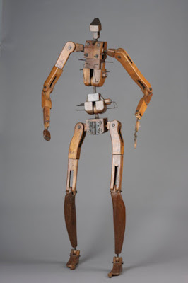
For standing poses, the figure generally also had a support attached to the pelvis from behind. This wood and metal skeleton has many points of articulation, even separate radius and ulna “bones” in the arm.

In this one, the arms also pronate, and the knees can rotate outward. All the joints can be tightened with screws. It has sort of a pre-Steampunk (“wood-punk?”) mech vibe to it. Imagine an army of these guys with crossbows. 

This full size lay figure had sufficient bulk and volume to support the shape of the clothes. But such mannikins never looked completely natural, and artists were often embarrassed to use them, regarding them as a poor substitute for a live model. 

For this reason, lay figures were not often discussed, or if so, they tended to be disparaged. The Journal of the Society of the Arts in 1854 said that under pressing financial circumstances, a painter with a “mercantile spirit” might use a lay figure that “answers for both the male and female form,” which could lead to a disharmonious and incongruous figure. 


Friday, December 30, 2011

Artists' Lay Figures, Part 1

Artists’ lay figures are jointed dummies, used in place of living models for the purpose of studying costumes and drapery. For the next four posts, we’ll take a closer look at them.

The little wooden mannikins that they sell in art stores nowadays are cheap miniature versions, nothing like the originals. They are just a remnant of what was once a common studio tool. 

Lay figures are most useful when they are full-sized and when their forms and joints are accurate. That way they can be dressed with real human clothes. They can hold still with infinite patience in place of a human model, and the folds of the drapery will not change.

Lay figures go back at least as far as Bartolommeo. When Gerard ter Borch (1617-1681) painted this figure of a woman in a dress, he almost certainly arranged the dress on a lay figure.

The Museum of London has a lay figure used by Louis François Roubiliac in the 18th century for his drawing and sculpting classes. According to the museum’s catalog, “The figure is articulated and can adopt a variety of poses. It has a skeleton of bronze overlaid with cork, horsehair, wool and an outer covering of silk stockinette. With a carved and painted wooden head that may be used as both male or female, the model has two sets of accompanying sets of clothes - one male and one female.”

Other lay figures were made from papier-mâché, similar to the dress forms used today in the fashion industry. Recently some manufacturers have produced full-sized mannikins made of plastic or foam over a wire skeleton. These allow more flexibility in posing than a department store mannikins and cost about $200.

Added image: Blog reader अर्जुन shared a link for this 1900 illustration by Andre Castaigne showing art students working on their Prix de Rome image with a lay figure gussied up in costume and a fellow art student posing, kissing the lay figure's hand. Thanks, अर्जुन 

Tomorrow we’ll see more old-style lay figures and how they were constructed.
------
The Mannikin Store

Read the full GurneyJourney series on lay figures:
Part 1
Part 2
Part 3 
Part 4

Thursday, December 29, 2011

Hale's Anatomy Lessons

Robert Beverly Hale (1901-1985), anatomy instructor at the Art Students League, was himself a student of  George Bridgman. Like Bridgman, he drew his demos very large, using a piece of charcoal on the end of a long stick. 
In these two excerpts, he sketches a horse (with a rather long neck), while drawing comparisons to the human skeleton that dangles nearby. (Part 1 has a rather long introduction before he really gets going with the drawing.)
Thanks, Keita! 

"We are the music makers"

Robert Beverly Hale (1901-1985), the legendary teacher at the Art Student’s League and curator of American paintings at the Metropolitan museum, reminds us that science and technique aren’t enough to equip an artist for the creative journey.


(Video LinkIn this archival video, he recites the “Ode” from Arthur O'Shaughnessy (1844–1881), making an eloquent case for the loneliness -- and loftiness -- of the artist’s life. 
  
Here’s the whole text:
“We are the music-makers,
And we are the dreamers of dreams,
Wandering by lone sea-breakers,
And sitting by desolate streams;
World-losers and world-forsakers
On whom the pale moon gleams
Yet we are the movers and shakers
Of the world for ever, it seems.


With wonderful deathless ditties
We build up the world's great cities,
And out of a fabulous story
We fashion an empire's glory
One man with a dream, at pleasure,
Shall go forth and conquer a crown
And three with a new song's measure
Can trample an empire down.


We, in the ages lying
In the buried past of the earth,
Built Nineveh with our sighing,
And Babel itself with our mirth;
And o'erthrew them with prophesying
To the old of the new world's worth;
For each age is a dream that is dying,
Or one that is coming to birth.
------

Wednesday, December 28, 2011

Softness in Eyes

I want to make a very simple point with this post: Keep the eyes simple. Downplay detail in them. Soften edges if you can.


I'll start with one of the greatest portrait painters of all time: Anthony Van Dyck. The eye of this old man looks complete, but note that the pupil doesn't have a hard edge, there are no individual eyelashes. The eyebrows aren't drawn as a bunch of separate hairs either.

The only part that's really crisp are the highlights, and they're more prominent in the lower lid and the lacrimal caruncula (the little watery pit on the inside corner of the eye).


In this woman's eye by Andrew Loomis, the pupil is sharper, but the iris is softened on the left side, and the eyelashes and eyebrows are softened and unified. He chooses to downplay the caruncula and the fold over the eye.


In this detail of a portrait by John Singer Sargent (click to enlarge) both eyes are greatly softened. There are some crisp edges, but look where he places them. They mainly occur in the structural forms surrounding the eye, not details within the eye itself, such as the iris, pupil or little hairs. 


Sargent spent as much time preparing the structure around the eye as he did painting the eye itself. He compared the process of painting an eye in its socket to dropping a poached egg on a plate. The subtle movement of muscles around the eye is what conveys the character of expression, perhaps even more the particular details within the eye.

Caruncula on Wikipedia

Tuesday, December 27, 2011

Marshall Vandruff's Animal Anatomy

Marshall Vandruff’s training video called “Introduction to Animal Anatomy for Artists” grew out of a popular six-month series of articles that he wrote for ImagineFX magazine.  

The diagrams that he developed for that series used analogies and comparisons to explain how the basic forms of the skeleton and muscles vary from one animal to another, and how they resemble similar forms in humans.
 
In his 82 minute video version of those articles, Vandruff presents a wealth of information through a series of diagrammatic drawings that develop before your eyes. 

The guiding intent is to give you the facts, but to simplify them so that you can remember what's most important. If you can remember and internalize the forms, you can use them for anything, including creatures and monsters that you invent. Vandruff's own sketchy monsters, drawn in pen in time lapse, are peppered throughout.  

Vandruff's ability to present the facts simply is especially helpful, because some animal anatomy texts are inclined to pedantry, detailing the names of each of the protuberances of individual vertebrae or the names of the individual carpal bones. All that detail is hard to remember and not that useful in practice.

The audio features Vandruff's voice as a voiceover, describing what to look for with humor and with colorful examples. He has experience in radio, and his narration adds a lot. His voice is reassuring and measured. The information is well scripted. "I spent lots of time honing it down to the fewest words I could, because I could," he told me. "When I teach live, it's always too many words." Transitions between sections are accompanied by riffy synth beats composed by his son, with references to silent movie scores. 

Marshall Vandruff has taught animal anatomy at Cal State Fullerton and Laguna College of Art and Design and later at seminars at studios and schools throughout the Los Angeles area and beyond.


Here's the link for more information about the video

Monday, December 26, 2011

Two-handed drawing

Drawing with both hands simultaneously is a pretty rare skill. Adolph von Menzel (1815-1905) could do it. His hands were cast in bronze holding a carpenter's pencil and a paintbrush.
H.W. Singer, in his 1910 book, The Drawings of Adolph Menzel said of him: "Menzel was naturally left-handed. When already past boyhood he trained himself to use his right hand too, and from that time could draw equally well with either. It is said that he continued making the rapid nature sketches with his left, and produced the careful finished drawings with his right hand." 

(Video Link) This video shows a contemporary portrait artist drawing actors Morgan Freeman and Tim Robbins, with both hands going at the same time, and crossing over to help each other from time to time. 

I find this performance impressive on many levels: not only using both hands at once, but splitting the attention to drawing two faces at once and drawing likenesses by starting with just an eye, apparently without a light structural lay-in to guide the construction.

----
Thanks, Christoph and Christian
Previously on GJ: 

Sunday, December 25, 2011

In the Bleak Midwinter


"In the bleak midwinter, frosty wind made moan,
Earth stood hard as iron, water like a stone;
Snow had fallen, snow on snow, snow on snow,
In the bleak midwinter, long ago.

"What can I give Him, poor as I am?
If I were a shepherd, I would bring a lamb;
If I were a Wise Man, I would do my part;
Yet what I can I give Him: give my heart.
--------
From "In the Bleak Midwinter" by Christina Rosetti
"Winter" (with detail) by Ivan Shishkin (1832-1898)
Painted in 1890, 124 x 204cm, State Russian Museum (more Shishkin images)
Thanks, Tim Adkins for the photos

Friday, December 23, 2011

American Diner

The Village Diner in Red Hook, New York, is a classic type of roadside restaurant popular throughout the northeastern United States.


(Link to HD Video) It’s a vintage prefabricated “Silk City” model, dating back to the 1920s. The streamlined, railroad car look was meant to suggest cleanliness, speed, and efficiency. Throughout its lifetime, the diner has been picked up and moved twice.


Jeanette and I have eaten there a lot and sketched the interior details, but this was the first time we'd painted it from the outside.

Technical notes: The painting is done with a Schmincke half pan watercolor set
in a Moleskine watercolor notebook. The brush is a 1/4 inch watercolor travel brush with a flat tip, good for architectural subjects. I started painting the motorcycles first because I guessed they would drive off soon, and they did! I then tackled the parked cars one by one, knowing they would all leave, too. Jeanette's using a homemade watercolor easel, basically a piece of plywood with a 1/4 inch hex nut attached to the backside of it so that it can attach to a camera tripod.

Visit the GurneyJourney YouTube channel to sign up and see all my videos.
Historic Village Diner website
Wikipedia on the Village Diner
Thanks to Kevin Macleod for the music

Thursday, December 22, 2011

Book of Cain: Behind the Scenes

A few months ago, Blizzard Entertainment, the game publisher that had developed World of Warcraft, Starcraft, and Diablo,  commissioned me to do some pencil drawings for their book called “Diablo III: Book of Cain.” The book has just been released.


(Video link.) I drew the floating city of Pandemonium, the center of creation in the Diablo universe. While I worked, I shot some video. My parakeet, Mr. Kooks, hung out on my shoulder and supervised.


The book was conceived as an in-world artifact, representing the lore about the heaven and hell, as recorded by the character Deckard Cain.


I felt honored to be included on the team of artists who worked on this book. The other contributors include Jean-Baptiste Monge, Iain McCaig, Adrian Smith, Mark Gibbons, Brom, Alan Lee, John Howe, Joseph Lacroix, Victor Lee, Christian Lichtner, and Petar Meseldžija.
---------
Diablo III: Book of Cain
on Amazon
Wikipedia on Diablo III: Book of Cain
Visit or join the GurneyJourney channel on YouTube

Previously on GurneyJourney:
Portrait of Ben Thompson (Blizzard senior artist)
A Visit to Blizzard Entertainment (2010)

Wednesday, December 21, 2011

Dog Cam

You get up out of your chair, and your dog is watching you. Are you going to feed him or take him for a walk? He studies your every move.

What is he looking at? Is he watching your hands to see if you’re reaching for the leash, or your eyes to see where you’re looking? Does he look over at his dog bowl or at the door?


And what happens if you take him for a walk and he sees a female dog? Does he look at her the same way we would?

According to this week’s Science magazine, a team of U.S., Dutch, and Belgian researchers have developed an eye tracking device called a “DogCam” to see what a dog actually looks at when it studies the subtle cues of its owner and its surroundings.

Graduate student Alejandra Rossi at Indiana University in Bloomington says the wireless device uses three cameras: one to capture the dog’s eye view of the world, and two others to track where each eye is looking within that visual field.


Other scientists are conducting eye tracking studies to try to understand how the visual behavior of chimpanzees differs from that of humans. One early observation is that humans tend to look more at faces, while chimps look more at other parts of the body.

So if we know where dogs or apes are looking, can we tell what they're thinking? Not yet, unless we can add further lines of evidence, such as a simultaneous brain scan. The ability to infer cognitive states in non-human animals based on eye tracking data alone is still a rather uncertain prospect. But I'd love to take a dog with an Eye Cam into an art museum...

READ MORE:
Courtesy of Science magazine and Indiana University’s cognitive science program.
Chimp vs. Human scanpaths courtesy Kyoto University
Eye tracking studies in comparative cognitive science

Tuesday, December 20, 2011

Part 12. The Creation of Dinotopia: Book Launch

When the book was published, Turner Publishing sent me on a three-month-long book tour.


They put me on Good Morning America and Larry King Live and a lot of other TV shows. Which was funny, because I haven’t owned or watched a TV since the mid 1970s. So I had never watched those programs and didn’t know the celebrities. The publisher also wanted me to go on QVC to push the book, but I had never seen that show either and I declined because it sounded like something I didn’t want to do.

They flew me to 35 different cities, and whisked me from one bookstore to another. The tour was disorienting for me, because I had to meet so many new people each day, and say the same things over and over.

It was difficult for my wife, too, since she was left home with two small kids. We only had one car, which was often left at the airport. That meant she had to put the two kids in a wagon and walk a mile to pick up the mail and groceries. When the publisher realized our problem, they sent stretch limos, but that was kind of weird too, because I just couldn’t get used to living that way.


At St. Columba's School in Ballarat, Australia

During the tour, I met lots of kids, and received boxes of letters. I tried to respond to each one, and I’ve been very pleased recently to meet some of the kids who wrote to me and even sent me their drawings. They’re all grown up now, and some are artists, which makes me really proud of them for sticking with it.

I was excited to learn that the book had a strong effect on some of its readers. One girl told me that when she read the book she was careful not to lean too far forward, for fear that she would fall headlong into the pages and never return.


I visited a school in Connecticut where each of the teachers—in science, art, and language —did a unit based on Dinotopia. I put on the costume of Arthur Denison and we had an impromptu parade in the field out back.


When Dinotopia: A Land Apart from Time was published, what struck me was how each new reader discovers something of himself or herself on the island. One girl wrote me and said: “My brother and I had an argument. Can you settle it? He says Dinotopia is made up. I say it is real. Please tell us who is right. And don’t lie.”

That’s a hard question to answer. On one level, the brother was right, because as I’ve shown, the book came into existence from an arrangement of pencil and paint. But at a much deeper level, the sister was right, too.

Myths and stories are real, I tried to tell her. And they're enduring. They're the one thing that lives on through the years as the physical monuments of old civilizations crumble into dust.


A well-worn copy of the first edition
The key to inventing Dinotopia was believing that it already existed beyond the confines of my own mind. Even if I couldn’t tell the the latitude and longitude, I believed it was out there somewhere beyond the reach of my senses. To engage readers with that reality I had to pay attention to the spaces between the paintings, the moments poised across the page turn, which each reader conjures anew.


I’m grateful to Dover Publishing for making the book available again in this new edition, so that new visitors can find their way to its distant shores.

So, thanks, Jeff Poindexter for asking me that question: “What inspired you really to create Dinotopia?” I’m afraid I’ve given you a rather long answer. Now, back to the drawing board.
---------
More at these Links:
-----
The new official Dinotopia website
-----
Dover has just published two new 20th anniversary editions of the original  Dinotopia book: a regular hardcover edition and a slipcased collector's edition. Both have 32 pages of new content and 45 behind-the-scenes  images. You can get a signed copy from me via Paypal at my website shop. For multiple-book or international orders, you can order them unsigned and send me an email saying to whom you’d like your books signed. We’ll ship within 24 hours of receipt  of your order.
You can also get it from Amazon, and you can give a review there.
------
"Origins of Dinotopia" series on GurneyJourney:
Part 1: Childhood Dreams
Part 2: College Obsessions 
Part 3: Lost Empires
Part 4:  Dinosaurs
Part 5: Treetown
Part 6: The Illustrated Book
Part 7: Utopias 
Part 8: Building a World 
Part 9: Words and Pictures 
Part 10: Canyon Worlds 
Part 11: Putting it Together
Part 12: Book Launch

Monday, December 19, 2011

Part 11. The Origins of Dinotopia: Putting it Together

Continuing the story of how the book Dinotopia came to be....
What should Arthur Denison’s journal look like? To find out, I traveled to the Library of Congress in Washington, D. C. and asked to see their collection of nineteenth century explorer’s sketchbooks. (This photo was taken after Dinotopia was published.)


Most of them were executed in pencil and watercolor, with cursive script for the written notes. I took an old book in my collection and mocked it up with a fake cover to look like my own copy of Denison’s journal.


Early mock-up of Denison’s Journal
Evoking that sketchbook look meant developing a lighter, more transparent technique than I was accustomed to. I wasn’t comfortable enough in watercolor, so I came up with an unusual way of working in oil paint for the vignetted illustrations, something that would look more improvisational and show the pencil drawing underneath.
 

In contrast to the sketchy vignettes, I wanted a few pictures to be more finished and to completely spill over the edges of the pages. Paintings like Dinosaur Boulevard required several weeks to produce. Creating such a picture was like directing a single frame from a Hollywood movie.

I based my approach on methods that I gleaned from the Golden Age American illustrators and the academic painters of Europe. I studied everything I could find about artists such as Lawrence Alma Tadema, Adolphe-William Bouguereau, and Jean-Léon Gérôme, who faced similar challenges creating detailed, realistic paintings of worlds they couldn’t observe firsthand.


Friends as models
For my references I used ordinary things that I found around me. I made charcoal studies from costumed models, or I photographed my neighbors and friends posing in small groups. They wore theater costumes that I bought from a rental company in New York that was selling off its dilapidated stock.

The girls in the parade posed with artificial flowers, bought at the five-and-dime store in our small town. Sometimes I dressed up in a costume and acted out a part in front of a full-length mirror. I made three-dimensional maquettes of dinosaurs and architectural details using clay, tissue paper, cardboard, and dowel rods.


Set of homemade maquettes
I made a miniature skybax from a combination of toothpicks, wire, leather, and polymer clay. For the wing membrane I used my wife’s discarded pantyhose. I set up these models in natural light conditions to observe how the light and shadow played across the forms. A typical day might find me building a cardboard hat, pacing around snarling like a Tyrannosaurus, and helping my two boys with their own studio projects.

The process of writing the book began with a fifteen-page outline, which laid out the overall story structure and character arcs. Then I planned the composition of each page spread by means of a complete storyboard, drawn in pencil on pre-printed pieces of card stock.


Unused art: "Saurian Pageant"
The next step was to create the finished artwork. This was by far the most time-consuming part of the process. I completed the art out of sequence, sending the paintings off in batches to be photographed for the publisher. Parting with finished artwork before the book was finished made continuity difficult.

I resolved the final text only after all the artwork was finished. I typed out the story on a manual typewriter and attached the columns of text with a paste-up waxer alongside photocopies of the artwork on layout boards that were the same size as the finished book. I rode my bicycle to the copy store in town, photocopied these layouts, and mailed the copies to the publisher so that they could prepare the book for printing.
---------
More at these Links:
-----
The new official Dinotopia website
This "making-of" story, illustrated with photos and sketches, is published in the Afterword section of the new 20th Anniversary Edition of Dinotopia: A Land Apart from Time
------
"Origins of Dinotopia" series on GurneyJourney:
Part 1: Childhood Dreams
Part 2: College Obsessions 
Part 3: Lost Empires
Part 4:  Dinosaurs
Part 5: Treetown
Part 6: The Illustrated Book
Part 7: Utopias 
Part 8: Building a World 
Part 9: Words and Pictures 
Part 10: Canyon Worlds 
Part 11: Putting it Together
Part 12: Book Launch

Sunday, December 18, 2011

Part 10. The Origins of Dinotopia: Canyon Worlds

Continuing the story of the development of Dinotopia...

As I planned the journey for the characters in Dinotopia: A Land Apart from Time, I realized that the ideal place for training pterosaur pilots would be in the canyon area on the eastern part of the island.

Dream Canyon
I wanted the Canyon City to have natural stone arches spanning the gorge and dwellings sculpted into the walls of the chasm.


Valley of the Tombs, plein-air watercolor study

Some of the inspiration came from the rock-cut tombs that I had painted while on assignment in Jerusalem for the National Geographic.


North rim, Grand Canyon.

While the Dinotopia book was still in the works, I made a research trip to the American west to paint on location. Photos by Tobey Sanford.


The weird landforms of Bryce Canyon in southern Utah also sparked some ideas. In this photo, I’m the guy standing (with wobbly knees) with a French easel near the edge of the cliff.


When I painted these flooded carvings in Dinotopia’s canyons, I was also thinking of the temple of Abu Simbel in Egypt.  The story of how Abu Simbel was disassembled and moved for the Aswan Dam blew my mind when I was a kid.

This painting got me started thinking about Dinotopia’s deep history, something I would explore in the next two books. For me, fantasy world-building happens in stages. Ideas form around other ideas. An answer to a question leads to three more questions. As you can see, I didn't have it all written down in a binder in advance; it grew organically, based on chance encounters, as Brueggert observed in the comments yesterday.

As I painted the canyon world of Dinotopia in my studio, I tried to call up my memories of the real places. A few times I almost felt as if I was living inside my pictures. Once when I was painting Dinotopia’s canyon panorama, my wife called me for supper. I was so immersed in my imagination that when I heard her voice, it echoed off the canyon wall.
--------- 
More at these Links:
A collectible art print of the "Dream Canyon" panorama is available exclusively at the Dinotopia online shop. 
 -----
The new official Dinotopia website
This "making-of" story, illustrated with photos and sketches, is published in the Afterword section of the new 20th Anniversary Edition of Dinotopia: A Land Apart from Time
------
"Origins of Dinotopia" series on GurneyJourney:
Part 1: Childhood Dreams
Part 2: College Obsessions 
Part 3: Lost Empires
Part 4:  Dinosaurs
Part 5: Treetown
Part 6: The Illustrated Book
Part 7: Utopias 
Part 8: Building a World 
Part 9: Words and Pictures 
Part 10: Canyon Worlds 
Part 11: Putting it Together
Part 12: Book Launch

Saturday, December 17, 2011

Part 9. The Origins of Dinotopia: Words and Pictures

Continuing the story of how the illustrated book, Dinotopia, came to be....
 I believed that the book should have enough scope to feel like a novel, and should be no shorter than 160 pages, fully illustrated with color on every page. This sort of “long-form picturebook,” was pioneered by the Dutch illustrator Rien Poortvliet (with Wil Huygen) in Gnomes and Noah's Ark.


Producing that much artwork would mean that I would have to cut myself off from all my freelance illustration clients. My wife, our two little boys, and I would have to survive on the sale of art prints and originals until the book was published.

Seaside Romp, 1990
 I had about a hundred and fifty paintings to complete in about two years. A few of the paintings could serve double duty, both as book illustrations and as art print subjects. Those keynote images had to be larger and more finished, and they also had to stand alone outside of the narrative.


The longer form gave me plenty of scope to develop the fantasy. It was five times the length of a typical thirty-two page children’s picture book. It wasn’t like a graphic novel, because each page had only one or two images, and it didn’t require dialog and word bubbles to tell the story.


Storyboard: Will learns to Write
 The running text could be a mix of narration, description, and dialog. The text didn’t have to match the pictures exactly. The pictures could provide side excursions into details of the world.

I felt that the illustrated book medium, since it allowed the reader to skip around or pause on a single image, lent itself to a mode of conjuring that could be found in no other medium.


Storyboard: Code of Dinotopia
 I wanted to depart from the good-versus-evil dramatic formula that motivated most fantasy universes in literature and film. I knew there must be other ways to set up an imaginary world.

I read more deeply in Irish and Italian folktales, which are full of whimsy and tricksters. I reread other fantasies that I had loved as a child, such as Gulliver’s Travels, The Wonderful Wizard of Oz, and Alice in Wonderland. Those stories inspired me with their fantastic invention and episodic plot lines.

Read More at these Links:
-----
The new official Dinotopia website
Purchase a signed 20th Anniversary Edition of Dinotopia: A Land Apart from Time 
----
Gnomes by Poortvliet and Huygens
 Noah's Ark by Poortvliet
------
"Origins of Dinotopia" series on GurneyJourney:
Part 1: Childhood Dreams
Part 2: College Obsessions 
Part 3: Lost Empires
Part 4:  Dinosaurs
Part 5: Treetown
Part 6: The Illustrated Book
Part 7: Utopias 
Part 8: Building a World 
Part 9: Words and Pictures 
Part 10: Canyon Worlds 
Part 11: Putting it Together
Part 12: Book Launch