We boarded Flight 23 through gate SB30, the one you get to by riding down the luggage conveyors.
Not many people know about the subterranean hangars. The steam dirigible took us into the clouds. It was a strange crowd on board—many unintelligible languages.
The coffee on board was dark and chocolaty, with a wood-fire taste, served by flight attendants who were mountain trolls, a bit grumpy.
In Geneva our dwarf guide took us down the back alleys, where you can still see the occasional “granchat.” They block traffic until they wake up.
A goat man brought us firewood on this brouette, which was parked at the base of the stairs of our stone house.
Tuesday, September 30, 2008
Swiss Air
Labels:
road tour,
Watercolor Painting
Friday, September 26, 2008
Called Away
It’s tough to be called away in the middle of a plein air sketch.
Sometimes a rainstorm does it. The raindrops at the top of this watercolor study by William Trost Richards testify to what happened. A storm moved in, and he had to stop working.
Here’s another Trost Richards seascape. Why is the bluff on the left only just laid in? Maybe someone called him to dinner, or his ride was leaving. We make art at the mercy of the stomach and the weather.
Thanks to William Vareika Fine Arts, link.
Thursday, September 25, 2008
Jules Verne et Dinotopia 4 Octobre
(Scroll down for English Translation)
Inauguration de l'Espace Jules Verne, le 4 octobre 2008
Maison d'Ailleurs, Yverdon-les-Bains, Suisse
Pour son inauguration, l'Espace Jules Verne à Yverdon-les-Bains sera accessible gratuitement de 10h30 à 22h30 pour douze heures de rencontres, de visite et de découvertes. Cette salle historique en plein centre ville présentera ses nouveaux atours au public et ses collections exceptionnelles autour de Jules Verne: documents rares, livres précieux, modèles des véhicules extraordinaires, audio-visuels originaux, borne interactive sur les voyages littéraires, affiches dans un incroyable présentoir automatiqueÅ
10h30 Partie officielle en présence des autorités d'Yverdon-les-Bains, du collectionneur Jean-Michel Margot et de l'artiste américain James Gurney (place Pestalozzi). Dans Retour à Dinotopia, plus de cinquante nouveaux tableaux donnent vie à un lieu hors du temps où dinosaures et mammifères préhistoriques sont représentés avec une rigueur toute scientifique.
Toute la journée, animations sur la place Pestalozzi avec les Orbylis et les envoyés du Yuocland... Ainsi que le superbe Gramoulinophone, un spectacle rétrofuturiste et décalé (représentations à 13h, 14h30, 16h30, 18h - entrée libre).
L'ouvrage Dinotopia: un voyage à Chandara (Editions Fleurus) paraît pour l'ouverture de l'exposition à la Maison d'Ailleurs.
Paris mercredi 8 octobre 2008 à 16h: Dédicace de James Gurney pour son ouvrage "Dinotopia, un voyage à Chandara" (Fleurus). FNAC Paris - Forum (Châtelet les Halles)
ENGLISH
The new extension of Maison d'Ailleurs (Museum of Utopias and Science Fiction), in Yverdon, Switzerland, is devoted to Jules Verne, the father of Extraordinary Journeys and his time. The new museum building will open on October 4th, from 10:30 to 22:30 for 12 hours of discoveries and amazement. This historical room in the old center of Yverdon-les-Bains will house rare documents, extraordinary models, precious books, films and interactive works, an incredible poster-matic machine and much more. The entry is free for the whole day.
10h30: Official opening with the Yverdon-les-Bains authorities, collector Jean-Michel Margot and Dinotopia artist James Gurney, to accompany the exhibit “Return to Dinotopia,” with 50 paintings on exhibit from the new book, Dinotopia, Journey to Chandara, which will be released in its French edition the same day. (Pestalozzi plaza)
During the whole day, street performers, musicians, and actors will make the day unforgettable. Meet the strange Orbylis aliens, and the emissaries from distant Yuocland... And enjoy the weird Gramoulinophone, a retro-futuristic wonder (playing at 13h, 14h30, 16h30, 18h - free entry).
-------
Maison d’Ailleur, Oct. 4 agenda, link.
Dinotopia exhibition info, text in English or French
Street performers, link.
Yuocland, link.
Orbylis, link.
Gramoulinophone, link.
Previous GJ post on Maison d'Ailleurs, link.
Labels:
Dinotopia,
Museum Visits
Wednesday, September 24, 2008
Action Poses and Photography
For much of the nineteenth century, the mental image of the galloping horse was this pose, typified by this Currier and Ives print from 1890.
As blog reader R8R mentioned this in yesterday’s comments, Eadweard Muybridge began systematically photographing running horses as early as 1877.
This began as a way to settle a bet about whether a horse really had all four feet off the ground at a single time. The photos proved that it does, but not quite in the way artists had imagined. At the moment when all four feet are off the ground, they’re gathered under the horse’s belly, not kicked out front and back.
According to the photographic evidence, the Currier and Ives picture was inaccurate, even though it was done after Muybridge’s photos were available.
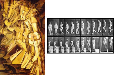
Muybridge’s evidence must have been hard for artists to digest at first. Modern painters like Marcel Duchamp, to their credit, were grappling with how to capture the dynamics of action in a single painting. There’s no easy or right way to do it, despite my promise at the end of yesterday’s post.
Yesterday we looked at three paintings of people walking. All of these paintings were based on poses that a model could hold in a static position. Although Wyeth and Rockwell certainly had access to fast-action photos of people in motion I suspect that candid action photographs didn’t “look right” to them.
A lot of you commented in praise of yesterday’s paintings, and I agree. Cormon’s image has gravitas; Rockwell’s has a stateliness, and Wyeth’s a desperate urgency. But I think they’re successful despite their posing of action. Not only are the poses all the same in each picture, they're not consistent with the realism of the rest of the treatment, and I think a painting that shows an action has to be convincing not only as a singular, static image, but also as a moment in a larger conception of movement and time.
Since Muybridge, the notion of what “looks right” has changed somewhat. Most of us wouldn’t accept the standard Currier and Ives pose for running horses anymore. We accept photographic action effects, like the blurring of a moving foot, for example.
Most illustrations by the mid twentieth century that show action poses—like this advertising illustration by Austin Briggs—tended to rely on candid action photography for paintings of action scenes. As a work of art, this one is a bit silly, but clearly he did his homework and really posed models in the action.
Tom Lovell also clearly studied action photography for this painting of Alexander for National Geographic. To my eye, this painting is successful in terms of movement because it conveys both the timeless epic and the snapshot incident.
Thanks to Leif Peng for the Austin Briggs image, link.
Muybridge on Wikipedia: Main article, and assorted animated gifs.
Labels:
Golden Age Illustration,
Models Posing
Tuesday, September 23, 2008
Walking Poses
When Fernand Cormon (1845-1924) painted the family of Cain walking through the desert, he gave each of the figures a heavy plodding step. Each person has their feet in the same position.
The foot in front is flat on the ground, with the knee bent. The rear heel is lifted off the ground, with the ball of the foot squarely on the ground.
Norman Rockwell, in his great painting “The Problem We All Live With,” uses a different pose to signify walking, but again it’s the same pose for all of his characters. Rockwell has a different theory of how people walk. All four men and the girl are perfectly vertical, and they're all walking with very short steps, with their heels and toes in the air at the same time. The men’s backswinging elbow is well behind the body, and the forward arm is in a loose fist in front of the stomach.
Rockwell arrived at these poses by propping the toes and heels of his models on stacks of books. He did not take candid photos of people actually walking.
Here he uses the same theory of walking poses, with heels and toes up. The strides are even shorter. If you try actually walking so that you end up with these poses, your style of walking does not match the intended feeling of the picture. Instead, it feels like a silly robot.
N.C. Wyeth has yet another conception of how people walk. He too applies a single pose equally to his whole crowd of pirates. They all have full meter-long strides with the body leaning far forward. Try walking in a way that matches these poses. I’ll bet you’ll feel less like a pirate and more like Groucho Marx.
Are these poses “expressive?” Perhaps so, but what the poses express is an unrealistic kind of action that doesn’t match the rest of the picture. In every other respect, these paintings are fine examples of realistic storytelling. But I would submit that they would have been even more successful—both more realistic and more expressive—if they had been based on a closer observation of authentic movement, and if the individual figures had been given some variety.
Tomorrow we’ll look at some ways to achieve that.
---------
Wikipedia on Cormon, link.
Art Renewal Center, 7 Cormon images, link.
Labels:
Academic Painters,
Golden Age Illustration
Monday, September 22, 2008
Harpy Meals Are In
On Saturday at noon, just as President Bush was announcing his proposed 700 billion dollar Wall Street bailout package, Jeanette and I were setting up our folding chairs in the parking lot of the Dunkin Donuts in Kingston, New York to view the American Experiment firsthand.
Across the street, the McDonald’s customers were arriving in their Hummers and Expeditions. A bright banner proclaimed the new offering: “Angus Chipotle BBQ Bacon Burgers.”
The yellow sign with movable letters said “WIZARD OF OZ & LEGO HARPY MEALS ARE HERE.” I looked again, and it really said “HARPY.” I guess the signmakers ran out of “P’s.” Perhaps they were also unaware of the winged monsters from Greek mythology who punished King Phineas by stealing food out of his mouth just as he was about to eat from the banquet table.
I took a little time to work out my pencil drawing first, knowing that watercolor is unforgiving. I started painting on the right side of the composition, concentrating on the white car. I guessed it would only stay for 15 minutes while the owner was dining inside. In fact, he emerged after only 12 minutes.
The man stood beside his car with a cigarette and a cellphone in one hand and a soda cup in the other while waiting for his son to come out of the “Playplace.” The Playplace—the glassed-in structure at right in the picture—is a two-story playground retrofit from the 1990s. Kids can slide around through large intestine-like plastic tubes while digesting their cheeseburgers.
The son arrived as the man finished his Coke, his cigarette, and his telephone conversation. “Get your butt in the car,” the man said.
Labels:
Paint Technique,
Watercolor Painting
Sunday, September 21, 2008
Alexander’s Dark Band
I know—it sounds like a Vaudeville jazz group.
In fact, Alexander’s dark band is the darker region separating the primary rainbow from the secondary bow. The secondary rainbow is reversed in its color sequence. It’s weaker than the primary rainbow. The light for the second rainbow comes from sunlight that bounces twice inside the spherical raindrops that are suspended in the air after a rainstorm.
The band of sky between the bows looks darker compared to the region inside the primary bow because a certain amount of light bounces back at angles below 42 degrees. In fact, in this photo there are faint “supernumerary bows” inside the primary bow.
Alexander’s Dark Band is named after Alexander of Aphrodisias, who first described the phenomenon. While the main bow forms at 42 degrees from the antisolar point (see last week’s post), the secondary bow forms at 51 degrees.
Here is a version of the double rainbow that I painted for Dinotopia: First Flight. To get the curvature exactly even, I attached the paintbrush to an improvised beam compass (basically a long wooden bar pivoting on a nail). It’s the best way in traditional oil paint to keep the arc geometrically perfect.
John Everett Millais Blind Girl of 1856 shows a double rainbow correctly painted in terms of the sequence of colors (red at the outside of the main bow). But he failed to show the lighter region inside the inner bow, and the darker band between the two bows.
The majesty of Millet’s conception comes from the knowledge that the blind girl is unaware of the glory behind her. Millet is careful to show the light coming almost exactly from the front. The shadows are cast just a little to the right of the trees.
The sun is behind us, a bit to the left. The antisolar point (the point 180 degrees opposite the sun) is outside the frame of the picture, just to the right of the flock of crows. It forms the center of the arc of both rainbows.
-------------
Rainbow photo by Eric Rolph, courtesy Wikipedia, link.
Last week's post on the science of rainbows, link.
Another explanation of all this, with a nice diagram of the angles, link.
Labels:
Color
Saturday, September 20, 2008
Simplfied Planes
To simplify something as complex as a rocky outcropping, it sometimes helps to think in terms of groups of planes.
In the case of these rocks along the coast of Maine, the rock naturally breaks into four fracture planes:
1. Top planes
2. Side planes in light
3. Front planes in halftone
4. Side planes in shadow
The actual scene had a lot more complexity of form and randomness of tones, but if you group the planes, it will be easier for the viewer to sort things out, and the form will carry more punch.
By the way, this was painted with a very limited palette: Black, white, burnt sienna, and yellow ochre. An ultra simple palette was enough for a pure form study.
When you're painting details of a larger scene, like these small figures in a Canaletto painting, you can simplify planes to light, halftone, and shadow. This makes the details read instantly, and it saves painting time.
Labels:
Plein Air Painting
Friday, September 19, 2008
Slowing Down
Back in 1994, my friend Garin Baker invited me to join him for a figure painting session at the School of Visual Arts in New York. He was working from the model with a group of master figure painters that included Max Ginsburg and Steve Assael.
As I recall, they had already been painting from the same model for some weeks. This was their fourth or fifth session with the same pose. By the time I joined them, they had put in 20 or 30 hours into that one pose.
I was amazed with the quality of their work, which showed deep observation. I was so accustomed to painting from the standard 20- or 30-minute poses in most sketch groups, that even a three-hour session seemed like a huge luxury.
After two hours on the same pose, I felt like I overcooked the pasta.
So I applied the Ninety Degree Rule. Steve Assael became my subject. I felt energized. Here was a living, moving subject and only 45 minutes of time left. Even though he wasn’t holding completely still, there was a quality of life and tension that excited me.
I greatly admire what my colleagues have accomplished with extended observational poses, but I guess I’m more suited to catching life on the run.
I’m curious to learn from those of you who have more experience than I do painting from long poses. How much time is ideal for you? How do you pace yourself with longer poses? If you were running an atelier, how would you balance short and long poses?
--------
Related GJ post "Artists as Models," link.
"Ninety Degree Rule," link.
Websites for Steve Assael, Max Ginsburg, and Garin Baker.
Max Ginsburg has an exhibit "Visions of Reality," in NYC through Sept. 26.
Also, Garin, Steve, and Max are part of a group show called "The Old Hat Club" at the High School of Art and Design, through October 3.
Labels:
Models Posing,
Portraits
Thursday, September 18, 2008
Vibert’s Gulliver
Jehan-Georges Vibert (1840-1902) was an academic painter who specialized in realistically imagined scenes of court life.
Last spring, Sotheby auction house unveiled a large Vibert painting depicting a scene from Jonathan Swift’s Gulliver’s Travels. The painting had disappeared from public view for over 100 years.
Vibert visualized the army of the Kingdom of Lilliput with extraordinary attention to individual characterization and costume.
He placed the viewer at the eye level of the Lilliputians, looking upward at the foreshortened giant. The face seems miles away.
--------------
Wikipedia Commons, 16 reproductions, link.
Gallery of Paintings by Vibert, link.
Labels:
Academic Painters
Wednesday, September 17, 2008
Art in Embassies Program
It is with sadness that I learned today of the loss of life of six Yemeni guards and four civilians this morning as the U.S. embassy in Sanaa, Yemen, was hit by two car bombs.
I have a particular interest in that embassy because one of my paintings, “Hudson Highlands,” is on loan to that embassy, part of the “Art in Embassies Program” sponsored by the U.S. State Department.
There is no official word yet about the condition of the building or its contents, though reports indicate that further explosions and gunfire followed the initial bomb blast, and smoke was seen rising from the compound.
I also have a couple of paintings on loan to the U.S. Permanent Delegation to the Conference on Disarmament in Geneva, Switzerland.
In the short run, artwork has no power over guns and bombs, but I believe that cultural exchanges between countries can make a small difference in the long run.
-----------
News photo courtesy ©EPA
News story here and here
Art in Embassies Program, link.
Tuesday, September 16, 2008
Plaster Casts
Artists pursuing academic training in contemporary ateliers spend time making charcoal studies of plaster casts. These replica sculptures are made from classic Greek, Roman, and Renaissance originals.
This is an excellent way to refine drawing skills, especially the close observation of light and shade on form. As an added benefit, you get to feast your eyes on the timeless beauty of master sculptures.
Here’s a plaster cast of Michelangelo’s Moses from London’s Victoria and Albert Museum.
Plaster casts can be either gigantic full figure replicas or smaller pieces. These affordable casts of individual facial features are based on Michelangelo’s David.
Most art schools once had large plaster cast collections, but many destroyed them in the wanton orgy of iconoclasm of the 1950s, 60s and 70s. The cast collection belonging to Vassar College in New York State (seen intact above) was a typical sad story. The director of the Art program, Agnes Clafin, ordered the destruction of the collection in the 1940s arguing that casts were no longer useful in teaching, and that “this was a time to innovate, to bring Vassar up to speed.” Only a few casts at Vassar escaped annihilation.
But fortunately there are still several museums and schools that held onto their plaster cast collections. Many will allow artists to draw from them, but the limitation is often the lighting. Typically, museum lighting uses multiple light sources, which makes the study of form and chiaroscuro rather confusing. If you’re drawing a cast that’s lit by multiple light sources, it’s best not to bother copying tones and to study the lines and shapes instead.
---------
Intact collections
George Walter Vincent Smith Art Museum in Springfield, Massachusetts
Department of Art History and Archaeology at the University of Missouri in Columbia
Carnegie Museum of Art, Pittsburgh, PA (including architectural casts)
University of Oxford, Great Britain
Victoria and Albert Museum, London
Copenhagen Cast Collection
Pushkin Museum in Russia
for a full listing, check out:
Plaster Cast Collection Database
Story of the Vassar Casts, link
Retail Sources:
Note: beware that some are third or fourth generation molds, and may not resemble the original very closely.
Sculpt Shop
Fine Art Store
Giust Gallery
Labels:
Academic Painters
Monday, September 15, 2008
Wray Gunn
At the Norman Rockwell Museum on Friday I met the gentleman who posed for Mr. Rockwell’s famous painting “New Kids in the Neighborhood.”
Wray Gunn of Stockbridge was the black boy to the left of the scene. He said that many members of his family posed for Rockwell’s other paintings during this period.
He showed me a series of prints of the photos that Rockwell worked from.
I did a quick sketch of him in the same angle as the original picture, 41 years later. The Norman Rockwell Museum has several museum docents who are former models.
Labels:
Golden Age Illustration,
Pencil Sketching,
Portraits
Sunday, September 14, 2008
The Science of Rainbows
Some poets and artists of the Romantic era were not entirely happy with Isaac Newton’s scientific analysis of the rainbow. The poets Wordsworth and Keats believed that Newton “destroyed all the poetry of the rainbow by reducing it to prismatic colors." “Unweaving the rainbow,” as they put it, reduced its power and meaning. (See the last post on the meaning of the rainbow).
But Newton also had admirers among artists, especially Turner, Overbeck, Runge, Palmer, and Constable, who did this plein air sketch in 1812 of what he called “this most beautiful phenomenon of light”
From ancient times, people speculated on how many strands of colored light went into the rainbow. Ancients argued for two, three, or four. Newton reasoned that there are three primaries, but seven hues, namely red, orange, yellow, green, blue, indigo, and violet.
The rainbow forms when rays of sunlight bounce around inside raindrops that hang suspended in the air after a storm. These raindrops reflect and refract light back toward the viewer at a 42 degree angle. As the light bounces inside the spherical water droplets, the component colors of light bend in varying amounts, and exit the droplet at slightly different angles, creating the colors of the bow.
The main rainbow forms at 42 degrees from the “antisolar point,” the point in the sky below the horizon) that is 180 degrees away from the sun. As the sun gets lower in the afternoon sky, the antisolar point raises up closer to the horizon, and more and more of the full circle of the rainbow is visible.
It doesn’t matter whether the droplets reflecting the sunlight are close to the viewer or far away. What matters is the angle, as anyone who has seen rainbows in a sprinker’s mist will know.
In this photo by Andy Goldsworthy, a man is creating a rainbow by slapping the water with a stick and sending up a stream of droplets into the air.
Next week we’ll look at the secondary rainbow and the mysterious dark region between the two bows.
Also on GJ: The Meaning of Rainbows
More in my book: Color and Light: A Guide for the Realist Painter
Rainbows in Art, link.
Constable sketch from Victoria and Albert Museum, link.
Labels:
Color
Saturday, September 13, 2008
Brodner at the Rockwell
The Norman Rockwell Museum is hosting an exhibition of political satire and caricature called “Raw Nerve: The Political Art of Steve Brodner.”
Steve happened to be in the museum yesterday when Jeanette and I stopped by. We got to talking, and when it was time to exchange business cards, we both found we were all out of cards.
So we made custom cards, starting with a caricature of each other.
Here’s Steve’s drawing of me.
Later, while Steve was regaling some fans with some funny stories about drawing Sarah Palin, I did another sketch of him.
He took the sketchbook, turned it sideways, and created a new drawing of me, using the portrait of him as a starting point. It’s the first time I’ve “shared a nose” with a fellow artist.
If you can make it to Stockbridge, Massachusetts, don’t miss the exhibition. It contains over 100 pencil, pen, and watercolor originals, along with lots of videos of Steve drawing. His work is a rare combination of complete honesty, deep feeling, biting wit, and consummate skill. The exhibition will be on show through Oct 26.
-------
Visit Steve Brodner’s blog and website.
Norman Rockwell Museum, link.
Society of Illustrators Museum in NYC is also hosting "Politics O8", link.
Labels:
Comics/Cartooning,
Museum Visits,
Pencil Sketching,
Portraits
Subscribe to:
Posts (Atom)