Wednesday, October 31, 2012

Halloween 2012

Best wishes to all on this Halloween.

Thomas Couture, Monk Contemplating Skull, 1875.

Ernst Oehme, Procession in the Fog, 1828

Tuesday, October 30, 2012

Sunday Market

On Sunday mornings, Baltimore hosts a farmer's market downtown beneath a couple of highway overpasses.
I got there a little before sunrise and leaned on a concrete wall, which served as a taboret for my watercolors. The first rays of orange sunlight illuminated the smoke from the donut and kettle corn vendors, while cool blue skylight filtered down through the spaces between the overpasses.


Here are three steps in the process. I was thinking about warm vs. cool and light vs. dark, trying to get the big shapes established first before worrying about the smaller details.


Here's an ultra close-up of an area the size of a quarter to show how I abstracted it. Note a few dots of yellow-white gouache.

Next to me was a guy who carved sculptures from driftwood. He had Miles Davis playing on his boombox, which set the perfect mood.

Baltimore Sunday Market on Yelp

Monday, October 29, 2012

Animations of Cell Life

What goes on in biological systems at the molecular and cellular levels often can't be filmed, so the action has to be visualized with computer animation.


(Link to video) Artists can make an important contribution, making choices about color and light that bring out the beauty of this unfamiliar world. The example is produced by XVIVO Scientific Animations.

Thanks to Veronica, a medical illustration student at Johns Hopkins, for this link.

Sunday, October 28, 2012

Separateness of Black


One of the notable qualities of this 1921 painting "The Breakfast Table" by Solomon J. Solomon is its use of black. In particular, the black dress of the woman is presented as a distinct note quite separate from the other dark passages in the painting. The areas under the table and chairs, and around the feet of the nearer figure retain some color and stay well away from pure blackness.

Solomon was a Royal Academy painter who also trained in France. In his book "The Practice of Oil Painting and Drawing," he lists black as one of the colors on his palette. But he also quotes a maxim of Rubens: "It is very dangerous to use white and black."

There's nothing wrong with black as a color—Sargent used it, too, and so have painters all through the ages. The danger comes from using black to tone all the dark mixtures, and from infusing the painting with too many heavy, colorless passages in the deep tones of the picture. This can rob the dark passages of luminosity, and can take away the specialness that a black note should have. Contemporary painters who use photos as reference tools should be especially aware of this problem, since photos usually present a lot of areas of pure black.

You can order Solomon Solomon's book on painting from my website store. I wrote the introduction, and have some copies that I've signed. The book is also available through Amazon.
 

Saturday, October 27, 2012

House Concert

Here's a group portrait I did last night at a house concert. The band was Isaac Alderson, Dylan Foley, Dan Gurney, and Sean Earnest, kind of a Mount Rushmore of Irish music.
----
The band at Club Passim on YouTube 
Previously on GJ: Club Passim Gig

Waterfall City Mosaic

Dan Gamaldi is a stained glass and mosaic artist in San Francisco. A few years ago he asked permission to do a mosaic of Waterfall City on the floor of the entry to his shop, which is called "Cradle of the Sun.". It's about four by five feet. Nice job, Dan!

Here's a video interview of Dan Gamaldi

Friday, October 26, 2012

Johns Hopkins Medical Illustration

The medical illustration program at Johns Hopkins University is extremely selective. Of the 50 portfolio applications they receive, they invite only 20 for an interview, and accept only five.
The program was established by pioneering medical illustrator Max Brödel (1870-1941), who developing the carbon dust technique for scientific illustration. Above is one of Brödel's drawings from 1910. The first assignment for the students is to render a human pelvis bone in carbon dust at full size.


Most of the other North American medical illustration programs were founded by Brödel students. In addition to doing medical artwork, many of the graduates do work in other scientific fields. For example the painting above is by John Cody, who is known as the "Audubon of moths."


Tim Phelps, above, is the assistant director of the Johns Hopkins program. In his spare time, he paints hot rods and is the author of Up in Flames: The Art of Flame Painting. On the tour he showed us the workshop of one of the assistant professors, Juan Garcia, M.A., who practices and teaches facial prosthetics.


Dr. Garcia creates custom-made prosthetic substitutes for people who are missing parts of their facial anatomy due to injury or illness. The prosthetics must be lightweight, flexible, and they're often attached by magnets.

Johns Hopkins' Art as Applied to Medicine is a two-year graduate program. Students must take some courses in anatomy, pathology, physiology, and biophysics alongside medical students. As a result, their commitment to science must be as strong as their commitment to art. In addition to illustration, the curriculum includes training in sculpture, digital tools, and animation skills, which are fundamental to succeeding in today's scientific illustration marketplace.

Johns Hopkins Art as Applied to Medicine Department

Thursday, October 25, 2012

Chinese Plein-Air Scenes

In China, the how-to books on oil painting often feature bold, brushy paintings of everyday scenes. Here's a painting of an ordinary hair styling salon. Sorry, I don't know the name of the artist.

These appear to be painted from life, and they have a refreshing directness and simplicity. Judging from the historical books in the art bookshops, the approach is inspired by Fechin, Repin, Menzel, and Zorn.


By the way, the squatting guy above is working a popcorn cannon. Here's one in action (Thanks, SteveC):
----
Thanks, Gary Geraths for the scans
Previously on GJ: Chinese Drawing

Wednesday, October 24, 2012

Four-Color Poster Palette

In this 1924 poster for the London Underground, Walter E. Spradbery limited his palette to just four colors: white, cyan, red, and green. 


The resulting poster has a several advantages over an image with a full range of tones and colors. It's cheaper and easier to print, and the simplicity gives it more visual impact from a distance.


Here's a detail of the original painting in opaque water-based colors. Where possible he eliminates outlines around small shapes and lets them blend together.

It's a challenge to design a picture with just four colors. One naturally wants to subdivide, gradate, soften, and outline. But a painting gets its power from the grouping of tones, and this regime forces the artist to group, generalize, and simplify.

Tuesday, October 23, 2012

Raptor Suit

The CGI visual effects for the movie Jurassic Park received a lot of attention, but the animatronics were equally groundbreaking.


(Link to video) In this archive video, one of the designers, John Rosengrant recalls how the people at Stan Winston Studios were able to build raptor suits around him and Mark 'Crash' McCreery.

StanWinstonSchool.com
Previously on GJ: Jurassic Park Set Visit

Monday, October 22, 2012

Baby Doll

On Saturday I was sketching at the corner of West Eager Street and Park Avenue in Baltimore, when I noticed a woman crossing the street toward me, walking her dog.

There was something strange about the dog. At first I thought she had electric lights instead of eyes, because her eyes seemed to be glowing.

She was a Corgi mix, and she moved slowly and stiffly on her short legs. When the dog reached the curb, the owner shortened the leash. The dog leaned forward, touching her nose to the curb, and then she gingerly lifted her paw and climbed the curb. She sniffed around near my chair.

The dog was completely blind with cataracts. The owner was patiently guiding her on her morning walk.

The dog's name was Baby Doll. She was more than twelve years old. She did just fine with her hearing and her sense of smell. She found a crust of bread and started munching it. "Get that out of your mouth, Baby Doll," the owner said.

"She knows her way around my house. But I've got to make sure I don't leave anything out of place, or she'll bump into it."
----
Previously: Old Dog Silver

Sunday, October 21, 2012

CG Wires Interview

The website CG Wires has just posted an interview. Read it here.
CG Wires is a great resource for job listings, tutorials, and other behind the scenes information about gaming, animation, and VFX fields.

Lyman Allyn Exhibit Review


Kristina Dorsey of TheDay.com reviewed the Dinotopia exhibition that's on view at the Lyman Allyn Art Museum in Connecticut. Read the review
----

Sketch / Painting / Study

JeanTraveling asked a question about my commentary on yesterday's painting video:
"You called this a painting at one point and a sketch at another. What is the difference between a sketch and a painting? This is a discussion my husband and I have fairly often:-)"

Jean, it's a matter of semantics, of course, and I'm OK with either term for the one I did yesterday. For me, the distinction between the two terms may be a matter of attitude as much as of finish.

To me, a "sketch" tends to suggests a momentary glance or quick impression, executed freely and intuitively, without much thought to how it lays on the page. Sometimes a sketch is a means to an end, a planning stage or a first effort.

I also use "sketch" as a noun or a verb referring to any picture done purely from observation, regardless of media or level of detail. I like the sound of "I'm going sketching" better than "I'm going plein-air painting." Sometimes I sketch indoors, and "indoor plein-air painting" is a contradiction in terms.

A "painting" might have more consideration behind it, perhaps more thought of composition or overall effect. A painting might demand the use of better materials— a true sketch might be something you could draw on a shopping bag in the heat of the moment.

I like the term "study" too, because it gets me into the frame of mind of patiently observing the world as it is. My goal when I'm working on location is often to try to portray something unfiltered by preconceptions. Not easy! Being patient and open enough to find a fresh motif, and then to try to see beyond artistic conventions, is the most difficult challenge for me in observational work, but it's also the most productive mindset to cultivate.

By the way, I have a hard time distinguishing between the terms "drawing" and "painting," especially when using water-soluble colored pencils, which can be used wet or dry in the same picture. Art historians often group watercolors with drawings, even if they're made entirely with a brush. I suppose that has a lot to do with the way watercolors are stored and displayed in museums.
----
Previously on GJ: Why do we have no word in English for a person who draws?

Saturday, October 20, 2012

Friday, October 19, 2012

American Society of Architectural Illustrators


We're in Baltimore as guests of the conference of ASAI, the American Society of Architectural Illustrators.
It's a fun group, and part of the motive of the gathering is sketching in the host city. Baltimore is a sketcher's paradise. Here's a gouache I did yesterday of the Domino Sugar factory, which looks over the inner harbor.

During an evening boat cruise, Tim Bell, a painter in the American Impressionist tradition, did a demo of oil painting techniques.

One of the evening speakers Aleksander Novak-Zemplinski, an architectural illustrator who grew up in Poland and has become a master of digital techniques.

Here's a sketch of Jon Soules, who was in the audience.


Thursday, October 18, 2012

Sketching Hats

Plein-air painters must choose the right brushes and paint, but they must also choose the right hat.

From left: Peder Krøyer, Carl von Marr, Theodore Robinson, Unidentified, Aldro Hibbard, and Ivan Shishkin.

Here are a few contemporary hat choices: Armand Cabrera, me, David Starrett, Jeanette G., Tom Kegler, and Jacob Collins.

Wednesday, October 17, 2012

Prometheus VFX Breakdown


(Direct link to video) Creating the environment for the science fiction movie Prometheus involved many layers of 3D digital data, some of which came from Google Earth. Visual Effects Supervisor Richard Stammers explains how he used digital scans of a desolate location called Wadi Rum in Jordan as a starting point for constructing the alien planet. "Google Earth became an important tool for any of our previs and shoot planning," he says. From CG Wires
-----
This Saturday, I'll be speaking at MICA in Baltimore in connection with the annual meeting of ASAI, the American Society of Architectural Illustrators. Everyone is welcome, but there's an admission charge. If you'd like to look into attending, here's more info.  

Tuesday, October 16, 2012

Line Direction

A blog reader named Whiskey asked a question about line direction:

If we're drawing so that shading lines describe the contour and volume of an object, how should it be done? Should the lines go in the direction of the light source? Or along a perspective line?

I've attached a little jpg to illustrate my question because I'm not sure if I've made any sense. Which way is best for the lines to go?

Answer:
It's a good question. Actually there are no rules. Both ways you've suggested can describe the form well.

The one marked A is often called "shading along the form" or "along the axis." B is sometimes called "bracelet shading" which I mentioned on another post. In that case, the lines (or brushstrokes, if you're painting) are going around the axis of the form.

On a larger compositional level, your choices often depend on the feeling you want to create.
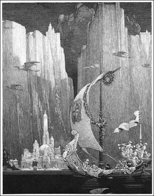

For example, in this fantastic world drawn by Franklin Booth, the lines on the far mountains are vertical, which reinforces the feeling of soaring majesty.


In this detail of a drawing by Polish artist Stanislaw Bohusz-Siestrzencewicz (1869-1927), the lines on the horse's neck wrap around the cross section of the form, but he's also connecting diagonal movements from the horse to the man to suggest action.
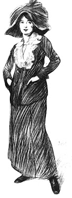

In this drawing by the same artist, the lines spiral diagonally around the form to suggest the relaxed, informal posture of the woman.

So I'd say: experiment with both kinds of shading: along and across the axis. Also, try shading diagonally if you want to suggest atmosphere or action. Once you're comfortable with the choices, it will become automatic, and you can mix them up in the same drawing.
----
Thanks, Paul Mendonca for the Siestrzencewicz files.
More samples of Stanislaw Bohusz-Siestrzencewicz
Andrew Loomis talks about a similar topic, stroke direction in painting, in his excellent book Creative Illustration, which has just been republished.


Monday, October 15, 2012

Sheep Shearing

Last Friday, we helped out at a friend's sheep farm on shearing day.


(Direct link to video) Here's a one-minute video. We started by bringing in the sheep from their pastures. After they were shorn, we did the "skirting." Skirting a fleece means removing the short, dirty, or matted fibers.

I drew a couple of portraits of the Icelandic sheep using watercolorwatercolor pencils, and gouache in a watercolor notebook.

Then we went into the farmhouse for a feast of chicken soup, homemade bread, potato salad, sandwiches, and peach/berry cobbler.


I kept thinking of the 1880 painting called "Shearing the Rams" by Tom Roberts of Australia.
------
For information about purchasing sheep, fiber, or pasture-raised lamb, visit the website for the Dancing Lamb Farm in Earlton, New York.

Check out my
 other videos or subscribe to the James Gurney YouTube channel.
Music on the video is by Kevin MacLeod.
-----
Sheep shearing on Wikipedia

Sunday, October 14, 2012

Painting in Bright Light

A plein-air painter friend of mine posed the following question: 

"I have noticed that when I paint outside I nearly always return with a less than bright painting. It will look good in the field but then look disappointingly desaturated in the studio. I assume this is because the pupils are so dilated outside and letting in so much light that when I'm back in the studio and my pupils are normal again and the light bouncing off the paint is considerably reduced (thus reducing chroma). I've thought I could make a kind of blinker out of black tubes to restrict the amount of light entering my eyes except in the foveal area. But due to my bifocals I doubt I could get such a gizmo to work. Obviously one could try and overcompensate for this effect by adding high chroma pigment but this seems untrue to the plein air idea. Have you run across any solutions to this problem?" 
—Squinting

Dear Squinting,
I'm glad you raised the point because the same thing happens to me. I also notice a similar effect when I bring a finished painting from the studio outdoors into direct sunlight. The sunlight brings out all sorts of color and detail in the dark areas that I hadn't noticed in the studio. 

In theory, when a person goes outdoors into bright light, the pupils should constrict to the appropriate size, just as a camera adjusts the exposure settings. This can take quite a few minutes, especially as we get older. When I first go outside, my eyes are dilated more than they should be, so it's naturally easier to distinguish those dark colors.  

I asked a vision scientist how the sensitivity of the cones (color receptors in the retina) changes with increasing brightness levels, and I was told that the ability to distinguish colors increases with increasing light levels. In very low light, such as moonlight, the cones are barely functioning, but they get better and better at their job as the light increases—up to a point. In extreme glare conditions, such as bright white snow or sand, the color sensitivity begins to drop off. In that extreme environment, neutral gray sunglasses might help.


The best solution for me under normal conditions is to put a diffusing white umbrella over my work area so that the illumination on the work is close to the same as the illumination on the subject. Bright light in itself usually isn't the problem -- it's different amounts or kinds of illumination on the work and the subject. 

I also try to avoid painting with the canvas or the palette in direct sunlight if I can help it, especially if the light on the painting is higher than the subject.

The issue may also be the kind of light you have indoors. As I'm sure you know, if you're working under incandescent or cool white fluorescent indoors, you're getting a distorted color rendition, so your eyes will have a hard time seeing color accurately whatever the light level. For suggestions on studio lighting, see the post linked below.
-----
Related posts on GurneyJourney:

Saturday, October 13, 2012

While waiting for lunch...

I never tire of the classic diner still life. There's always about a 15-20 minute time limit from when the order goes in to when the food is on the table. The time limit focuses the brain better than coffee does.


The humble catsup bottle, sugar shaker, napkin holder, and creamer are an interesting challenge to paint, because they offer a variety of transparent and reflective surfaces: stainless steel, glass, and paper. And there's the catsup creeping up the side of the bottle, backlit and warmed with transmitted light.

What interested me this time were the two colors of light on the subject. From the left was a cool light the window, which mostly looked out to the blue sky. The light inside was from a relatively warm compact fluorescent. So my first move after laying in the subject in pencil was to lay down a  ghost wash to establish the overall cool and warm statement, being careful to paint around the highlights.

I hope all this make sense. I would show you a video, but I was too preoccupied to shoot one.

Technical notes: The painting is done with a half pan watercolor set in a watercolor notebook. I used two flat watercolor brushes: 1 inch and 1/4 inch, with a few dark accents from watercolor pencils.
----

Friday, October 12, 2012

Banknote Engraver

Christopher Madden is one of the few people who creates the artwork that appears on U.S. paper money. He works at the Bureau of Printing and Engraving in Washington, DC, one of only three master artists and three apprentices. I visited him last month for a rare tour of his workshop.


It took ten years of apprenticeship for Mr. Madden to get where he is now. One of the milestone projects was to do an engraved portrait of President Obama. 


“Fortunately he was happy with the likeness,” Madden said.


Banknote engraving a painstaking art form, hardly changed in 200 years. All the work is done by hand at the printed size; there are no photographic or computer shortcuts. The lines and dots on a dollar bill are engraved with a burin on a steel plate. Each microscopic line often must be re-entered by the cutting tool several times. 


Artists learn the vocabulary of line: the “mainline,” “crossline,” and “interdot,” which add up to a tonal rendering that can suggest a curve in a cheek, a curl in a lock of hair, or a cluster of leaves in a tree. 


“It’s the most time-consuming and difficult graphic process in the world,” Madden says.

It’s often a tug of war between security and artistry. Currency has to be safe from counterfeiting, of course. Between 60% and 75% of currency that's printed ends up overseas, and a sizeable percentage of U.S. currency overseas is not genuine. 

But the money also has to look good, too. 

Most collectors agree that U.S. banknote engraving reached its highest artistry with the “Educational Series” in 1896. In those days, notable academically trained artists, such as Asher B. Durand, Walter Shirlaw and Kenyon Cox contributed their talents to make the money beautiful. 

"The admiration for artists like Mucha and Durand runs deep among my colleagues," Madden said.  

What traits make a good banknote engraver? Madden replied that they must draw well, they must work in a disciplined fashion, and they must recognize that they don’t have any ownership over their work.

To satisfy his own artistic itch, Madden is a dedicated plein-air painter in his spare time.
--------
Photo of Madden from CCAD website