Thursday, March 31, 2016

Mike Hernandez Kickstarts Art Book


Gouache painter Mike Hernandez has launched a Kickstarter campaign for a facsimile book of his location paintings. By printing the art on the same boards he paints on, it will feel like holding one of his original sketchbooks in your hands. 
---
Mike Hernandez Kickstarter campaign

Series on Shannon Stirnweis


At the blog "Today's Inspiration," illustration historian Leif Peng is doing a series of posts interviewing Shannon Stirnweis (b. 1931) about his years painting pictures for the advertising, men's adventure, western, and romance markets.

Shannon Stirnweis, Part 1: "I wanted to be an artist when I grew up"
Shannon Stirnweis, Part 2: "The (men's) adventure begins"

Wednesday, March 30, 2016

Portrait During a Sushi Lunch

"You don't need to pose. I'll just sketch you in whatever angle you're in."


Here's a quick sketch I did of Jeanette at a Japanese restaurant yesterday. (Link to YouTube) The donkey is Jeanette's good friend Jezzy.


I'm using a super-limited palette of gouache, just raw sienna, brilliant purple and titanium white (with just a touch of watercolor red for the ears) in a 5 x 8 inch watercolor sketchbook. For most of it I'm using a synthetic #6 filbert, which is ideal for stating the big planes and shapes, without worrying about the details of the features.
----

Tuesday, March 29, 2016

Lens Flare for Painters

Whether you call it lens flare (what happens in a camera when you look at the sun) or color corona (a similar phenomenon that happens in your eye), it's a powerful effect that's popular in photography and video these days, but it's also something that has fascinated painters for a long time.

Peder Mønsted, A Winter's Day
The painting above was done in 1918, before color photography would have been in common use, so it's almost surely based on the effect that you can observe with your eyes. However, I don't recommend looking directly at the sun, which can damage your eyes.

The effect comes from light scattered by water vapor and dust in the air between you and the sun. The light is further scattered by your eyelashes when you squint, and then by the aqueous humor and vitreous fluid of the eye. The effect is best observed when you glimpse a setting sun through trees or when you see a streetlight at night.

Try squinting hard at a streetlight and tilting your head to see how the rays tilt with you. Also, try walking through the forest where the sun is mostly blocked by branches and glance up toward the sun as you walk to see how the corona comes and goes.

Giuseppe Pellizza (Italian, 1868-1907) Volpedo, The Sun, 1904
Both Mønsted and Pellizza show the corona with lines radiating from the sun. They also observe a shift from yellow into red. Pellizza breaks the effect into particles of varied color. Note how simply and softly he paints the foreground areas.


Lens flare is easy for digital artists to add, and a little harder for physical painters, depending on the technique. As a photographic effect, it has origins in camera optics. Its artistic use—and overuse—in film, television, and photography is well explained in this Vox video (link to YouTube). Thanks, Dan.
--------
Related GurneyJourney posts:
Color Corona
How to Get a Feeling of Misty Light
Practical Lights
Light Spill

More of this kind of stuff in my book Color and Light: A Guide for the Realist Painter

Monday, March 28, 2016

Thoughts about Doing Live Demos

My friend Greg Ruth asked me about my thoughts on doing public painting demos, so here are a few musings.

James Gurney paints James Warhola, photo by Patrick O'Brien at MICA
Drawing or painting in front of an audience has its challenges. It's really a kind of performance. I've done everything from Vaudeville style chalk talk gags for bored first graders to oil portrait demos at art schools.

For both, I lower my expectations about how well the painting is likely to turn out. That's because I have to fire up both brain hemispheres so I can talk and draw at the same time, something I'm not as accustomed to doing as art professors are.


Demo portrait in watercolor of Dennis Nolan, professor at Hartford Art School
Also I can't predict the outcome because I don't have a single tried-and-true system of painting. I may come at the subject with pencil, watercolor, casein, gouache, or oil, depending on how adventurous I'm feeling, or what I happen to have with me.

While I'm up there, I alternate between moments of confidence and moments of doubt. I think it's best to avoid expressing too much of either emotion. What the audience genuinely does need is a practical understanding of how that internal struggle plays out on the page. How do you spot an error, and how do you fix it? What makes you decide to rub something out? What things to you need to get right at different stages?

The demo should be not merely a display of the outward process, but also of the reasoning behind the process, so that the student has a map to find their way through the thicket.

Greg Ruth interviewed a lot of other artists on this topic, and you can read the range of thoughts on demoing on the blog Muddy Colors.

I'd be interested in any comments from those of you who are veterans at doing painting demos. And I'd also like to hear from students about what you like most about the best demos you seen (It's OK to name names or suggest videos). Also, what are your pet peeves about demos that haven't been helpful (without naming names).
-----
My video tutorials on Gumroad
Instagram I have a different track of images on Instagram

Sunday, March 27, 2016

Repin's Easter Procession


Ilya Repin's Religious Procession in Kursk Province shows an Easter procession of Bright Week, a tradition of the Eastern Orthodox church. 

Repin --Study for Religious Procession

Controversial in its day, the painting documents the range of Russian social strata moving together toward their common destiny while cruelly maintaining their differences.

According to David Jackson
"At the right, burly peasants carry a platform holding the icon inside an elaborate neoclassical case; only gleams of light reflecting off the gold riza icon cover can be made out. Lines of peasants joining hands hold back the crowd, the foremost at the left trying to stop the crippled boy breaking through the cordon with his stick. Alongside ride peasant or priest stewards and officials and police in uniform, some of the latter beating back the crowd with their riding crops. Behind the icon follow priests and better-dressed people, carrying icons in front of their chest, and an "effete, dandified and bored priest" in vestments carefully straightens his hair." 

Saturday, March 26, 2016

Richard Schmid on Versatility

Richard Schmid, sketched while he did a demo
In his book Alla Prima: Everything I Know about Painting, Richard Schmid offers the reader a wealth of helpful tips, including the reminder to practice a variety of methods of painting. 

Painting by Richard Schmid
He says: "Cultivate as many working methods as you can so that you can respond to the demands of painting different subjects. Don't expect that an effective way of painting a landscape will work as well for a child's portrait. Learn to paint thickly, thinly, loosely, tightly, quickly, slowly, and so on, according to the requirements of your subjects. Strive to expand your repertoire. For no other reason, work in different ways just for the satisfaction of confounding art critics."
----
His books are expensive (my copy cost more than $100), but they're worth it: 
Instagram

Friday, March 25, 2016

Harold Speed on Flat and Gradated Tones

Welcome to the GJ Book Club. Today we'll cover pages 187-192 of the chapter on "Tone and Colour Design," from Harold Speed's 1924 art instruction book Oil Painting Techniques and Materials.

I'll present Speed's main points in boldface type either verbatim or paraphrased, followed by my comments. If you want to add a comment, please use the numbered points to refer to the relevant section of the chapter.

1. Gradated and Flat Tones
Speed covered this topic in his book on drawing as well. He suggests planning the picture in flat tones and to "let your gradations be the result of such tones melting into each other where necessary." Form that is conceived in planar terms has more vigor, he argues, compared to smoothly curving form, which can start looking effete or feeble.

Turner - Norham Castle Sunrise
2. Lost Edges
Speed says that a good place to put gradations is in the edges between the big flat shapes. "The larger the number of these lost edges the more gracious the expression, and the larger the number of hard edges, the more forceful and less gracious the expression." As with all painterly aesthetics, an intelligent mix of both is the best bet.

3. Range of Tone
Here's another principle: "The smaller the range of tone used, the quieter and more peaceful the result." In the Turner sunrise painting, the values are kept close and the edges are kept soft, creating a gentle effect, like a shimmering tremolo on the violin. Note that he didn't use pure white for the sun, but shifted hue and chroma from a light gray sky to a high-chroma yellow sun. The piece is high in key and is saved by the solitary dark accent of the cow (or is it a horse? I can't tell).

Whether Turner pushes his effects too far in his late work is a matter of taste; I prefer his earlier work where the effects are more understated. I think Frederic Church is better at Turner than Turner is.

The reverse is also effective: a mostly dark painting with a single light accent, as with the Bierstadt nocturne below:

Bierstadt Ships at Night
Speed says: "When the full scale is used and the tones strongly contrasted you get the most dramatic effects. But when the full scale is used but the tones are not strongly contrasted but gradate quietly into the other, you get an effect that is neither dramatic nor peaceful but simply a strong normal effect."

Giorgione's Holy Family with Saints
4. Giorgione's Holy Family with Saints
Note the central position of the Madonna, but the varied handling of the flanking figures.


5. Giorgione's Fête Champêtre (Pastoral Concert)
Speed admires the wide range of tone without dramatic edge contrasts. Contrast between gentle form modeling on figures to staccato accents on the drapery.


6. Poussin's Flight into Egypt
Speed seems to greatly admire this painting. He analyzes the piece by sketching a tone plan and a diagram of line rhythms, and he breaks down the composition in tonal terms. Personally, I don't see this as being a very exemplary work. It has so many confused centers of interest and awkward, stiff passages. What is the baby Jesus most worried about: the concrete clouds, the heavy handed foreshadowing, or his distracted parents? Sorry, I've just never been a big fan of Poussin.
Next week—We'll continue with the Veronese on page 192.
-----
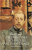
In its original edition, the book is called "The Science and Practice of Oil Painting." Unfortunately it's not available in a free edition, but there's an inexpensive print edition that Dover publishes under a different title "Oil Painting Techniques and Materials (with a Sargent cover)," and there's also a Kindle edition.
----
GurneyJourney YouTube channel
My Public Facebook page
GurneyJourney on Pinterest
JamesGurneyArt on Instagram

@GurneyJourney on Twitter

Thursday, March 24, 2016

ImagineFX Reviews Fantasy in the Wild


The new issue of ImagineFX magazine says that the video tutorial Fantasy in the Wild is "full of both practical guidelines and creative inspiration."

Get your own download at Gumroad, or a DVD at Kunaki.

Wednesday, March 23, 2016

Are Acrylics and Other Plastics Decaying?

Assessing damage and losses to an Andy Warhol painting
Acrylics and other plastics are disintegrating, and that's causing a problem for museum conservators.

Everything from space suits to crash test dummies to acrylic paintings by Andy Warhol are showing signs of degradation after as few as two or three decades.

Yvonne Shashoua with a 1970s-era crash-test dummy
that is leaking plasticizer
"Plastic objects are among the most vulnerable found in museums and galleries,” says Matija Strlič, a chemist at the Centre for Sustainable Heritage at University College London.

Depending on how the plastic was formulated, it might discolor, bleach, form a scaly crust, give off foul-smelling gases, leach out acid or sticky liquids, turn to goo, or become brittle and cracked.

According to the April, 2016 issue of Scientific American magazine, exposure to oxygen or ultraviolet light removes the electrons that bind the larger molecules of plastics together.

Lisa Young restores Neil Armstrong's spacesuit (source)
Astronauts' space suits are composed of a variety of materials, including unstable plastics. A New York Times article quoted conservator Mary T. Baker as saying: ''None of these suits will ultimately survive,.' ''In 500 years, there will be the Mona Lisa. But there will not be an Apollo spacesuit.''

Many plastics are composed of a complex mixture of dyes, stabilizers, surfactants, plasticizers, and antioxidants. Those ingredients can affect how the material behaves over time and what should be done to try to stabilize it. Unfortunately, the actual composition of many plastics are not known because the manufacturers kept them secret.

The plastics most prone to degradation are:
• PVC (polyvinyl chloride). PVC was used in crash test dummies, which are now weeping fake blood into display cases.
• Polyurethane, an ingredient in panty hose and sponges.
• Polyethylene (HDPE or high-density polyethylene). People who have stored water in old milk jugs may have noticed that they will spontaneously rupture.
• Cellulose nitrate and cellulose acetate. Cellulose was one of the first synthetic polymers, and was used extensively in making motion picture and photography stock. Cellulose is flammable, and it degrades "malignantly," meaning it releases nitric acid and toxic vapors as it breaks down, and the acid can corrode adjacent materials. Conservators have become adept at recognizing chemical changes through telltale smells.
• Acrylic polymers, used by artists such as Andy Warhol, David Hockney, and Mark Rothko since the paints were introduced in the 1940s as a more permanent alternative to oil paints.

Andromeda, 1962, acrylic, by Andrew Liberman
suffers from a whitish bloom
Using water to clean an acrylic painting can be risky as it can make the paint swell and lead to surface losses, according to a conservation scientist for the Tate museum.

[Edit March 24: Please see the comments after this post, where Mark Golden of Golden Acrylics argues that modern acrylics do not suffer any longevity or stability issues.]
----
Read more:
"Choosing the Acrylic Paint that's Best for You" by Lindsey Bourret.
Scientific American, April 2016 "The Art of Saving Relics" (article is in the print edition)
New York Times "Mighty Moon Suits are Falling Apart"
Chemical and Engineering News: "Preserving Plastic Art"
Online: "Plastics Denial Syndrome"
Online: "When Acrylic Paints Get a Spa Day"

Tuesday, March 22, 2016

Exhibition of Unfinished Art


Juan Ramirez assembled this chart of unfinished heads by John Singer Sargent. These are arranged from least finished at the beginning to mostly finished at the bottom.


It's amazing how quickly he arrived at the basic statement of the character. Within the first five minutes, he had the head shape, the hair, the background, and the spots for features.

Anton Raphael Mengs (1728-1779). Portrait of Mariana de Silva 
y Sarmiento, duquesa de Huescar
The Metropolitan Museum of Art, in its new Breuer space, opened a new exhibit called Unfinished: Thoughts Left Visible on March 18.

There are than190 works dating from the Renaissance to the present. About 40 percent of them come from The Met’s collection. The show includes work that was interrupted before completion, as well as non-finito artwork, art that was intentionally left uncompleted.

Thanks, Juan Ramirez
Previously: Non Finito

Monday, March 21, 2016

Masters of Illustration to be rereleased


If you missed the chance to buy a copy of Masters of Illustration in 2011, it's too bad because it was one of the best books on illustration history and it went out of print fairly quickly. Used copies cost more than $170.

The good news is that it will be rereleased via a Kickstarter campaign that's taking off like gangbusters.

The book is based on articles for Step-by-Step Graphics written by historian and dealer Fred Taraba. From 1989 to 2001. Taraba wrote about many of the great illustrators that were overlooked in the classic book from the mid-1940s Forty Illustrators and How They Work.


Some of the illustrators included in this volume are Andrew Loomis, John Gannam, Mead Schaeffer, Al Dorne, and Robert Fawcett. The book is beautifully produced, with high quality scans of the original artwork, plus documentary photos about each of the illustrators' life and process.

Previously on the blog: "Masters of Illustration: 41 Illustrators and How They Work."

Sunday, March 20, 2016

Old Man in Vieques


I met this old guy in Vieques and sketched his portrait. We were sitting across the street from a ruined building that used to be a sugar cane factory. He used to work there when he was young, but it closed down in this area 60 years ago.

Now the area is home to wild horses. But they're not really wild because people feed them. Hurricane Hugo killed hundreds of them, he said.

Saturday, March 19, 2016

Watercolor Chart


Quick tip: Make a chart to help distinguish watercolors in dim light. (Link to YouTube)


Gumroad tutorial: Watercolor in the Wild

Friday, March 18, 2016

Harold Speed on Unity and Variety

Today we'll cover pages 181-187 of the chapter on "Tone and Colour Design," from Harold Speed's 1924 art instruction book Oil Painting Techniques and Materials. This is another very long section of the book that we'll have to break into parts.

I'll present Speed's main points in boldface type either verbatim or paraphrased, followed by my comments. If you want to add a comment, please use the numbered points to refer to the relevant section of the chapter.

Andrew Wyeth The Sleepers
1. "Art may be expression, but if nothing has been communicated, nothing has been expressed in any effective way."
The distinction between expression and communication is an important one, since the latter requires someone to receive the message. Expression can happen when an artist is all alone on the beach writing something on the sand. One thing the Internet has given artists is the ability to see right away how their work is received by real people. I don't know if being conscious of the audience's reaction is a good thing or a bad thing, but it sure is a thing. It's hard to ignore the audience and I wonder how it affects us in the long run.

2. Natural appearance vs. rhythm
Speed is setting up a distinction between something that looks convincingly real and a something that uses design principles to have an effective emotional impact. These two objectives in painting aren't necessarily in opposition. The way I think about it is that there are many kinds of realism, or many ways to paint something so that it looks convincingly real. You might for example focus on the texture or the atmospherics or the silhouette or the warm glowing colors, or whatever expresses your idea. And then there are all the qualities of paint handling. Each of us has to choose which type of realism best serves the idea.

3. Page 184, paragraph beginning: "It is not rather that...." Speed says: "We are continually seeking to transform the things of this existence into terms of this inner, more permanent realm."
Speed gets philosophical here, and the language is a bit difficult to unravel, but what he's saying is profound, connecting the world of our inner mental life with the external world that we perceive and interpret through art. Andrew Wyeth talks a lot about this. He doesn't head out looking for a scene to paint. He starts with an inner idea and builds it from the inside out. The result may be realistic to the eye, but it all starts with dreams and memories.


Tone Design
4. Flat tones create unity. A lot of light-to-dark modeling can create variety.
In the Raphael above, there's a lot of modeling within each form, and each form is distinguished from its surrounding background, creating a choppy effect. Thomas Hart Benton also has a tendency to define his forms all the way around. The tones are much more unified in the Cornwell below. One is not necessarily better than the other. 


Image: Dean Cornwell

5. For broader effect, "assemble the light masses together and unite the dark masses also, so that the light and dark tones, instead of playing together throughout the picture, are divided and grouped separately."
Hey, this sounds like shapewelding, something that I discussed in a previous post.

6. In a mostly dark-toned picture, the light masses will attract attention. 
Speed says: "This is why portrait painters so favour a dark background, as it so easily makes the light head the dominating interest in the picture."

Next week—We'll continue on page 187 with his discussion of gradated and flat tones.
-----
More on Andrew Wyeth's thinking about art in the two books by Richard Meryman: Andrew Wyeth: A Secret Life and Andrew Wyeth: A Spoken Self-Portrait

In its original edition, the book is called "The Science and Practice of Oil Painting." Unfortunately it's not available in a free edition, but there's an inexpensive print edition that Dover publishes under a different title "Oil Painting Techniques and Materials (with a Sargent cover)," and there's also a Kindle edition.
----
GurneyJourney YouTube channel
My Public Facebook page
GurneyJourney on Pinterest
JamesGurneyArt on Instagram

@GurneyJourney on Twitter