Today let's hear from Dan Gurney, the developer of our new sketching app. This is adapted from his article in Medium called Building the “Living Sketchbook” app.
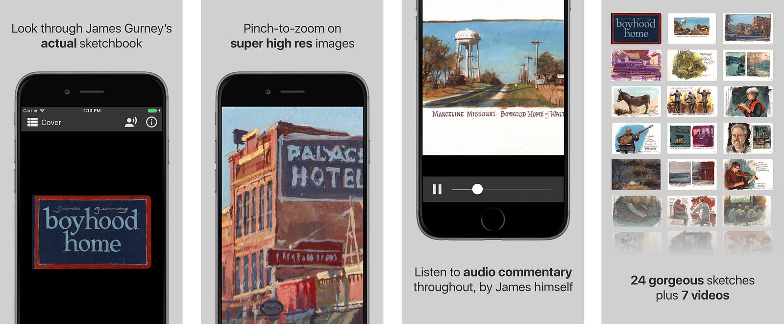
Dan says: "My dad is an artist, and for a long time he’s wished for an app that would let you see every page of a sketchbook in scalable high res, combined with voiceovers and videos about the experience of creating it.
"He couldn’t find authoring software to deliver the full experience that he imagined. So I helped him build a new technology in app form, and we’ve launched it with one of his sketchbooks. It’s available now on iOS and Android as “Living Sketchbook Vol. 1: Boyhood Home.”
"Here’s how we did it…
Research + Planning
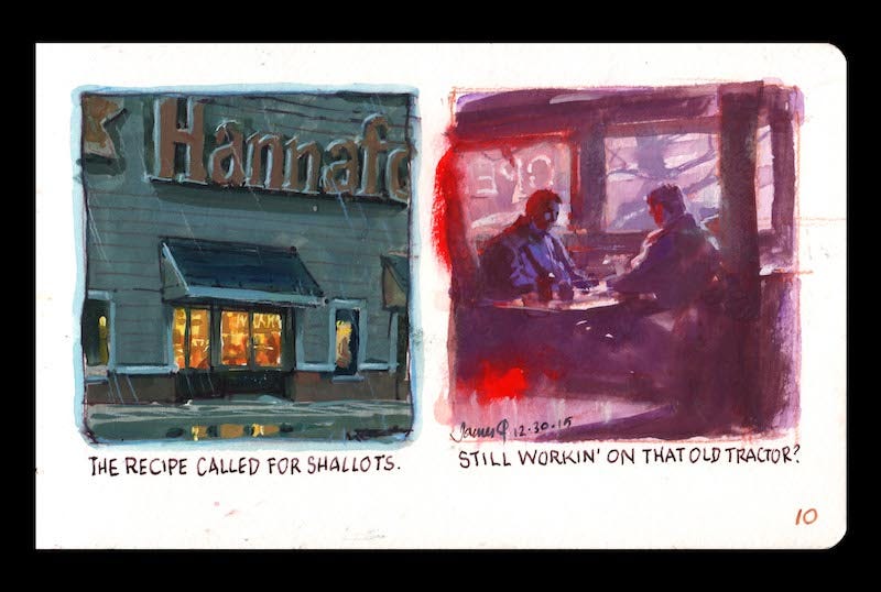
"The core idea is pretty simple — a way to look at high-res sketches with accompanying audio and video.
"We first looked at the usual suspects like iBooks and PDFs. iBooks were initially tempting, but the authoring interface was limited and clunky, and distribution was limited to only iOS devices, completely leaving out a large segment of my dad’s fanbase who uses Android. We also looked at PDFs but couldn’t find a reliable way to insert audio and video.
"In addition to having a custom user interface, we wanted to make sure that the app would run well for all users with no formatting issues.
"So I decided to build an app from scratch. Recently I’ve been using a new technology called React Native. It’s built by the team at Facebook, it’s open source, and instead of writing completely separate apps for Android and iOS, you can write one app which works natively on both platforms.
"When I first heard about React Native — after spending months learning Swift — I was skeptical. iOS and Android with the same codebase… it seemed too easy.
"Then I looked into it and realized that not only did it compile to native code, but I could also apply my existing knowledge of CSS and HTML thanks to JSX. Conceptually it was an easy call, so despite my time investment into Swift, I jumped in.
"Boy am I glad I did. Despite a few annoying compatibility errors and other small snafus, I find RN faster, simpler, and more consistent than Swift. The RN documentation online is vibrant and extensive. So when it came time to build the “Living Sketchbook,” RN was the clear way to go.
Design + Build
"After some on-paper wireframes, I did the visual design in Sketch. I kept the UI simple, with buttons for table of contents, voiceover, video (where applicable), and info. I used Google’s Material Design icons which look great and are familiar to people.
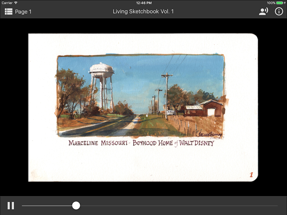
"The initial setup and layout for the app went fairly smoothly. We wanted it to run equally well on phones and tablets, so I built an adaptive layout that would expand to fill available screen space. Props to React Native’s handy “Dimensions” feature which lets you detect the screen size upon initial app load and subsequent device rotation.
"The first real roadblock came when I began testing the app on actual devices. These high resolution images are BIG. About 5000 pixels across. And it turns out that older iPads, and stock Android devices, can’t really handle them at all, leading to an app crash.
"So I had to do some combination of optimizing the app for older devices, and/or limiting which devices could run the app.
"I wanted to support as many devices as possible, so my first approach was optimization. Instead of loading 25 high-res images at once (and storing them in the device’s memory), I loaded only the full image you were currently viewing, and used placeholder thumbnails for the rest.
"This helped tremendously, especially on Android devices, but older iPads just didn’t have the processor to handle even one high definition image, so I “gated” the app to iOS devices with arm64 processors and above. To cut out the oldest devices on the Android side, I specified Android KitKat (4.4) and above.
"One other difficulty came with the panning, zooming, and swiping mechanics. Due to the native differences between iOS and Android, as well as some disparities in React Native support, I had to write custom components which targeted specifically iOS or Android using RN’s handy “component.ios.js” and “component.android.js” convention.
"The iOS component used a native ScrollView with some minor tweaks, including a custom PanResponder to register fast swipes happening during animation transitions. The Android component used “react-native-transformable-image” with some customizations to the touch responder in the “react-native-view-transformer” dependency.
"Optimizing performance, testing on different devices, and writing custom touch interactions definitely took the bulk of the development time – at least 60%. This is one area where writing for two platforms at once can be a headache. But hey, it still took way less time than writing two completely separate apps. I’d estimate altogether, I had about 90% code reuse.

"One thing I loved — it was cool seeing these open source components being updated in real time by the community. React Native is truly a living piece of technology and is improving all the time. That can lead to headaches when it comes to updating software and dependencies, but in my opinion it’s worth the trouble.
"At the end of the day, I used these plugins (thanks to all of the awesome authors):
react-native-code-push, react-native-photo-view, react-native-sound, react-native-splash-screen (for initial loading screens), react-native-svg (to render Material Design icons), react-native-swiper, react-native-timer, react-native-transformable-image (pinch to zoom on Android), react-native-video, react-redux, redux-thunk
Testing
"Once I had tested the app fairly extensively on a motley collection of iPads, iPhones, and Androids, it was time to get some beta feedback. There are so many devices out there — especially Android! — that we needed to know which devices simply wouldn’t be able to run the app.
"Luckily, my dad’s fans are really engaged and happy to help provide feedback on new products. We announced a limited beta program on my dad’s blog and used a Google Form to collect responses. Then, I made a spreadsheet with a representative sample of devices and assigned beta testers to cover the range, focusing especially on the “gray area” of older devices which may or may not work. We also asked testers about the interface, overall experience, bugs, and suggested selling price, again collecting responses via a Google Form.
"The feedback was extremely useful and we learned a lot about device compatibility as well as pricing. It was interesting that iOS users seemed willing to pay more than Android users — about 2–3x as much. However, in our case, we didn’t want to charge some people more than others, so we reduced the price to match on both platforms.
Launch
"Articles, like apps, always take longer than you think…
"As launch approached, I put together app store screenshots using Sketch, which provides handy size presets.
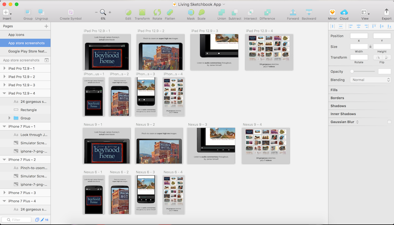
"The icon was fun, as we wanted something “handmade” to balance out the clean digital lines, and ended up using an original drawing by my dad.

"I uploaded the screenshots, icons, and final app binaries to the app stores, with Code Push included so I could push any updates over the air.
"My dad handled all the marketing, as he has a great process developed through his past art instruction videos.
"And now hopefully you all are enjoying the Living Sketchbook! Thanks for reading. I had a blast building this app, and the process only deepened my appreciation for React Native. Building for iOS and Android simultaneously — with live app previewing throughout — is an amazing tool to have.
"You can download “Living Sketchbook Vol. 1: Boyhood Home” now on iOSand Android.
"If you’d like to inquire about your own app project, you can reach me at gurney.dan (at) gmail.com.
"Thanks and have a great day."
-----
There's a review of "The Living Sketchbook, Vol.1" in today's post on the art blog Lines and Colors by Charley Parker.


6 comments:
As a retired chemist (and programmer) who is taking art lessons during retirement I enjoyed reading this article... it brought back old memories on how to interface analytical equipment to the computer... though I dropped out of the day to day work when Visual Basic and HTML were "hot", I still teach spreadsheets and often have to illustrate the process on the black board... so I am still combining art and science... thanks for the back story...
It was so interesting for me to read about the process of getting this app working. I just love the app. It is easy to use and I love having this information and access to your Dad's painting process. Thank you!
I have been really enjoying the app and am looking forward to future sketchbook releases. Thanks so much, Dan Gurney!
Sounds like your App would be of interest to other artists and publishers / content creators. Not just for publishing more of your dad's sketchbooks (though, of course, that is also worthwhile). Maybe you should open source your App. Or sell the source code package as its own App? Certainly it would be of interest to other artists. But I imagine it would appeal to many others ... travel bloggers, photographers, scrapbook creators, technical document authors, ..
"The core idea is pretty simple — a way to look at high-res sketches with accompanying audio and video."
Then you explain why PDF and iBooks didn't work for what you wanted.
Great to read the behind the scenes account. I agree with Codeman Dan, it is "interesting" that iOS users were willing to pay 2 to 3 times more for the app than Android users. I guess that attitude begins with buying the hardware. I say this as someone using iOS.
I can only imagine how gratifying it is for a father and son to collaborate on a project like this.
WOW... great app and thanks for letting us peek behind the curtain on the development. I would imagine, there would be a market for this software for lots of different content producers..
Post a Comment