Wednesday, September 18, 2013

Punch Drunk Moustache

Punch Drunk Moustache is the name of an art book showcasing the images and stories by eight animation industry artists working on their dream projects in their spare time, when they're not working as concept artists for Sony and LucasFilm.

The artists include Amy Beth Christenson, Max Lim, Jeff Sangalli, John-Paul Balmet, Will Nichols, Nate Watson, Sean Pando and Chris Voy. Each has a penchant for storytelling, and it's inspiring to see the various ways they use the modes of comics, film, and picture books to introduce their characters and worlds.

Each artist's chapter runs 14 pages, which gives them enough space to tell a tight story or to invite the reader to conjure a whole world. Besides being an impressive collection of artwork, this is a great book for anyone interested in learning more about the way a concept artist thinks.

Punch Drunk Moustache: Visual Development for Animation and Beyond

CGI short about the life of a spider


This CGI short video portrays the beauty and violence of the life of a spider as it captures and immobilizes a hapless moth. (Video link) It's a fascinating blend of art and science, with a Leo-award winning soundtrack.
Created by the artists at Polynoid and Blacklist, thanks, CG Bros.

Tuesday, September 17, 2013

Postvisualization


In big-budget live action movies, an increasingly important part of the CGI pipeline is a step called "postvisualization," which means a series of shots with low-res digital effects created after principle photography.

(Direct link to video) This documentary explains the advantages that postvis gives the director and editor to allow them to make good storytelling decisions and bid the effects accurately before the expensive rendering of the final shots.
----
Via CGBros

How to turn a laptop into a pochade easel


Karen McLain shows how to recycle an old laptop computer into a plein-air pochade easel. (Direct Link to Video)
Karen McLain's website

Monday, September 16, 2013

Aaron Becker's "Journey"


Blog reader Aaron Becker created the bestselling picture book 
He told me that he builds digital maquettes before doing his finished illustrations in traditional watercolors.

I invited him to do a guest post explaining the process, so here it is:

"Journey began as this large scale drawing, completed over the course of two afternoons three summers ago."

"Once the story had been roughed out, I returned to the original drawing and built this 3D model in Maya as a proof of concept – to see if I could replicate the spirit of the drawing as a detailed digital model. I would use this to help with perspective and lighting, and went on to build similar models for other environments in the book."

"At this stage, I’ve added significant detail to the 3D model with a new scanned pencil drawing. This light overlay gets printed out onto 300 LB Arches watercolor paper using my Epson large format printer."

"This allows me to dive into the watercolors with the confidence that my composition and perspective is spot-on. I prefer the heavy stock for watercolor as it minimizes warping and allows for fantastic control over the amount of moisture while applying pigment."

"From there, it’s a matter of old-school pen and ink and watercolor. I do the pen and ink first, making sure to give myself the freedom to change anything from the pencil underlay should the spirit move me. That said, I find the more I’ve decided conceptually ahead of time, the more I can concentrate on pure technique at any stage of the image-making game."

"Watercolor is applied in several washes from light to dark and then finished up with shadow details. I try to minimize the use of any masking fluid as I find this changes the quality of the paper for subsequent washes. Gouache was used for all of the punchy red and purple bits throughout the story."
"When it came time to create the book’s video trailer (see below), I went back into the 3D model and camera-mapped the watercolor painting onto the geometry, like a virtual slide projector covering a foam-core model. After separating the painting into several layers (background, towers, castle walls, etc) I was able to move a virtual camera in Maya and bring the image to life."


"Some details, like the waving flags were hand animated and projected onto transparent “cards” in Maya. This entire technique is similar to how matte paintings are now done in feature films. Having come from a film background, I wanted to utilize as much of the tricks I had learned as possible, while retaining the hand-made feel of the watercolor paintings. In the end, there are no shortcuts when it comes to dipping a brush into pigment and placing it on the page. Hope you all enjoy the finished product!"

JOURNEY by Aaron Becker (official trailer) from Aaron Becker on Vimeo.

Here's the book trailer Aaron created.

Find out more about Aaron Becker's work at http://www.storybreathing.com or on facebook.

Be sure to read the comments on this post, which explain a variety of inexpensive software options, such as Sketchup and Blender.
-----
You can pick up the book online at:
or Barnes and Noble
Or you can order a signed copy from Aaron's local independent bookseller, Odyssey Books.
Thanks, Aaron!

Sunday, September 15, 2013

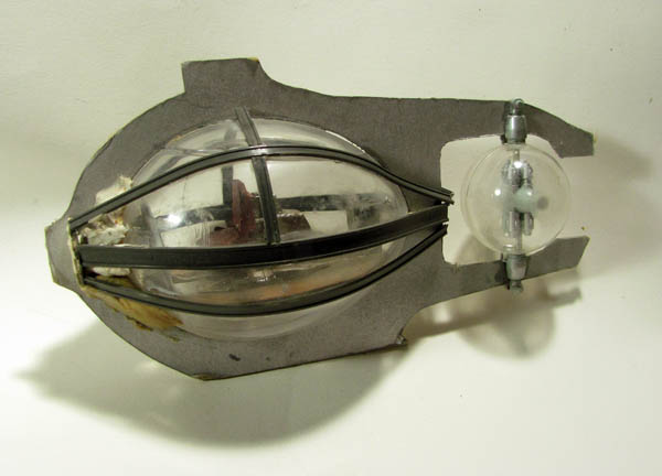
Submersible Maquette


Reference maquettes don't have to be made from Sculpey. Any materials that you've got in the studio or workshop can come in handy (which is a good excuse for being a lateral thinker and a packrat).


I constructed this very rough maquette for Arthur Denison's submersible using cardboard for the body profile and a clear plastic egg shape, which I filled with kit-bashed plastic model parts. The long gray pieces came from a model railroad supply store.

As you can see, I didn't follow the maquette closely at all, but it was really valuable for imagining Arthur Denison's submersible. I also referenced reconstructions of Bushnell's Turtle, a Revolutionary-era ancestor of submarines.


Combined with a kronosaur maquette that I had on hand, along with underwater photos of whales, I felt more sure of myself when I tackled a more difficult scene like this one, from Dinotopia: The World Beneath. 

Saturday, September 14, 2013

Hard and Soft Light


What is meant by hard and soft light?

Hardness or softness refers to how large the primary light source appears to be from the point of view of the subject. A hard light comes from a small, sharp source. Even though the sun itself is a very large object, it’s a relatively hard source of light because the disc of the sun appears small in the sky. A streetlight or a theater spotlight is also a hard source. Think of a hard light source as one that you could completely cover up with your thumb held at arm’s length. A medium-hard light is one that you could cover up with the width of your palm.

Soft light, on the other hand, shines out from a wide area, as seen from the subject’s point of view. This could be a fluorescent light, a north-facing window, or an overcast sky. A soft source is any light that appears larger than a piece of office paper held at arm’s length.

A plaster écorché in hard light (left) and soft light (right) 
Effects of hard and soft light
Any given light source becomes harder as it moves farther back from the subject and gets progressively smaller from the subject’s perspective.

These two photos of an écorché head demonstrate the effects of hard and soft light outdoors at midday. At left, direct sunlight coming from above and to the right illuminates the head. Note the clear division between light and shadow, the crisp edge of the cast shadow projected by the nose onto the chest, and the pocket of shadow in the eye socket.

At right, the same head is lit by a soft light positioned directly above. With the direct sunlight diffused, there’s no clear division of light and shadow, and no definite edge to the cast shadows. Instead, the darkest tones appear in the hollows and the down-facing planes.
Soft light: "Waiting at the Window" from Dinotopia: Journey to Chandara by James Gurney
In soft light, planes tend to get lighter as they face upward since they receive more and more of the diffused light from above. In the case of this photo, the light is diffused by a large white piece of fabric, but it would be the same effect if the sky were covered with a thin layer of clouds.

Hard light: 15 minute figure study in oil by James Gurney
Hard light is more directional and dramatic, but it can also be harsh and unflattering. Highlights are more pronounced. It casts crisper shadows and it brings out more surface texture, especially in the region of the half light, where light turns to shadow.

Soft light is generally more suited to portraiture because it shows fewer wrinkles. Because there are no sharp-edged cast shadows, the overall effect is simpler. Tonal transitions from light to shade are more gradual in soft light compared to hard light. 
-------
For the complete article, with additional illustrations and more info, including how to set up your lights to get hard and soft light, pick up a copy of the current issue of International Artist magazine, voted the #1 art magazine by GurneyJourney readers. The issue also has an article by Mitchell Albala on notan and a call for entries for a contest about seascapes, rivers, and lakes.

For more on light, you can get my book Color and Light: A Guide for the Realist Painter signed from me or from Amazon.

Friday, September 13, 2013

Danish landscapes compared with photos taken from the same spot

Danish photographer Joachim Adrian has recorded many famous sites from the exact position used by earlier painters, giving you the chance to slide a bar and switch between painting a photo. 


You have to go to this website to get the interactive feature. (User tip. You don’t have to drag the bar across. The easiest way is to click near the right or left edge of the picture.)


Blog reader Peter Sass, who shared the link, says:
"I find it fascinating to compare. The landscape has often changed somewhat between now and then. More interesting is to see how the painter has chosen to use and sometimes change a little what was before his eyes, and how style, personality and the story the painter wanted to tell shows up in the painting, and how a painting can show things better than a photo can. Something you often have written about yourself.
A bit of historical context. When the national romantic painters, such as J.T. Lundbye and P.C. Skovgaard and Købke started in the 1840s, Denmark had become much smaller than it used to and still fighting with Germany over where the border should be. So the feeling you sense in those paintings are a fervent love for Denmark as a nation and its landscapes. Lundbye went on the customary tour to Rome and was terribly homesick the whole time. They wanted to show the danish landscape as magnificent as that of any other country, even if Denmark is small and flat. You can see in Lundbye's picture that he has exaggerated the forms a bit. National feelings ran high all in all of Europe at the time."

Danish landscape / photo comparisons from Politiken (thanks, Peter!)
Previously on GurneyJourney: Christen Købke

Thursday, September 12, 2013

Extracting a 3D model from a 2D photo


In this remarkable demonstration, Daniel Cohen-Or and colleagues demonstrate a method of digitally inferring a three-dimensional solid from a 2D photo. (Direct link to video). This could be a big timesaver for digital modelers and matte painters.
--------
Thanks, Rob Nonstop

Wednesday, September 11, 2013

Brad Teare webcast tonight at 9:00

Landscape painter Brad Teare will offer his first Concert Window webcast tonight at 9:00 Eastern time.


Concert Window Open is a monetized streaming platform that has so far been used mainly by musicians, but it's also ideal for artists to share their painting techniques and connect with their followers. People can watch from anywhere in the world, paying what they want ($1 minimum), and interacting by means of written messages that the artist can read as he or she works. Brad's wife Debra, herself an accomplished still life painter, will be reading the questions.

Brad has shared his reference photo, and encourages people to paint along with him if he wants.


Brad has also released two YouTube videos leading up to the event, starting with the preliminary drawing (Video link). He did a second video showing how he sketches on canvas. In the webcast tonight, he decided to do the underpainting step, since that's the stage where the most exciting stuff happens.
-------
I did a CWO show last month. It was fun and people asked great questions. Any of you artists reading this might want to consider signing up to host your own show (learn more).

I just signed up to do another one on Sunday, September 29 at 7pm Eastern time. By popular request, I'll be using a limited palette of caseins, and I'll extend the show to 45 minutes. You can sign up to watch my show by following this link.
------
Sign up to watch Brad's webcast tonight
Brad's blog "Thick Paint"
Previous post on GJ: How I did a webcast on Concert Window