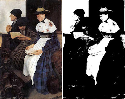
Put a painting through the “Threshold” filter in Photoshop (Image >Adjustments >Threshold) and see what happens.
William Liebl’s painting Drei Frauen in der Kirche (Three Women in Church), 1882, benefits from a strong and simple value arrangement. The book and the hands of the young woman fuse into the light of the near girl’s apron. The dark elements (dresses, head scarves, ceramic jug and carved pew) are all shape-welded together and kept in a mass.
The result is that this painting would speak across a room of a gallery. Its meaning would be clear even from a great distance.
-------
See this and other images from the 1889 Universal Exposition on Matthew Innis’s blog "Underpaintings."
Previously on GurneyJourney: Shape Welding


8 comments:
Good tip James, shape-welding can be a great asset to an illustration, but it's difficult to manage, the threshold filter can help while developing an image.
I've heard the same thing said for squinting, when it comes to designing an image. I don't think this approach is right for every piece, but it does seem like a good rule of thumb.
I live in Hamburg and have an art class at the "Kunsthalle", so I see this painting every week. I always stop to look at it. I guess now I know why.
One interesting thing is, that the young woman's face has a strange discoloring on the cheek that isn't visible on some reproductions in books or on the net.
I do the same thing in my studio by holding up my droid phone at an angle, almost parallel to the floor but just under my eyes on the bridge of my nose while viewing the subject or set up I'm painting. The resulting upside down reflected image, separated the lights and darks, objectifies the drawing and the light-dark pattern. A black mirror is also my other favorite cheat tool.
Pati Springmeyer
www.patispringmeyer.com
thats a cool trick, ill have to try it.
As far as that image goes, its great, but that lady on the right, her arms look suuuuper long to me, anyone else getting that?
Right now I am working primarily in comics, in black and white. "Thresholding" every value to either the blackest black or the whitest white is extremely common, and makes you very aware of design elements like the placement of the figures in Liebl's painting.
But reading this blog has muddled my brain. I am not a painter, but painters have made me realize that nothing in nature is completely black or completely white, that shadows are really very complicated things. Sometimes it's mighty hard to balance this painterly/scientific understanding of values with the demands of clarity.
sirfrancisdrake, I definitely concur about the arms looking weird. At least part of it stems, I think, from the high-waisted cut of her dress, but even still, it looks a little odd.
Yes, final; black and white.
Balance in contrast!
see another "Equilibrium" in dinamic represents
Pati... sounds like a great trick... just avoid allowing others to see you with your phone on your nose.... or a lot of explaining...
try mounting a sheet of clear red acetate on a piece of mat board with a window cut out.
You can hold it in any direction... and see relative values without the color (other than red).
Post a Comment