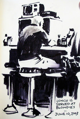
If your work suffers from “middle value mumbling,*” here’s a cure.
1. Bring your sketchbook to a restaurant, bus station, lecture hall, or waiting room.
2. Draw the scene very lightly in pencil, just to work out the shapes. You’ll erase these lines later.
3. Choose a drawing tool that only makes black shapes, such as a wide calligraphy marker or a water brush filled with black ink.
4. Define all the shapes as either white or black. If the scene is strongly lit, you can make the shadows totally black and the light areas white.

5. There are two rules:
a. DON’T DRAW OUTLINES. Let one black area run into another. Let white areas merge together. Resist the temptation to draw boundaries. You can see I started to forget this rule and outlined the top of the head and the base of the stool at right.
b. The other rule is DON’T DRAW MIDDLE TONES. This is hard to do. I desperately wanted to put in halftones and transitions in the man’s back.
5. Now erase the pencil lines. The result will probably look nothing like other drawings you’ve done. It might have a startling realism.
The viewer will have no trouble understanding the scene. The mystery can work very much in your favor. It’s excellent practice if you’re learning to paint, because these grouping decisions are a key to good tonal composition.

It’s also wonderful for giving your work more punch or more mystery. Dean Cornwell (above) in his early career was very interested in this kind of thinking.
*Middle value mumbling is the common tendency to mix all your colors in midrange tones, rather than pushing them to either the light or the dark. We all fall into this problem. It takes conscious effort to avoid it.
Previously on GurneyJourney:
Krøyer's Hip Hip Hurra
High Contrast Shape Welding
“Shape Welding”
Concert Sketching
Related concept called "notan" explained at Empty Easel.com


15 comments:
James,
I've done a few of these and I love the result. They are produce striking dramatic images. Also, it is good to work out if an image will read clearly.
Thanks for posting this.
cheers,
Kyle
A great idea, and in the atelier video you posted recently I really found the advice of having 2/3 of a figure in light or shadow very helpful advice.
If you're working from a photo reference, there is a useful tool (in Photoshop & Gimp) called "Threshold" with which you can compare your finished drawing and two-colored photo.
Great Post, I'm definitely giving this a try. Ive got a brand new sketchbook ready to go.
Thanks for this post. My work sometimes suffers from mvm so this is a great reminder.
Someone who masterfully alternated between working in black/white and painting in color was Lee Jaques. For many years he painted dioramas for the American Museum of Natural History. His b/w work was seen most widely in illustrations for books written by Sigurd Olson. I wish I could have found larger images, but in a quick search, these turned up:
http://www.upress.umn.edu/images/Books/O/olson_lonely.big.gif
http://www.upress.umn.edu/images/Books/O/olson_listening.big.gif
http://minnesota.publicradio.org/collections/special/columns/state-of-the-arts/archive/2010/06/capturing-the-wild.shtml
It's something I've been consciously working on with my new inking projects. Aside from working with photos, and relearning inks (I've been digital for years), I've tried with each of them to really make the contrast stark, then come back in and soften it with more lines. You're right though, it's difficult to let areas mix with one another.
Isn't the back of man in second picture is grey? and the drapery and background of first picture was not (solid) black either. I just wonder if you did it in purpose..
Nevermind, I got the point anyway. Thanks for sharing.
Splendid post Jim !
Thank you for this post, James! So helpful! :-D
All the best,
Christian
Excellent post! Very informative resource.
Homeowner Insurance
I tend to be confused about where to put the hard boundary on the paper, where there is a smooth gradation in reality. What is the thought process behind this? Do you guys try to imagine where the terminator would be if the light was harsh, or stylize the boundary to show form or both?
Agapetos, glad you mentioned the Photoshop threshold tool, which reduces everything to black and white, and you can dial up or down the division line. Some cameras will take photos in this mode, too.
I should have also mentioned that comic artists and storyboard artists are often really good at this kind of exercise, and that's why a background in comic art often is good training for a painter.
Steve, thanks for those links.
Bia, yes, I found it so hard to be a purist that I couldn't resist smudging a little gray into the transition.
Petr, the subject and the lighting often dictates the choices. If the subject consists of people wearing tuxedos standing in front of pianos, the lighting hardly matters.
Really interesting post James. I'm hoping to try this using paynes grey acrylic then overlay watercolour to put the middle value back in. It'll probably look a complete mess but should be fun!
James,
I appreciate the blog and check it daily (or almost daily).
Another direction for middle value mumblers to take, in my experience, is to examine the way Netherlandish painters utilize middle and middle dark tones and the fearless use of near black in the shadows to heighten the sense of contrast among the mids.
Sean
Sir, when can we say if that particular notan is good enough for a design? Can we even tell it or is it purely subjective?
Post a Comment