Joshua asks on YouTube: "You said in part 1 of Color Wheel Masking, "... As each of these colors approaches the center, it becomes a neutral gray." Why neutral gray, what is the reasoning or significance for this? I see in some wheels, the use of (outer to inner circles) white, black and saturation centers as well as neutral gray. Same question regarding a center white or black, if you please?"
 |
| A color circle created using CMYK Sliders (Source) |
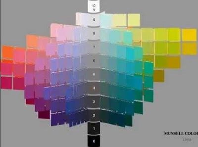
So the color wheel is a horizontal cross section of that 3D color volume, sliced through the peak saturations of each hue, with a gray at the center.

Most color wheels don't have a constant value all around the perimeter. I chose to represent the hues at whatever value shows them at peak chroma, and then I put the center point at an average gray value rather than raising it up to white or dropping it to black.
------


5 comments:
I had to read this a couple of times before I understood. I made a little illustration of the color wheel as a "section view" of the Munsell tree. It makes sense to my engineering mind anyway. Thank you for this explanation.
https://imgur.com/C0EhYeB
"I chose to represent the hues at the value where they appear at peak chroma and then I put the center point at an average gray value rather than raising it up to white or dropping it to black."
Thanks for the Enlightenment! Excuse the pun.
In this manner my friend Wesley Virgin's tale begins in this SHOCKING and controversial video.
As a matter of fact, Wesley was in the military-and shortly after leaving-he unveiled hidden, "SELF MIND CONTROL" secrets that the CIA and others used to get whatever they want.
As it turns out, these are the EXACT same secrets lots of celebrities (especially those who "became famous out of nothing") and the greatest business people used to become wealthy and famous.
You probably know how you only use 10% of your brain.
That's mostly because most of your BRAINPOWER is UNTAPPED.
Perhaps that expression has even occurred INSIDE your own mind... as it did in my good friend Wesley Virgin's mind 7 years back, while driving an unregistered, beat-up garbage bucket of a vehicle without a driver's license and with $3 in his pocket.
"I'm absolutely frustrated with living payroll to payroll! Why can't I turn myself successful?"
You've been a part of those those types of thoughts, am I right?
Your success story is waiting to be written. All you have to do is in YOURSELF.
Watch Wesley Virgin's Video Now!
Hi James, I was wondering if you'd heard of color print processes with wider gamuts than CMYK, like 6 color process (CMYKOG that includes orange and green inks) and others? If you ever reissued "Color and Light" or expanded it or did a special edition, such wider gamut printing process might be something to consider, and might be even better for representing your ideas about color.
So for those of you new to all of this it helps to remember that when you mix 2 hues that are opposite on the color wheel, like red and green you get a neutral value and that puts these neutral "grey" in the middle as you move in from one pure chroma to the neutral color which represents an equal mix of the two and outward toward the other pure chroma on the other side.
As and artist this makes sense to me, but of course so many things affect the colors we see.
What type of light is it or what time of day etc. The original hues you begin with and if they have other hues mixed in and the percentage of those hues, reflections, shadows, the air we are looking through, and finally some people see colors differently. This is not about training but about genetics.
Really loved this and now I want to make a version of your 3D color wheel for my studio.
Thanks
Post a Comment