Wednesday, April 17, 2019

Relative Color Temperature

Anand has some questions about how people talk about color temperature.

He says he understands how a yellow can be cooler if it leans more toward blue, and warmer if it has a red bias. But which blue is warmer/ cooler? One could argue that a blue with a red or violet bias is warmer because red is a warm color. But a blue with a yellow or green bias can also be regarded as warmer because yellow is also a warm color.

He also asks which is warmer, green or magenta? And is there a pure primary color on the dividing line between warm and cool? Finally, Which is the warmest color on color wheel of tube colors yellow or orange?"

Casein paint
Answer: Artists mean different things when they talk of color as warm or cool. A swatch of orange or blue standing alone can be described in absolute terms as a warm color or a cool color. Alternately, some artists use color temperature more as a relative concept to distinguish two closely related colors. For example, a green mixed with more orange might be regarded as warmer than a similar green that was composed with more of a blue-green hue. 

As you suggest, this relative approach to assigning color temperature can be confusing when someone is talking about blue, which could be made warmer with the addition of either red or yellow. I would agree with you that blue is the coolest color, so I don't think it makes any sense to describe a warmer blue.

Is there a primary color on the dividing line between warm and cool? Yes, greens and violets are on the dividing line, but artists don't always agree precisely where to divide the color wheel. Color theory historian David Briggs explains further how the color wheel has been divided between warm and cool through history.  

Which color is the warmest? I'd say a yellow orange, like a cadmium yellow medium is the warmest. But this is also a matter of debate. Keep in mind that warmth is not something you can measure with a thermometer. It's psychological. And the effect of a color in a given painting depends to a great extent on what colors you put around it.
----


Tuesday, April 16, 2019

Remembering Alphonse Mucha


Alphonse Mucha's son Jiří (1915-1991), who wrote one of the best books on the artist, went before the camera in 1975 to share his recollections. He leafs through old prints and portfolios and tours the family home in Prague.

About 14 minutes into the video, he talks about the reference photographs that he discovered among his father's things. The photos were especially helpful for drapery. Mucha would not copy the photograph, Jiri says, instead he would just use it as inspiration. (Link to video)

He says that his father put the idea of the perfect women on such a high pedestal that he was aloof and even disdainful around his actual models. When his father was about 13, he fell in love with a girl his age, who died. Forever afterward, he cherished that childlike feminine ideal, and tried to recapture it in his work.


Another video that's well worth seeing is the slide lecture on Mucha given by Felicia Zavarella Stadelman. The vivid stories she tells brings the artist to life.  (Link to video)
-----
Alphonse Maria Mucha by Jiri Mucha (1989-03-15)
Previous posts on Mucha

Monday, April 15, 2019

Ink-Jetting

Zoungy asks: "What's the term for painting each area to completion, rather than painting the whole area broadly with pale washes and increasing the depth?"

Answer:
 "Some people call it "window shading," especially oil painters. I usually call it "area-by-area painting" when it's in oil and "ink-jetting" when it's in watercolor.  


For example, I want to paint this diner in watercolor. I start with a pencil drawing to give a baseline scaffolding. While I'm doing that step I notice that a couple of the cars have already been replaced by new cars.


It has an active parking lot. Patrons stay inside for an average of 45 minutes (according to Google). I decide to paint the motorcycles first and then record the parked cars one at a time. 


The rendering grows outward from those finished areas. I can worry about the sign and the trees after I finish the parking area.


Ink-jetting is just another painting strategy that every painter should try and have ready when you need it, in contrast to the "overall approach" advised by Pissarro and others.  
----
Previously: 

Sunday, April 14, 2019

Catalog Review: American Pre-Raphaelites

Today the National Gallery in Washington opens the exhibition "American Pre-Raphaelites: Radical Realists."

John William Hill, Bird's Nest and Dog Roses, 1867
watercolor, gouache, and graphite
The exhibit examines a group of American artists that were inspired by the English critic John Ruskin. Ruskin advocated that young artists should go to Nature ‘rejecting nothing, selecting nothing, and scorning nothing.’ 

Thomas Charles Farrer, Mount Tom, 1865, oil on canvas,
The show includes more than 90 works of art, including oil paintings, watercolors, and drawings, some never before exhibited. One of the American leaders of the movement was English expatriate Thomas Charles Farrer, who was instrumental in spreading Ruskin's philosophy of close observation of nature.

Oddly enough, the curators left out Asher B. Durand from the selection of exhibited artists. He was a central figure in advocating truth-to-nature philosophies and practices, at least as much as Ruskin was. Although Durand didn't mention Ruskin by name in his Letters on Landscape Painting, he exemplified many of Ruskin's philosophies in his careful studies of trees and landscapes, and he gave Ruskin's ideas his own American slant. Durand exhibited these studies to a rising generation of landscape painters at the National Academy of Design in New York, where he was president from 1845-1861. Contrary to the impression left by the catalog essay, which quotes critics accusing Durand of belonging to a "past age and a dead system," in fact he remained an influential advocate of close observation, celebrated and beloved by younger artists until his death in 1886.

Henry Roderick Newman, Study of Elms, 1866, watercolor, 17 x 19 in.
The catalog begins with seven essays examining roots of the truth-to-nature philosophies, the role of photography in their work, their interest in still life painting, and the iconography of American Pre-Raphaelites.

Charles Herbert Moore, Hudson River, Above Catskill
One of the authors devotes twenty pages to the idea that some of the landscape paintings contain veiled references to the Civil War, Abolitionism, and other hidden political agendas. For example, the boat pulled up on shore in Charles Herbert Moore's painting Hudson River, Above Catskill is described as a "wrecked or stranded boat emblematic of a foundered ship of state and the associated fears for and even a loss of faith in the American corporate enterprise during and following the Civil War."

While some artists were certainly painting landscapes with political overtones during this period, I'm a bit skeptical of some of these interpretations. In the case of the Moore landscape above, maybe the boat was there because someone just beached his rowboat above the high tide line (the Hudson River above Catskill is tidal).

William Trost Richards Corner of the Woods,
1864, graphite, 23 x 17.5 in.
I wish the catalog's editors had devoted less page space to political theories (why not publish those online?) and instead tell the factual and humorous stories of the artists. What logistical challenges did they face, and what practical methods did they use? There are a lot of vivid, first-hand accounts in letters and journals to draw upon. I also wish the editors would consult practicing painters and conservators to give themselves more of a grounding in the concerns the actual artists faced.

Or better yet, cut back on the text and devote more pages to reproductions of artwork.

John William Hill, Apple Blossoms, watercolor, 1874, 9 x 15.5 in.
Despite those quibbles, the 312-page catalog is worth the cost ($65 list, $42 on Amazon) for the 210 color illustrations. There are high quality reproductions of all the works in the show, plus several closeups.

Fidelia Bridges, Study of Ferns, oil on board, 10 x 12 in.
I was especially impressed with the 11 works by William Trost Richards and the six samples by Fidelia Bridges. The back of the book includes an exhibition checklist, a timeline, artist biographies, notes, and index.
----
Catalog: The American Pre-Raphaelites: Radical Realists on Amazon
Exhibition: American Pre-Raphaelites: Radical Realists will be up through July 21, 2019.


Saturday, April 13, 2019

Gouache Portrait of Mickey & Friends

It's time to visit my friend Mel Birnkrant, who almost singlehandedly rescued the early image of Mickey Mouse. 

Minnie, Horace, and Mickey, gouache, 5x8 inches
Classic Mickey was nowhere to be seen between 1939 and 1973, because Mickey was replaced with the redesigned version).


One of Mel's cherished possessions is a set of one-of-a-kind sculpts of Minnie, Mickey, and Horace Horsecollar from about 1934. The rubber-hose style legs are made from electrical wire, and the heads are hand-carved from wood.


The painting is in gouache (white, raw sienna, terra rosa, and ultramarine blue) over a casein underpainting.


I'm using my homemade sketch easel at sitting height. Original Borden Dairy “Elsie” puppets by Bil Baird are in the background.
-----
Saving Classic Mickey on MelBirnkrant.com

Friday, April 12, 2019

Chinese Tomb Guardians

Tomb guardians in ancient China from the 7th to 9th century A.D. served to protect the living from wandering spirits of the dead, and to protect the tomb from robbers.


Some of these molded earthenware sculpts were composite figures that included qualities of human and animal forms.


According to Wikipedia, the earth spirits had animal bodies "often including wings sprouting from the tops of the forelegs.


"The heads are often different, with one semi-human and another perhaps based on a snarling lion. Both have horns and crests like flames or huge cockscombs."

Unglazed face of an earth spirit of the semi-human type
Read more on Wikipedia: Tang Dynasty Tomb Figures

Thursday, April 11, 2019

Cadmium Pigment Escapes E.U. Ban

The European Union has thrown out Sweden's proposal to ban cadmium paint
"It’s hard to imagine painting without cadmium. The brilliant, lightfast pigment was discovered around 1820 and started appearing in artist’s red, yellow, and orange paints in the 1840s — just in time for Impressionist founder Claude Monet’s arrival in the world. They’re what gave us Monet’s haystacks, Van Gogh’s sunflowers, and Matisse’s red-drenched studio. The European Chemical Agency (ECHA) began considering a ban on cadmium after the Swedish Chemicals Agency submitted a 197-page document calling for one in December 2013. Cadmium pigment is made with cadmium sulphide, a toxic heavy metal. It is not technically classified as hazardous by REACH, the EU body that advises the commission on chemicals, and it makes up only .1 percent of paints. Nonetheless, the report argued that artists were polluting the environment by rinsing their cadmium-soaked brushes in the sink. The cadmium would find its way into sewage sludge that is spread on agricultural land and wind up polluting crops, and so increase the risk of cancer and other illnesses."
Read more at HyperAllergenic: Rejoice! The Red (Paint) Scare Is Over in Europe

Wednesday, April 10, 2019

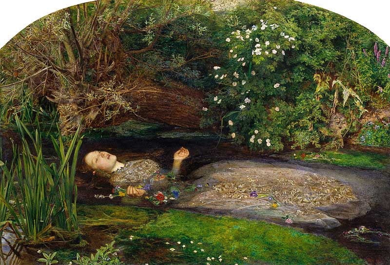
Painting the Background for Ophelia

In the summer of 1851, Pre-Raphaelite painters John Everett Millais and William Holman Hunt traveled to the Elwell River in England, each in hopes of painting the background for an ambitious picture that they had planned in their heads. 

Millais wanted to paint Hamlet's Ophelia drowning in a stream, and his plan was to paint the background first.


Following the advice of critic John Ruskin to capture every detail faithfully—“rejecting nothing—selecting nothing”—Millais dutifully recorded the "flowering rush, river daisy, forget-me-not, willow herb, meadowsweet, and the wonderful tangle of brier bush with its multitude of dog roses in bud and bloom."

According to a 1923 biography: 'They were up by six o’clock and at their selected spots by eight o’clock, where they painted until evening, returning to their lodgings about seven o’clock; Hunt had to walk four miles and Millais two to their respective painting places. 

'In a letter to Mr. Combe, Millais gives an interesting description of the trials and difficulties of the time : “I sit tailor-fashion under an umbrella throwing a shadow scarcely larger than a halfpenny for eleven hours, with a child’s mug within reach to satisfy my thirst from the running stream beside me. I am threatened with a notice to appear before the magistrate for trespassing in a field and destroying the hay; likewise by the admission of a bull in the same field after the said hay be cut; I am also in danger of being blown by the wind into the water and becoming intimate with the feelings of Ophelia when that lady sank to a muddy death, together with her (less likely) total disappearance through the wrath of the flies. There are two swans who not a little add to my misery by persisting in watching me from the exact spot I wish to paint, occasionally destroying every water-weed within their reach.’’'

'Their lodgings were far from comfortable; their hunger had to be appeased with an unvarying diet of chops, until Millais writes that he has taken such “an aversion to sheep that I feel my very feet revolt at the proximity of woollen socks.”'

The process of painting the background on location took more than two months.
-----
Quotes from 'John Everett Millais: Master Painters of the World' by Arthur Fish, 1923
Previously on the blog: Ophelia by Millais

Tuesday, April 9, 2019

Eye tracking and film

Where do our eyes look when we watch a movie? Eye-tracking technology can record in real time how  the observer's eyes land on important features, and then jump to new points of interest. 

Image from Pixar. Overlay by Avni Pepe
Scientists can take the data from the visual experience of many individuals and compile it into heat maps showing where most observers actually look. That information can suggest the cognitive activity driving the eye movements, and it can help editors understand what information people are taking away from the moving pictures.

Researchers used this technology on three films: the war movie "Saving Private Ryan" and two Pixar movies, "Up" and "Monsters, Inc." 

The researchers' concluded that the eyes and the mouth were especially important for delivering narrative information:
1. "Hot spots emerge around the character’s mouths, as if our viewers are conditioned to look for identification through the way a film’s central characters 'speak', and are searching for narrative clarification through dialogue exchanges that actually never emerge."

2. "Objects and motifs that actively move the story along and define character mood are picked out of the mise-en-scène and gazed at even when the scene is fluid and action is taking place across the filmic space."

3. "Our eyes seem to be active in finding emotive objects even when they are found in a busy scene. There is a caveat here of course: the 'extra' attention to significant objects may well have been because the scenes were free of dialogue." 
4. "When the sound is off, viewers actually migrate slightly away from the character’s mouths to focus on their eyes, and to objects that are pregnant with narrative information." 
5. "The viewer is searching for non-verbal signs to confirm what might be taking place and because the eyes, culturally speaking, are where “truth” is to be revealed."
-----
Read the whole article at The Conversation

Monday, April 8, 2019

Book Review: Working with Color

A new book by urban sketcher and watercolorist Shari Blaukopf explores the practical possibilities of color.


Working with Color: Techniques for Using Watercolor and Color Media on the Go is a vibrant collection of painter's wisdom, served up with colorful artwork and friendly and encouraging captions.


The book is the latest in the Urban Sketching Handbook series. It's printed in a small (5 x 8 inch) flexible covered book of 112 pages that almost looks like a sketchbook, and there's at least one color reproduction on almost every page.


Shari builds on her experience as a workshop leader to structure the book. She covers painting and drawing tools, pigments and color mixing, color & value, limited color, color relationships, and neutral colors.

She includes a few charts and diagrams to clarify points made in the brief text.

Watercolor by Mike Kowalki
In addition to her own work, she also includes artwork by friends and colleagues, such as Mike Kowalski and Donald Colley.

Other volumes in the Urban Sketching Handbook series include:
• Working with Color: Techniques for Using Watercolor and Color Media on the Go
• Understanding Perspective: Easy Techniques for Mastering Perspective Drawing on Location 
• People and Motion: Tips and Techniques for Drawing on Location
• Architecture and Cityscapes: Tips and Techniques for Drawing on Location 

Shari also has a Basic Watercolor Brush Set
Shari Blaukopf's website