Our visual system does a similar thing with tones, discounting the effect of shadows and grouping tones into meaningful sets.
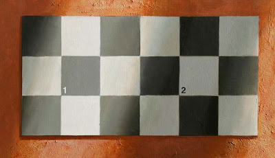
 This checkerboard is an example. I painted it using the exact same gray mixture for the dark square in the light area (1) as I did for the light square in the shadow (2).
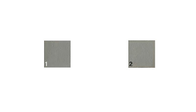
  Don’t believe it? Here are the exact same squares with everything else made white.
Why do the tones seem so different? The light square is surrounded by darker squares. This makes our visual system automatically conclude that the actual tone is light in value, and we group it with the other light squares.
We interpret the diagonal bars of darker tone as shadows for the following reasons:
1. They have soft edges, and soft edges usually belong to shadows.
2. Those edges are parallel, and cast shadows from the sun on flat surface are parallel.
3. The tones of adjacent colored squares gradate to an equal degree, just the way shadows do.
Our visual system is designed to help us determine the actual color of objects in the world. The fact that it seems to deceive us is not a defect of our vision. It’s central to our survival.
But we have to know about this mechanism of visual perception if we want to paint tones accurately.
----------
A related illusion from Edward Adelson’s website.


19 comments:
I cut two small windows in a sheet of paper and held them up to the screen, playing off your Color Constancy post of a week ago. It was still startling to have the revealed squares suddenly appear as the same gray value.
Later, looking at Adelson's site, I saw him recommend the cut paper mask as a low tech way to check the values.
For me the queston becomes: How consciously would you keep this kind of information in mind as you paint? Or would it be enough to trust your visual apparatus and paint what "looks right," without analyzing it?
Steve, you raise a good point. No matter how visually experienced an artist might be, the shadow-eliminating mechanism still keeps on working away. No one can switch it off, really.
I guess it's a matter of just knowing and estimating how deep the shadow is, and making the necessary adjustments when you mix a color. And the other thing is using all the color-isolator tricks like you did to see a spot out of context.
It seems one main area where this knowledge might be particularly useful is anticipating the difference between a paint's appearance on the palette and how it will appear in the context of its neighboring elements in a painting.
Working in an opaque medium, you could adjust for "misjudgments" pretty readily. Working in watercolor, if I "go to the dark side" too soon, it's tough to reel it back.
I find this all the time when I put a stroke down on one area and it's too light, I move it slightly and suddenly it's shades darker! I know it's a trick of the eye, but it's still astonishing no matter how many times I see it.
What's interesting here is really that the more of the same grey you delute each respective shadow/light area with the starker the contrast between the same greys become. If you remove all other checkers with the grey: The difference almost seizes to exist. Why is this?
I'm trying to wrap my head around this phenomena (and tried for some time now).. To detect it in nature you really need to have an unbiased source (such as a pure white sheet of paper) you can compare values with. To use it in your painting you need to know that it's relative to the other same tones in your shaow / light.. It's not going to look as bright if you don't spread it throughout the neighbouring colors / values.. Excuse me, I'm thinking out loud.. :)
Also, I've seen an example with this using warm and cool colors. I could dig it up..
Hi hope you dont mind I linked this photo on my blog (with a link back of course)
Crushedoutheavenly.tumblr.com
Great stuff as usual Gurney!
When we were doing cast studies and highly polished figure drawings in Atelier Stockholm, a classical atelier of the Florence school, we used pieces of paper with windows in them when we were keying our drawings. This worked great to show us that even though we thought we had gone dark enough, we could still go much darker. However, I can imagine that slavishly using a color isolator to find values and colours can be detrimental, both because it makes the process mechanical, and because we know we will never be able to match the darkest dark or lightest light of nature anyway.
What's interesting as well is if I remove my glasses. With everything out of focus most of the illusion is lost.
this might be related to how squinting (etc.) helps us see value better?
The thing that seems to most interest me right now is painting images with full light and full shadow intersecting, and I'm encountering a lot of what you're talking about. "It's fascinating, Jim," as that pointy-eared guy would say--the one in the spaceship.....
Looking forward to the new book.
Wow!! This blog is great. If you want check out my blog: http://cyglobe.blogspot.com. Greetings from Greece.
It gets a little confusing. I thought the lightest dark in the shadow should never be as light as the darkest light in the light. (Disregarding reflected light) What you are also saying is if the white square (2) was in shadow and placed next to the black square (1) the edge between the two squares would disappear or be lost right? Which would destroy the checkerboard pattern.
A very short comment this time. I completely agree with the comments of Steve.
This stuff is great! I love when we get back to fundamentals, something I think all of us need from time to time.
My first gut reaction was to squint while looking at it. This helped to a degree, but the distance between the two subject squares was too far apart with too much visual info in between to tell if they were the same tone.
A few questions:
1. If you paint all of the tones by isolating them, would you get the same painting you would if you painted the entire painting at once and adjusted each tone in relation to the other?
2. Would it be best to use the tone isolator only to establish the lightest light and the darkest dark, and then go from there working between those extremes?
3. By not using the isolator would the artist's "flawed" sense of tone translate to the viewer and look natural anyway since their sense of tone would be flawed as well?
Do we paint nature as we see it or paint it how it really?
Whoa, my brain needs a rest after this one... ;0)
Do we paint nature as we see it or paint it how it really is? (Sorry, forgot "is" on the end of that in my last post).
I agree with all of you who say that tone isolator devices can be helpful tools, but their usefulness is limited by the lighting conditions in the scene. I believe you still have to rely on a combination of squinting, comparing.
Tom, about the lightest dark's relationship to the darkest light, it all depends on the relative strength of the secondary light sources. That's a good rule of thumb for a sunny day, but there are many factors: haze, the value of the ground surface, clouds, etc, all of which can raise the shadow value quite a bit.
Again, this demo painting was done out of my head, not from observation.
I’m not going back out on that limb this time!
What I get out of this is not so much the need to become a slave to your handy-dandy value-isolator, because I think indulging one’s intuition and aesthetic sensibilities is vital to the creative process, but a great tool for establishing a common tonal value for an underpainting… similar to Genes coment: <2. Would it be best to use the tone isolator only to establish the lightest light and the darkest dark, and then go from there working between those extremes?>... since the common gray value for the light and dark relationships will harmonize and unite the painting; It’s also a great tool to help get you out of a color mixing jam. Great post Mr. G. -RQ
This is actually really interesting.
I did some experimenting around this notion today and blogged about it. http://dragonladych.livejournal.com/184537.html
One thing I did some years ago when teaching myself colours, was to "cheat" in Photoshop. Use the colour picking tool to define my palette, as I did in this blog. I learned a lot by doing this, but of course the rest of the time I rely on observation and memory.
I'd say that this is some sort of training for said memory.
Post a Comment