 Today we'll continue Chapter 9: "Painting from the Life" from Harold Speed's 1924 art instruction book Oil Painting Techniques and Materials
I'll present Speed's main points in boldface type either verbatim or paraphrased, followed by comments of my own. If you want to add a comment, please use the numbered points to refer to the relevant section of the chapter.
Today we'll cover pages 158 - 164 of the gold mine of a chapter on "Painting from the Life."
1. Analyzing Titian's Man with a Glove: "Unity and sublimity of impression is given to the head by this simple unity of focus."
There's a lot of information that he downplays, such as the line of the shoulder, the background, etc. The whole portrait hinges on the closer eye.
Note too how there's a single, large movement of tone on the model's right hand, from the higher light at the wrist to the extended finger.
2. "Do not soften one tone into another by brushing them together."
Speed says to use another carefully mixed tone between them. "The more often paint is touched, the less vital the impression." This reminds me of the "mosaic" approach of Carolus-Duran, Sargent's teacher. Good advice, but it can be taken too far if the artist makes brushstrokes the subject of the picture.
3. Analyzing Rubens' technique
I won't reiterate the whole process, but you can read it on page 159. Rubens was essentially a member of "the Brown school," but it was a very efficient method that allowed him to produce a lot of work.
4. When you paint a light tone thinly over a dark background, it will tend to look cool. When you paint a dark tone over a light BG, it will look warm.
This is also true of smoke, as I pointed out in a previous post.


Smoke against a dark background appears blue. Against a light sky, the same smoke will appear orange.
5. "Halftones are generally cool, and consequently they should be painted with the lighter side overlapping the dark."
He continues: "The enhanced effect that transparent color gives can often be got in solid (opaque) painting by lightly painting dark over a wet light tone." He goes on to talk about the color temperature of hair relative to skin. Such rules should be learned and tested skeptically against your empirical observation.
6. "When two edges come together with much variety on one side and little on the other, paint the variety side first, leaving the edge to be trimmed up when painting the simpler tone of the other side."
"You cannot vary the tones in a touch as you carry it along an edge."
7. "Another way of simplifying the larger modelling of a form that is made up of a variety of colours (that must necessarily be put on separately) is to sweep them together with one stroke of a large, dry brush. But this can only successfully be done once, or the softening effect of it will deaden the colour too much."
There are several kinds of brushes you can use for this sort of blending. I like to use a one-inch flat white synthetic.
8. Selective Focus—and lack of it
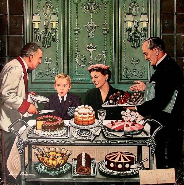
Speed cautions against painting a picture with a hard focus all over. American illustrator Stevan Dohanos above, would be an example of the "Primitive" school, in that he gives equal focus to everything. Speed emphasizes how a unity of focus comes from being more selective. The Venetians began to explore the idea of fusing edges and unity of vision, or tout ensemble vision, one of the French concepts imported by this time into the Royal Academy.
 Next week—we'll continue this chapter with the section analyzing Velazquez, starting on page 164.
-----
In its original edition, the book is called "The Science and Practice of Oil Painting ." Unfortunately it's not available in a free edition, but there's an inexpensive print edition that Dover publishes under a different title "Oil Painting Techniques and Materials
 (with a Sargent cover)," and there's also a Kindle edition.
----GurneyJourney YouTube channel
My Public Facebook page
GurneyJourney on Pinterest
JamesGurney Art on Instagram
@GurneyJourney on Twitter


11 comments:
4.Overlapping edges
I have never been aware of a rigid rule of light over dark being "cold".
Isn´t that influenced by temperature of the color rather than its value.
For example a slightly darker than blue smoke would not appear warm over the blue sky?
A lot of figure painters work in darks over lights and do not intend to have a warm effect.
At least that is what i always thought.
What about scumbling light over dark and glazing dark over light alternately over the same part of a picture to readjust.
That would somehow undermine that rule.
Or am i getting something wrong?
Gyrus, don't worry too much about the rules. Just experiment and figure it out for yourself.
James is right Gyrus. It's only in the application that rules make sense, mind you #4 is spot on. Try it and you will see.
I really must get a copy of this book. My years of stumbling around would have been considerably lightened with this kind of training. I've had my nose pressed into the varnish of a very fine Rubens trying to get handle on how he wielded such extraordinary skill with great economy. That Titian is superb.
RE: #2 "Do not soften one tone into another by brushing them together." ...use a tone between them.
You make a good point James, this transition stroke, though painterly, could be over employed- drawing too much attention to brushwork- if I'm hearing you right? It's a good thing to consider, painting is such a balancing act.
Is "Oil in the Wild" on the workbench?
Bryan
Bryan, Yes, I think Speed is cautioning against overmodeling, as there is a freshness to separate tones precisely mixed and allowed to stand. I think it's good to avoid habitual back-and-forth stroke-stroke-strokes.
Thanks for asking about the next video. I just edited a free video about the making of a new paleo illustration. And I have a lot of segments painted in gouache and casein that I'm thinking of releasing as "Color in the Wild." Casein isn't available in Europe, and I think a lot of people don't want to feel they have to invest in a new set of paints, so I'm hesitant to call it "Casein in the Wild." Also, there's a lot specifically about color that I'd like to talk about and demonstrate.
Bobby / Ross, Speed sounded truly impressed with Rubens' productivity, but couldn't resist a slight dig at his old fashioned methods. As for owning the book, I'm working from an old xerox copy of it, but I like the copy because it's got my marginal notes from when I read it at age 25, and I like having the overlay of my more recent notes.
1. "Unity and sublimity of impression is given to the head by this simple unity of focus." I confess that I don't understand this sentence in regard to the example painting. To me, the gloved hand draws my eye initially, and demands my attention for several long moments as my brain attempts to 'consider' this magnet of focus. The mans head, to my eye, is secondary. The title even supports this. I find no unity, or sublimity of impression, or unity of focus, given to the head, it is given to the glove, with the head perhaps the extension of the hand. The very phrase, 'unity of focus' is strange, in that the word 'focus' implies one-pointed attention, while the word unity implies more than one quality amalgamated into one. Broadly speaking, there are three focal points: the head and two hands. Given the title, and the odd nature of the glove, the primary focus for me is the gloved hand, and then I look to the face to find the quality of the person who might wear such an adornment to learn if he might be a warrior, a patient, a sufferer, an eccentric, etc. Very curious statement.
Hi Sesco. I can read that admittedly vague term as referring to the very simple triangulation of the composition. I'm drawn to the head first, then the right hand and its that gesture that takes me up to the gloved hand and back to the head. The gloved hand to the head forms a neat 45 degree, which is a much favored device used by many of the greats. The agreeable 45 degree line was pointed out to me only recently by a very fine local artist who uses it a helluva lot and its a device I try to employ as much as possible now.
Sesco, I would assume he means that there's a unity of focus within the head, and that's achieved by the choice of values and edges within the face. The larger portrait, despite the secondary interest of the hand, still puts strong focus on the face because of the dark and simple treatment to the rest of it.
Regarding the design of the painting "Man with a Glove": I am surprised there aren't some comments about the white shapes. They could have easily stolen the show. The head and two hand areas are almost isolated elements floating in all that 85% to 100% black. The white shapes single those areas out and—at the same time—unify them.
It is interesting that the exposed shirt area is subdued as it narrows. Also, the amber, gold hues of the pendant help establish the warm colors in the bottom of the painting.
By the by ...Interesting article on Giorgione and Titian where "Man with a glove" gets a mention.
http://www.theguardian.com/artanddesign/2016/feb/21/who-painted-giustiniani-portrait-giorgione-or-titian-royal-academy
Post a Comment