 Today we'll start Chapter 9: "Painting from the Life" from Harold Speed's 1924 art instruction book Oil Painting Techniques and Materials
I'll present Speed's main points in boldface type either verbatim or paraphrased, followed by comments of my own. If you want to add a comment, please use the numbered points to refer to the relevant section of the chapter.
The chapter on "Painting from The Life" takes up a major part of the book, so let's break it down into parts, starting with the introduction and Painting from the life in two colors.
Fortunately it's not out of fashion any more, and is very much a part of the curriculum of modern academic ateliers.
 2. Why it's good to paint from casts before painting from a live model.
Speed explains why painting from plaster casts is a good idea. Skin has a lot of variation in local color. This variation has to be considered in addition to the modeling. Also, hair also doesn't follow the normal principles of modeling. I would add that if the light is placed too near the model, there's a variation in value intensity that also must be considered.
3. "Keep your work as large and simple in treatment as possible."
This is consistent with Speed's advice throughout: State the broad masses with a big brush first and save the nuances for later.
4. "Reflected lights in the shadows are what give the luminous quality to them, without which they are heavy and opaque."
Speed explains how reflected light usually comes from the direction opposite to the light, making the darkest part of the shadow (often called the "core" of the shadow), just beyond the terminator. This isn't always true, however. If there are sources of reflection or secondary fill lights near the viewer, the core won't be apparent. It's often an artistic choice whether to include it. The core of the shadow is also generally not apparent with indirect, diffused, or overcast light.
5. Painting from the life in two colors.
Speed suggests using blue-black for the cool color. You can mix such a blue-black by mixing some French ultramarine deep with ivory black. On the warm side, you can use Venetian red or burnt sienna. As Speed says, the relationship of warm and cool colors is one of the most important features to watch in flesh painting, or for that matter, any painting.

6. The advantages of painting with limited palettes
"In training oneself, the thing to aim at is taking the difficulties one at a time, and concentrating the whole attention on them....Muddling along with a full palette, and the whole difficulties of painting presented at once, which is the common method, is asking for trouble."
Using limited palettes is like living within a strict financial budget, where you're forced to account for every expense. It forces the painter to get the most out of the limited resources, and encourages clean handling.
"Fine coloring usually results from a simple palette the range of which has been fully used. You are forced, by starting with two colors, to find the utmost that can be obtained with them." Later when you use a full palette, you won't be seduced into using too many bright colors.
7. "In flesh, seen under an ordinary indoor aspect, the half-tones are usually the coolest colors, the warm being in the shadows and to a lesser degree in the lights."
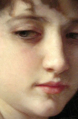
I'm always a little skeptical about such hard and fast rules, but this is a good one to think about and experiment with. The Bouguereau detail at left shows a very nice distribution of warm and cool colors, with slightly cool halftones and warm colors in the shadow and the forms and hollows of the form. I suspect that subsurface scattering and the peculiar qualities of how skin reflects light may be a part of this principle.
 Next week—Chapter 9, "Painting from the Life," continued.
-----
In its original edition, the book is called "The Science and Practice of Oil Painting ." Unfortunately it's not available in a free edition, but there's an inexpensive print edition that Dover publishes under a different title "Oil Painting Techniques and Materials
 (with a Sargent cover)," and there's also a Kindle edition.
----GurneyJourney YouTube channel
My Public Facebook page
GurneyJourney on Pinterest
JamesGurney Art on Instagram
@GurneyJourney on Twitter


9 comments:
7. I would LOVE to, just once, paint skin that looks like the Bouguereau. James, have you ever experienced painting skin like that, with depth, luminosity? In these days of impressionistic rendering, it is a marvel to see complex skin like that in babies or fair-skinned humans (think eighteenth century French Aristocrats just after a bath) whose skin is so thin and so sensitive to Sunlight. I cannot break through the opaque or impressionistic rendering of human flesh, which is fine for me, but I would love to have that arrow of perfect rendering of flesh in my quiver for just showing off at cocktail parties.
6. Are you familiar with Fletcher's Colour Control on this topic?
I know you have Sargent contained in your Color and Light, and your suggestions on limited palletes are also on point, however Fletcher is very direct in elaborating the Naturalistic (Golden Section in Color) Palette. (although I like dynamic and randomized Gamut mapping instead of being contained only within one system)
Of course, I'm only kidding about showing off at cocktail parties, I would really love to know how to paint realistic flesh expertly, efficiently, without a lot of angst.
Hi Sesco - may I humbly suggest you look at a grisaille or underpainting, then the judicious use of glazes to get that pearl-like, evanescent, cocktail party stopping effect?
7. I also believe this is crucial to all artists striving for at least somewhat naturalistic form and color effects. I have my students often try black/white alone in their first grisaille, but I also demonstrate for them underpainting in (and soon require them to mix their own) "black" without black, using indigo and/or ultramarine, alizarin crimson and a touch of umber for the darks; these are turned toward the fuller masses using a bit of white to that mix for half-darks, and then contrasted against lighted areas made with either wholly or mostly white with a touch of ochre and/or subtle red in the main lighted areas, and only the tiniest touch of neutralized blue(s) in the reflected lights. This is still restricted and teaches them to try to find the best way to neutralize the three main colors toward almost dead greys and seeing the possible slight differences in warm and cools of the same tone. After this "dead color" layer (stolen from Rembrandt, who admittedly used almost no blues), we glaze with a variety of juicier warms and a select few cool blues. Greens must be done with separated layers of warm and cool (or achieved simply by letting that earlier umbrish underpainting glimpse through warmer tints applied semi-opaquely with scumbling), unless a particular bottle screams viridian transparently (it's a silent scream).
The whole process gets re-applied in various degrees as successive layers accumulate, except where the thinnest shadows are meant to stay thin. I have them do this near the start of teh course (week 4 of 16) in acrylics, and later, near the end with portraits in oils over an acrylic underpainting. Using aggressive rag-work and scumbling, plus control of gloss medium not too soupy!), the all-acrylic works can end up looking awfully close to oils. I've had well-schooled non-artists and even a few colleagues mistake my acrylics for oils when the two are side by side. But I also give students plenty of chances to play up the fun and pizzazz from acrylics: Pop Art style, wet-in-wet transparency, etc.
7. I have read of using green AS the grisaille, mimicking the venous blood? In the Va. Museum of Fine Art there are portraits that, when inspected closely, clearly show the faintest trail of a vein through the skin. It is such a surprising, and delightful feeling, to see this handling by a Master, when it is not so evident when viewing from just a couple of feet or more back from the canvas, and yet I know it is a critical part of the 2D illusion of 3D reality when I step back for viewing. I assume the color of the grisaille depends upon the 'fairness' or 'ruddiness' of the subject, or is that mostly adjusted for in the glazes?
A mostly greenish grisaille would be my go-to Sesco. As you say, the fairness or ruddiness can be mostly adjusted with the glazes. The beauty in using the green is its complementaryiness(?) with red and it is that whisker thin push/pull with the greys that you are after. Please note that all I have said is done from the comfort of my plush library that smells of mahogany.
:)
Nerses, thanks for the stuff on Fletcher's Colour system. I downloaded it and wasn't aware of it.
Sesco, they're giving you good advice, and thanks, Bobby La/Ross and JvL for adding that good information on glazing over "dead" or more monochromatic color. Although I haven't done a lot of experimenting with that method, it's a wonderful way to get luminosity in flesh tones, and Rubens, Titian, and many other old maestros used it. Solomon Solomon's book on painting devotes several chapters to the glazing over monochrome versus the more impressionistic methods, and Speed will discuss it more, too.
Sesco- on the subject of grisailles, take a look at this painting by Ingres:
https://upload.wikimedia.org/wikipedia/commons/0/06/Ingres_Princess_Albert_de_Broglie.jpg
Look closely at the bottom inch of the painting and you can see the grisaille coming through (at least that's what I've been told).
I'm told that Ingres used a grisaille or 'closed' underpainting that seems to be gray, maybe blue-black and white? Supposedly this is how he achieved those cool, pearly skin tones, but I'm not sure if this grisaille was just for the dress- it seems like for other paintings Ingres painted portraits directly on a 'buff' colored ground.
If you are in NY any time soon you can see it in the MET in person, although it is in an odd spot- not in the main collection.
Post a Comment